


Search results for "Apartment address plaque" in Home Design Ideas
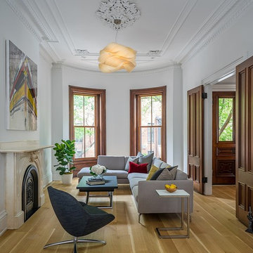
New Yorkers are always on the prowl for innovative ways to make the most of the space they have. An upper east side couple, challenged with a slightly narrow L shaped apartment sought out Decor Aid’s help to make the most of their Manhattan condo. Paired with one of our senior designer, Kimberly P., we learned that the clients wanted a space that looked beautiful, comfortable and also packed with functionality for everyday living.
“Immediately upon seeing the space, I knew that we needed to create a narrative that allowed the design to control how you moved through the space,” reports Kimberly, senior interior designer.
After surveying each room and learning a bit more about their personal style, we started with the living room remodel. It was clear that the couple wanted to infuse mid-century modern into the design plan. Sourcing the Room & Board Jasper Sofa with its narrow arms and tapered legs, it offered the mid-century look, with the modern comfort the clients are used to. Velvet accent pillows from West Elm and Crate & Barrel add pops of colors but also a subtle touch of luxury, while framed pictures from the couple’s honeymoon personalize the space.
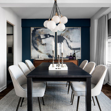
Moving to the dining room next, Kimberly decided to add a blue accent wall to emphasize the Horchow two piece Percussion framed art that was to be the focal point of the dining area. The Seno sideboard from Article perfectly accentuated the mid-century style the clients loved while providing much-needed storage space. The palette used throughout both rooms were very New York style, grays, blues, beiges, and whites, to add depth, Kimberly sourced decorative pieces in a mixture of different metals.
“The artwork above their bureau in the bedroom is photographs that her father took,”
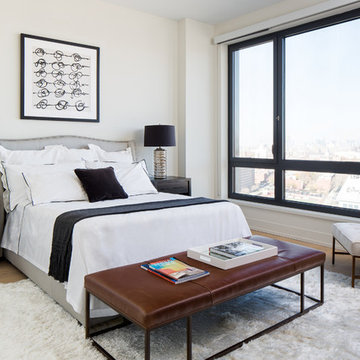
Moving into the bedroom renovation, our designer made sure to continue to stick to the client’s style preference while once again creating a personalized, warm and comforting space by including the photographs taken by the client’s father. The Avery bed added texture and complimented the other colors in the room, while a hidden drawer at the foot pulls out for attached storage, which thrilled the clients. A deco-inspired Faceted mirror from West Elm was a perfect addition to the bedroom due to the illusion of space it provides. The result was a bedroom that was full of mid-century design, personality, and area so they can freely move around.
The project resulted in the form of a layered mid-century modern design with touches of luxury but a space that can not only be lived in but serves as an extension of the people who live there. Our designer was able to take a very narrowly shaped Manhattan apartment and revamp it into a spacious home that is great for sophisticated entertaining or comfortably lazy nights in.

Photographer: Tom Crane
Made of 300, 10-foot steel blades set upright 8 inches apart, the award winning Cor-Ten Cattails Sculptural fence was designed for a home in Berwyn, Pennsylvania as a yard sculpture that also keeps deer out.
Made of COR-TEN, a steel alloy that eliminates the need for painting and maintains a rich, dark rust color without corroding, the fence stanchions were cut with a plasma cutter from sheets of the alloy.
Each blade stands 8 feet above grade, set in concrete 3 feet below, weighs 80-90 pounds and is 5/8 inch thick. The profile of the blades is an irregular trapezoid with no horizontal connections or supports. Only the gate has two horizontal bars, and each leaf weighs 1200 pounds.
Million Dollar Listing’s celebrity broker Ryan Serhant reached out to Decor Aid to stage a luxurious Brooklyn condo development. The only caveat was that our interior designers had 48 hours to come up with the design, concept, and source all the furniture. Always up for a challenge, we partnered with Mitchell Gold & Bob Williams to create this contemporary gem.
Staying true to their contemporary vision, our interior decorators sourced all pieces through MGBW. Starting in the living room, we placed the Gunner Sofa, a piece that offers clean-lined living. The thin arms and slanted profile emphasize the modern elegance of the home. Through the use of various contemporary patterns and textures we were able to avoid the one-dimensional ambiance, and instead, the apartment’s living room feels detailed and thought out, without making anyone who enters overcrowded with home decor.
The Melrose cocktail table was sourced for its sleek, stainless steel and glass design that contrasts with more substantial pieces in the space, while also complementing the contemporary style. The glass design gives the illusion that this table takes up less space, giving the living room design a light and airy feel all around. The living space transformed into something out of a decor catalog with just the right amount of personality, creating a room that follows through with our starting design, yet functional for everyday use.
After the living room area, we set our eyes on designing the master bedroom. Our interior decorators were immediately drawn to the Celina Floating Rail Bed, it’s opulent nailhead trim, and dramatic design brings fresh sophistication to the bedroom design, while also standing out as a timeless piece that can complement various trends or styles that might be added later on to the bedroom decoration. We sourced the Roland Table Lamp to add texture, with its elaborate ribbed design, that compliments the air of masculinity the Carmen Leather Ottoman add while contrasting with the light, sleeker pieces. This difference in weight left us with a bedroom decoration that lives up to the trending modern standards, yet a space that is timeless and stylish no matter the decor trends.
Once we finished and the project was completed, our senior designers took a step back and took in all of their hard labor. Decor Aid was able to make this newly built blank space and design it into a modern wonder small brooklyn apartment. The MGBW furnishings were all hand-picked to keep an even balance of complementing and contrasting contemporary pieces, which was one of our more critical apartment decorating ideas. The apartment home decor brings to life this modern concept in a way that isn’t overbearing and shows off their style making the space in every sense an accurate reflection of a chic contemporary style.
Find the right local pro for your project
Brandon Schulman
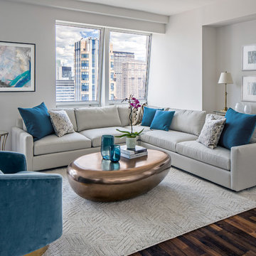
Example of a classic formal living room design in New York with beige walls and a standard fireplace
Example of a classic formal living room design in New York with beige walls and a standard fireplace
This renovated brick rowhome in Boston’s South End offers a modern aesthetic within a historic structure, creative use of space, exceptional thermal comfort, a reduced carbon footprint, and a passive stream of income.
DESIGN PRIORITIES. The goals for the project were clear - design the primary unit to accommodate the family’s modern lifestyle, rework the layout to create a desirable rental unit, improve thermal comfort and introduce a modern aesthetic. We designed the street-level entry as a shared entrance for both the primary and rental unit. The family uses it as their everyday entrance - we planned for bike storage and an open mudroom with bench and shoe storage to facilitate the change from shoes to slippers or bare feet as they enter their home. On the main level, we expanded the kitchen into the dining room to create an eat-in space with generous counter space and storage, as well as a comfortable connection to the living space. The second floor serves as master suite for the couple - a bedroom with a walk-in-closet and ensuite bathroom, and an adjacent study, with refinished original pumpkin pine floors. The upper floor, aside from a guest bedroom, is the child's domain with interconnected spaces for sleeping, work and play. In the play space, which can be separated from the work space with new translucent sliding doors, we incorporated recreational features inspired by adventurous and competitive television shows, at their son’s request.
MODERN MEETS TRADITIONAL. We left the historic front facade of the building largely unchanged - the security bars were removed from the windows and the single pane windows were replaced with higher performing historic replicas. We designed the interior and rear facade with a vision of warm modernism, weaving in the notable period features. Each element was either restored or reinterpreted to blend with the modern aesthetic. The detailed ceiling in the living space, for example, has a new matte monochromatic finish, and the wood stairs are covered in a dark grey floor paint, whereas the mahogany doors were simply refinished. New wide plank wood flooring with a neutral finish, floor-to-ceiling casework, and bold splashes of color in wall paint and tile, and oversized high-performance windows (on the rear facade) round out the modern aesthetic.
RENTAL INCOME. The existing rowhome was zoned for a 2-family dwelling but included an undesirable, single-floor studio apartment at the garden level with low ceiling heights and questionable emergency egress. In order to increase the quality and quantity of space in the rental unit, we reimagined it as a two-floor, 1 or 2 bedroom, 2 bathroom apartment with a modern aesthetic, increased ceiling height on the lowest level and provided an in-unit washer/dryer. The apartment was listed with Jackie O'Connor Real Estate and rented immediately, providing the owners with a source of passive income.
ENCLOSURE WITH BENEFITS. The homeowners sought a minimal carbon footprint, enabled by their urban location and lifestyle decisions, paired with the benefits of a high-performance home. The extent of the renovation allowed us to implement a deep energy retrofit (DER) to address air tightness, insulation, and high-performance windows. The historic front facade is insulated from the interior, while the rear facade is insulated on the exterior. Together with these building enclosure improvements, we designed an HVAC system comprised of continuous fresh air ventilation, and an efficient, all-electric heating and cooling system to decouple the house from natural gas. This strategy provides optimal thermal comfort and indoor air quality, improved acoustic isolation from street noise and neighbors, as well as a further reduced carbon footprint. We also took measures to prepare the roof for future solar panels, for when the South End neighborhood’s aging electrical infrastructure is upgraded to allow them.
URBAN LIVING. The desirable neighborhood location allows the both the homeowners and tenant to walk, bike, and use public transportation to access the city, while each charging their respective plug-in electric cars behind the building to travel greater distances.
OVERALL. The understated rowhouse is now ready for another century of urban living, offering the owners comfort and convenience as they live life as an expression of their values.
Photography: Eric Roth Photo
This renovated brick rowhome in Boston’s South End offers a modern aesthetic within a historic structure, creative use of space, exceptional thermal comfort, a reduced carbon footprint, and a passive stream of income.
DESIGN PRIORITIES. The goals for the project were clear - design the primary unit to accommodate the family’s modern lifestyle, rework the layout to create a desirable rental unit, improve thermal comfort and introduce a modern aesthetic. We designed the street-level entry as a shared entrance for both the primary and rental unit. The family uses it as their everyday entrance - we planned for bike storage and an open mudroom with bench and shoe storage to facilitate the change from shoes to slippers or bare feet as they enter their home. On the main level, we expanded the kitchen into the dining room to create an eat-in space with generous counter space and storage, as well as a comfortable connection to the living space. The second floor serves as master suite for the couple - a bedroom with a walk-in-closet and ensuite bathroom, and an adjacent study, with refinished original pumpkin pine floors. The upper floor, aside from a guest bedroom, is the child's domain with interconnected spaces for sleeping, work and play. In the play space, which can be separated from the work space with new translucent sliding doors, we incorporated recreational features inspired by adventurous and competitive television shows, at their son’s request.
MODERN MEETS TRADITIONAL. We left the historic front facade of the building largely unchanged - the security bars were removed from the windows and the single pane windows were replaced with higher performing historic replicas. We designed the interior and rear facade with a vision of warm modernism, weaving in the notable period features. Each element was either restored or reinterpreted to blend with the modern aesthetic. The detailed ceiling in the living space, for example, has a new matte monochromatic finish, and the wood stairs are covered in a dark grey floor paint, whereas the mahogany doors were simply refinished. New wide plank wood flooring with a neutral finish, floor-to-ceiling casework, and bold splashes of color in wall paint and tile, and oversized high-performance windows (on the rear facade) round out the modern aesthetic.
RENTAL INCOME. The existing rowhome was zoned for a 2-family dwelling but included an undesirable, single-floor studio apartment at the garden level with low ceiling heights and questionable emergency egress. In order to increase the quality and quantity of space in the rental unit, we reimagined it as a two-floor, 1 or 2 bedroom, 2 bathroom apartment with a modern aesthetic, increased ceiling height on the lowest level and provided an in-unit washer/dryer. The apartment was listed with Jackie O'Connor Real Estate and rented immediately, providing the owners with a source of passive income.
ENCLOSURE WITH BENEFITS. The homeowners sought a minimal carbon footprint, enabled by their urban location and lifestyle decisions, paired with the benefits of a high-performance home. The extent of the renovation allowed us to implement a deep energy retrofit (DER) to address air tightness, insulation, and high-performance windows. The historic front facade is insulated from the interior, while the rear facade is insulated on the exterior. Together with these building enclosure improvements, we designed an HVAC system comprised of continuous fresh air ventilation, and an efficient, all-electric heating and cooling system to decouple the house from natural gas. This strategy provides optimal thermal comfort and indoor air quality, improved acoustic isolation from street noise and neighbors, as well as a further reduced carbon footprint. We also took measures to prepare the roof for future solar panels, for when the South End neighborhood’s aging electrical infrastructure is upgraded to allow them.
URBAN LIVING. The desirable neighborhood location allows the both the homeowners and tenant to walk, bike, and use public transportation to access the city, while each charging their respective plug-in electric cars behind the building to travel greater distances.
OVERALL. The understated rowhouse is now ready for another century of urban living, offering the owners comfort and convenience as they live life as an expression of their values.
Eric Roth Photo
When a family living in Singapore decided to purchase a New York City pied-à-terre, they settled on the historic Langham Place, a 60-floor building along 5th Ave which features a mixture of permanent residencies and 5-star hotel suites. Immediately after purchasing the condo, they reached out to Decor Aid, and tasked us with designing a home that would reflect their jet-setting lifestyle and chic sensibility.
Book Your Free In-Home Consultation
Connecting to the historic Tiffany Building at 404 5th Ave, the exterior of Langham Place is a combination of highly contemporary architecture and 1920’s art deco design. And with this highly unique architecture, came highly angular, outward leaning floor-to-ceiling windows, which would prove to be our biggest design challenge.
One of the apartment’s quirks was negotiating an uneven balance of natural light throughout the space. Parts of the apartment, such one of the kids’ bedrooms, feature floor-to-ceiling windows and an abundance of natural light, while other areas, such as one corner of the living room, receive little natural light.
By sourcing a combination of contemporary, low-profile furniture pieces and metallic accents, we were able to compensate for apartment’s pockets of darkness. A low-profile beige sectional from Room & Board was an obvious choice, which we complemented with a lucite console and a bronze Riverstone coffee table from Mitchell Gold+Bob Williams.
Circular tables were placed throughout the apartment in order to establish a design scheme that would be easy to walk through. A marble tulip table from Sit Down New York provides an opulent dining room space, without crowding the floor plan. The finishing touches include a sumptuous swivel chair from Safavieh, to create a sleek, welcoming vacation home for this international client.
Excerpted from Washington Home & Design Magazine, Jan/Feb 2012
Full Potential
Once ridiculed as “antipasto on the Potomac,” the Watergate complex designed by Italian architect Luigi Moretti has become one of Washington’s most respectable addresses. But its curvaceous 1960s architecture still poses design challenges for residents seeking to transform their outdated apartments for contemporary living.
Inside, the living area now extends from the terrace door to the kitchen and an adjoining nook for watching TV. The rear wall of the kitchen isn’t tiled or painted, but covered in boards made of recycled wood fiber, fly ash and cement. A row of fir cabinets stands out against the gray panels and white-lacquered drawers under the Corian countertops add more contrast. “I now enjoy cooking so much more,” says the homeowner. “The previous kitchen had very little counter space and storage, and very little connection to the rest of the apartment.”
“A neutral color scheme allows sculptural objects, in this case iconic furniture, and artwork to stand out,” says Santalla. “An element of contrast, such as a tone or a texture, adds richness to the palette.”
In the master bedroom, Santalla designed the bed frame with attached nightstands and upholstered the adjacent wall to create an oversized headboard. He created a television stand on the adjacent wall that allows the screen to swivel so it can be viewed from the bed or terrace.
Of all the renovation challenges facing the couple, one of the most problematic was deciding what to do with the original parquet floors in the living space. Santalla came up with the idea of staining the existing wood and extending the same dark tone to the terrace floor.
“Now the indoor and outdoor parts of the apartment are integrated to create an almost seamless space,” says the homeowner. “The design succeeds in realizing the promise of what the Watergate can be.”
Project completed in collaboration with Treacy & Eagleburger.
Photography by Alan Karchmer
© Wing Wong
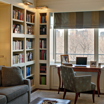
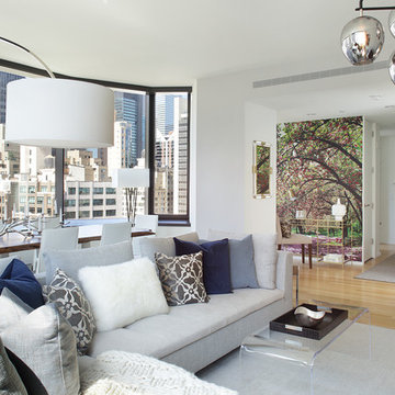
Space efficiency was a major design factor in this one bedroom apartment on Fifth Avenue that serves as a second home. Pocket doors were installed to the living room to provide privacy when necessary but allow light to enter the interior of the apartment, and a spacious foyer now acts as a dining room. Custom cabinetry in the home office and bedroom maximizes storage space for books, and millwork details provide formality and visual interest to an otherwise simple space.
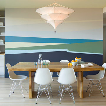
This project was simply furnishing the front room of a small Portland apartment. The apartment is north-facing so we chose a soft yellow for the ceiling to bring in a feeling of warmth and sunlight. The walls are a pale grey, and both colors find their way into the layers of Emily’s abstracted land and sea scape mural.
When a family living in Singapore decided to purchase a New York City pied-à-terre, they settled on the historic Langham Place, a 60-floor building along 5th Ave which features a mixture of permanent residencies and 5-star hotel suites. Immediately after purchasing the condo, they reached out to Decor Aid, and tasked us with designing a home that would reflect their jet-setting lifestyle and chic sensibility.
Book Your Free In-Home Consultation
Connecting to the historic Tiffany Building at 404 5th Ave, the exterior of Langham Place is a combination of highly contemporary architecture and 1920’s art deco design. And with this highly unique architecture, came highly angular, outward leaning floor-to-ceiling windows, which would prove to be our biggest design challenge.
One of the apartment’s quirks was negotiating an uneven balance of natural light throughout the space. Parts of the apartment, such one of the kids’ bedrooms, feature floor-to-ceiling windows and an abundance of natural light, while other areas, such as one corner of the living room, receive little natural light.
By sourcing a combination of contemporary, low-profile furniture pieces and metallic accents, we were able to compensate for apartment’s pockets of darkness. A low-profile beige sectional from Room & Board was an obvious choice, which we complemented with a lucite console and a bronze Riverstone coffee table from Mitchell Gold+Bob Williams.
Circular tables were placed throughout the apartment in order to establish a design scheme that would be easy to walk through. A marble tulip table from Sit Down New York provides an opulent dining room space, without crowding the floor plan. The finishing touches include a sumptuous swivel chair from Safavieh, to create a sleek, welcoming vacation home for this international client.

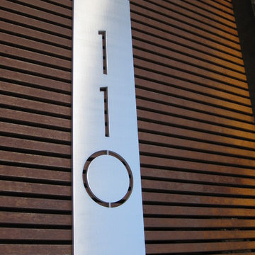
Palm Springs Modern House Number Plaque (modernhousenumbers.com)
brushed 3/8" thick aluminum with a high quality clear coat and 1/2" standoffs providing a subtle shadow.
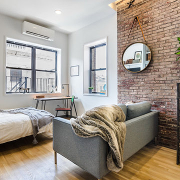
The living space and bedroom are one, but clever furniture placement creates different areas within the compact open plan. The restored brick wall is an original chimney in this building from the mid-1800's.
Photography and styling by Heidi Solander
SoCal Modern House Number Plaque (modernhousenumbers.com)
brushed 3/8" thick aluminum with a high quality clear coat and 1/2" standoffs providing a subtle shadow.
This Manhattan Upper East side apartment renovation introduces memories of California into a New York setting for clients who embrace the Big Apple lifestyle but didn’t want to give up their Marin County, California comforts. The carved out ceilings and walls add a new dimension to the space; while the blond color woods and curved shapes bring memories of a calmer life. The overall result of the apartment design is a fun, warm and relaxing refuge from their current, higher energy lives.
Photography: Charles Callister Jr.
When a family living in Singapore decided to purchase a New York City pied-à-terre, they settled on the historic Langham Place, a 60-floor building along 5th Ave which features a mixture of permanent residencies and 5-star hotel suites. Immediately after purchasing the condo, they reached out to Decor Aid, and tasked us with designing a home that would reflect their jet-setting lifestyle and chic sensibility.
Book Your Free In-Home Consultation
Connecting to the historic Tiffany Building at 404 5th Ave, the exterior of Langham Place is a combination of highly contemporary architecture and 1920’s art deco design. And with this highly unique architecture, came highly angular, outward leaning floor-to-ceiling windows, which would prove to be our biggest design challenge.
One of the apartment’s quirks was negotiating an uneven balance of natural light throughout the space. Parts of the apartment, such one of the kids’ bedrooms, feature floor-to-ceiling windows and an abundance of natural light, while other areas, such as one corner of the living room, receive little natural light.
By sourcing a combination of contemporary, low-profile furniture pieces and metallic accents, we were able to compensate for apartment’s pockets of darkness. A low-profile beige sectional from Room & Board was an obvious choice, which we complemented with a lucite console and a bronze Riverstone coffee table from Mitchell Gold+Bob Williams.
Circular tables were placed throughout the apartment in order to establish a design scheme that would be easy to walk through. A marble tulip table from Sit Down New York provides an opulent dining room space, without crowding the floor plan. The finishing touches include a sumptuous swivel chair from Safavieh, to create a sleek, welcoming vacation home for this international client.
Crest Butte Apartments is a 52 unit complex located in the heart of Bend. The project consisted of a complete interior and exterior rehabilitation of the existing buildings. The modern design of the updated facades will be a bold new approach for this area of Bend. It will revitalize and bring a sense of pride and style to the aging apartment complex. Energy efficiency is a priority with the remodel. Window sizes were increased to maximize daylight, insulation was added to surpass Oregon’s already strict energy code. Photography by Alan Brandt
Showing Results for "Apartment Address Plaque"
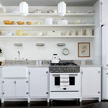
Mary’s floor-through apartment was truly enchanting . . . except for the tiny kitchen she’d inherited. It lacked a dishwasher, counter space or any real storage, items that have all been addressed in the makeover. Now the kitchen is as cheerful and bright as the rest of the home.
© Wing Wong
Space efficiency was a major design factor in this one bedroom apartment on Fifth Avenue that serves as a second home. Pocket doors were installed to the living room to provide privacy when necessary but allow light to enter the interior of the apartment, and a spacious foyer now acts as a dining room. Custom cabinetry in the home office and bedroom maximizes storage space for books, and millwork details provide formality and visual interest to an otherwise simple space.
CKM Home Design took the sleek, stark space from a blank canvas to a warm mixed media masterpiece by adding layers of texture, color and light.
The client, a fashionable and sophisticated 22-year-old aspiring actress was looking for a warm, glamorous aesthetic that melded with the building’s contemporary vibe and architecture. The space included many typical NYC apartment nuances requiring some creative design strategies and elements: one large open space living/dining area, awkward narrow nook that needed a purpose and some personality but also had some impressive design elements to maximize including the vast oversized windows and high ceilings.
photo cred: Peter Rymwid
1