


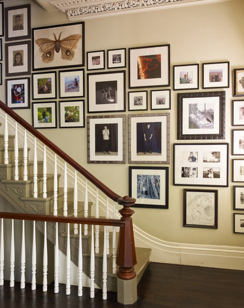
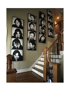
HELP WITH STAIRCASE WALL
Anmarie Pizzoferrato
11 years ago
Featured Answer
Sort by:Oldest
Comments (16)
 Emily H11 years ago
Anmarie Pizzoferrato
11 years ago
lefty47
11 years agodlpippin
11 years ago PRO
PRODistinctive Interiors & Designs
11 years ago PRO
PROChroma Design
11 years agolast modified: 11 years ago
inkwitch
11 years ago
Peggi Newlands
11 years ago PRO
PROSusan Mills Design
11 years ago PRO
PROILevel
11 years ago PRO
PROMint Design
11 years agopro777
11 years ago PRO
PRORenovations by AaronSherwood
9 years ago PRO
PROKimberli Pottery
9 years ago- PRO
Kimberli Pottery
9 years ago


Related Stories
SHOP HOUZZShop Houzz: Products to Help You Create a Gallery Wall
Curate a stunning collection for a gallery wall that makes an artful statement
Full Story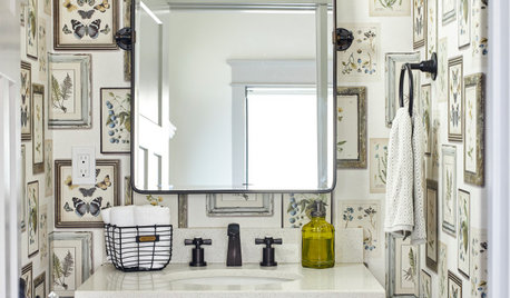
BATHROOM DESIGNKey Measurements to Help You Design a Powder Room
Clearances, codes and coordination are critical in small spaces such as a powder room. Here’s what you should know
Full Story
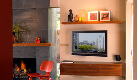
DECORATING GUIDESDecorate With Intention: Helping Your TV Blend In
Somewhere between hiding the tube in a cabinet and letting it rule the room are these 11 creative solutions
Full Story
Storage Help for Small Bedrooms: Beautiful Built-ins
Squeezed for space? Consider built-in cabinets, shelves and niches that hold all you need and look great too
Full Story
SMALL SPACESDownsizing Help: Storage Solutions for Small Spaces
Look under, over and inside to find places for everything you need to keep
Full Story
STANDARD MEASUREMENTSKey Measurements to Help You Design Your Home
Architect Steven Randel has taken the measure of each room of the house and its contents. You’ll find everything here
Full Story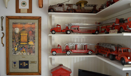
DECORATING GUIDESHouzz Call: What Home Collections Help You Feel Like a Kid Again?
Whether candy dispensers bring back sweet memories or toys take you back to childhood, we'd like to see your youthful collections
Full Story
ARCHITECTUREHouse-Hunting Help: If You Could Pick Your Home Style ...
Love an open layout? Steer clear of Victorians. Hate stairs? Sidle up to a ranch. Whatever home you're looking for, this guide can help
Full Story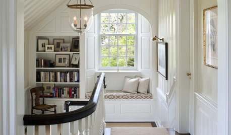
STAIRWAYSHelp Your Stair Landing Take Off
Whether for storage, art, plants or whatever else strikes your fancy, your stair landing can serve your home in a thoughtful way
Full StoryMore Discussions


Mint Design