


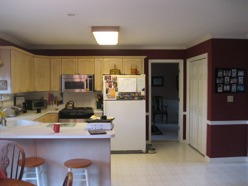
Kitchen Upgrade
Attention to Detail Home Remodeling
10 years ago


Related Stories

PRODUCT PICKSGuest Picks: 19 Kitchen Upgrades for When You Can't Afford an Overhaul
Modernize an outdated kitchen with these accents and accessories until you get the renovation of your dreams
Full Story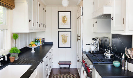
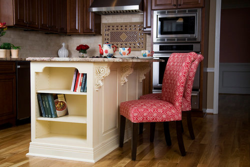
KITCHEN DESIGN10 Upgrades for a Touch of Kitchen Elegance
Give your kitchen a more refined look by changing just a detail or two
Full Story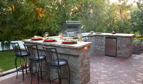
MOST POPULAR13 Upgrades to Make Over Your Outdoor Grill Area
Kick back on your patio or deck with a grill that focuses on fun as much as function
Full Story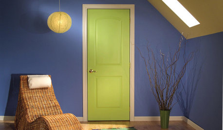
GREAT HOME PROJECTSUpgrade Your House With New Interior Doors
New project for a new year: Enhance your home's architecture with new interior doors you'll love to live with every day
Full Story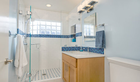
BATHROOM DESIGNLight-Happy Changes Upgrade a Small Bathroom
Glass block windows, Starphire glass shower panes and bright white and blue tile make for a bright new bathroom design
Full Story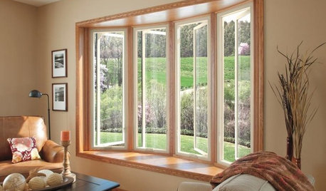
GREAT HOME PROJECTSUpgrade Your Windows for Beauty, Comfort and Big Energy Savings
Bid drafts or stuffiness farewell and say hello to lower utility bills with new, energy-efficient windows
Full Story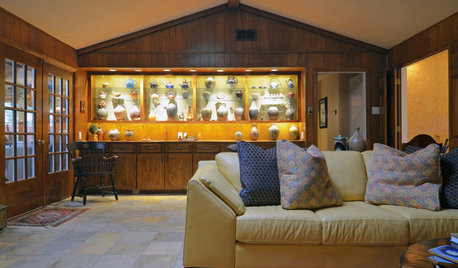
HOUZZ TOURSMy Houzz: Ranch House Gets a Craftsman Upgrade
Inspired by the Arts and Crafts movement, a Dallas couple reimagines their traditional ranch house
Full Story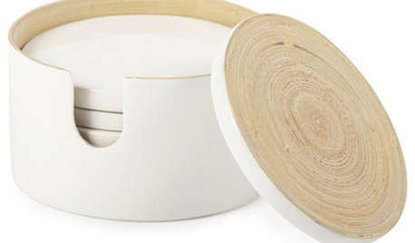
PRODUCT PICKSGuest Picks: Resolve to Upgrade Your Home
Gift yourself any of these 20 accessories to help get those New Year's resolutions for your home rolling
Full Story
GARDENING AND LANDSCAPINGGuest Picks: Stylish Rugs Upgrade Outdoor Space
A weatherproof rug has the power to turn a regular patio into a chic outdoor room
Full Story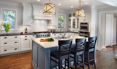
KITCHEN OF THE WEEKKitchen of the Week: Casual Elegance and Better Flow
Upgrades plus a new layout make a D.C.-area kitchen roomier and better for entertaining
Full StoryMore Discussions


Comments (18)
Marlene Servant
Caroline
Business_Name_Placeholder
dwhalen
Jeffrey Homes LLC
Attention to Detail Home RemodelingOriginal Author
Attention to Detail Home RemodelingOriginal Author
Attention to Detail Home RemodelingOriginal Author
Jeffrey Homes LLC
Business_Name_Placeholder
Reico Kitchen & Bath
vixter1
Attention to Detail Home RemodelingOriginal Author
Attention to Detail Home RemodelingOriginal Author
City Cabinet Center
Attention to Detail Home RemodelingOriginal Author
City Cabinet Center