


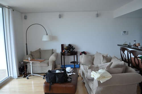
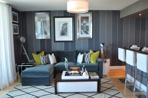
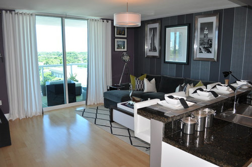
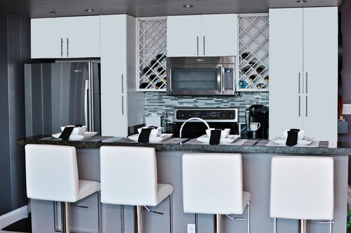
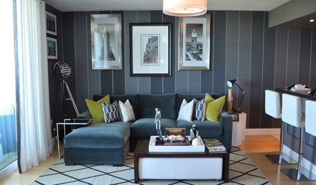
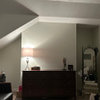
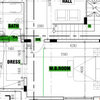
Bachelor Pad Makeover
Nicole White Designs Interiors LLC
10 years ago
Featured Answer
Sort by:Oldest
Comments (44)

mmilos
10 years agoBrenda
10 years ago
My Crappy House
10 years ago
cloudpants
10 years ago PRO
PROPanivino
10 years ago
Anina Salerno_Aita
10 years ago PRO
PRONicole White Designs Interiors LLC
10 years agoUser
10 years ago
Robert Polino
10 years agosophia818
10 years ago- PRO
Nicole White Designs Interiors LLC
10 years ago - PRO
Nicole White Designs Interiors LLC
10 years ago - PRO
Nicole White Designs Interiors LLC
10 years ago  PRO
PROPamela DeCuir Interior Designs
10 years agoNicole White Designs Interiors LLC thanked Pamela DeCuir Interior Designs- PRO
Nicole White Designs Interiors LLC
10 years ago reggiesmall
10 years agoreggiesmall
10 years ago
Becky Harris
10 years ago
Bryan
10 years ago PRO
PROMichael Lee, Inc
10 years ago PRO
PRONorwood Architects
10 years ago PRO
PROpurehome
10 years agolast modified: 10 years agolouiselaprade
10 years ago
Darzy
10 years ago
decoenthusiaste
10 years agolast modified: 10 years agoNicole White Designs Interiors LLC thanked decoenthusiastesophia818
10 years ago- PRO
Nicole White Designs Interiors LLC
10 years ago sophia818
10 years ago
Related Stories
APARTMENTSHouzz Tour: Personalizing a Miami Bachelor Pad
Meaningful artwork and other taste-specific touches make for a masculine home that happily fits the owner
Full Story
DECORATING GUIDESNew Sophistication for a Connecticut Bachelor Pad
A designer helps her client update two key spaces in a home with beautiful lakeside views
Full Story
LOFTSHouzz Tour: A Bachelor Pad’s Part II
A designer has a hand in two phases of this movie director’s life and his loft in a landmark Art Deco building in L.A.
Full Story
SHOP HOUZZShop Houzz: The Stylish Bachelor Pad
Graduate from sloppy apartment to stylish bachelor pad with these on-trend picks
Full Story0

The Modern Bachelor Pad: Single, Sexy and Stylish
Design Tips for Guys: Set the Stage for Individuality, Comfort and Visitor Appeal
Full Story
HOUZZ TOURSHouzz Tour: New Color and Fun for a Midcentury Bachelor Pad
A mix that says modern, vintage and Hollywood hotel gives this single guy's midcentury home a lively look
Full Story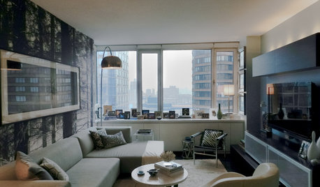
HOUZZ TOURSMy Houzz: Boutique Hotel Ambience in a Manhattan Bachelor Pad
Chanel, MoMa and nature all had a hand in influencing this city apartment's design, but the killer skyline views needed no help at all
Full Story
HOUZZ TOURSMy Houzz: Buried Treasure in an Eclectic Bachelor Pad
An under-carpeting surprise joins antique furnishings and artwork to help an owner love his Netherlands home
Full Story
HOUZZ TOURSHouzz Tour: Sleek San Francisco Bachelor Pad
Nicole Hollis designs a minimalistic and masculine home for one
Full StorySHOP HOUZZShop Houzz: Outfit Your Bachelor Pad
Bring laid-back masculine style to every room
Full Story0


User