


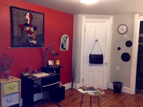
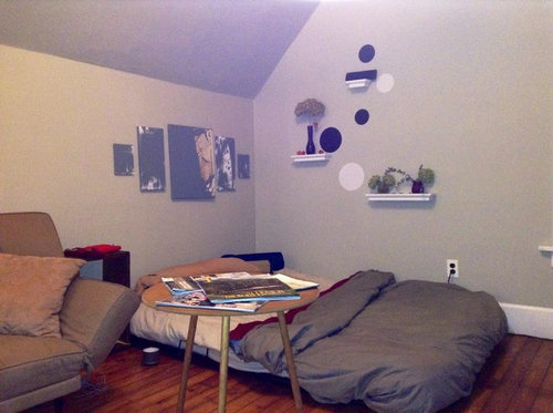
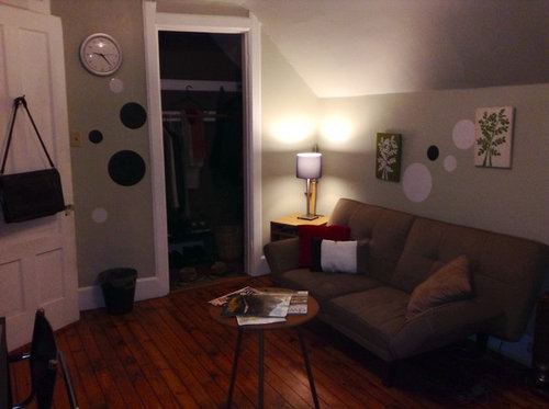
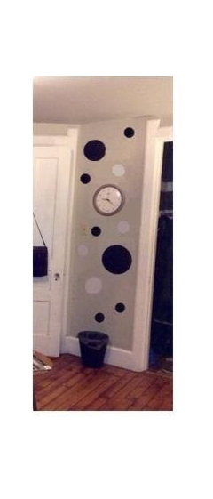
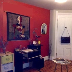
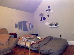
Wannabe Interior Designer
AuDrius Morris
10 years ago

Featured Answer
Sort by:Oldest
Comments (32)

AuDrius Morris
10 years agoRelated Professionals
Bell Gardens Architects & Building Designers · Mount Prospect Kitchen & Bathroom Designers · Plymouth Kitchen & Bathroom Designers · Austin Furniture & Accessories · Charleston Furniture & Accessories · Indianapolis Furniture & Accessories · Milwaukee Furniture & Accessories · Detroit Furniture & Accessories · Golden Glades Furniture & Accessories · Bryn Mawr-Skyway General Contractors · Champaign General Contractors · El Sobrante General Contractors · Halfway General Contractors · Pacifica General Contractors · Renton General ContractorsAuDrius Morris
10 years agoAuDrius Morris
10 years agolast modified: 10 years agoAuDrius Morris
10 years ago
User
10 years agoAuDrius Morris
10 years agoUser
10 years ago
Rina
10 years agoAuDrius Morris
10 years agolast modified: 10 years ago PRO
PROJohn James O'Brien | Inspired Living, by design
10 years agoAuDrius Morris
10 years agoUser
10 years agoAuDrius Morris
10 years agoUser
10 years agoAuDrius Morris
10 years agospatialthinking
10 years agospatialthinking
10 years agoAuDrius Morris
10 years agospatialthinking
10 years agoRina
10 years agoAuDrius Morris
10 years ago
decoenthusiaste
10 years agospatialthinking
10 years agospatialthinking
10 years agoAuDrius Morris
10 years ago PRO
PROOasisDesign&Remodeling
10 years agospatialthinking
10 years agoAuDrius Morris
10 years ago
Related Stories
DECORATING GUIDESCalifornia Law: License to Practice Interior Design?
A proposed bill that would require a license to practice interior design in California has Houzzers talking. Where do you stand?
Full Story
WORKING WITH PROS12 Questions Your Interior Designer Should Ask You
The best decorators aren’t dictators — and they’re not mind readers either. To understand your tastes, they need this essential info
Full Story
EVENTSIndie Interior Designs: The 2015 Interior Design Show West
Homeowners and professionals get up close with boutique brands, independent artists and up-and-coming designers
Full Story
DECORATING GUIDESTop 10 Interior Stylist Secrets Revealed
Give your home's interiors magazine-ready polish with these tips to finesse the finishing design touches
Full Story
MOST POPULARHow to Work With an Interior Designer
Interior designers do much more than make a home pretty — they turn it into a harmonious haven that's uniquely yours
Full Story
WORKING WITH PROSInside Houzz: An Interior Design Match Made Right Here
See a redesign that started on Houzz — and learn how to find your own designer, architect or other home pro on the site
Full Story
WORKING WITH PROS8 Things Interior Designers Want You to Know
Get the scoop on certifications, project scope, working from afar and more
Full Story
WORKING WITH AN INTERIOR DESIGNER5 Qualities of a Happy Designer-Client Relationship
Cultivate trust, flexibility and more during a design project, and it could be the beginning of a beautiful alliance
Full Story
WORKING WITH PROS3 Reasons You Might Want a Designer's Help
See how a designer can turn your decorating and remodeling visions into reality, and how to collaborate best for a positive experience
Full Story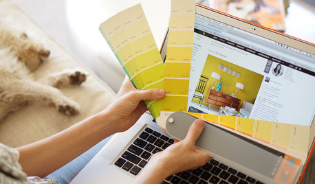
WORKING WITH PROSWorking With Pros: When You Just Need a Little Design Guidance
Save money with a design consultation for the big picture or specific details
Full StoryMore Discussions


PaintColorHelp.com Dallas