


rug, curtain help
Ninja Betic
11 years ago
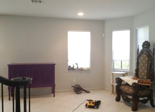
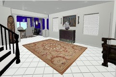
here's My formal living room/gallery! Its eceltic! I just did the console this deep purple grape color and am having trouble deciding what rug to get. I'd like ideas (i wont purchase a rug online but i need i deas of what COLOR/s to look for when im shopping!) please. Also not sure what curtains to get... do they macth the rug (so to say?)

Featured Answer
Comments (46)

Ninja Betic
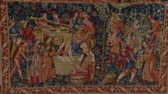
Original Author11 years agoalso over the cabinet will be this tapestry, flanked my these 'sconces' from pier one

Darzy
11 years agoYou like eclectic..I propose gold velvet drapes, floor to ceiling, with a decorator rod and rings. The gold will speak to your purple/goldn accent console. (That turned out great BTW). Then, you can do purple (or blue tassels) with gold swirls? for tie backs. I think a Persian rug..with blues, purples, golds and even a touch of red would be awesome here. Have fun!
User
11 years agoSome ideas for rugs
[houzz=] Tile Jaipuri 4 x 6 Rug · More Info
[houzz=] Stockholm Rug, Black Stripe | IKEA · More Info
[houzz=]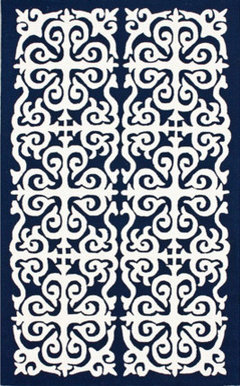 Homespun Damask Trellis Navy Blue Rug · More Info
[houzz=] Surge Graphic Iris Rug · More Info
[houzz=]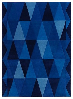 IKEA STOCKHOLM TRIANGEL Rug, Low Pile · More Info
and drapes:
[houzz=] Blue Sari Curtains · More Info
[houzz=]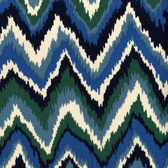 Zikat Fabric, Indigo · More Info
[houzz=] Rasymatto Blue fabric by Marimekko · More Info
[houzz=] Herringbone In Lake · More Info
[houzz=]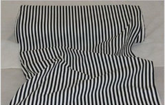 Pin Stripes Black White Curtain Material Fabric · More Info
They shouldn't match, but reference each other and the context..1123
11 years agoI love the blue wall and the purple.
I would find a rug with the blue or use a white on. Find a large
non-representational or abstract work of art and pull the colors together with the art. Use roman shades for the windows . Add interesting colored blown glass and let art and color take center stage.Ninja Betic
Original Author11 years agolast modified: 11 years agothe rugs with modern prints dont look right in that space, i think the high contrast white's to much and brings the focus too much on the rug.
What do you think about this black shag (1st pick)? i know its a bit out of the ordinary but ...i thought maybe the black shag with its natural iridecense would reflect some gray/silver too?or is that TOO much black then? I'm not sure about the long pile though.. i got a shag once for another room and though it was "just" pure white, it looked so messy it was giving me anxiety.. had to take it back!!!
i'm a bit afraid to use the grape color because what if i get rid of that piece.. i dont want to be stuck with a rug that doesnt match anything....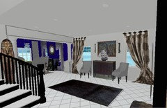


TanCalGal
11 years agoI like the black shag, first choice, providing you can try it at home and return, if needed.
Are you hanging the tapestry with a wrought iron rod? I'd use the same WI rods for the drapes or WI "rosettes" as you show. I wouldn't have the drapes overpower the tapestry: drape colors to blend with the tapestry and wall not the rug. The tapestry is "heavy" so I'd choose a light fabric for drapes (silk?). Tassels on tapestry might be an idea (photo) Grande Baroque Tapestry · More Info
Ninja Betic
Original Author11 years agolast modified: 11 years agoj222b, thats perfect advice since i have an aged bronze rod w/ fleur de-lis ends, and huge tassels ;)Ninja Betic
Original Author11 years agosomeone had mentioned glod velevt drapes, so i tried it out.. .umm.. not what i was looking for i think. PLUS i got cats, sooo no velvet ;)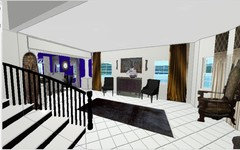
Ninja Betic
Original Author11 years agolookie what I found! there are tans and black in here but best of all it has an ANTIQUED finish i'm really digging for this space! comes in 2patterns, a traditional and a bit more geometric. Now it's only online but i might have to take the chance, if you agree! Also played around w chairs, black vs. (some) animal print like leopard... what do you say?


 PRO
PROBelfry Designs Custom Carpets
11 years agoI would suggest staying away from the Black Shag and go to A charcoal Grey so the the yellow gold pops and it would work well with the Purple. Also consider that a Black will tend to show every piece of lint whereas the grey masks that slightly. I would suggest Phenix's (manufacturer) Forest Glen (line) Color Boulder or Granite. And I would not put a rectangle. I would consider a shape instead to give it more interest. PRO
PROCynthia Taylor-Luce
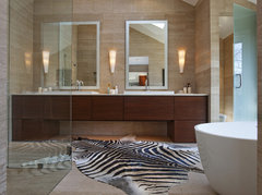
11 years agolast modified: 11 years agoI'd like to weigh in with my two cents' worth! The mock-ups are helpful, and I can see right away that the dark rectangle on your light floor isn't doing anything for the space. What about a cowhide that's painted as zebra? The black and white will look sharp and crisp, will be timelessly elegant, and the irregular shape will be interesting (and soften all the straight lines).
As for the drapes, I would love to get you some custom drapes. You could do something with a faux silk that matches the walls, lined with a faux silk that matches the dining room blue, interlined so the blue doesn't telegraph through the face of the drape. I suggest faux silk because it won't disintegrate like real silk will, in the sunlight. Would blue be a problem with your outside view?
The blue could run up the back of the drapes and wrap onto the top of the pleats, as well as the leading edge and a band across the bottom. You could even add faux or functional romans in the blue as an underlayer treatment along with the long drapes.
OR you could do something (again custom) with black and white stripes, which would be bold and graphic but the colour wouldn't compete with the blue or the purple. This is so much fun! You are such an original :) Cottage Chic Family Room · More Info
 Cottage Chic Family Room · More Info
 Jane Lockhart Interior Design · More Info
 Black & Cream Hand Weaved Cotton Curtains & Drapes · More Info
The last one with the narrow horizontal stripes makes me think of the stripes on the King Tut mask!
You could do the stripes for the two windows flanking the purple piece, and then dress the other windows in romans with a black accent line as in the last picture.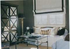
Ninja Betic
Original Author11 years agoCTL i was just going to ask for your help! you 'heard' me! OK i m going to do some mock-ups of your greatttt suggestions. But I am disappointed that Revival overdyed rug wont work *sniff* I hate my floors! Builder's grade WHITE WHITE hard ceramic :/ I wish i had charcoal marble with white veins! Its like i try to get really big rugs to hide it :o- PRO
Cynthia Taylor-Luce
11 years agoNaw, ninj, just work with it. It could be a lot worse than just white! :) So glad I "heard" your call! Isn't it funny how that works? LOL TanCalGal
11 years agoI like the revival over dyed rugs. Do the rugs come very large to cover the tile you dislike. I also like the leopard chairs idea providing the animal print fabric blends with the rug, drapes, walls, living room and does not over power the tapestry. Tapestry is the diva. I'd want a beautiful, heavy, subtle rug in the foyer. A sturdy rug that no one will trip on or slide into the living room on.- PRO
Cynthia Taylor-Luce
11 years agoGood point, j222b. Definitely put a non-slip underpad under the rug. You'd have to shape it to fit the rug! Make sure it's one that's meant for use on hard surfaces. There are other underpads designed to work with carpets laid on carpets.
I wouldn't put a pattern on the chairs--just a beautiful solid texture that will allow the shape and detail of the chair to be the star rather than more colour/pattern... Do them in white in a fabric that you can easily wipe the cat fur off of. I love the Nanotex or Crypton fabrics that don't absorb any solid or liquid stains. If you can't find one, you can also get some gorgeous fabrics through Sunbrella. Everyone thinks of them as outdoor only, but they have beautiful fabrics that would be quite appropriate for this use. Kim D
11 years agoI love, love what you have so far, that room color is dazzling. I would consider an abstract rug with similar muted hues from the wall and dresser.Ninja Betic
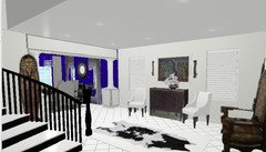
Original Author11 years agolast modified: 11 years agohere are some of CTL's in mock-ups.. i have a few Qs...
1> does the bold B&W scheme make the richness of the other pieces take backstage?
2> are there too many focal points? (ooh tapestry! ooh throne! ooh starange console! ooh king tut, etc)
3> these rugs are affordable only in smaller sizes (8x5 etc), is that too small? (for the cowhide IKEA has one!)
thanks!!


michigammemom
11 years agoninjabetic I'd stick with the zebra print cowhide if this is the direction you're heading. It's sophisticated and classic, goes well with the black buffet piece in your dining room and it suits the eclectic vibe you have going on in the rest of the room. The spotted cowhide is more western/rustic. I do think you need the softness of drapery panels as opposed to just blinds...maybe something in a silvery plum??- PRO
Cynthia Taylor-Luce
11 years agolast modified: 11 years agoThank you, ladies (blushing modestly!)... I love the third picture with the horizontal black and white bold stripe. Look how it repeats the "stripe" of the stair spindles! The chairs you're going to use are the thrones, aren't they? That's why I particularly wanted white to be a foil for the carved wood. But if you have new chairs like the ones in your mock-up, I actually like how the white upholstery settles them into the room without making too much of a splash. You already have enough splashes going on! LOL
And I LOVE the hide rug. Of course I like the large size, but if you must go small, bring it right over in front of your purple piece. Then it won't even be in your traffic path, but it will be a statement on the floor. How magnificent this will look when you're grandly descending the stairs and viewing the space from above!
What I particularly like is the way the black and white stripes look architectural, rather than another colour of drapes. With coloured or patterned drapes, you're going to have too much of a "spotty" effect with your eye bouncing from piece to piece, each surrounded by neutral paint. You need the strength of the bold stripes to offset your coloured accents, in my opinion. I think it's a winner! :) Ninja Betic
Original Author11 years agolast modified: 11 years agoCTL it also repeats the stripe on tut's tomb! I never would have guessed to try this. You have some eye, lady!
So i guess they have to be panels then, prevsly i was thinking of the ornate medallion look but i dont suppose that will work w this modern print?
The chairs arent thrones, there is just the ONE throne in frt of the bay window (far right of pics) (will need advice on what to do with curtains THERE now, i thought i had it all figured out before...) :)Ninja Betic
Original Author11 years agowas going to 'faux' arched drapes (like you did once on a project, CTL!) with medallions for a medieval look but not sure it will work w the stripe ..? Also since i do not want the drapes covering the actual window this may not work...(????)

TanCalGal
11 years agoI like the black & white theme, too. I'm not there, but I thought the tapestry was the diva. Not sure this theme is enhances tapestry / buffet.Ninja Betic
Original Author11 years agoj222b, i guess i have to decide what LOOk i want out of this room-- either antique medallions/antique rug etc) or leaning toward modern (CTL's)- PRO
Cynthia Taylor-Luce
11 years agoExactly, this has to resonate with your own taste. Just as you took utmost care with the colour of the dining room and the painting of your purple piece, you will know when the scheme is right for you. There are no right or wrong answers--just different approaches that you'll either love or not!
I'm going to take a break for a bit, and you can think about it. I'm sure there will be a lot more comments posted too! If you decide to go for this look, then I'm available to talk one-on-one about more specifics like curtain style and chair upholstery, etc. And I wouldn't rule out a larger hide rug based on price as I have a good source for these that might be exactly what you'd like ;) We'll talk! LOL jrost
11 years agoI too like the black and white look, I was first thinking a harlequin design, for a rug. I'd like to see silvery gray curtains with big pull back and puddling on the floor. Big oversized chairs with textureNinja Betic
Original Author11 years agojrost, sorry i didnt get you-- did you say you like the B&W or gray/puddling look?jrost
11 years agoMy mind goes faster than my fingers, rug of black and white harlequin design, silver damask puddling curtains and a couple of big poof ottomans does that help?fife2
11 years agoDear Ninjabetic: I would like to jump in here. CTL has some great ideas - and your combinations are FANTASTIC - I love your ability to see the contradidtions - fabulous.
I would like to say, I am NOT a fan of the B&W - as I feel the sublties of your compilation look will be overwhelmed.
As you do seem drawn to certain period pieces juxtaposed - I would keep the draperies more simple. During this period with fascinates you (tapestry, benches and chairs) - there was MUCH overlayering. I would like to suggest you go to an INVESTMENT level rug dealer - take your beautiful tapestry with you.
There is so much more to antique rugs than all over multi-colored patterns - some ARE quite simple in their profundity. Personally, I do not feel there is NO reason why you cannot have both the skin type of layering (which WAS done during this time) with a little modern twist to combine the two? The first rugs WERE skins - and then came the weaving - yes?
As you have the very rich blue and the georgeous dinning room adjacent - I would play on this by pulling the sheen of a rich grey (ish) brocade into this adjacent space. All of this could have the modern take by the nature of the way you hang the drapes, and of course, the space itself.
I think the idea of a large underplacement rug - with the skins layered over - and around - would be a fabulous setting for pulling everything together - perhaps you could consider this as a possibility? I happen to adore tapestry work and am a HUGE fan of textiles - rich, layered, multi-textured - just makes me want to stay and never leave. I have seen this done in castle settings, old (really old) family homes, and is a great historic view on what we think is modern today.
I think your personal style is absoultely fabulous and VERY fun - keep the joy going here!
And definitely let us know. :-)fife2
11 years agoDear Ninjabetic: I would like to jump in here. CTL has some great ideas - and your combinations are FANTASTIC - I love your ability to see the contradidtions - fabulous.
I would like to say, I am NOT a fan of the B&W - as I feel the sublties of your compilation look will be overwhelmed.
As you do seem drawn to certain period pieces juxtaposed - I would keep the draperies more simple. During this period with fascinates you (tapestry, benches and chairs) - there was MUCH overlayering. I would like to suggest you go to an INVESTMENT level rug dealer - take your beautiful tapestry with you.
There is so much more to antique rugs than all over multi-colored patterns - some ARE quite simple in their profundity. Personally, I do not feel there is NO reason why you cannot have both the skin type of layering (which WAS done during this time) with a little modern twist to combine the two? The first rugs WERE skins - and then came the weaving - yes?
As you have the very rich blue and the georgeous dinning room adjacent - I would play on this by pulling the sheen of a rich grey (ish) brocade into this adjacent space. All of this could have the modern take by the nature of the way you hang the drapes, and of course, the space itself.
I think the idea of a large underplacement rug - with the skins layered over - and around - would be a fabulous setting for pulling everything together - perhaps you could consider this as a possibility? I happen to adore tapestry work and am a HUGE fan of textiles - rich, layered, multi-textured - just makes me want to stay and never leave. I have seen this done in castle settings, old (really old) family homes, and is a great historic view on what we think is modern today.
I think your personal style is absoultely fabulous and VERY fun - keep the joy going here!
And definitely let us know. :-)Ninja Betic
Original Author11 years agolast modified: 11 years agofife2 wow thanks for all that profound commentary! I truly appreciate your Vision and your dedication to this Art ;)fife2
11 years agoDear Ninjabetic: Thank you for your kind comments - I am NOT a trained decorator - but I am an historian & anthropologist. I adore medievial architecture, spaces, literature, romance - the introduction of industrial materials which were coming of age during this period; the fascination with silks, laces, Belgian Tapestries, etc. And who can forget the LUSHNESS of Venice? Gateway to the orient - Turkey's trade routes to China - AND the hand made SILK rugs of China, the hand- loomed richness of Persia? Safforn dyed silks from Nepal and Tibet? the rare skin rugs of Yak, and the new access to Africa? All of this came together - for a new richness Europe had never known - And - the Moorish influence on Spain, France, the Netherlands, Flanders - we see all of this in art, daily living structures and intense change in how people were able to live their lives.
I see this in all the truly lovely pieces you have pulled together - which I think are stunning - I love the Ormolou chests you have in your DR - fabulous with that rich blue - and very stunning.
One thought I had - IF you truly love the Harlequin look - perhaps an artist could come and paint this design by using the tiles you have - to create this look and then seal the floor? Then you could layer skins over this? Depending on what you decide.
I think YOUR space is one of the most exciting I have seen on these pages.
Thanks for sharing.fife2
11 years agoDear Ninjabetic: Thank you for your kind comments - I am NOT a trained decorator - but I am an historian & anthropologist. I adore medievial architecture, spaces, literature, romance - the introduction of industrial materials which were coming of age during this period; the fascination with silks, laces, Belgian Tapestries, etc. And who can forget the LUSHNESS of Venice? Gateway to the orient - Turkey's trade routes to China - AND the hand made SILK rugs of China, the hand- loomed richness of Persia? Safforn dyed silks from Nepal and Tibet? the rare skin rugs of Yak, and the new access to Africa? All of this came together - for a new richness Europe had never known - And - the Moorish influence on Spain, France, the Netherlands, Flanders - we see all of this in art, daily living structures and intense change in how people were able to live their lives.
I see this in all the truly lovely pieces you have pulled together - which I think are stunning - I love the Ormolou chests you have in your DR - fabulous with that rich blue - and very stunning.
One thought I had - IF you truly love the Harlequin look - perhaps an artist could come and paint this design by using the tiles you have - to create this look and then seal the floor? Then you could layer skins over this? Depending on what you decide.
I think YOUR space is one of the most exciting I have seen on these pages.
Thanks for sharing.mjmil
11 years agoDear Ninjabetic: When I first saw your post I immediately thought black & white. I absolutely love the suggestions by CTL. I think it would look beautiful.Ninja Betic
Original Author11 years agolast modified: 11 years agofife2 i could've guessed from your 'gamer tag' that you had a proclivity for the medieval! me too! Just saw the movie Vanity Fair the other day and i was drooling at the rich colors used in venice at that time (blazen vermillion, anyone?)! I've redone the (formerly puke green) credenza myself and painted, added legs, etc, and i'm planning on doing most of the rest of the room's work DIY at this time, including curtains--- painting the floors will be too much i think, but a good idea, thx! I like to get my hands dirty ;)fife2
11 years agodear nijabetic2 ; well I am pleased you think I am that techno of an individual - but sorry no - we don't have "game" stuff . This is a compliation of my initials and my dog - Fiona! (Fi) which is funny because we call her FiFe and she is a HUGE 75 pound American Pit Bull Terrier whom we rescued. But, I do agree - the colors are rich and senuous from this time. IF you LOVE color , texture, sensory overload - seen - Ang Lee's "The Last Emperor" - totally lucious.
Please just let us know what you decide on - I know it will be fab!
IF there are Indian National stores anywhere near you . . . the silks, in so many fabulous colors are fantastic - draped, hung, layerd - pillows, with other fabrics can be stunning - from the simple to the outrageous - I have seen these used to highlight other under-hung fabrics.
We will be waiting.Ninja Betic
Original Author11 years agoOK people, after a seriously long break (life happens!) I am really not loving the re-done table, and am looking for a new one (that may take like a year), BUT i did get the tapestry hung above and the sconces have been BOUGHT (not hung).
I realizsed that the problem is that the border of the tapestry is VERY red- orange, a tone not subdued, so UNlike everything else in the room. When looking at the room from the staircase landing above (aerial view) i notced the only unifying color in ALL the furniture pieces/decor is the gold-- SO i think a pale gold with either red or black touches, NON-BUSY pattern will work well in a rug...Also the black will "lead into " the dining room furniture as well..OPINIONS???! :)
Ninja Betic
Original Author11 years agolast modified: 11 years agothat being said, i DO like this one--- it's almost SO busy it looks SOLID. Called Kathry ireland's MANOR, in EBONY.. but wonder where i can see it in person?!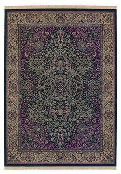


Related Stories


SELLING YOUR HOUSE10 Tricks to Help Your Bathroom Sell Your House
As with the kitchen, the bathroom is always a high priority for home buyers. Here’s how to showcase your bathroom so it looks its best
Full Story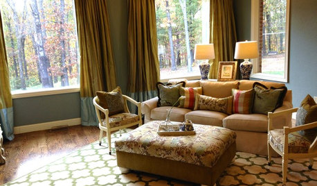
LIVING ROOMSA Living Room Miracle With $1,000 and a Little Help From Houzzers
Frustrated with competing focal points, Kimberlee Dray took her dilemma to the people and got her problem solved
Full Story
COLORPick-a-Paint Help: How to Create a Whole-House Color Palette
Don't be daunted. With these strategies, building a cohesive palette for your entire home is less difficult than it seems
Full Story
COLORPaint-Picking Help and Secrets From a Color Expert
Advice for wall and trim colors, what to always do before committing and the one paint feature you should completely ignore
Full Story
SELLING YOUR HOUSEHelp for Selling Your Home Faster — and Maybe for More
Prep your home properly before you put it on the market. Learn what tasks are worth the money and the best pros for the jobs
Full Story
STANDARD MEASUREMENTSKey Measurements to Help You Design Your Home
By Anne Colby
Architect Steven Randel has taken the measure of each room of the house and its contents. You’ll find everything here
Full Story
LIFE12 House-Hunting Tips to Help You Make the Right Choice
Stay organized and focused on your quest for a new home, to make the search easier and avoid surprises later
Full Story
SELLING YOUR HOUSE10 Low-Cost Tweaks to Help Your Home Sell
Put these inexpensive but invaluable fixes on your to-do list before you put your home on the market
Full StoryMore Discussions


Kim D