


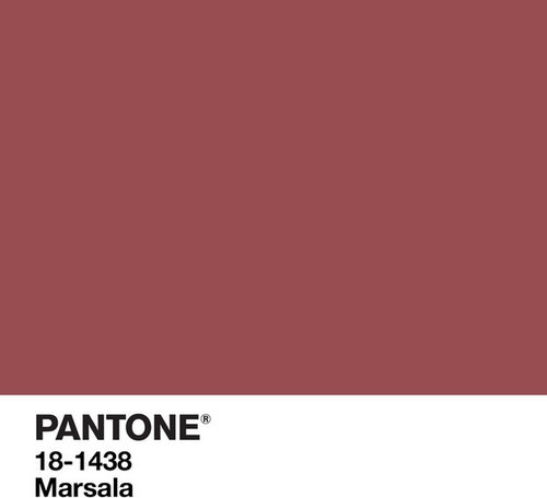
What do you think of Marsala, the Pantone color of the year?
User
9 years ago
LOVE it!
Can't stand it!
Mmm, I can take it or leave it.
I much prefer Chicken Marsala.
Featured Answer
Comments (229)

fitchick911
9 years agolast modified: 9 years agoRelated Professionals
New Bern General Contractors · Ames General Contractors · Bay City General Contractors · Citrus Heights General Contractors · Elgin General Contractors · Groton General Contractors · Jericho General Contractors · Mount Vernon General Contractors · Panama City General Contractors · San Carlos Park General Contractors · Union Hill-Novelty Hill General Contractors · Alpine Flooring Contractors · Apopka Flooring Contractors · Cedarburg Flooring Contractors · Troy Flooring Contractors
Alina Garcia Moscat
9 years agoGail Carter
9 years ago PRO
PRODurham Designs & Consulting, LLC
9 years agolast modified: 9 years agoUser thanked Durham Designs & Consulting, LLC


Related Stories
COLORHow to Use Marsala, Pantone’s 2015 Color of the Year
Pantone digs deep and goes earthy with its selection. Here are ways to make it work in your home
Full Story
COLORSay Hello to Minion Yellow, Pantone’s Newest (and Happiest) Color
This Hollywood-inspired shade is anything but despicable. Here’s how to work the cheerful and cheeky color into your home
Full Story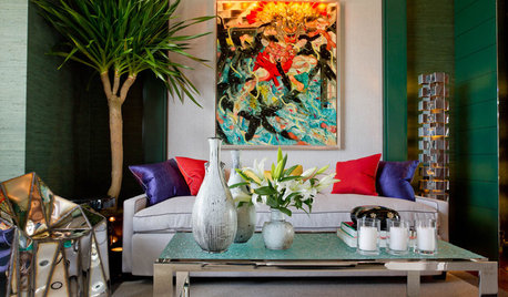
COLORPantone Unearths Emerald as Its 2013 Color of the Year
Whether you dig a natural version or go for one with polish, Pantone is predicting you'll treasure emerald green at home over the next year
Full Story
PINKHoneysuckle: Inspired by Pantone's Color of the Year
13 ways homes can wear this confident shade of pink, Pantone's color of 2011
Full Story
DECORATING GUIDESTangerine Tango: 4 Ways to Use Pantone's Color of the Year
Don't let this bold hue scare you — try warming up any room with this cheerful red-orange color of 2012
Full Story
SHOP HOUZZShop Houzz: Mad About Marsala
This muted brick red pairs prettily with warm or cool tones
Full Story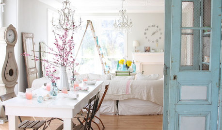
COLORS OF THE YEARPantone Has Spoken: Rosy and Serene Are In for 2016
For the first time, the company chooses two hues as co-colors of the year
Full Story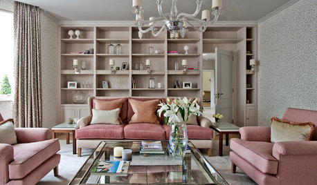
SHOP HOUZZShop Houzz: In the Pink With Pantone’s Rose Quartz
Get tickled pink with one of Pantone’s Colors of the Year for 2016
Full Story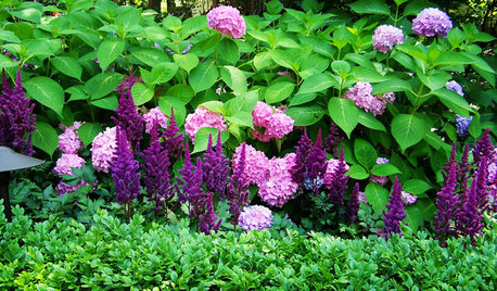
FLOWERS9 Plants That Channel Pantone’s Color of 2014
Try these pinkish-purple wonders to be right on trend — or just for their own captivating beauty
Full Story
COLORBest Ways to Use Radiant Orchid, Pantone's Color of 2014
Learn how to work in this bold fuchsia-pink-purple successfully around the home, and give it a yay or nay in the Houzz poll
Full Story


User