


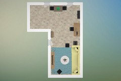
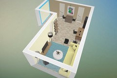
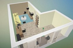
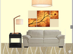
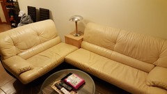
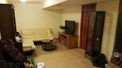
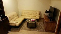
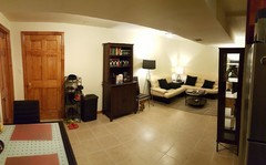
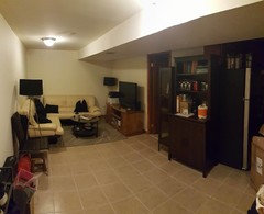
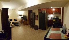
Small Basement Floor Art above Couch Ideas and Other Furnitures Ideas!
lazyb0ne
8 years ago
last modified: 8 years ago
Featured Answer
Sort by:Oldest
Comments (50)
Related Professionals
Wanaque Interior Designers & Decorators · South Farmingdale Kitchen & Bathroom Designers · Pooler General Contractors · Abington General Contractors · Dorchester Center General Contractors · Dover General Contractors · Erlanger General Contractors · Fremont General Contractors · Hampton General Contractors · Irving General Contractors · Kentwood General Contractors · La Marque General Contractors · Mountlake Terrace General Contractors · Tyler General Contractors · West Babylon General Contractors
lazyb0ne
8 years agolazyb0ne
8 years ago
Nancy Ingram
8 years agolazyb0ne
8 years agolazyb0ne
8 years ago
Rina
8 years agoNancy Ingram
8 years agolazyb0ne
8 years agolazyb0ne
8 years agoRina
8 years agoNancy Ingram
8 years agolazyb0ne
8 years agoRina
8 years agoRina
8 years agoRina
8 years agoRina
8 years agoRina
8 years agoRina
8 years agolast modified: 8 years agolazyb0ne
8 years agoRina
8 years agolazyb0ne
8 years agolast modified: 8 years ago PRO
PROIt's a Beautiful World!
8 years agolast modified: 8 years agolazyb0ne
8 years agoRina
8 years agolazyb0ne
8 years agolast modified: 8 years agoRina
8 years ago- PRO
User
8 years ago lazyb0ne
8 years agolast modified: 8 years agoRina
8 years agoRina
8 years agolazyb0ne
8 years agolast modified: 8 years agolazyb0ne
8 years agolast modified: 8 years agoRina
8 years agolazyb0ne
7 years agoRina
7 years ago


Related Stories
DECORATING GUIDESPin Down a Fabric for Your Couch
Material, color and pattern choices for couch fabric can be dizzying. These upholstery ideas can help you choose wisely
Full Story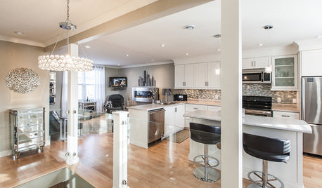
HOUZZ TOURSMy Houzz: Open-Concept Living Above a Salon
A staircase commute to work gives a Canadian hairstylist more time to enjoy her bright and open downtown apartment
Full Story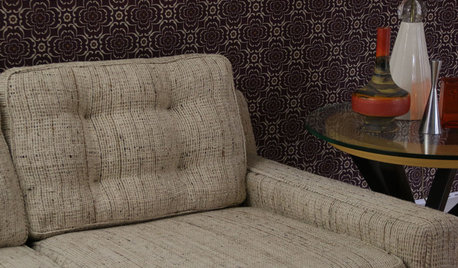
UPHOLSTERYFurniture Clinic: End the Curse of Slouchy Couch Cushions
Prolong the life of your couch with this inexpensive fix that’s so easy, even a beginning sewer can do it
Full Story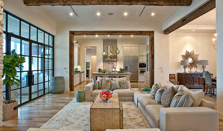
LIVING ROOMSLay Out Your Living Room: Floor Plan Ideas for Rooms Small to Large
Take the guesswork — and backbreaking experimenting — out of furniture arranging with these living room layout concepts
Full Story
SMALL HOMES16 Smart Ideas for Small Homes From People Who’ve Been There
Got less than 1,000 square feet to work with? These design-savvy homeowners have ideas for you
Full Story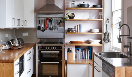
MOST POPULAR99 Ingenious Ideas to Steal for Your Small Kitchen
Make the most of your kitchen space with these storage tricks and decor ideas
Full Story
FUN HOUZZDon’t Be a Stickybeak — and Other Home-Related Lingo From Abroad
Need to hire a contractor or buy a certain piece of furniture in the U.K. or Australia? Keep this guide at hand
Full Story
LIVING ROOMSHow to Decorate a Small Living Room
Arrange your compact living room to get the comfort, seating and style you need
Full Story
BATHROOM DESIGNFloor-to-Ceiling Tile Takes Bathrooms Above and Beyond
Generous tile in a bathroom can bounce light, give the illusion of more space and provide a cohesive look
Full Story
THE HARDWORKING HOME12 Smart Designs for Small-Space Living
The Hardworking Home: Furnish your compact rooms more efficiently with these creative built-ins and adjustable pieces
Full Story


Rina