


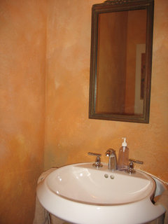
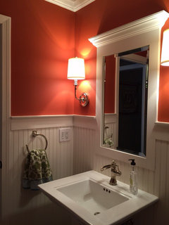
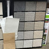
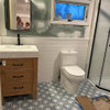
Help! What color to pull from art for powder room?
mmessbl
8 years ago
last modified: 8 years ago

Featured Answer
Comments (53)

S Bailey
8 years agolast modified: 8 years agommessbl
8 years agoRelated Professionals
Carney Architects & Building Designers · Hillcrest Heights Architects & Building Designers · Taylors Architects & Building Designers · Lenexa Kitchen & Bathroom Designers · Vineyard Kitchen & Bathroom Designers · Winton Kitchen & Bathroom Designers · Easton Furniture & Accessories · Norwalk Furniture & Accessories · Catonsville General Contractors · Fremont General Contractors · Jericho General Contractors · Markham General Contractors · New Milford General Contractors · Schertz General Contractors · Wolf Trap General Contractors
Amber S
8 years agommessbl
8 years agommessbl
8 years agoAmber S
8 years ago
sandradclark
8 years agommessbl
8 years agoAmber S
8 years agommessbl
8 years agommessbl
8 years agoAmber S
8 years agoqam999
8 years agoanthip
8 years agoclassysass
8 years ago
lynartist
8 years agolynartist
8 years ago PRO
PROTerrence Howell Home Staging and Art
8 years agopartim
8 years agolynartist
8 years agommessbl
8 years agolynartist
8 years agolynartist
8 years agommessbl
8 years agommessbl
8 years agommessbl
8 years agoElizabeth Z
8 years agolynartist
8 years agommessbl
8 years agolynartist
8 years agommessbl
8 years agolynartist
8 years agoElizabeth Z
8 years agommessbl
8 years agommessbl
8 years ago
decoenthusiaste
8 years agommessbl
8 years ago- PRO
Terrence Howell Home Staging and Art
8 years agommessbl thanked Terrence Howell Home Staging and Art anthip
8 years agommessbl
8 years ago
eveuchan
8 years ago


Related Stories

COLORPaint-Picking Help and Secrets From a Color Expert
Advice for wall and trim colors, what to always do before committing and the one paint feature you should completely ignore
Full Story
ORGANIZINGStick to Your Resolutions: Help From a Pro Organizer
Accomplish your goals — from decluttering to rediscovering fitness — for real this time
Full Story
LIVING ROOMSA Living Room Miracle With $1,000 and a Little Help From Houzzers
Frustrated with competing focal points, Kimberlee Dray took her dilemma to the people and got her problem solved
Full Story
STANDARD MEASUREMENTSKey Measurements to Help You Design Your Home
Architect Steven Randel has taken the measure of each room of the house and its contents. You’ll find everything here
Full Story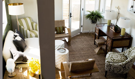
SMALL SPACESDownsizing Help: Think ‘Double Duty’ for Small Spaces
Put your rooms and furnishings to work in multiple ways to get the most out of your downsized spaces
Full Story
Sixties Southern Style: Inspiration from 'The Help'
Oscar-nominated movie's sets include formal entertaining spaces, front porch breezes and lots of florals
Full Story
SHOP HOUZZShop Houzz: Products to Help You Create a Gallery Wall
Curate a stunning collection for a gallery wall that makes an artful statement
Full Story
COLORPick-a-Paint Help: How to Quit Procrastinating on Color Choice
If you're up to your ears in paint chips but no further to pinning down a hue, our new 3-part series is for you
Full Story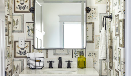
BATHROOM DESIGNKey Measurements to Help You Design a Powder Room
Clearances, codes and coordination are critical in small spaces such as a powder room. Here’s what you should know
Full Story
MOST POPULAR7 Ways Cats Help You Decorate
Furry felines add to our decor in so many ways. These just scratch the surface
Full StoryMore Discussions


sandradclark