How tall should my sideboard lamps be?
Paul F.
11 years ago
I got this great sideboard for $1000 online... it was crazy for me to buy something based on pics but the size was perfect. It turns out I love it.
I'm starting to collect art and one large piece in the dining room is almost to the 8 foot ceiling above the new cabinet. I'm just looking for drama with two lamps flanking the painting and I'm looking for a sophisticated funky, artsy look. The lamp shown is 30" tall.
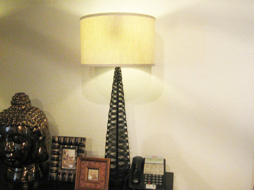
I've got my eye on the wire lamps (w/see-through body of black twisting wire) shown in the second pic but they are 37" tall. Is my scale getting out of whack with lamps that tall or does the height of the painting demand height? Thanks in advance.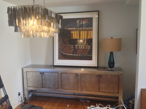


Featured Answer
Comments (40)
Paul F.
Original Author11 years agoThis is the dining table I'm looking at. The veining is a navy color with a bit of yellow. It has a cross shaped chrome base and pedestal.
queenamis
11 years agoI don't like anything about this space. All wrongly done. Skip the painting. Two lamps should work. Or just skip everything altogether. You can have that space done on a lower budget and beautifully done too. Skip the ceiling light too for somthg simpler. Can we see a full pic of the room? That will bring better advice,Related Professionals
New Providence Interior Designers & Decorators · Tahoe City Interior Designers & Decorators · Plymouth Kitchen & Bathroom Designers · Yorba Linda Kitchen & Bathroom Designers · Lake Zurich Furniture & Accessories · Rockville Furniture & Accessories · Duluth Furniture & Accessories · Vail Furniture & Accessories · American Canyon General Contractors · Gainesville General Contractors · Hagerstown General Contractors · Homewood General Contractors · Lakeside General Contractors · North Lauderdale General Contractors · Welleby Park General ContractorsMonica McCleary-Stuart
11 years agoLove the sideboard...the wire lamps would look best with your art.daarnold05
11 years agolast modified: 11 years agoI love the space. I think the art needs to be more horizontal in shape rather than so tall. Or try a really cool mirror. The lamps are really cool!Maya Hill
11 years agoFirst thing is I would advice to shift it several inches off the wall from the corner. This adds more dimension to the area.
The second lamp (wire) could go well with the piece if you can find something(s) of similar height to balance the area. You could even do a set of three glass vases with one have the dramatic height and then the other two staggering down from there. You could use the first one. Though I would go with a different shade. See comment as to why
Third, bring bits of the arts color out when decorating around it. It has red; add something red. I would suggest red lamp shades though because they would be more at the immediate eye level and draw you there. White or a grey shade would blend better and detract from the piece.
Fourth, less equals more. With that theory only do one lamp and then do the accenting balancing part to the other side.
Final suggestion is consider having your piece reframed. Then you can have it matted, and part of the white border will be behind the matte. This may equal a smaller sized frame in the end.
Good luckBarbara Griffith Designs
11 years agoLove these pieces so far. That cabinet was a steal! Center the cabinet with the light fixture. Love the large piece of art..reframing you could do later if you choose. Just hang it..center between the ceiling & the top of the cabinet. Love the tall black wire lamps..they will be perfect. Do not clutter the space. The table is interesting..but I think I would keep it more simple..too much pattern on the top. I would however, look for a bold patterned rug..large..for under whatever table you choose..Let the rug make a more subtle statement. I would probably look for a dark wood table. I like a table like this..I like the black finish..it is not too big, and easy to replace seat fabric to a bold stripe. http://www.homedecorators.com/P/Martha_Stewart_Living_Larsson_Dining_Table/210/User
11 years agoGreat to see you love our sideboard! Send us a shot of the space when you're done decorating, I'm sure it will look fabulous!n247080
11 years agoNice sidedboard. Seems too squiched into the corner. Can you move it over to the right?
The 2nd lamp but with different shade that blends better with your ceiling fixture. Or go shoppnig for another lamp entirely that's smaller, less assuming, blends better with your ceiling fixture, perhaps a narrow pair?
That piece of art is too big for that location. Is there another wall you could put it on? Also, that white boarder clashes with the tone of the other things. Any chance of getting it reframed with a boarder that brings in come color from the art?
I like the table but I think it's wrong for that ceiling fixture. The sizes don't mesh.David Stallworth
11 years agoThe sideboard is alright, it simply needs to be moved more into the centre of the wall. As for the chandelier, it's interesting and simply needs a good cleaning in order to bring a greater smokey luminescent quality to the glass. Heck, depending upon the colour you're going for you could stencil a design upon the glass shards in order to pick up some of the colours from the framed art piece you have. As for the buffet lamps, their size is dependent upon what you feel most comfortable with and how it ties into the room itself. I'd suggest adding a simple crown molding in a colour remeniscent of your sideboard as it shall automatically bring the eye up. You're already doing so with the lamp shade and chandelier. Go with what feels right for you. If in doubt, trust your initial instincts. They'll never lead you wrong lest you second guess them. As for those who complain, but do not offer constructive suggestions... Don't listen, they're obviously bitter. Remember, a dining room should be a place of good memories, peaceful conviviality, and a place one enjoys being in. Create a room which impresses you first and foremost. Others shall get the message. CheersYvonne Dixon
11 years agoI would like the measurements of the space, the measurments of the items that you want in the space.sulley01
11 years agoFirst of all, I love the West Elm chandelier! Great choice! Secondly, I love the sideboard (it needs to be centered on the wall though). I do, however, really think that artwork is way too large for that spot. A beautiful horizontal frameless mirror would look really beautiful, as I think it would go so well with those two pieces. I'm not crazy about the lamps. They seem too casual for what else you have going on. I would also go with a dark wood or black rectangular dining table and some nice slipcovered dining chairs.Kelly
11 years agoAgree with above- find another place for the art and find a fab mirror to replace it....then go from there..Jane Antonacci Interior Design
11 years agoNice sideboard. I would center it on that wall. The lamp looks about right ht, could be even up to 5 " taller but no more than that. With your rectilinear chandelier, I would go with a rectilinear table. Good luck to you! I like the vertical artwork and the drama of it going up high. It balances the sideboard size. You could also do a mirror that size. Just don't go too small!decoenthusiaste
11 years agoThe pieces are great but the proportions are off and the room location seems cramped. The lamps you want are great, but will be too much with the huge piece of art. I'd prefer a better proportioned mirror and the lamps if you have another wall for the painting. It needs its own space and a mirror will reflect the chandy.Terri Maines_Theisen
11 years agoI think the chandelier blocks the view of the picture. I like the lamps & sideboard but I think a mirror or a different piece of art work would look better. the large picture needs a wall of its own.Barbara Griffith Designs
11 years agoI prefer the picture..especially if the client likes it. It adds color and pattern to the area..it compliments the cabinet..a mirror in this location with this furniture in this room is the wrong choice.cjohnston
11 years agoI love the art as well. With such a wide sideboard, I think the large scale art helps balance it. Hmmm, I really want to say go with the blue lamp because it looks amazing. I get why others are saying the black wire is a better match, but I do love the blue.Paul F.
Original Author11 years agoThanks for the input everyone. Its kinda running 50/50 with the size of the litho it looks like. I bought the wide sideboard because of looks and great price... I could see it I'm sure. But I liked how it seemingly continues the stainless steel kitchen on that wall... not sure if I should like that but I do.
The oversized picture is kinda of like my ode to the massive two-story painting in the dining room of Downton Abbey. :) I can move the art to the opposite wall to see how it looks... where it can be mounted a bit lower.
Not sure the West Elm chandelier is staying but we'll see when I find the table. I have just enough cropped out of the photo so you can't see all the mess. I'll post more pics of the rather small dining room with measurements.
Thanks again everyone... this is my personal space and the first time in my adult life that I'm feathering my nest. Being so generous with your talents is moving to me.
I love the blue lamp (jamie young) as well but it goes in the living room.
bevballew
11 years agoI like the sideboard and picture and the new lamps you chose,but I think the chandelier does not go with the room and I think the table clashes. If you move the picture and add a mirror then maybe the chandelier will look go but I still think the table clashes but the new lamps,would work. I would agree with the suggestion of the table above.Paul F.
Original Author11 years agoI meant to say I could SELL the sideboard if its too big I'm sure I could probably make a small profit on the price I paid.Carolyn Albert-Kincl, ASID
11 years agoIt's interesting to see the room from another angle. You're off to a great start with the silver buffet and the black wire lamps. I still love the picture over the buffet, but with only the lamps joining it, nothing more.
Seated at a table, the chandelier must be quite lovely, twinkling away with the soft rustle of capiz shells in any breeze through the room. You will need a sophisticated table to go with your lovely buffet. I love the marble one you showed us, though would prefer more neutral striations. A glass one would also work. I know you'll be selecting more contemporary chairs to go with whatever table you choose.Carolyn Albert-Kincl, ASID
11 years agoYour buffet is not too large, and I know you plan on centering it. I certainly consider 6" on each end adequate "breathing" space, and it looks like you have that much, or close enough.Bonnie
11 years agoWhat a great sideboard - you got a real find! I like the art horizontal and the wire lamps. I also would move the sideboard off the wall on the left - I don't like when furniture is too close to a corner. Good luck!Carolyn Albert-Kincl, ASID
11 years agoOne of the reasons I applaud the art piece that finndian has chosen (besides the fact that she loves it) is that with a low ceiling, a vertical piece of art or a vertical mirror will visually lift the ceiling, making the walls look higher. Even with a higher ceiling, I prefer vertical art and mirrors to either elevate or emphasize the ceiling height. I never hang a framed mirror horizontally. Not that anyone is wrong to do so. I just prefer them vertical.
I will, in a contemporary bathroom, run a horizontal stripe of unframed mirror around the room. It might be 30" high, starting at 45" above the floor.DIAspoton
11 years agoyour feathering your first nest beautifully. doesn't it feel wonderful and empowering to buy unique and original items? love the sideboard. it was well worth the splurge.
a dining table with more character and less pattern might be a better choice.
leave room in your home and in your budget for amazing 1 of a kind finds at the upcoming spring and summer arts festivals. it's fun to see something you have to have, talk with the artist about it. learn how the idea was concieved and then became a reality. and then voila...it's hanging on your wall or gracing your dining table.idiggardens
11 years agoI recently posted a similar "cry for help" with accessorizing my console. With much help and advice from some wonderful contributors on houzz you can see the final results (changed a bit since but no updated pics yet....I elimated some small knick knacky type items in favour of some "greens"......if you click on my name you should be able to see the pics. Good luck with your project!Beth Woodie
11 years agoIf the painting is indeed moving to another wall, one way you can add a big bold Downton drama substitute is to wallpaper the wall behind the console, then hang several (3?) square b/w (or just black or just white) pictures. Square to echo the door shapes on the console. Looks like your tastes run modern, so perhaps a monochromatic wallpaper pattern in a subtle or a bold color. Red to make it a little ethnic, a warm lt to medium gray to make it feel more collected.
Congrats on making the space your own!Shanin Legg
11 years agoI think I see why you have your eye on the two twisted wire lamps...to me it resembles the lovely veining in your table. The pieces you have chosen are eclectic, which makes it interesting and fun. What matters is how you feel when you look at your room. Does it make you happy?Paul F.
Original Author11 years agoIt does feel great to customize the place with things I like to see and touch every day. It makes me extremely happy. I will keep a look out for one of a kind pieces since I'm really getting into the Venice art shows and festivals here at the beach.
I've always wanted to use wall paper somewhere so I'll consider that. I like looking at the artwork and the subject matter seems suited for the dining room... I'll try the other wall but now that Carolyn Albert-Kincl Design backs me up with the ceiling raising effect I'll keep both options open. I hesitate to reframe it because its a museum quality frame job with with linen lined chamber with the litho appearing to float inside.
I like the contrast of the working class subject matter in the litho, chandelier made from shells, the distressed sideboard with simple wire used to form shapely looking lamps... squint and everything looks elegant and perfect but its not really. My roots are midwestern blue collar and I don't want to forget it.... if that makes sense. Nothing too perfect.
My second choice for table has been glass and chrome or glass top with great sculptural wood base. I'll continue my search. Thanks again for all your help.zanzi1
11 years agogreat sideboard, wish I had seen it first. You need more art on the walls. Put painting to the left and add other pieces next to it. Am no thrilled with the lamps. Tall, modern, see through lamps would look great. If I can, I'll upload photos of my lamps to give you an idea. Happy decorating.Beth Woodie
11 years agoHere's a fun resource I just discovered http://www.spoonflower.com (how did I not know about this before!) you can make your own wallpaper, fabric and decals.
For inspiration you might also check out the epic Restoration Hardware catalog. Totally not what I was expecting, has a very modern/reclaimed vibe.
I also enjoy looking at the Joss & Main collections (you may have to give them your email). They really know how to arrange an entry/console! They have a regular rotation of lighting, furniture, wallpaper, vases, etc.
And last, I guess I was really thinking about Martyn Bullard when I saw your space. Mr. Million Dollar Decorator himself (and fabulous). He uses a lot of wallpaper prints in his spaces. The patterns and hues are not subtle, but they really work in the spaces he designs. His wallpaper really sets the mood more than anything else.Susan Mills Design
11 years agoBeautiful sideboard, what an inspiration to create a very personal space. I think the one picture is too large and dominates this wonderful piece. I would suggest for the artsy look your after to either use tall coloured lamps one each side of an unframed piece of modern art or a collection of artwork. I also could see a unique but rectangular shaped table and colourful or mismatched chairs. Take all the time you need to find your unique pieces and your friends will admire much more than the food on the table!

User
11 years agoLove the sideboard and artwork. It is a large piece but to my eye it works, especially with the wire lamps you have your eye on. The openness of them ties into the yellow grid in the middle of the art piece. If they are from a local store, ask to take one or both on spec for 24 hours to see how they work. The oval marble table is also wonderful and might work beautifully with the sideboard, art and lamps. Again, if it is local, it would be helpful if your could get it on spec. Might be tough as it is a heavy piece. But do a mock up of it's size out in the room on the floor so there are no surprises and perhaps do some photo mock ups before committing to it. Good luck, you have a great eye.Marie Hebson's interiorsBYDESIGN Inc.
11 years agoHi finndian, Marie here.
I'm not sure the painting goes with the lamps, and your dining fixture.
As far as scale and proportion goes - your spot on. Go big, or go home.
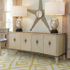
Some inspiration on accessories by Global Views - masters at accessorizing and definitely a good place to get inspiration - great sideboard!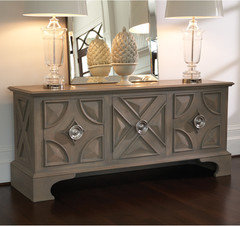


Tara Imani Designs, LLC
11 years agoHi finndian, I love your choices and your room is looking great. I think the sideboard is perfect and goes with the chandelier. I like the large art piece, too.
I don't think the large size art piece is the problem, but the image within the picture itself is of a larger scale than what's going on in your room with the furniture scale and that's what might be throwing some people off.
I love the idea of the two lamps flanking it on either side; definitely go with taller lamps, and maybe solid based ones with some gravity to them- or use larger round diameter shades atop the black wire ones (those are a good height).
I love the marble table-- it adds to the modern urban feel. I only wonder if it's going to be big enough to seat the number of people you're going to have around the table. It looks like it would comfortably sit 4, maybe six.
Also, are the wall colors going to remain the current neutral greige? It looks good, but to add to the drama you've already got going, maybe consider painting the wall behind the sideboard a yellow or rust color (not too ultra deep, though-- choose a higher color reflective value). Or, you could paint the longer wall an accent color if you wanted to maintain the flow of the kitchen across into the dining room.
Let us know what you decide to do.
I can't wait to see your finished product!
Congrats...
User
11 years agoI like what you have going on there. I would get taller lamps on sideboard with that art piece and I would pick a dining room table with a glass top/wood bottom.Paul F.
Original Author11 years agobclowg, I love Joss and Main and I'm on One Kings Lane every morning too... thanks for the links. I guess if I'm to consider the use of color or wall paper on the wall behind the sideboard I'd have to coordinate it all with the lamp shade color and new chandelier if I replace the one already there...my head already hurts! Martyn Bullard is sure daring, isn't he? Wish I was that fearless with pattern and color. He is inspiring.
Tara, very good point about the subject matter of the art being so large scale. Opinion seems pretty divided... so, its up to me I guess. Thanks for the suggestions as well. I definitely will post pics of the finished product.
Susan I have many small framed artworks that I could do a collage of them on the wall if I move the large artwork. Thanks for that inspiration. The mismatched chairs are interesting as well.
I have a small bar cabinet area with a pop art day glo graffiti painting over it. I found a cocktail shaker that looks exactly like a can of spray paint that sits under it. Anyway, I need to get more daring with the other rooms so my bar area isn't so out of place! The funky quotient needs to be raised a little no doubt.
Thanks Marie you've been very helpful. The huge lamps are an inspiration and gives me something to think about scale wise with Tara's theory about the size of the subject matter in the painting itself. I need to explore "go big" with the lamps before settling for the wire lamps. I'll take sjkingston's great advice and start bringing stuff home to try it out.
I'd like to see your lamps zanzi1 and thanks 10merygirl for your input.sashaivan
11 years agoGreat styling and eclectic pieces. Don't change a thing!
The scale of the art work is just right. Better large and bod to create drama and impact. You want to draw the viewer's eye in. Having too small a piece takes away from that and looks even more odd.
Love the colors, by tthe way...they all work well together. Especially the teal lamp base.
As for height of the lamp, it's just right.
Now, here...you can do one of two things when it comes to table lamp height; actually, three things:
1) Create a symmetry: both table lamps matching in height, on either side of the picture, or...
2) Create asymmetry, so that one is shorter than the other (but not drastically); so the 30" on one side and the 37" on the other side. So if you were stand back, you'd essentially be looking at an asymmetrical triangle-like arrangement. You can even intentionally off-center the art work to create more drama; but would have to one or two other smaller objects the remaining lamp to create a grouping of three (interior decor principle: always odd number groupings to create effect; but feel free to break the rule when you need to .....or want to.
3) Instead of one other table lamp, consider a floor lamp, instead, which would add to the lighting ambience but cast the light slightly differently. yet maintain same grouping principle. If you did this, provided the base fit into the remaining floor space between the wall edge and the side board, you would move the table lamp over to the other side. You could also stand a short floor lamp (like the Japanese rice paper shade style) on the credenza and use it as a table lamp (this in effect creates an asymmetrical arrangement).
4) only use the existing lamp and have a large bowl and/or vase to complete the vignette (or, add a few more other favorite pieces).
The iron lamp which is 37" is an ideal piece to add into the vignette , in order to continue the eclectic theme.
Love the chandelier, too.....again, better large than small here (which is what too many people tend to do). Also love the sideboard....and it's perfect for the space (contrary to all the nay sayers out there).
I think a graphic wallpaper print would have also worked well, too, to add to the drama. Again, here, as long as the scale of the wallpaper print does not compete with the scale of other fabrics being used, and the colors were complementary, there's no reason why it shouldn't work.
You can pore through other picture examples to get a better idea, too.
One other thing: i love your marble dining table choice. The only thing is, because i haven't seen the floorplan and only the picture above, i was wondering if it would fit into the dining area. You want to ideally leave at least 30"-36" space between the chairs and the wall (when the chairs are pushed into the table). I'm gathering you've already measured the space so you are pretty confident then with the table size choice..
Hope this helps! Be sure to post the final pic when you're done! Thanks.....Designs by Sashadoublegutshot
11 years agoThat's a beautiful sideboard! I want one just like that :) I see how some may think it's a bit large for the room, but I think you could make it work. The painting is great too. Each of them has a strong presence and stands out on its own. However, I think that combining those two pieces leads to a clash between them - they are just competing with each other for attention. I think moving the painting to some other place (opposite wall?) and decorating the top of the sideboard with a more understated complementary piece, will take some weight off this side of the room and let the sideboard shine and be the dominant piece on that wall and have a much stronger visual impact by itself.
As for the lamps, I think, if you decide to keep the sideboard and painting together, it would be a mistake to go with very big ones. Then you'll have a big sideboard, a big paiting and two big lamps lined up against one small wall in a relatively small room. It's great to have oversized pieces in small rooms as long as there are not too many of them crammed in together. Now, two big lamps and a smaller painting or a simple mirror in the middle would probably work great
Related Stories
FURNITUREStyling Secrets for Beautiful Buffets and Sumptuous Sideboards
Keep these timeless pieces fresh and relevant with art, flowers and well-thought-out accessories
Full Story
FURNITUREHigh Style: Extra-Tall Headboards
By Becky Harris
Looking for a Little Drama? Create a Lofty Backdrop for Your Bedscape
Full Story
DINING ROOMSBuffet, Sideboard, Server, Credenza: What's the Difference?
Learn the definitions and details to make shopping for dining room storage furniture less confusing
Full Story
DECORATING GUIDESTable + Lamp: 10 Perfect Pairings
No more dithering over scale and style. We take the guesswork out of matching lamps to credenzas, coffee tables, nightstands and more
Full Story
LIGHTINGVintage Lighting Shines
Add to your personal look with a great vintage table lamp, floor lamp or retro-style pendant
Full Story
DECORATING GUIDESLighting Trends: 10 Tripod Lamps to Love
By Becky Harris
Classic Shape Gives Floor Lamps a Light New Silhouette
Full Story
DECORATING GUIDESHot and Functional Desk Lamps
Industrial, Sleek or Cozy Traditional, Lamps Light Your Workspace in Style
Full Story
LIGHTINGMix Your Lamp Styles for Major Interest
Unpair those light fixtures for unrivaled personality and appeal. Here’s how to do it right
Full Story
LIGHTINGThe Great Unsung Storyteller in a Room
A statement lamp can bring artistry, history and personality to your interior. Which of these styles speaks to you?
Full Story



Carolyn Albert-Kincl, ASID