


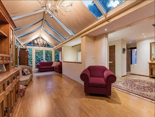
Conservatory help...
Jen
8 years ago


Featured Answer
Comments (14)
Related Professionals
Linton Hall Interior Designers & Decorators · Little Egg Harbor Twp Interior Designers & Decorators · Bonita Kitchen & Bathroom Designers · Carlisle Kitchen & Bathroom Designers · Lenexa Kitchen & Bathroom Designers · Alpharetta Furniture & Accessories · Temple Terrace Furniture & Accessories · Elyria General Contractors · Fargo General Contractors · Gainesville General Contractors · Meadville General Contractors · Palatine General Contractors · Statesboro General Contractors · Troutdale General Contractors · Warren General Contractors
Jen
8 years ago
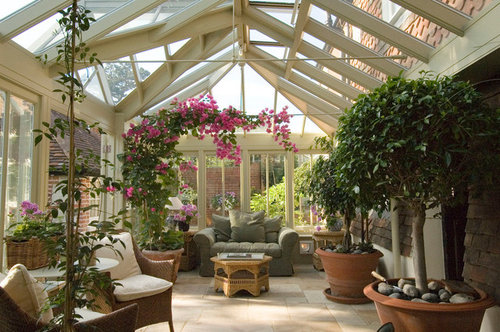
wuff
8 years ago
Debbie Fisher
8 years agoJen
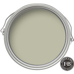
8 years agoJen
8 years agoJen
8 years ago PRO
PROVanessa Wood Interiors
8 years agoJen
8 years ago


Related Stories

GREEN BUILDINGHealthy Home: Sunrooms and Conservatories
Discover how bringing in natural light can give your life a healthy glow
Full Story
DECORATING GUIDESGo for a Greenhouse Effect With an Exotic Conservatory
Cultivate a rarified hothouse feel with or without all-glass walls; these inspiration photos and product picks show you how
Full Story
HOUZZ TOURSHouzz Tour: A New Conservatory Brightens a Converted Carriage House
A year in Barcelona and fond memories of London spur a new sunny addition and a whole-house refresh
Full Story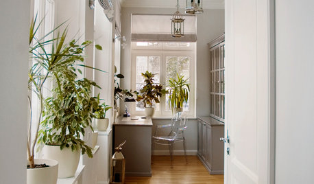
HOUSEPLANTSHow to Create an Indoor Landscape
Apply principles and elements of design to help your indoor garden flourish
Full Story
GARDENING AND LANDSCAPINGRaise Backyard Chickens Without Ruffling Neighbors' Feathers
Before you build a coop in the backyard, follow these strategies to help keep your neighbors from squawking
Full Story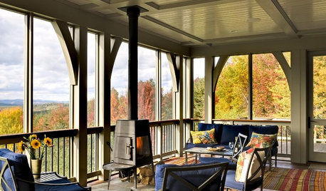
Houzzers Say: A Wish List for the Entire House
10 dreamy suggestions to help a home meet all of your present and future needs
Full Story
HOUZZ TOURSMy Houzz: Family Efforts Pay Off for a 1915 Home
Everyone from the kids to the grandparents helped renovate this Montreal house — and the results show how much they care
Full Story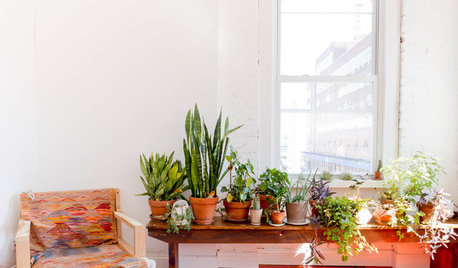
HOUSEPLANTSIndoor Winter Gardens for Cheerier Days
Bring plants inside for drab-days mood boosting — not to mention cleaner indoor air and protection for your greenery
Full Story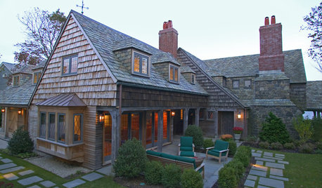
REMODELING GUIDESAdding On: 10 Ways to Expand Your House Out and Up
A new addition can connect you to the yard, raise the roof, bring in light or make a statement. Which style is for you?
Full Story
INSPIRING GARDENSWhat We Can Learn From Longwood Gardens’ New Meadow
Sustainability, ecology, native plant communities ... this public garden is brimming with lessons on horticulture for home gardeners
Full Story

Vanessa Wood Interiors