


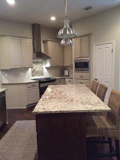
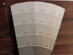
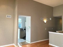
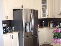
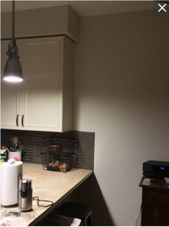
Accessible beige and balanced beige
myongmei
7 years ago
Featured Answer
Sort by:Oldest
Comments (45)
 PRO
PROJAN MOYER
7 years agolast modified: 7 years ago
myongmei
7 years agoRelated Professionals
Fort Smith Interior Designers & Decorators · Fountain Hills Interior Designers & Decorators · Bonney Lake Architects & Building Designers · Fort Wayne Furniture & Accessories · St. Louis Furniture & Accessories · Asheboro General Contractors · Big Lake General Contractors · Brighton General Contractors · Clarksville General Contractors · Elgin General Contractors · Los Alamitos General Contractors · Norfolk General Contractors · Parkville General Contractors · Signal Hill General Contractors · Stoughton General ContractorsUser
7 years agomyongmei
7 years agomyongmei
7 years agomyongmei
7 years agoseagirl73
7 years agoleelee
7 years agomyongmei
7 years agomyongmei
7 years agoavilla98
7 years agolast modified: 7 years agomyongmei
7 years agoRuth Ann Widner
7 years ago- PRO
Patricia Colwell Consulting
7 years ago myongmei
7 years agomyongmei
7 years agomyongmei
7 years agoUser
7 years agomyongmei
7 years agoJill McK
7 years agomyongmei
7 years ago
flopsycat1
7 years agolast modified: 7 years agoJill McK
7 years agoRuth Ann Widner
7 years agomyongmei
7 years agomyongmei
7 years agomyongmei
7 years ago PRO
PROHMH Development Inc
7 years agomyongmei
7 years ago
Jackie S
7 years agomyongmei
7 years agoseagirl73
7 years ago
emmarene9
7 years agomyongmei
7 years agomyongmei
7 years agokarenreinstern
5 years ago
Nancy Marra
5 years ago
Siv Bennett
5 years ago
Betty Andrews
5 years agoblondy1
5 years agoLaura
5 years ago4witsend
5 years agoKate Laura
3 years agoHU-588495056
3 years ago


Related Stories

MOST POPULARWhat’s Your Neutral: Beige or Gray?
A designer shares 10 tips for using the neutral shade that works best for you
Full Story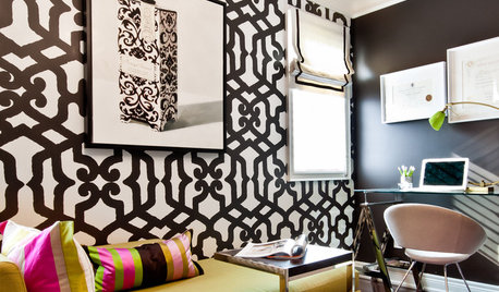
HOUZZ TOURSHouzz Tour: Builder's Beige Gets a Makeover
Home goes from boring to lively with color, furniture and textures to fit a family's personality
Full Story
NEUTRAL COLORSRunway to Room: Pink-Kissed Beiges and Golds
The new neutral colors from the spring 2012 fashion runways may just make your rooms blush
Full Story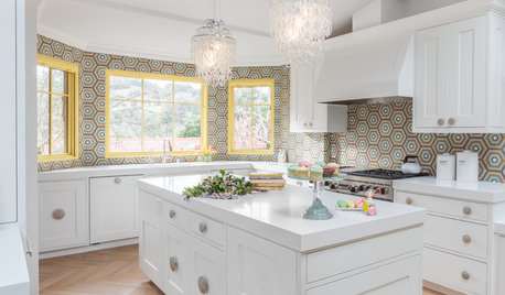
ROOM OF THE DAYRoom of the Day: A California Kitchen Boots Out Beige
A down-and-out kitchen catches the joy wave and turns up the fun for a social family of 5
Full Story
HOUZZ TOURSMy Houzz: Accessibility With Personality in an 1870 Home
Hand-painted murals and personal touches fill an accessible home with warmth and charm
Full Story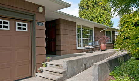
HOUZZ TOURSMy Houzz: A Seattle Remodel Offers Accessibility
Access for legs and wheels was the priority in this Washington state home's renovation, but universal design doesn't mean less style
Full Story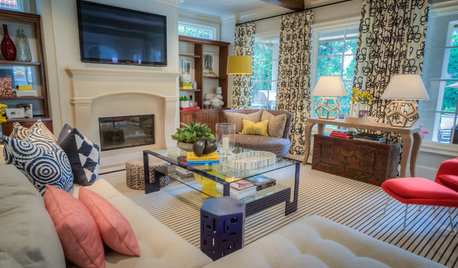
DECORATING GUIDESRoom of the Day: A Modern Slant on a Traditional Space
A big and beige Texas family room gets an energy infusion with a mix of bold colors, patterns and shapes
Full Story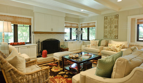
HOUZZ TOURSHouzz Tour: Elegant Carmel Beach Bungalow
Contemporary art and a sandy beige palette give this classic board and batten beach house in California a subtle coastal flair
Full Story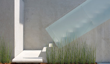
LANDSCAPE DESIGNDoes Your Landscape Need a Little ‘Cosmic Latte’?
Beige — the color of the universe — can be both building block and backdrop in a contemporary garden
Full Story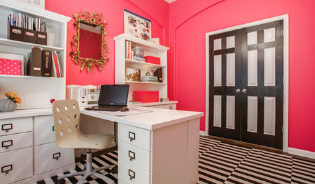
HOME OFFICESRoom of the Day: Proudly Pink in San Antonio
See how a ho-hum beige box became a luscious and energizing workspace worth showing off
Full Story


Tiffany Maddox