


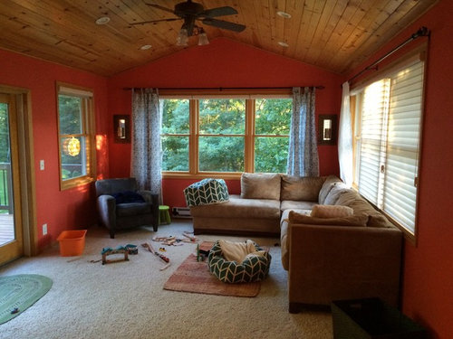
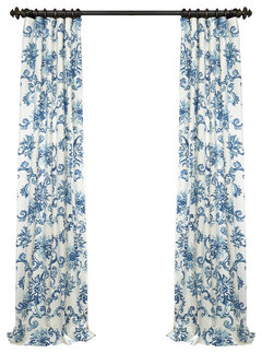
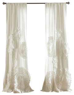
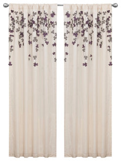
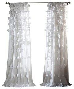
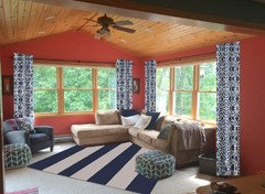
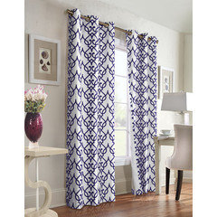
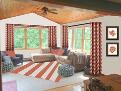
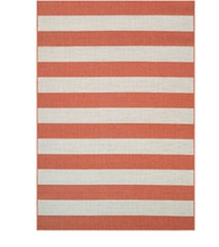
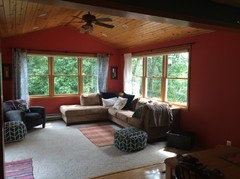
Are these curtains too crazy
jflash G
7 years ago

Featured Answer
Sort by:Oldest
Comments (38)

jflash G
7 years ago
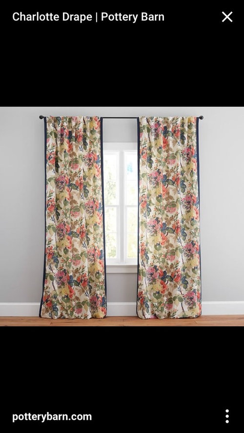
susanalanandwrigley
7 years agoRelated Professionals
Bel Air North Interior Designers & Decorators · Bell Gardens Architects & Building Designers · Pleasanton Kitchen & Bathroom Designers · Atlanta Furniture & Accessories · North Hollywood Furniture & Accessories · Alabaster General Contractors · Cedar Hill General Contractors · De Pere General Contractors · Livermore General Contractors · Milford General Contractors · Tamarac General Contractors · University Heights General Contractors · Waimalu General Contractors · Waldorf General Contractors · Warrenville General Contractors PRO
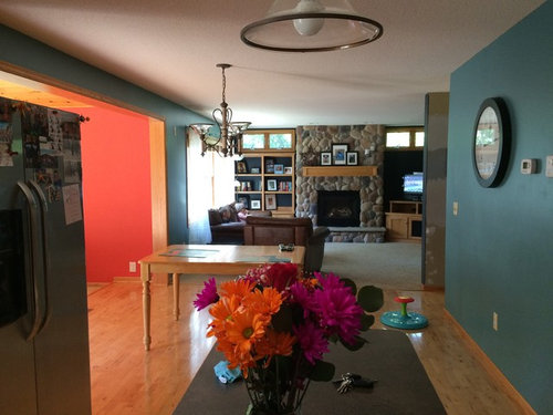
PRODesign Details
7 years agojflash G
7 years ago
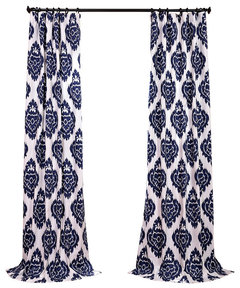
suzyq53
7 years agojflash G
7 years agosuzyq53
7 years ago PRO
PROCatherine Schager Designs
7 years ago PRO
PROCynthia Taylor-Luce
7 years ago PRO
PROColor Zen
7 years ago
Jan Brandvold
7 years ago
Bev
7 years ago
Sherre Bishop
7 years agolast modified: 7 years agojflash G
7 years agojflash G
7 years ago
Jennifer Havin
7 years agolast modified: 7 years agoUser
7 years agoshirlpp
7 years agoteamaltese
7 years agoshirlpp
7 years ago PRO
PROBeverlyFLADeziner
7 years agolast modified: 7 years agoLiz H
7 years agosaratogaswizzlestick
7 years agob1016
7 years agolast modified: 7 years ago- PRO
BeverlyFLADeziner
7 years ago connie912
7 years ago PRO
PROJudyG Designs
7 years agolast modified: 7 years agojflash G
7 years ago- PRO
BeverlyFLADeziner
7 years ago jflash G
7 years ago PRO
PROOasisDesign&Remodeling
7 years agoJan
7 years agoJan
7 years agoUser
7 years agojflash G
6 years agoSherre Bishop
6 years agoUser
6 years ago


Related Stories
DECORATING GUIDESStroke of DIY Design Genius: 14 Crazy Cool Hand-Painted Walls
See how these homeowners used paintbrushes and permanent markers to create custom wallpaper
Full Story
LIVING ROOMSNew This Week: 3 Living Rooms Mix Wild Patterns While Keeping Calm
Go neutral for the main furniture pieces and crazy with curtains and pillows for a comfortable space with just enough energetic character
Full Story
MORE ROOMS'Mad Men' Style: Sally Draper's Tween and Teen Bedroom
Will girly pinks prevail, or will the crazy colors and patterns of the '70s drop in? Tune in for our predictions for Sally's bedroom
Full Story
LIVING ROOMSRoom of the Day: A Chicago Living Room Puts Boyishness Behind
Dark curtains and lots of leather give way to a more sophisticated take on the bachelor pad
Full Story
WINDOW TREATMENTSThe Art of the Window: Power Up With Motorized Treatments
We look at 11 spots in your home where automatic shades, screens, curtains and more make sense
Full Story
PRODUCT PICKSGuest Picks: Add Some Color to Your Cool Summer Shower
Give summer heat the cold shoulder when you chill out behind one of these stylish shower curtains
Full Story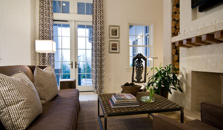
WINDOW TREATMENTSThe Case for Stationary Draperies
Curtains that open and close are great in some situations, but stationary draperies can give you a better view (and save money too)
Full Story
DECORATING GUIDES8 Wonderfully Creative Window Treatments
If regular curtains and rods feel too off the rack, look to these imaginative alternatives for one-of-a-kind windows
Full Story
WINDOW TREATMENTS6 Ways to Deal With a Bad View Out the Window
You can come out from behind the closed curtains now. These strategies let in the light while blocking the ugly
Full Story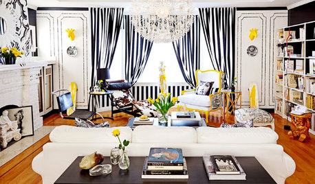
CONTEMPORARY HOMESRoom of the Day: Parisian Pop Lifts a San Francisco Living Room
Turning bedsheets into curtains and drawing on the furniture with a pen are a couple of the decorating tricks used in this living room
Full Story


User