Shop Products
Houzz Logo Print
lorenrvasquez

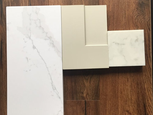
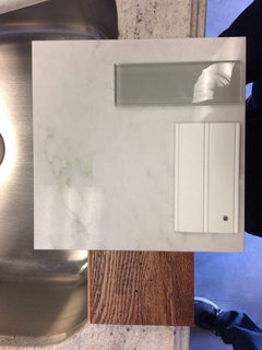
I'm back for your countertop wisdom :)

LVasquez
7 years ago

Hi everyone!

You guys really helped me sort out what I wanted with my cabinet color, and I had the quartz all picked out.... UNTIL I saw another color, and now I am torn. What else is new? lol

I'm using Cliq Studios' Urban Stone cabinets (dakota, which is basically shaker), and I WAS set on Zodiaq London Sky, but we just recently saw Silestone Eternal Calacutta, which is brighter and really pretty too.

I'm attaching a photo of the cabinet with both quartz samples (London Sky is the smaller one), and they are sitting on the floor sample I THINK we are going to use. (A whole other can of worms)


I worry that the London Sky is too close to the cabinet color, but the calacutta is too cool or bright?


Give me your wisdom, everyone!

Comments (24)

  • acm
    7 years ago

    I like all your finishes. Both counters look nice, but I slightly prefer the one on the left because the veining is a little sharper.

    LVasquez thanked acm
  • PRO
    Flo Mangan
    7 years ago
    Still like London Sky. There has been some issues with the larger veining and then accomplishing good seams. I would choose LS.
    LVasquez thanked Flo Mangan
  • chiflipper
    7 years ago

    London Sky, the other IS too white.

    LVasquez thanked chiflipper
  • eve_62025
    7 years ago

    Yep...I agree with others. I think the LS will actually help your cabinets appear brighter and easy on the eyes as opposed to too yellow or green by comparison to the bright white.

    LVasquez thanked eve_62025
  • Irene Morresey
    7 years ago
    London sky for sure
    LVasquez thanked Irene Morresey
  • Irene Morresey
    7 years ago
    Found these with London sky
    LVasquez thanked Irene Morresey
  • User
    7 years ago
    I think the LS matches too.
    LVasquez thanked User
  • Candice Hoz
    7 years ago
    London Sky! A gray cabinet color for the other.
    LVasquez thanked Candice Hoz
  • PRO
    Diana Bier Interiors, LLC
    7 years ago

    The London Sky for sure! The creamier color blends better with the cabinets and the flooring (which is lovely by the way!) Also I find that the very pronounced veining in the man-made quartz can look fake on a large scale.

    LVasquez thanked Diana Bier Interiors, LLC
  • LVasquez
    Original Author
    7 years ago
    last modified: 7 years ago

    WOW, you guys are AWESOME!! Thank you so much for taking the time to help me again, and even finding some photos for me! I'm telling you, I'm so grateful to this forum- you all are helping me tremendously.


    ETA: I am doing a farmhouse sink, and I was planning on white. Is this still the right choice, given the finishes? My style is normally somewhat modern, but I do love a classic farmhouse sink and pretty moulding, so my goal is to kind of mix traditional with modern.


    Here is a screenshot of the kitchen rendering:

  • TM c.
    7 years ago
    I guess I'm the only one but I think the calacutta is way nicer with your cabinets and a crisper/brighter look. Then a white back splash would set it off.
    LVasquez thanked TM c.
  • LVasquez
    Original Author
    7 years ago

    TM c. see, that's what I thought when I saw it, too. Brighter, crisper, a little more modern. They're both so nice!!

  • eve_62025
    7 years ago

    I think a bright white farmhouse sink will give a nice pop to your creamier choices. Our eyes always want to "find the white" in any space (we call that white balance in photography). By having the creamy cabinets as your main element, the brighter white quartz which has a blue/white base will make the cabinets appear more yellow/green in comparison. This causes visual tension (our eyes bounce back and forth) but also visual interest. That's a preference thing. In a creamy-white based space, you should inject cool pops to keep everything from looking all cream and brown (like a bright white sink, pale blue-grey accents, etc). In a cool white space (like bright white cabinets with bright white grey marble/quartz), you should inject warm elements (wood tones, greens, etc) to keep it from looking sterile.

    Above is a nice white sink contrasting with cabinets. Below is the visual tension of a greenish cream with a blue-based bright counter. The designer repeats the cool white in the ceiling as well as the floors.

    LVasquez thanked eve_62025
  • PRO
    Diana Bier Interiors, LLC
    7 years ago

    I know you didn't ask this, but after looking at your rendering, I want to ask--are you sure you want the microwave over the range? It really is a pain, 2 people can't stand at the range at the same time. It's also quite high, and difficult for shorter people to use. There is also a danger factor when taking hot foods out of an oven that high up. Is there anywhere else you could find to place it?

    As far as the bright white/cream debate, it truly comes down to personal preference, so ultimately it's up to you.

    LVasquez thanked Diana Bier Interiors, LLC
  • LVasquez
    Original Author
    7 years ago

    eve_62025 holy COW, thank you so much. Everything you said makes sense and gives me lots to think about!

  • LVasquez
    Original Author
    7 years ago

    Diana Bier Interiors, LLC Hi! I'm so sorry- I somehow missed your comment. Strange that you say that- I had exactly the same setup in my last home, and we never experienced any issues with any of that. Maybe because my husband and I are both taller? hah! I'm not sure! Come to think of it, I don't think I've ever had a place where the microwave wasn't on top of the range.

    Out of curiosity- where would you put it? If I moved it, I would then need a hood over the range, right? Interested to hear your ideas!

  • User
    7 years ago

    I like both samples, for different reasons. Each will be really easy to maintain, both can fool the eye- mimic marble without the maintenance. No matter what, though?

    Take great care in getting the thickest slab you can. Sounds silly, but 3cm vs 2cm (et al) makes a huge difference in appearing- and being-substantial. I would also consider doing a very simple eased edge, vs all the other choices. It will help give you a "today" modern look that's also very classic. And it's often less expensive on the install.


    LVasquez thanked User
  • inabunker
    7 years ago
    last modified: 7 years ago

    What's up with the matchy matchy? I like the bright white on the left. It's called "contrast".

    LVasquez thanked inabunker
  • PRO
    Diana Bier Interiors, LLC
    7 years ago

    Well if you don't find it a problem, then great! I had it like that once and I found it a problem. You are correct that you would need an exhaust fan over the range, and then you'd lose a cabinet. One option is to place it under the counter either to the left of the range or sink. Another option is to place it at counter height either directly on the counter or in a floor-to-ceiling cabinet. In that scenario you would lose some counter space.

    LVasquez thanked Diana Bier Interiors, LLC
  • LVasquez
    Original Author
    7 years ago

    902 Juanita you read my mind. Definitely a 3cm, and definitely a standard edge. The fancier ones aren't really up my alley :) Thank you!!

    inabunker Thank you! This is exactly what I wrestle with. lol I think Eve_62025 had some great points about the differences between going with something that matches vs going with something that contrasts.


  • LVasquez
    Original Author
    7 years ago

    Diana Bier Interiors, LLC This is true, I'd definitely lose counter or cabinet space. And then an extra expense of the hood. I think if it was a bigger kitchen, I'd definitely go for the hood over the range and the microwave under the counter. I definitely prefer the look of a hood over the range vs. a microwave.

  • LVasquez
    Original Author
    7 years ago

    Diana Bier Interiors, LLC I just wanted to pop back on and say you have given me a lot to think about! I am considering not doing an OTR microwave, afterall. I have a few solutions, now I just have to see how much those solutions will cost me.

    So THANK YOU! :)

  • PRO
    Diana Bier Interiors, LLC
    7 years ago

    You are very welcome LVasquez. Good luck with your project!