


The Perfect White to go with Grey
I have chosen the Paint Colors.. Silver Leaf, Voyage and Drizzling Mist for the walls.. I am now looking for a good paint for the Trim and Cabinets.. Should I go with a cool white which has blue undertones or a warm white with yellow undertones.. I see the cool whites and they look very blue to me.. and I don't want my home to seem cold.. I like the warm whites but I worry the yellow undertones are going to clash with the colors I chose.. and if I went pure white I feel like that would be too sterile.. And do I paint the ceiling with the same color I used for my trim? I am on a budget so I would like to not have to buy a dozen different shades if possible.. Any help would be greatly appreciated.. Thank you.
Comments (65)
 PRO
PROLori A. Sawaya
6 years agolast modified: 6 years agoC2 is a Full Spectrum line of paints like Ellen Kennon. If you're new to color world, Sandra, the whole full spectrum color mixing thing might be a little overwhelming! Here's a blog post I wrote about FS paint.
In addition to all of the Behr colors, The Home Depot also carries colors from The Master Palette (Glidden). In stark contrast to Behr, The Master Palette uses an absolutely genius color notation system to organize their 2,016 colors which include an amazing range of complex chromatic grays and whites. Unfortunately, not many people know it's there because it gets lost in the color chaos.

Sandra Jacobs
Original Author6 years agoWow! I am all for learning more. I love all this information. Thank you for educating me. ;) xRelated Professionals
Hillcrest Heights Architects & Building Designers · New River Architects & Building Designers · Town and Country Architects & Building Designers · Haslett Kitchen & Bathroom Designers · Rancho Mirage Kitchen & Bathroom Designers · Mill Valley Furniture & Accessories · Zionsville Furniture & Accessories · Claremont General Contractors · Dallas General Contractors · Fitchburg General Contractors · Hagerstown General Contractors · New River General Contractors · North Smithfield General Contractors · Panama City Beach General Contractors · Syosset General ContractorsSandra Jacobs
Original Author6 years agoBTW thank you Lori. I just read your article with my fiance and we are both very impressed with your knowledge and information. The article is extremely well written and informative. I really like the concept of the full spectrum paints. We are always talking about how it feels like most paints absorb light rather than reflect it back into the room and so it feels limiting to what colors you can paint. I don't know what the cost difference is between the low range Valspar and Behr and higher range of SW and BM. And what if I wanted to paint with FS paints later on. Can you paint over existing paints with FS paint? Just curious. ;)
- PRO
Lori A. Sawaya
6 years agoOh, sure you can paint over FS paint - it's exactly the same in terms of chemistry and paint film. It's not like a faux finish or anything.
The only difference is no black or gray colorant in the mix. What that does is change the spectral curve of the color - I call it color DNA. It's kind of crazy when you compare the data. Like if you have XYZ paint color by Ben Moore and have a full spectrum version of XYZ paint color created, it shows up in the data. (I think I talk about being able to measure the difference in my blog post.)
When you analyze the data you can see how the balance of greenness/redness and blueness/yellowness is evener. And even crazier is while the lightness value and chromaticity (amount of grayness) remain rather consistent between the two colors, the full spectrum color will have a higher, brighter light reflectance value - like, you can quantify that a full spectrum color reflects more light energy back into a room compared to its color match mixed via regular methods.
I have to add a bit of caution to what I said because I don't know that's true for every, single full spectrum paint color because I haven't analyzed every single full spectrum paint color out there. But I have found this to be true with the full spectrum to regular paint color data comparisons I have done. Sandra Jacobs
Original Author6 years agoThat's very cool. I am actually very much into color and energy healing. I find it fascinating and therapeutic. Right now I'm studying Reiki and Earthing. What's interesting is how color has energy wave lengths which can translate into how people can feel or express energy. Such as when people think of red for passion, pink for love or white for innocence. The most calming color blue resonates with the throat chakra which has to do with expression and communication. when I was reading your article it really resonated with me since the best energy therapy will hit all the chakras or the full spectrum. So this is definitely something I will be looking into more. I love it. LOL!- PRO
Lori A. Sawaya
6 years agoOoohhhh, yeah, this is so up your alley! You are going to have a ball researching and exploring! You can either thank or blame truey for bringing up C2 Paint, lol! :)

lwfromny
6 years agoSandra, just a tip since you (like most of us!) are on a budget and are new to the BM/SW world of paint. Both will probably be more expensive than the big box stores. But SW is generally lower priced than BM, plus SW runs sales constantly. Sign up for their email distribution and you will get coupons and sale notices, often for 30, and sometimes 40% off. I usually use BM just because I know their colors and paint really well, but I get the SW emails because I do use certain colors from there. You will probably find that as you start to use one of them, you will keep going back to the same place because it is easier to find complementary colors when you stick with one company.
Also, when you go there, ask them for a full fan deck to take home. They will probably charge you for it. It's worth every penny - you will use it for years and it's a lot easier than taking home tons of paint strips. They will have more than one deck - I'd just tell them you want the most popular one.lwfromny
6 years ago@Lori - you are the color expert of Houzz for sure and I always learn from you. I have a question about Sandra's Valspar choices. I looked them up because I don't know Valspar at all. Now that I've seen them, I'm wondering what your thoughts are about whether they have enough differentiation that they will actually appear different in the various areas of her home. I have found that when using varying shades of a similar color it is often a wasted effort because they can all end up looking the same. Obviously her light will affect it but just curious about your thoughts. On my monitor the midtone color in particular looks as if it could appear the same as either the lightest or the darkest one.- PRO
Lori A. Sawaya
6 years agoI love me a SW sale. The sale pricing for consumers is better than their contractor discounts!
I don't know what the cost difference is between the low range Valspar and Behr and higher range of SW and BM.
Here's an infographic that compares price per square for a bunch of top tier brands.
 PRO
PROFlo Mangan
6 years agoLori, your color knowledge is PhD level for sure. I always learn something from you. I know that my discount from BM and SW does not beat their sales especially SW. So true. I really like Behr colors but I'm not crazy about their paint. So it is a challenge and most clients just want the lowest price even though we try to educate them. BM has catered to designers more than SW for colors, but SW is doing some new good things too. My long time favorite has been Pratt and Lambert, but their distribution and I think ownership got muddled up in the last 5 years or so and it is very hard to find these days. At least around here. So thanks for helping all of us understand color a bit better. I have my tricks for selecting colors and they have served me well. Sometimes instinct also works!
Sandra Jacobs
Original Author6 years agoI thank you all for the input.. I am so happy I found the houzz app.. the fiance and I are going to the paint Store tomorrow or Saturday.. will be a fun adventure for sure.. ;)- PRO
Lori A. Sawaya
6 years agolast modified: 6 years agoI have a question about Sandra's Valspar choices. I looked them up because I don't know Valspar at all. Now that I've seen them, I'm wondering what your thoughts are about whether they have enough differentiation that they will actually appear different in the various areas of her home. I have found that when using varying shades of a similar color it is often a wasted effort because they can all end up looking the same.
SO TRUE! You are exactly right and I have found the same, major bummer :( when folks have gone to a ton of trouble to choose and use different colors from the same strip and they all end up looking the same because of the light.
First thing is we know that looking at paint colors on a device or monitor will totally mess with your eyeballs.
I happen to have the chips and pulled the chips the other day in order to put together that range of whites for Sandra - so I know they look good and I'd be surprised if she has the problem of them all looking alike which you so wisely caution about happening.
In addition to how these three colors look, I also took a peek at the colorimetric data (the color DNA) and compared the colors that way too. You can see the difference in chroma, lightness and LRV - the data shows that they are comfortably different - different enough so it's unlikely they'll look the same in various qualities of inherent light. We can predict from the data that they'll definitely look similar because they all belong to the same hue family --- similar yet different.
For example "L" is lightness - that's perceived lightness based on how a human would see the colors. There's about a 10 point difference between 'em, so that's good. Also, LRV - which is measured reflectance. LRVs of 34, 49, and 63 (rounded up) tells us these are different enough to see and feel the difference.

We can actually calculate contrast ratios based on LRV. The ratio quantifies the light reflectance difference between two colors. In this group of three colors, the lowest contrast ratio is about 20%. Any lower and I'd be worried. Certainly no issue with Silver Leaf and Drizzling Mist.
We can tell from the data that if a problem of colors looking too similar is going to happen, it's going to be with Voyage and Drizzling Mist.
Hope that helps.
 PRO
PROJohn McLean, Architect
6 years agoSandra, I am going to put a wrinkle into the ease of your color selection because I don't think it was mentioned previously. Keep in mind: (1) The lighter your color, the more it will look different in various parts of a room with different light conditions. 2) In rooms with direct sunlight, the color will change over the course of a day as the sun moves and delivers different amounts of direct light into a room.
An example of the No. 1: One time I was using a pink color on the walls of a room. In wall areas hit by sunlight, it was gorgeous, taking on a warm peach tone. In dark wall corners, it was a much cooler pink that I did not like.
An example of No. 2: I was at a client's house one day for a meeting that lasted a couple hours. The newly painted room in which we were meeting for which I had chosen a very light peach tone had its color change dramatically over the course of the meeting as sunlight poured through skylights and windows. However, it was a color changing situation both the owner and I found very appealing. The paint color also looked different under artificial light.
So ........ in your case, I suggest you take all your candidate whites, get the largest size color cards you can (I use 6x9 sheets) and tack those cards as a group up on the wall in various places in the room with different light conditions and see what you think of each color in the different locations. I'd also look at them under artificial light at night. Further, I would probably try to shuffle the deck of colors so that I wasn't sure which came in first originally on one location (to avoid selecting that color a second time with a bias knowing I preferred it before) as I made my visual preferences in each location. Eventually, your preference among the subtle color differences will emerge. When you do make a tentative decision(s), I'd encourage you to buy a quart of that color (those colors) and apply it to a a nice size wall area in different locations to confirm your choice.
One final idea .... once you have chosen a hue that is acceptable, keep in mind you can adjust the paint formulation if you want to make slight tweaks to that hue's intensity. I have often used the same hue for the walls and ceiling, for example, but lessen its intensity on the ceiling.
You may not want to make this amount of effort to choose a color, but it can be helpful in choosing the one you like best among very light colors with subtle differences among them. Have fun!
- PRO
Flo Mangan
6 years agoSandra - I am very interested in "energy/Reiki" pro retired. Any chance you are in the Houston area?
Sandra Jacobs
Original Author6 years agoWow Lori. I didn't realize you went to that much trouble for me. That's very generous and thoughtful. I feel a bit spoiled right now with all this help and information from everyone. LOL! I will be taking all the suggestions to heart.Sandra Jacobs
Original Author6 years agoDear Flo. No I'm not though I would love to visit one day. ;)- PRO
Flo Mangan
6 years agoI mis-typed there or it got auto-corrected. What I meant is my Reiki pro retired and I miss her so much! She kept me centered and in very good health. I have a new person, and she is really nice, but not as experienced. Good luck with your work. It is fascinating to me.
Sandra Jacobs
Original Author6 years agoOh thank you kindly. Have you thought about getting certified for reiki yourself? You can do self reiki and you can then do it for family and friends. Another fun thing to try if you haven't already is binaural beats meditations. Good for balancing chakras. I look them up on YouTube some are a bit annoying sounding and some are more subtle. Most have a description under the video. I just put in my ear buds, lay down and close my eyes and do some deep controlled breathing and do that before bed every night. Excellent way to reduce stress. ;)- PRO
Flo Mangan
6 years agoThanks, would be good for relaxing and stress reduction for sure! I will give it a go.
- PRO
Lori A. Sawaya
6 years agoWow Lori. I didn't realize you went to that much trouble for me.
I do it every day, all day, Sandra. :) I pop in here to read and soak up knowledge and expertise from this fabulous community all the time so I like to chime in and contribute if I can. Sandra Jacobs
Original Author6 years agolast modified: 6 years agoLori thank you for the suggestions.. Sherwin Williams is having a sale and the paint guy said they can match any of the colors from other brands. very excited. These are the colors we chose.

- PRO
Lori A. Sawaya
6 years agoThat looks good!
All the ceilings don't have to match unless they're connected and not separated by a doorway. So, instead of HR White on the ceiling:- In the bedrooms, you could use Silver Leaf or Voyage. Depending on the size of the Master, you could even put Drizzling Mist on the walls AND ceiling.
- Drizzling Mist on the laundry room ceiling with Silver Leaf walls.
- Silver Leaf on the ceiling in the kitchen and living room with Voyage walls.
I plotted all the colors on a color wheel so we can see how/why they work. The whites belong to the green-yellow hue family next door to the wall colors and that's a good thing.
Voyage is over closest to the blue-green hue family which is where a sense of blue overtones is coming from. Which means Silver Leaf and Drizzling Mist probably look grayer or 'just gray" in comparison.
When you plot it all out, it makes sense and confirms your selections.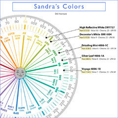
lwfromny
6 years agoTotally agree with Lori about not painting all the ceilings white. I know white seems normal and that painting then a color seems like it will make the rooms small. It WON'T - you will be amazed how good your rooms will look with color on the ceilings.Sandra Jacobs
Original Author6 years agooh thank you.. our ceilings are 8 ft.. the living room kinda flows into the kitchen/dining room.. 2 of the bedrooms are quite large and two are smaller.. the fiance wants to do a dark dark color in the upstairs tiny bedroom for his office.. do you think it would be wise to paint a small room a dark grey? he likes the Southern Grey which I can't remember if it's BM or SW.. I suggested to him maybe an accent wall that color and maybe doing the Silver Leaf on the other 3 walls.. I never really thought about painting the ceiling another color.. always thought that would make a room appear smaller.. or does it depend more on the lighting and/or size? And do you think I should have my cabinets in the kitchen the same color as the trim? As I want to have white cabinets in the future. I am also in a toss up over white quartz countertops vs black quartz countertops. Still trying to figure out handles and lighting. Very exciting all this. ;)Sandra Jacobs
Original Author6 years agolwfrommy saw this after I replied to Lori.. LOL! I will be honest I'm a bit nervous about painting the ceiling a color.. :P But I am open minded so I will see how the fiance feels about that.. so far he's liked my ideas and the ones on here that you've all given.. ;)- PRO
Flo Mangan
6 years agoPainting your ceilings same color as walls makes rooms with low ceilings feel much bigger. Just do that. Small rooms can definitely look great with darker colors. Dark colors "recede" and it can be an amazing affect. You do need good lighting in those spaces to make everything work right, especially if you are using for office space.
Sandra Jacobs
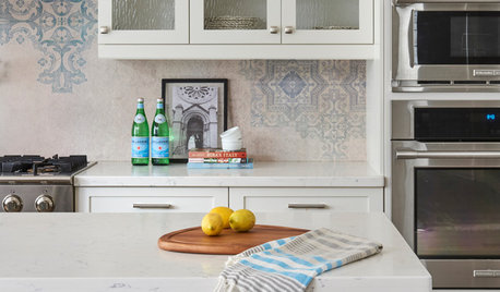
Original Author6 years agobtw the shiny white thing at the bottom of the picture is a handmade subway tile.. want to do that in the kitchen and bathrooms.. seen some gorgeous black and white tiles I want to do on the floors in the bathrooms and laundry room.. gonna do a wee shiplap wall in the laundry with floating shelves above.. still trying to figure out flooring in the kitchen as well..Sandra Jacobs
Original Author6 years agowhat if there's crown molding? can you still paint it the same color or a different color other than white? and the office space has one window on the northside.. so no I don't think that room get alot of light.. :( PRO
PROАрхитектурно-дизайнерское бюро "5идей"
6 years agolast modified: 6 years agoHello, help our realized project in these shades is possible, he will give a better picture of the combination of colors and you will understand what to apply in your home.
 Квартира в Неоклассическом стиле · More Info
 Квартира в Неоклассическом стиле · More Info
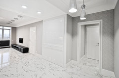 Квартира в Неоклассическом стиле · More Info
 Квартира в Неоклассическом стиле · More Info
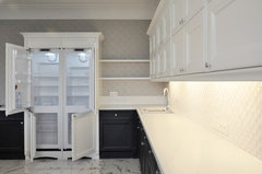 Квартира в Неоклассическом стиле · More Info
 Квартира в Неоклассическом стиле · More Info
 Квартира в Неоклассическом стиле · More Info
 Квартира в Неоклассическом стиле · More Info
 Квартира в Неоклассическом стиле · More Info
- PRO
Lori A. Sawaya
6 years agolast modified: 6 years agothe fiance wants to do a dark dark color in the upstairs tiny bedroom for his office.. do you think it would be wise to paint a small room a dark grey? he likes the Southern Grey which I can't remember if it's BM or SW.. I suggested to him maybe an accent wall that color and maybe doing the Silver Leaf on the other 3 walls..
Yes, small rooms and dark wall colors work well. What makes a room feel small is contrast. If you minimize the lines of contrast it works. So, with that in mind, I would paint the ceiling the same color - even if it's a dark color.
Of course, it makes sense that if you do an accent wall it's going to create lines of contrast, chop up the room and emphasize the fact that it's a small room. So you want to commit to one color and go for it.
I never really thought about painting the ceiling another color.. always thought that would make a room appear smaller.. or does it depend more on the lighting and/or size?
It's more about color psychology, experience, and preference. I'm from the midwest and we grew up with smooth walls and ceilings that were bright and white. That kind of experience carries over and as a result, you'll find many midwesterners who simply prefer a white ceiling because, gosh darn it, that's what ceilings are supposed to look like. :)While many others feel a white ceiling looks unfinished and makes the room feel "off" and overall just not right. Those folks need color on the ceiling to make a space feel complete.
In general, humans like dark color beneath their feet and light colors over their heads. Painting the ceiling the same color as the walls works from a color psychology point of view because it defines and creates a special, cozy environment and supplants the dark beneath your feet/light above your head deal. And dark color on super high ceilings is the right thing to do in order to shift the volume of space into a comfortable human scale. Strategies for ceiling colors is a whole big thing, but that's it in a nutshell.
And do you think I should have my cabinets in the kitchen the same color as the trim?
Yes. Decorator's White is a great, flexible cabinet color and might as well keep it simple.I am also in a toss up over white quartz countertops vs black quartz countertops.
If you have hard water, don't get the black. Been there done that and I'll never do it again. lwfromny
6 years agoGood question about the crown molding. I will defer to the pros on that because it can be a bit trickier :). But in rooms where you don't have it, your rooms will appear bigger if the ceiling isn't white. Even in rooms without a lot of light. The light hits the ceiling differently than the walls, so they will not look the same color as the walls - they will look lighter. But subconsciously, when the ceilings are painted the same as the walls, the ceiling kind of disappears, making the room feel taller. Plus the cutting in doesn't have to be as exact!
When the ceilings are darker, they become a gorgeous feature of the room. My dining room is a soft grey with a deep green ceiling (with blue undertones). It is really beautiful and people comment on it all the time. It does have crown and the crown frames out the ceiling and makes it pop.
Here's an example of a room with the walls and ceiling the same color: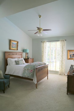
Sandra Jacobs
Original Author6 years agoI am slowly getting on the bandwagon for color ceilings.. LOL! We don't currently have crown molding but since the home is from 1900 we figured it would suit it.. but the home does have a more casual farmhouse feel which I love.. so I been looking at farmhouse type trim.. there is trim at the base boards.. but they seem kinda dinky compared to the size of the rooms.. never intended to buy such a large home.. but it really was a great investment for us.. as for the countertops that's good to know.. we have well water and it is hard.. so white quartz it is.. LOL!Sandra Jacobs
Original Author6 years agobtw our home is in Upstate NY I am originally from Southern Oregon. and they do white ceilings only there too.. ;) I might go the route you said and nix the crown molding.. Do you think foregoing the crown molding will make the home too casual? Or do you think the seem less wall to ceiling color will keep it classy?- PRO
Lori A. Sawaya
6 years agoCrown and moldings in general always add value when done well. Meaning the style and proportions are right.
In the overall color summary and the goal to limit contrast, I don't count crown molding because it's at the top of the room. Technically, in some circle of color rules, that's probably not correct, but I've never heard anyone say the room looked or felt smaller because of the white crown next to dark ceiling and walls. Sandra Jacobs
Original Author6 years agowell that's good to know.. I really love crown molding.. just wasn't sure how it worked with ceiling being a color other than white.. LOL!- PRO
Flo Mangan
6 years agoI view white crown molding in a 8' ceiling situation like wearing a white belt and your are short. It doesn't work, it cuts you in half. So, not a fan of white trim with low ceilings, but it is kind of a personal choice. You can get "differentiation" with the change of "finish" from matte/or flat to "satin/or semi-gloss" and get a nice effect without sacrificing visually lifting the ceiling.
lwfromny
6 years agoHi Sandra - now that Flo and Lori (the experts) have weighed in on crown I'll add my two cents. I'm not a pro but I have a huge interest in design and I'm very analytical so when I look at a room - especially at color - I'm always analyzing WHY it seems to work or not work. After lots of looking, here's my observation/opinion about crown and painted ceilings. I think crown is a fine thing when the ceiling is a different color than the walls, especially if the ceiling is darker. In such a room, there was already going to be color differentiation, so the crown does not interrupt the eye much more than the color change already would have. In my opinion, it can actually act as a "frame" for a lovely or dramatic color on the ceiling. But in a room where the walls and ceiling are the same color, it chops the room in half - I like Flo's white belt analogy - and interrupts the visual experience of the room. So I use a different ceiling color in rooms where I have crown, and the same ceiling color in rooms where I don't. Lori and Flo can tell me if I'm crazy!
I'm in Upstate NY too - welcome :)!Sandra Jacobs
Original Author6 years agoThank both Flo Mangan and lwfromny I appreciate the feedback.. ;)- PRO
Flo Mangan
6 years agoWould love some photos of the home. Feel like I'm blindfolded and giving color advice! On the topic of crown molding, if the home didn't originally have it I wouldn't add it. If you are going for a more modern furnishings approach, don't add it. If you really want traditional, old world look think about it, but I would put in low on the priorities with all the other projects you will have. How's that!
Sandra Jacobs
Original Author6 years agoThe pictures I have don't show the ceiling line. Sorry. But I know what you mean about a low ceiling.
Sandra Jacobs
Original Author6 years agoNo, we close end of the month. Getting paint this next weekend. Soon as we get the keys it's cleaning and painting.. ;)
- PRO
Flo Mangan
6 years agoHow exciting. Your climate will sure be different. At least it is still summer up there. Your winter is going to be quite different! Fasten your seat belt for that. You will need a whole new wardrobe! Wishing you the best.
Sandra Jacobs
Original Author6 years agoVery excited. This is our third time trying to buy a home. Third times the charm I guess. LOL! I have actually been living here for 4 years now. So I was here for the record breaking 36 inches of snow in a 24 hr period in March. When I first moved here from the Sunny West Coast I had no sweaters or boots or a coat. :P

karandolph662
6 years agoLori - Can you suggest a BM or SW white for a small bath that we are replacing the vanity with a Merillat grey "shale" cabinet and MSI Calcutta Vicenza counter. Shower is white subway. No natural light.- PRO
Lori A. Sawaya
6 years ago@karandolph662, that's easy. Your white subway tile dictates which white. You have to use a tile from your lot of tiles, don't use a sample from the store. All you have to do is grab some white paint chips and choose the white paint color that matches your subway tile the best.
- PRO
Lori A. Sawaya
6 years agolast modified: 6 years agoAnd I get what Flo is saying about the belt - and, of course, she's right.
I am short, 5' 4", so my perspective about belts might be a little different. I can't wear my shirt tucked in my jeans with a belt of any color (looks ridiculous and Weeble comes to mind) but I can do a dress or a top with an empire waist all day.
Translating that to dimensions of a room, I would never cut a room with an 8 ft ceiling in half with a chair rail, but I do love me some perfectly proportioned, well-done crown molding.
Sandra Jacobs
Original Author6 years agogood to know.. LOL! And thank you kindly for the suggestion.. my best friend is 5'2" ;)


butter+velvet HOME · DESIGN