Shop Products
Houzz Logo Print
kkristie

Another backsplash dilemma

K G
6 years ago
After waiting for weeks for my subway tile, turns out it was in back order which we didn't know until two weeks of waiting or arrived... AND I think it is too cream!

When I choose it I was just using a sample door but not in the kitchen the simply white looks very white.

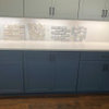
In the photo below are two of the subway tiles I have and one from home deport of a white white.

What should I do? Keep what I purchased or switch to something I can easily get at home deport. The actual tile wasn't expensive so I'd rather change now then regret it after labour costs.

My husband likes it as he thinks the creaminess blends with the counter. The wall next to the tiles is the side of the cabinet for the fridge and will Math the doors

Comments (67)

  • hummingalong2
    6 years ago
    Can you mount a larger sample of tile to poster board or foam core using clear tape, I think if you could see more than a few pieces up there, it may help you make a better decision.
  • Melissa Gallagher
    6 years ago
    So Flo, you're say this doesn't look right...?

    I think it all depends on what kind of a statement she wants to make...
    I personally think the creamier tiles with the matching creamy grout is just blah. And I think when she gets it all up then she will be coming back on here to ask how to fix it because it doesn't look good with her white cabinets...

    With that being said...only she knows how the natural light in the room AND her artificial lighting (and btw do you have under cabinet lighting?) affects the tone of her white cabinets no matter what brand it is. But putting a contrasting grout with the subway tile and using that granite I think looks more than totally ok.
  • Melissa Gallagher
    6 years ago
    Good idea, humming...
    And take a picture for us, please!

    This is a situation where it could either flop or end up looking really good...
  • K G
    Original Author
    6 years ago
    We don't have under cabinet lighting - the kitchen is well light though with 6 pot lights and there is a pot light about the sink.

    I might get under cabinet lighting added eventually - but didn't think to do it when the electrician was here and we had a lot of other stuff added.

    The lighting in the evening cast a warm glow, so the cabinets will likely look creamer. I haven't looked at the tile in the evening. I will try. I'm certain bright light it does look whiter which I like.

    I'll try a bigger sample. Good idea

    When I picked the tile I had samples on the island but the cabinets weren't painted so it was just one door I had. I felt this went well with the granite which I think everyone agrees.

    As for the groute, definitely found the best match and also the cream is a mare finish so it's not shinny. It's called 'buff mate' by
  • K G
    Original Author
    6 years ago
    My goal was a warm white kitchen - more classic than the contemporary ones with colder greys and stark white. The house is a 40 year old red brick home.
  • Melissa R
    6 years ago

    If possible I'd remove that 4" back splash that is already there

  • K G
    Original Author
    6 years ago
    Out of all Melissa's photos this is my favourite
  • Melissa Gallagher
    6 years ago
    Then how about straying with the cream, matte tile, but a darker shade of grout to compliment the granite....I think that could look more traditional
  • Melissa Gallagher
    6 years ago
    Then how about a glazed tile rather than matte?

    I feel like the matte surface seems suited to a bathroom....

    Since your home is older and has some character,I think a glazed tile would be really nice. Then pick the grout to match...

    Go to the Fireclay website and read up on it.

    They have different variations of color, crazing, sheen, etc....prepare to drool.

    Also you can get samples!
  • Melissa Gallagher
    6 years ago
    Check out tusk, gardenia, ultra cream and feldspar.

    Also I really love these tiles in Emily Henderson's kitchen
  • Porter Edun
    6 years ago

    Melissa, I'm not Flo yet saw your question. No, the darker grout with the off white tile doesn't work in this kitchen. Her kitchen is more transitional/traditional. Keeping it simple and cohesive is the best choice. Her granite is beautiful and should be the star of the kitchen, not the backsplash with a eye bending grout in a darker tone. Adding a darker grout to the off white tile would not work for a number of reasons.

    A more classic look and the best option is to tie the tile and grout as close as possible. The granite as I said should be the stand out... not causing a lot going on with a different color grout.


  • Melissa Gallagher
    6 years ago
    I'm not talking a deep grout color....

    To me, this isn't "eye bending"...
  • Porter Edun
    6 years ago

    Ok, respect your opinion Melissa.

    To me, it's completely the wrong direction for the kitchen to have contrasting grout I won't say it again. It should match the tile. That's my opinion.

    What you show above with a cool countertop and cool backsplash is a horse of another color and may be in a large kitchen that as people like to say, "farm style" and I do like that with the grays and whites in THAT kitchen, it's not at all the same as this kitchen. The grout in the lighter kitchen is also way too dark for this kitchen. That's my opinion and I'm sticking to it :)

    Good night....

    We should not take this away from the OP. It's not a contest. If you want to voice your opinion using your own design ideas why this kitchen should have a bit darker grout than please do so stating it in a way that you would design this kitchen backsplash with a bit darker grout and why it works and why it is best in this room taking in the floors, counters what you see in the photos, knowing the undertones of the cabinets....... That's all...... that would be great.


  • Porter Edun
    6 years ago

    then, not than :)

    again, good night and sorry OP... I think you are on the right track!

  • Melissa Gallagher
    6 years ago
    I thought I did that, and in no way was I trying to win some "contest".....

    I'm sorry if you took it the wrong way...

    The only thing that matters is what THEY like; agreed.

    I'm just simply suggesting other choices. .....that's all.
  • K G
    Original Author
    6 years ago
    @hummingalong2 I'm going to keep the granite part of the backsplash - I actually like it and with its removal I worry about damaging the granite. Most suggestions have been to remove but I had two designers walk through for some help at the beginning and both suggested keeping it as it our areas it is coming back in. Regardless of the style though I personally don't mind it so figured might as well save the removal cost
  • K G
    Original Author
    6 years ago
    @Melissa And Porter thanks so much for the opinions! I honestly really prefer seeing the two sides and also hearing your strong feelings. It helps me figure out what works for the overall look of the house.

    Melissa the pictures you post of cream back splashes I like a lot, including the one you posted with the more shinny tile.

    I agree with Porter that the overall contrasting white subway tile doesn't flow with the rest of the house. I actually that look and suggested it for my Sister in laws more modern updated home.

    The house style is transitional - so once learned from this board.
  • K G
    Original Author
    6 years ago
    Melissa - will check out the website you suggested.

    House renos are already about 4 weeks over do... so what's another two weeks for a backsplash.

    Cabinet doors go up Monday so I can see the current tile with the whole picture.


    The mate wasn't really
    A preference just all that I could find in an off white that seemed to work with my sample and counter.

    Husband is definitely tired of hearing my dilemma so this board helps a tone
  • PRO
    Flo Mangan
    6 years ago
    There is a tile tone called "bone". It is lighter than the cream and might help you with your dilemma. If you go shopping i would pick up a couple and try it. The danger is it might look like you tried to match cabinets and missed. A plain cream tile IMO with matching grout will give you the best overall look. Speaking from loads of experience helping people make these decisions and helping folks fix the
    double busy look. Busy granite busy backsplash with darker grout. If your countertops had less color and movement a nice mocha grout woukd
  • PRO
    Flo Mangan
    6 years ago
    Would work. You have busy granite so quiet backsplash.
  • K G
    Original Author
    6 years ago
    Flo - I will check out bone. Your right about trying to match and missing - that's my bigger fear. J want it to look intentional and not that I should have had a designer helped or that I did it all myself (in the bad way).

    I'm going to get the bigger board tomorrow and will post pictures. Hoping everyone can come back and give comments then. Also will take some morning photos which is when the east facing kitchen gets the most light.

    Had a friend over tonight and she prefers the white white. but I think that's because it matches the cabinets and we normal people forget to look st the whole vision with the granite.
  • PRO
    Flo Mangan
    6 years ago

    Yep, keep the total look in mind. A trick we use to help do this is to stand back as far as you can and take a photo. Look at it, and you will be amazed at what you see. the camera doesn't focus on one element! Humans do. Try that once you get the bone sample. They are a bit harder to find, so you might have to go to a real tile shop, not a Lowe's or Home Depot.

  • K G
    Original Author
    6 years ago
    Here's some photos from this morning of the larger board I made...

    excuse the kitchen mess (trying to feed my son breakfast at the same time.. plus deal with an unfinished kitchen)
  • K G
    Original Author
    6 years ago
    Photo from the further point in the kitchen as flo suggested
  • K G
    Original Author
    6 years ago
    Later today I'll go lowe's, Home Depot, and Rona (I'm in Canada) tomorrow I'll try the real tile store again - they are closed on Sundays and Saturday afternoons so couldn't make it yesterday.
  • K G
    Original Author
    6 years ago
    Further
  • Porter Edun
    6 years ago

    Kate, looks perfect to me! The one from way back is on the black surface of the stove.

    You might want to place it on the right maybe by the fridge and shoot it from back a ways is all. I don't think you could have selected a better just off of white shade!

  • K G
    Original Author
    6 years ago
    porter moved the board over

    The sun is now shinny and I think it works

    Oh and will probably change the little rug - needed something and it was on sale at Costco, but the colour is a bit too grey. Might move it to my entry. Want an actual runner
  • Marie
    6 years ago
    Kate, after seeing previous pictures & bigger board, I'd absolutely keep what you already have - the creamier subway tiles. Your white is a soft/warm white and looks beautiful with the creamy hues in the granite & tiles. Other pros...your work can continue without more delay and you won't have the expense of the additional tiles.

    Good luck! And post pictures of your beautiful finish! (I've been working on our family (my parents' estate) home flood rebuild this past year...a 62-yr old red brick home...enjoy working on yours, it's beautiful.)
  • K G
    Original Author
    6 years ago
    Thanks so much Marie.

    I'm glad to get confirmation it works. I didn't want to be posting after it was installed asking for suggestions to fix it.

    The Reno process has been such a learning experience but also great. So far I am really happy with all the decisions - and how things have come together. It is totally worth the time.

    Hoping for no more delays but keep reminding myself when it's all done and this is our forever home what does a few weeks even matter
  • K G
    Original Author
    6 years ago
    Marie - also so sorry to hear about the flood, but I hope the rebuilding process goes smoothly and you end up with something that is just as special as the original, if not more. The number of natural disasters this year has been horrible. We had a small basement flood but nothing compared to others.

    Good luck!!
  • PRO
    Randy Trainor
    6 years ago

    The cream subway tiles look really lovely with your countertops.

    Contemporary Kitchen & Bath · More Info

  • K G
    Original Author
    6 years ago
    Hi all - ended up finding a slightly off white shinny subway tile.

    I know everyone liked the cream but it just wasn't right for me -and I kept looking at it and feeling like I'd probably not be 100 percent happy. Maybe it was the mate finished? Who knows! Hubby liked it. In person vs camera it kept looking too beige or dirty grey to me.

    SO Thought I'd post a progress photo. I'm So happy with the change - maybe a little 'whiter' than is best for the granite based on the pros suggestions. but I like how it flows with the cabinets. The lighting in the room casts a nice shadow and in person the tiles look a warm almost off white - which is exactly what I was going for. Not really captured in the photo well - this room lighting really pulls things as white.

    Someone suggested watching the tiles theought the day and that made a huge difference in my decision. Morning light worked but as soon as noon hit the more cream turned a dirty beige colour under the shadow of the cabinets.

    Going to do a matching groute

    NOW another dilemma- the knobs? Should I go to a brushed nickel? I choose the aged iron as it matches the light fixtures through the house, but I'm wondering if it isn't 'pretty enough'. Door knobs including closets are all brushed nickle. Light fixtures are the aged iron.
  • Melissa Gallagher
    6 years ago
    I never liked the cream and thought it was not a good match....so glad you found another, better option...

    It looks really good! I think you could go either way with the hardware...
  • K G
    Original Author
    6 years ago
    Thanks Melissa, I think I'll live with this hardware for a little while and see. I can always pretty easily swap it out. I haven't decided on what I want to do for my pops of colour or accessories so maybe that will help.

    Glad you think the hardware works. I go back and forth in my inspiration photos between the silver (mainly brushed nickel) or black/age iron handles. Still Not sure what I love best
  • Melissa Gallagher
    6 years ago
    I like the iron.....

    Are you keeping the can lights over the island?
  • K G
    Original Author
    6 years ago
    Melissa Gallagher - yes, because we will have a hanging light over a round kitchen table and it is very close so would feel too cluttered.

    That's at least my thought right now - they can change as that's how I had the electrician install them.

    Going with an aged iron lantern - the visual comfort one (everyone seems to use it).

    The kitchen isn't huge so don't want too much clutter for the eyes.

    Thoughts?
  • Melissa Gallagher
    6 years ago
    ...you'll know when you put the table light up.....and it's not a huge island so I think it makes sense
  • PRO
    Flo Mangan
    6 years ago

    Glad you are happy and as to the hardware, the dark makes things more "contrasting" and leaning country and the "brushed nickel" look will look more modern. You can choose, its a personal choice. You are near the finish line! Good job. Sometimes you just have to go with your gut!

  • Melissa Gallagher
    6 years ago
    You could put a pendant light over your sink, rather than island....just a thought...
  • simstress
    6 years ago
    I like the black knobs/pulls. Can you change out the hardware to black on both sets of windows?
  • K G
    Original Author
    6 years ago
    Hmm that's a thought but Don't think we can change the knobs on the window - they are fancy European windows the last home owners put in and the visible hinges are also the brushed nickel.
  • K G
    Original Author
    6 years ago
    Flo - originally I felt the house needed a tinny bit country vibe but after all the renos I'm now thinking it can handle the glam... not so sure which I prefer now!

    Glad either choice works. I think for my husbands sanity I will leave the dark knobs for a few weeks.

    It's funny how the design of the house has sorta evolved over time from slightly more country and traditional to a bit more modern with a slightly fancier vibe.
  • K G
    Original Author
    6 years ago
    Melissa - that's an option I hadn't thought of. Might look to see if any I like - once the kitchen table light is up I'll have a better idea. Just waiting for the table to arrive - which is schedule for Monday
  • Marie
    6 years ago
    Looks good, Kate. I like the aged iron hardware. With your stainless w/ black appliances, the dark hardware works beautifully. We actually reinstalled the black iron & copper hardware that was original to the house my dad built in 1954-55. I love it.
  • K G
    Original Author
    6 years ago
    Marie - wow amazing. Love when you have the original. So much character.
  • K G
    Original Author
    6 years ago
    Here is my light for able the kitchen table - which is white and round. I think the light might be the size smaller (I have it and the proportions are right, but might have screen shot the wrong one). Regardless this is what it will look like.

    Any suggestions for an above the sink light or above island pendants?
  • Porter Edun
    6 years ago

    What is the diameter of your table Kate?... Wonderful choice with the Darlana lantern for the dining table. Just make sure you get the proper size....

    Provide the diameter of the table... unless it's a small table the 17" may work out well. Better to have it a tad large (tad) than too small especially as it's a open light so not obstructive as it's fairly spare in style.

    Do you need a light over the sink or want a light? A sconce would look nice, yet your windows could most likely obstruct the light as they open inward so be careful of that.

    This is the medium (in the silver albeit) with a table that comfortably seats 4.

  • K G
    Original Author
    6 years ago
    Porter - oh yes, I totally forgot the pot light over the sink was a specific decision since the windows open outwards.

    I really like those lights in your photo though although in the aged iron I feel like they might be too heavy for the kitchen?

    Here's a photo! Final cardboard is gone.

    I will check the dimensions of both the light and table. Is there a rule of thumb in terms of proportions. I would say our round is on the smaller sizzle. 42inches I believe.
  • Porter Edun
    6 years ago

    The diameter should be one half to two thirds the width of the table, and no greater than 12” narrower than the width of the table. Sounds as though the 17" would be a good fit. Would not look like it's too small. Just be certain you have the ceiling height to handle the height of the chandelier.

    You would hang it 32 to 36" from the table top to the bottom of the chandelier. It would look similar to the photo above with the round table... rather have a light a pinch larger than a tad too small. If you are able, but it on a dimmer switch!

    Medium Darlana Option Fixture: Width 17", Height 24.5", Depth 17"