


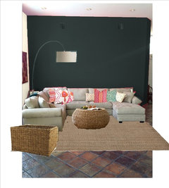
The drama continues....6 days later
kingslane
10 years ago


Featured Answer
Comments (243)

Carolina
10 years agoCarolina
10 years agoRelated Professionals
Appleton Interior Designers & Decorators · Wanaque Interior Designers & Decorators · Saint Louis Park Architects & Building Designers · Montebello Kitchen & Bathroom Designers · St. Louis Furniture & Accessories · North Hollywood Furniture & Accessories · Bartlesville General Contractors · Bel Air General Contractors · Browns Mills General Contractors · DeKalb General Contractors · Las Cruces General Contractors · Manalapan General Contractors · Mount Vernon General Contractors · Niles General Contractors · San Elizario General ContractorsCarolina
10 years ago
mefor
10 years agomefor
10 years agoCarolina
10 years ago
Victoria
10 years agoCarolina
10 years agoCarolina
10 years agomefor
10 years agomefor
10 years agoCarolina
10 years ago
Ann
10 years agoCarolina
10 years agoAnn
10 years agoCarolina
10 years agoAnn
10 years agoCarolina
10 years agoCarolina
10 years agoAnn
10 years agomefor
10 years agoCarolina
10 years agomefor
10 years ago
linlac
10 years agoCarolina
10 years agoVictoria
10 years agoVictoria
10 years agolast modified: 10 years agomefor
10 years agoCarolina
10 years agoCarolina
10 years ago
rinked
10 years agolast modified: 10 years agoVictoria
10 years agolast modified: 10 years agomefor
10 years agoAnn
10 years agoVictoria
10 years agomefor
10 years agoAnn
10 years ago
Nancy Walton
10 years agolast modified: 10 years ago PRO
PROElisa Contemporary Art
10 years agoVictoria
10 years agomefor
10 years agoVictoria
10 years agomefor
10 years agoCarolina
10 years agoVictoria
10 years agoCarolina
10 years ago PRO
PROAmy Wax
10 years agoVictoria
10 years agomefor
10 years agoNancy Walton
9 years ago


Related Stories

FLOORSDrama’s Afoot With Striking Black Floors
Be bold. Be brave. Drench your floors in black for a memorable interior scene
Full Story
GARDENING GUIDESTop 12 Summer-Blooming Perennials for Deer-Resistant Drama
Can you have garden color, fragrance and exciting foliage with hungry deer afoot? These beauties say yes
Full Story
LANDSCAPE DESIGNFor Garden Drama, Consider the Lowly Boulder
A boulder can be a thing of beauty in the landscape. Here are 10 ways to display them to full effect
Full Story
CONTEMPORARY HOMESHouzz Tour: Later in Life, a Bold New Design Adventure
A Washington, D.C., couple in their 70s embark on a new marriage and an innovative renovation of a historic row house
Full Story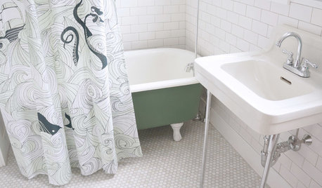
BATHROOM MAKEOVERSRoom of the Day: See the Bathroom That Helped a House Sell in a Day
Sophisticated but sensitive bathroom upgrades help a century-old house move fast on the market
Full Story
FEEL-GOOD HOMEThe Pros and Cons of Making Your Bed Every Day
Houzz readers around the world share their preferences, while sleep and housekeeping experts weigh in with advice
Full Story
LIFE6 Ways to Beat the Winter Blahs
Snow and dark days dampening your spirits? These ideas will have you looking on the bright side
Full Story
LIVING ROOMSRoom of the Day: Curiosities Bring Quick Intrigue to a Living Room
From blank box to captivating, exotic concoction, this room goes for the wow factor — and the whole house took just 4 days
Full Story
LIFEThe Moving-Day Survival Kit: Lifesaving Items and Niceties
Gather these must-haves in advance for a smooth move and more comfortable first days in your new home
Full Story
DECORATING GUIDESMission Possible: A Designer Decorates a Blank Apartment in 4 Days
Four days and $10,000 take an apartment from bare to all-there. Get the designer's daily play-by-play
Full StoryMore Discussions


Carolina