


saturated vs muted - how to tell the difference in a dark color
C DeV
4 years ago
Featured Answer
Sort by:Oldest
Comments (9)
 PRO
PROLori A. Sawaya
4 years ago- PRO
Lori A. Sawaya
4 years agolast modified: 4 years ago Related Professionals
Bend Painters · Huntington Painters · East Moline Cabinets & Cabinetry · Whitney Cabinets & Cabinetry · Franklin Flooring Contractors · Turlock Flooring Contractors · Englewood Flooring Contractors · Wakefield Furniture & Accessories · Sacramento Window Treatments · Walnut Creek Window Treatments · West Des Moines Window Treatments · Suisun City Interior Designers & Decorators · Aurora General Contractors · Channelview General Contractors · Fort Lee General Contractors
J Williams
4 years agolast modified: 4 years ago
C DeV
4 years ago- PRO
Lori A. Sawaya
4 years ago - PRO
Lori A. Sawaya
4 years ago C DeV
4 years ago- PRO
Lori A. Sawaya
4 years ago
Related Stories
ARCHITECTUREDesign Workshop: Materials That Tell a Story
See how wood, concrete and stone convey ideas about history, personal taste and much more
Full Story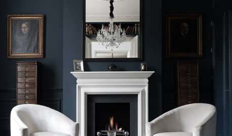
DECORATING GUIDESSo Your Style Is: Darkly Romantic
Envelop yourself in mysterious luxury with deep colors, rich textures and unexpected details
Full Story
FUN HOUZZSomething a Little Different: Fairy Houses
Miniature abodes crafted for otherworldly creatures capture the imagination
Full Story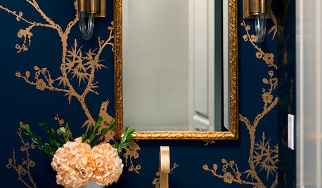
BATHROOM COLORPowder Room Palettes: 10 Handsome Dark Blues
See how paint, tile and wallpaper in shades of dark blue bolster these powder rooms
Full Story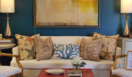
BLUESaturated Color: Peacock Blues
Call it Teal or Aquamarine, Either Way This Color is a Hit
Full Story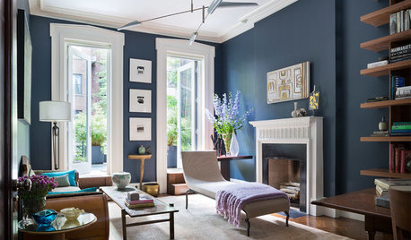
DECORATING GUIDESDesigner Picks: 9 Beautiful Saturated Blue Paints
Bold cobalt, inky indigo and moody midnight are just a few of the hues that can set a dramatic tone
Full StoryDECORATING GUIDESStaging vs. Decorating: What's the Difference?
Unlike decorating, staging your home isn't about personal style — it's about creating ambiance and appeal for buyers
Full Story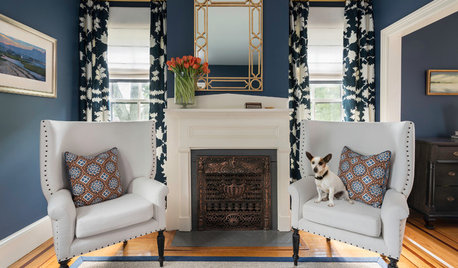
COLOR9 Dark Wall Colors to Suit Your Mood
Tired of light and airy? Try dark and moody for a change; you may be surprised by the moods these colors inspire
Full Story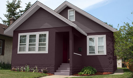
EXTERIOR COLORChoosing Color: 1 Home Has Fun With 5 Different Color Schemes
See a home’s potential for transformation with several new hues. Do you have a favorite?
Full Story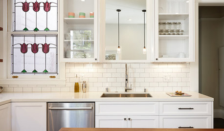
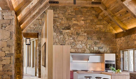
KITCHEN DESIGNKitchen of the Week: A Dark Kitchen Brightens Up
A cooking space honors the past while embracing the present
Full Story


Lori A. Sawaya