


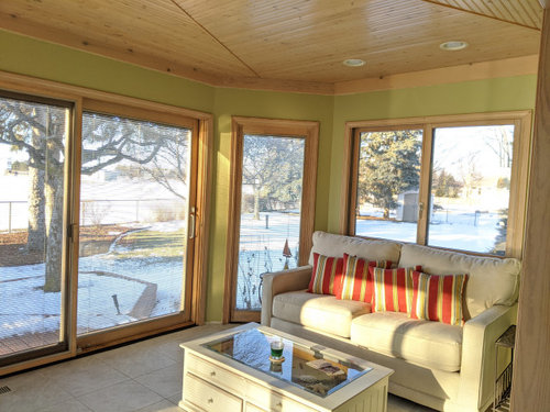
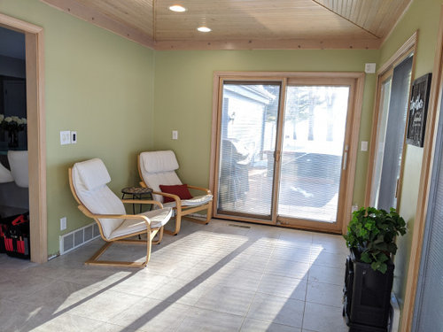
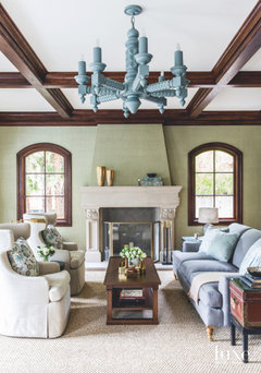
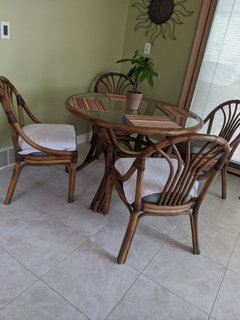
Paint color? Is it tooo green?? I need HELP I may repaint it.
sarahj512
4 years ago
Featured Answer
Sort by:Oldest
Comments (75)

eidsnessgirl
4 years agoUser
4 years agolast modified: 4 years agoRelated Professionals
Stamford Furniture & Accessories · Temple Terrace Furniture & Accessories · Tamalpais-Homestead Valley Furniture & Accessories · Sun Lakes Window Treatments · Boise Interior Designers & Decorators · Enterprise Architects & Building Designers · Four Corners Kitchen & Bathroom Designers · Lenexa Kitchen & Bathroom Designers · Montrose Kitchen & Bathroom Designers · Lake Zurich Furniture & Accessories · Chatsworth General Contractors · Millville General Contractors · Montclair General Contractors · Mountain View General Contractors · Troutdale General ContractorsUser
4 years agotuckerandscooby
4 years agoCindy Miller
4 years agomdcathy
4 years ago
Jilly
4 years agolast modified: 4 years agoGret Freese
4 years agopauletteg
4 years ago
Nancy Nesbitt
4 years agopegnear
4 years agoGram 1954
4 years ago
katinparadise
4 years agolovemattersmost
4 years agochartre
4 years agolast modified: 4 years agochartre
4 years agoSarah W
4 years agoSarah W
4 years ago
caffemocha
4 years ago
Sarah Jeffrey
4 years ago
Lizzy L.
4 years agoSarah Jeffrey
4 years agoSarah Jeffrey
4 years agoJilly
4 years ago
Renee Ainsworth
4 years ago- PRO
Gevork Mosesi Photography
4 years ago Sarah Jeffrey
4 years agoNick Platt
4 years ago PRO
PROBeverlyFLADeziner
4 years agotterri
4 years ago
sarahj512
4 years agosarahj512
4 years agonantarasi
4 years agodoods
4 years agolast modified: 4 years agodoods
4 years agolast modified: 4 years ago
Laurie Peterson
4 years agoequinekdc
4 years agokatrina_ellen
4 years agodianabythelocks
4 years agoSarah Jeffrey
4 years agokatinparadise
4 years agoSarah Jeffrey
4 years ago


Related Stories

ENTRYWAYSHelp! What Color Should I Paint My Front Door?
We come to the rescue of three Houzzers, offering color palette options for the front door, trim and siding
Full Story
EXTERIORSHelp! What Color Should I Paint My House Exterior?
Real homeowners get real help in choosing paint palettes. Bonus: 3 tips for everyone on picking exterior colors
Full Story
PAINTINGHelp! I Spilled Paint on My Clothes — Now What?
If you’ve spattered paint on your favorite jeans, here’s what to do next
Full Story
FUN HOUZZEverything I Need to Know About Decorating I Learned from Downton Abbey
Mind your manors with these 10 decorating tips from the PBS series, returning on January 5
Full Story

DECORATING GUIDESPaint Color Ideas: 8 Uplifting Ways With Yellow and Green
Dial up the cheer with yellow and green paint combinations sure to cast off winter doldrums
Full Story
COLORYou Voted. She Painted. This Pro’s Entry Is Now Leafy Green
A designer recently invited Houzz users to choose the new color for her home’s entry. See how the new paint looks
Full Story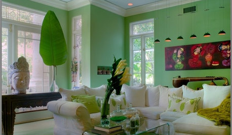
DECORATING GUIDESHow To Pick the Right Green Paint
Use Nature's Neutral to Energize, Soothe, and Surprise the Eye
Full Story
COLORPick-a-Paint Help: How to Quit Procrastinating on Color Choice
If you're up to your ears in paint chips but no further to pinning down a hue, our new 3-part series is for you
Full Story
FRONT DOOR COLORSFront and Center Color: When to Paint Your Door Green
Fresh, fun and a pleasant surprise on a front door, green in subtle to strong shades brings energy to home exteriors
Full StoryMore Discussions


roarah