


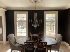
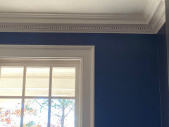
Update with pics - Bucktrout Brown walls - cornice appearing darker
Alicia Gordon
3 years ago
last modified: 3 years ago
Featured Answer
Comments (20)

Alicia Gordon
3 years agoRelated Professionals
Cape Coral Painters · Helena Painters · Monterey Park Painters · Lockport Cabinets & Cabinetry · Laguna Niguel Flooring Contractors · Lincolnia Flooring Contractors · Wixom Flooring Contractors · Hilton Head Island Furniture & Accessories · Ferndale Window Treatments · Stanford Interior Designers & Decorators · Troutdale Architects & Building Designers · Buffalo Kitchen & Bathroom Designers · Long Beach Furniture & Accessories · Temple Terrace Furniture & Accessories · North Smithfield General ContractorsAlicia Gordon
3 years ago
Marylee H
3 years agoAlicia Gordon
3 years agolast modified: 3 years agoAlicia Gordon
3 years agoAlicia Gordon
3 years agoMarylee H
3 years agoMarylee H
3 years agojjam
3 years agoAlicia Gordon
3 years agoAlicia Gordon
3 years agoMarylee H
3 years ago
Jilly
3 years agocat_ky
3 years agojjam
3 years ago

Related Stories
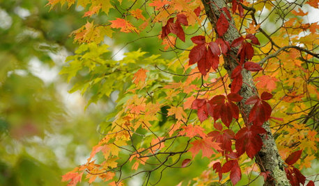
COLORFall on the Wall: Decorating With Rich Reds, Browns and Oranges
For your interiors, take a cue from nature’s colorful seasonal offerings
Full Story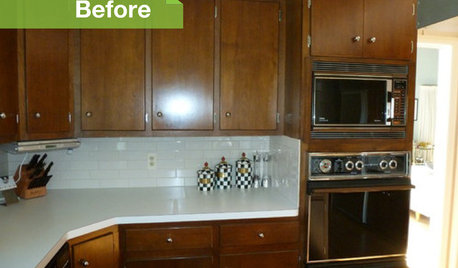
KITCHEN DESIGN3 Dark Kitchens, 6 Affordable Updates
Color advice: Three Houzzers get budget-friendly ideas to spruce up their kitchens with new paint, backsplashes and countertops
Full Story
COLOR12 Tried-and-True Paint Colors for Your Walls
Discover one pro designer's time-tested favorite paint colors for kitchens, baths, bedrooms and more
Full Story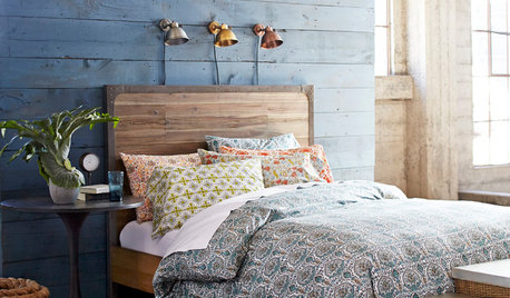
BEDROOMSHouzz Quiz: What Color Should You Paint Your Bedroom Walls?
Cool and soothing, or warm and spicy? Answer these questions and learn what hue is right for you
Full Story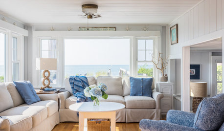
WHITEWhat to Know Before You Paint Your Walls White
A coat of white paint can do wonders in one room and wreak havoc in another. Here are tips for using the popular hue
Full Story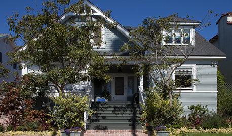
HOUZZ TOURSHouzz Tour: A 1905 Cottage Gets a Major Family Update
Historic Boston meets outdoors Oregon in this expanded California home
Full Story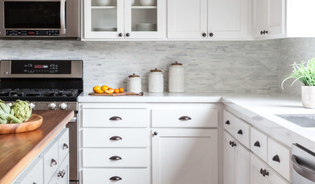
KITCHEN CABINETSHow to Update Your Kitchen Cabinets With Paint
A pro gives advice on when and how to paint your cabinets. Get the step-by-step
Full Story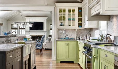
KITCHEN DESIGN11 Ways to Update Your Kitchen Without a Sledgehammer
Give your kitchen a new look by making small improvements that have big impact
Full StoryDECORATING GUIDESThe Case for the Anti-Accent Wall
Go ahead, paint everything the same color (even the trim)
Full Story
DECORATING GUIDES10 Ways to Update a Victorian Living Room
Bring your period living room sensitively into the 21st century with these simple yet effective design tricks
Full StoryMore Discussions


Marylee H