


_cancan_
12 years ago
Sort by:Oldest
Comments (3)
Related Stories
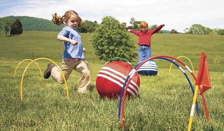
PRODUCT PICKSGuest Picks: Outdoor Summer Fun for the Kids
Set out these tents, swings and other playtime goodies and watch the kids flock outside
Full Story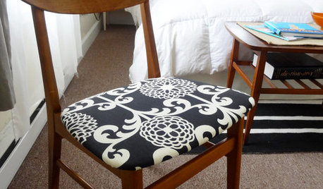
DIY PROJECTS29 Home Projects to Make You a DIY Superstar
Patch up holes, turn trash to treasure, erase stains ... these doable DIY projects will better your home and boost your ego
Full Story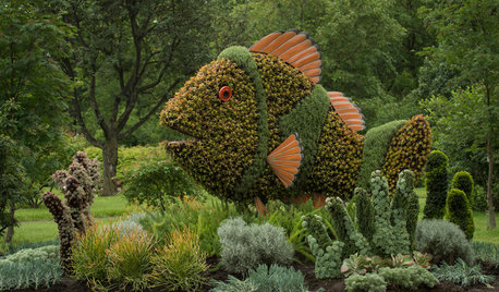
INSPIRING GARDENSLiving Sculptures Delight at the Montreal Botanical Garden
Go see it: clownfish, lemurs, frogs, loyal dogs and more — designers have turned plants into art for a fantastic summer installation
Full Story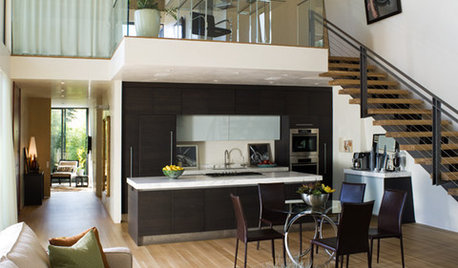
HOW TO PHOTOGRAPH YOUR HOUSEMeet 4 Basic Types of Home Photographers
Capture the details of your home's architecture or a fleeting moment — just don't expect both from the same photographer
Full Story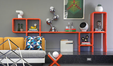
HOUZZ TOURSMy Houzz: Retro-Cool Playfulness Fits a Dallas Family
Vintage furniture and shots of bright color throughout a midcentury home in Texas suit a design-minded couple and their 3 kids
Full Story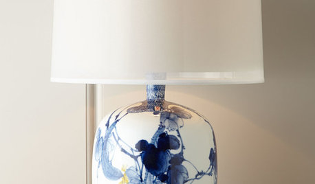
PRODUCT PICKSGuest Picks: Shining Examples of Chinoiserie Lighting
Make any room a bright spot with glam Asian-inspired lamps, pendants and chandeliers
Full Story
PRODUCT PICKSGuest Picks: Whip Up Kitchen Cheer With Aqua and Red
Cool blue and hot red accessories are foolproof ingredients of a jaunty kitchen with a hint of vintage
Full Story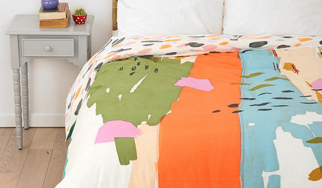
PRODUCT PICKSGuest Picks: Beautiful Bedroom Pieces That'll Grow With Your Girl
Leave tiaras and wands to the dress-up bin. These versatile girls' bedroom pieces will magically transition as she ages
Full Story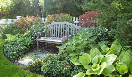
GARDENING AND LANDSCAPINGLandscape Design: A Secret Garden
Create a sense of discovery in your garden with an unexpected clearing, a shady arbor or a secluded nook
Full Story
More Discussions


bepsf
Emily Ruddo
Mona Ives