Software
Houzz Logo Print
webuser_910407769

Exterior colour critique — Louisburg Green + Red Earth trim?

15 days ago
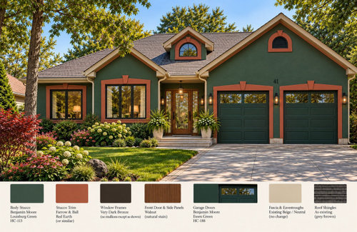
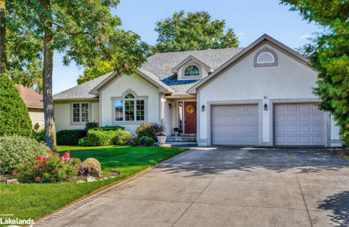
I’m repainting my 1990s bungalow and would love some honest exterior design feedback.

I’m keeping the existing architecture and roof but considering:

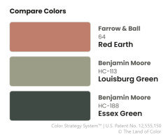
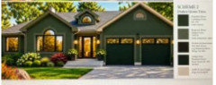
• Benjamin Moore Louisburg Green HC-113 stucco
• Farrow & Ball Red Earth (or similar) for the architectural stucco trim
• very dark bronze window frames
• walnut front door and sidelights
• Essex Green garage doors
• existing beige fascia and eavestroughs

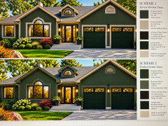
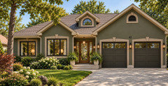
The second photo is a rendering of the proposed scheme.

The beige eavestroughs and fascia are staying - I’m not able to change that.

Does the Red Earth trim work with the Louisburg Green? Is it too busy? I’m looking for honest criticism!

Comments (26)

  • PRO
    15 days ago

    Although I understand your desire to go bolder in your color scheme than what you have now, I think the red and green is a bit too bold. I do like the dark green, but the contrast with the red is a bit much. Perhaps instead of red, you might consider a slightly lighter green? or the beige?

    H Speak thanked Diana Bier Interiors, LLC
  • 15 days ago

    I love it!

    H Speak thanked Rho Dodendron
  • 15 days ago

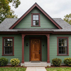
    Two additional options: beige trim or green trim. The render did not work perfectly for the fascia but it gives the ideas suggested above

  • 15 days ago

    Now the red does what I want it to- a nice focus on the front door.

  • PRO
    15 days ago
    last modified: 15 days ago

    You and all the brilliant folks on this forum probably already know this, mentioning it for others who might find their way here.

    All digital color is an attempt to mimic color appearance in real life.

    Except for AI, LLMs. They don't make that effort.

    They all work the same way, they conjure paint colors probabilistically. Which is why the AI version of paint colors aren't consistently the same; they aren't tethered to reality. Also why the paint color names and numbers they assign are often wrong.

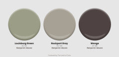
    That leaves using AI renders as inspiration and ideation. Which isn't a bad idea as long as you know what you're getting into. Again, everyone likely is aware that translating however the device in use is displaying those colors to in real life paint colors is never a direct path and not easy. For example, this is Louisburg Green HC-113. HC-105 is Rockport Gray.

    And Wenge is one of my favortie BenM colors of all time - it shows up definitively plum purple in a lot of contexts.


    These digital swatches are generated using our data. We only measure new color collateral provided by paint brands. There is no such thing as an official or correct HEX code, but this is as close as it gets.

    H Speak thanked Lori A. Sawaya
  • 15 days ago

    I really like Wenge and I was experimenting with Eggplant earlier. I also tweaked my colour choice around the front door. The stucco trim is so wide which was a challenge when it came to the door! So I will work up a new render using the Rockport Gray and Wenge as accents and post it later. I noticed that if I went too dark with the stucco trim colour it made the eavestroughs look pinkish. I think using Rockport will solve that problem. Also, I agree 100% the digital renders are fraught with inacceracy!! However we are using the renders in conjuction with real world sample paint pots. And one thing we have learned: it was too expensive to replace the eavestroughs and soffit and fascia! The cottage where I grew up had white base with green trim! Very English I feel!? Back then the eavestroughs were aluminum and could be painted. So I’m underlining that in our case we were basing our colour scheme on the historic colour of the eavestroughs, which seemed ludicrous, but that just seems to be the world we live in. As a silver lining, I guess: the window and door trim material/technology is great; those elements can be a wide range of colours so we gained a lot of flexibility there.

  • 15 days ago

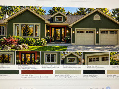
    The AI image is nothing like what you would get if you used that color scheme. AI

    * Got the colors wrong, the real colors are different

    *Made your trim much thicker than it is in real life, not to mention adding the keystones and removing the arch.

    * It change the proportions of your garage

    *It changed the color of your roof.

    * It made all the windows bigger and black.

    * It made your door bigger

    * It added flowers and landscaping

    * It added sparkle and glow.


    Expecting the AI image to represent what you will get if you paint your house the listed colors is a recipe for disappointment.


    I find the colors clash a bit much. It's okay in the glowy AI version, but I suspect in real life, on a house with the proportions and trim of yours it would be garish.

  • 15 days ago

    agree 100%. I use AI just to get the direction. Then I test in real life with sample paint pots. A bit frustrating. But it does move me forward. For example I can test an idea such as a monochromatic approach with the trim and also going lighter on the trim vs going way darker on the trim. So for example I can show something to my partner and we can discard idea, narrow down etc. and even computers do not render accurately. Period.

  • 15 days ago

    It was instructive also to approximate how certain colours conflicted with the eavestroughs.

  • 15 days ago

    Agree with Sigrid’s comment … ”garish” , but it would look sort of ”Christmas” .

  • PRO
    14 days ago
    last modified: 14 days ago

    I think your plan would be one of those things you look at down the road and say what was I thinking. Way too Christmas Village for tht style of house .I think the creamy beige trim will give you a timeless look and still a huge change .

  • 13 days ago
    last modified: 13 days ago

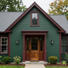
    I really like the direction you are going in. I did not edit your house photo, but I created a few AI visuals.


    In the images I created (until I specified “dark Louisburg Green”), the green color that AI used is showing substantially lighter than what is shown in your AI visual. And even when I specified “dark” it is still not as dark as the green that you show. Also, while I love red, I think that your F&B trim color is a bit too red (unless it is just showing that way in your visual and not in real life). I used Farrow & Ball’s ‘Deep Reddish Brown’; that is the color I would recommend for the trim.


    So here are just a couple of visuals with the general idea.


  • 13 days ago

    I agree that it’s a bit too much and gives it a garish look to your home. I do love the idea of using the green for the body of home I just wouldn’t add the red to your style of home - at least not that bold of red.

    Add your red in flowers and foliage in the landscaping.

  • 13 days ago

    This one really “clicks”! Excellent idea to bring the red into the landscape!!

  • 13 days ago

    I love the Deep Reddish Brown!! The colours are fun and a bit unexpected and they fit so well. I am constrained by the beige eavestroughs, fascia and soffits. So I will probably need to choose a lighter stucco trim/ accent colour.

  • 13 days ago

    I would do my best to match the trim with the eavestroughs, fascia and soffits. Have the color matched by the paint store.

  • PRO
    13 days ago
    last modified: 13 days ago

    I like the second one you posted previously, @H Speak, with the green trim. Then paint the front door red, and add some red to the landscape. A red Japanese maple would be beautiful.


  • 13 days ago

    It is Scheme 2, September 30th. The stucco trim in the same colour family is understated and looks sophisticated! It makes it less busy and coordinates with the fascia etc. I love the red door idea. For the window trim (not the stucco trim) I can choose from a lot of different colours. So I will likely start experimenting with a deep, almost black-brown/bronze

  • 13 days ago

    Pretty home! your roof looks pretty grey? i feel like the ai pics warmed it up considerably

  • 13 days ago

    The red Japanese maple is a very nice idea. There is also a beech tree that was very popular when I worked in nurseries. Loosely referred to as tricolour. I’ll post some pictures soon. I think you’ll find it interesting. And I’ll get the proper Latin names and discuss the different types.

  • 13 days ago

    Are you changing out all your windows to black? Are your existing white ones actually paintable?

  • 13 days ago

    @la la girl, yes the roof got its colour warmed up by AI. Good catch. A lot of houses in the area look so modern with their dark grey base, black trim and dark rooves. So I will follow that trend of adding more depth of colour but I will be held back as to how dark I go by the grey roof. Also if I went fully dark, our house would stick out as being too different in our neighbourhood. Not that I’m overly concerned about that but the current louisburg green solves many problems for me. When we replace the shingles, I’ll remember this grey is a cool colour and I’ll warm / darken things up with the shingle colour.

    @thinkdesignlive for a number of reasons we are changing out the windows and doors. At 20 years old the hardware (turning handles) are breaking, the UV filtering technology available now has greatly improved and heat repelling has become more of an issue.

    I would not want to paint a surface like that. We asked our window contractor about painting the eavestroughs which are brand new and he gave a hard no. There’s oils and acids in the newer materials in the eavestroughs that we installed.

  • 13 days ago

    I had new gutters and fascia installed 3 years ago after a hurricane. My painter was able to paint them with no problem. He painted them to match the rest of my stucco trim and 3 years later, they are still in excellent condition.

  • 12 days ago

    Interesting!!

  • 12 days ago

    I prefer the color scheme presented by @Diana Bier Interiors, LLC if I understand the doorway area can be a contrasting wood to provide contrast and draw attention to the home entrance as your focal point. I like the multiple shades of green and black(?) windows. They give depth and interest even better than contrasting trim. I don't like the beige with this at all. Green/black/charcoal look great but not the beige. A midtone cool-grey roof and not a greige roof will look very sharp and put-together with the greens. The best way to view something like this is in late winter when the landscaping looks awful. If the house colors look good then, you have a winner. All this added AI landscaping could make a cattle shelter look good.

Sponsored
Onestop Kitchen Bath
Average rating: 5 out of 5 stars3 Reviews
Maryland & Virginia's One Stop Kitchen & Bath Remodeling Service