


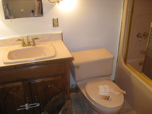
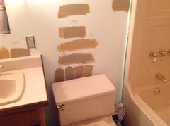
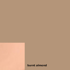
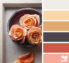
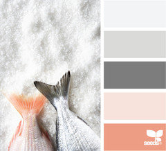
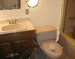
What color to paint my small 6 x 8' bathroom (all peach)?
Melissa
10 years ago
Featured Answer
Sort by:Oldest
Comments (87)

lessismoore
10 years ago
Nancy Travisinteriors
10 years agoRelated Professionals
Doctor Phillips Architects & Building Designers · Portsmouth Architects & Building Designers · Schiller Park Architects & Building Designers · Lenexa Kitchen & Bathroom Designers · Lorton Furniture & Accessories · Santa Barbara Furniture & Accessories · Fort Carson Furniture & Accessories · Maplewood Furniture & Accessories · Bowling Green General Contractors · Hillsborough General Contractors · Mount Holly General Contractors · New River General Contractors · Palatine General Contractors · Union Hill-Novelty Hill General Contractors · West Babylon General ContractorsNancy Travisinteriors
10 years ago PRO
PROJudyG Designs
10 years agolast modified: 10 years ago
Melissa
10 years ago
karemore55
10 years agoMelissa
10 years ago
cindyguent
10 years agocindyguent
10 years agolessismoore
10 years agolessismoore
10 years agolessismoore
10 years agokaremore55
10 years agokaremore55
10 years agokaremore55
10 years ago- PRO
User
10 years ago 
Sam Dewick
10 years agokaremore55
10 years agokaremore55
10 years agokaremore55
10 years agoMadeline
10 years agokaremore55
10 years agoMadeline
10 years agokaremore55
10 years ago PRO
PROTotal Solutions Group
10 years agolessismoore
10 years agoMelissa
10 years agokaremore55
10 years agokaremore55
10 years agokaremore55
10 years agokaremore55
10 years ago
studio10001
10 years agoMelissa
10 years agoMelissa
10 years agocindyguent
10 years agolessismoore
10 years agokaremore55
10 years agokaremore55
10 years agoMelissa
10 years agokaremore55
10 years agolessismoore
10 years ago
decoratinglady5
10 years agogjranch
10 years agogjranch
10 years ago
mamadubbs
10 years agolessismoore
10 years agolessismoore
10 years agobmcjb4
8 years ago
Cait Armstrong
8 years agoFifi P.
last yearlast modified: last year


Related Stories
KITCHEN DESIGNPopular Cabinet Door Styles for Kitchens of All Kinds
Let our mini guide help you choose the right kitchen door style
Full Story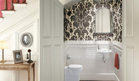
BATHROOM DESIGN8 Clever and Creative Ways With Small Bathrooms
Take the focus off size with a mural, an alternative layout, bold wall coverings and other eye-catching design details
Full Story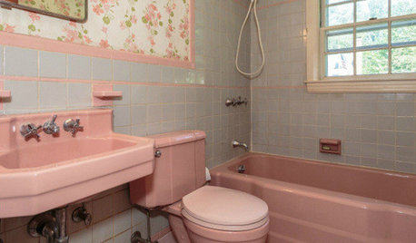
BATHROOM COLOR8 Ways to Spruce Up an Older Bathroom (Without Remodeling)
Mint tiles got you feeling blue? Don’t demolish — distract the eye by updating small details
Full Story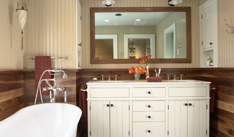
BATHROOM VANITIESAll the Details on 3 Farmhouse-Style Vanities
Experts reveal dimensions, finishes, paint colors, hardware, faucets and more
Full Story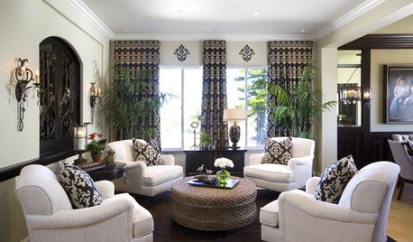
LIVING ROOMS8 Living Room Layouts for All Tastes
Go formal or as playful as you please. One of these furniture layouts for the living room is sure to suit your style
Full Story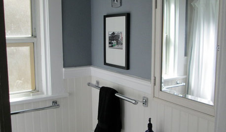
BATHROOM DESIGNMakeover Magic: Period Style for an All-New 1920s Bathroom
Leaky fixtures and water damage got the heave-ho, while the entire bathroom got a crisp new look in line with the home's style
Full Story
DECORATING GUIDES8 Splendidly Redesigned Home Basics We All Use
Whether you find God or the devil in the details, these new takes on utilitarian items for the home are simply divine
Full Story
KITCHEN DESIGN8 Stylish Sink Types for Kitchens of All Kinds
Choose the wrong sink and your kitchen renovation efforts may go down the drain — these sinks will let you clean up in the style department
Full Story
BATHROOM DESIGN8 Tiny Bathrooms With Big Personalities
Small wonders are challenging to pull off in bathroom design, but these 8 complete baths do it with as much grace as practicality
Full Story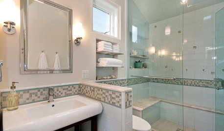
BATHROOM DESIGN6 Elements of a Perfect Bathroom Paint Job
High-quality paint alone won't cut it. For the best-looking painted bathroom walls, you'll need to get these other details right
Full Story


User