


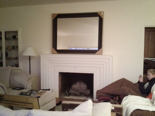
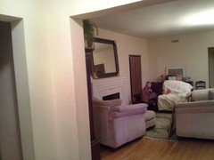
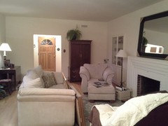
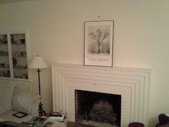
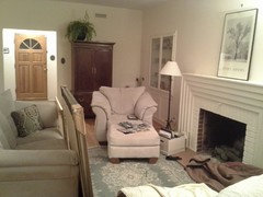
working with scale
blueskiesinNM
10 years ago
last modified: 10 years ago

Featured Answer
Sort by:Oldest
Comments (25)

blueskiesinNM
10 years agoblueskiesinNM
10 years agoRelated Professionals
Centerville Interior Designers & Decorators · East Patchogue Interior Designers & Decorators · Franklin Architects & Building Designers · Palmer Architects & Building Designers · Euclid Kitchen & Bathroom Designers · Knoxville Kitchen & Bathroom Designers · Carlisle Furniture & Accessories · Evanston Furniture & Accessories · Atlantic Beach Furniture & Accessories · Hawthorne Furniture & Accessories · Dunedin General Contractors · Kemp Mill General Contractors · Mineral Wells General Contractors · Pasadena General Contractors · Springfield General ContractorsblueskiesinNM
10 years agoblueskiesinNM
10 years ago
libradesigneye
10 years agoblueskiesinNM
10 years agolast modified: 10 years agoblueskiesinNM
10 years agoblueskiesinNM
10 years agoblueskiesinNM
10 years agoblueskiesinNM
10 years agoblueskiesinNM
10 years agoblueskiesinNM
10 years agoblueskiesinNM
10 years agolast modified: 10 years agoblueskiesinNM
10 years ago PRO
PROCarolyn Albert-Kincl, ASID
10 years agolast modified: 10 years agoblueskiesinNM thanked Carolyn Albert-Kincl, ASID- PRO
Carolyn Albert-Kincl, ASID
10 years agolast modified: 10 years agoblueskiesinNM thanked Carolyn Albert-Kincl, ASID blueskiesinNM
10 years agoblueskiesinNM
10 years agoblueskiesinNM
10 years agolibradesigneye
10 years ago


Related Stories
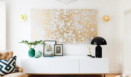
DECORATING GUIDES5 Decorating Tips for Getting Scale Right
Know how to work art, sectionals, coffee tables, lamps and headboards for a positively perfect interior
Full Story
DECORATING GUIDESLarge-Scale Pieces Give Small Rooms Massive Style
Work bigger elements into a diminutive space and watch its design cred grow by leaps and bounds
Full Story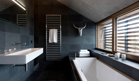
DECORATING GUIDES6 Lessons in Scale From Well-Designed Bathrooms
See how to mix shapes and sizes for an interesting and balanced bathroom design
Full Story
DECORATING GUIDESHow to Use Full-Scale Decor to Make a Small Space Feel Bigger
With a less-is-more approach, even oversize furnishings can help a compact area seem roomier
Full Story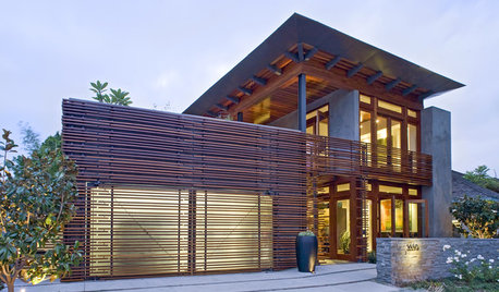
REMODELING GUIDESWood Slats in Design: Repetition, Scale and Light
Wood Screens Create Privacy, Delicacy, and Sometimes a Golden Glow
Full Story
DECORATING GUIDESDownsizing Help: Color and Scale Ideas for Comfy Compact Spaces
White walls and bitsy furniture aren’t your only options for tight spaces. Let’s revisit some decorating ‘rules’
Full Story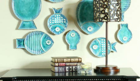
COASTAL STYLEFishy Business: Tilt the Scales With Aquatic Decor
A marine element can add a splash of whimsy to your home
Full Story
COLORInspired by Peeps: A Sliding Scale of Pastels
Opt For Just a Little or Go All Out With Pinks, Yellows and Light Blues
Full Story
DECORATING GUIDESStepping Up the Scale
Overgrown doesn't have to mean overblown when you take accessories, artwork and furniture up a notch or two
Full Story
DECORATING GUIDESHow to Work With a High Ceiling
Learn how to use scale, structure and shapes to create a homey-feeling space below a grand ceiling
Full StoryMore Discussions


Darzy