


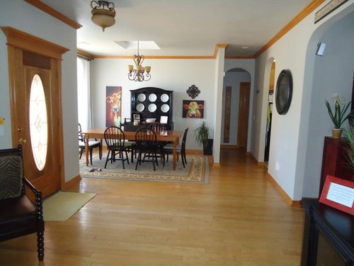
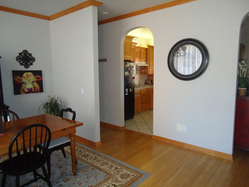
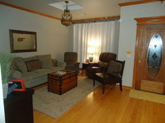
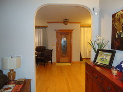
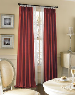
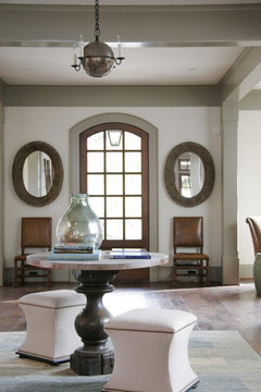
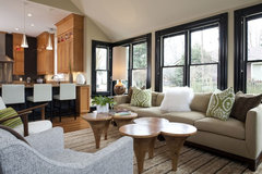
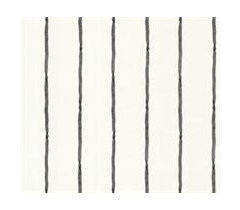
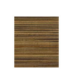
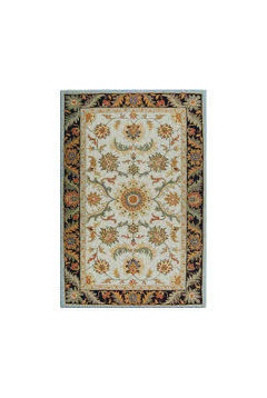
big open space needs color
Kerri Montgomery
10 years ago


Featured Answer
Comments (34)

Kerri Montgomery
10 years agoKerri Montgomery
10 years agoRelated Professionals
Ridgefield Interior Designers & Decorators · Wanaque Interior Designers & Decorators · Seal Beach Architects & Building Designers · Vancouver Architects & Building Designers · Frankfort Kitchen & Bathroom Designers · United States Kitchen & Bathroom Designers · Bridgeport Furniture & Accessories · Ashburn General Contractors · Chatsworth General Contractors · Haysville General Contractors · Norridge General Contractors · Redding General Contractors · Saint Andrews General Contractors · Saint Paul General Contractors · Van Buren General Contractors
Darzy
10 years ago
mpoulsom
10 years agoKerri Montgomery
10 years agoKerri Montgomery
10 years agoKerri Montgomery
10 years agoKerri Montgomery
10 years agoKerri Montgomery
10 years ago PRO
PROSandy G. ltd.
10 years agolast modified: 10 years ago
libradesigneye
10 years ago- PRO
Sandy G. ltd.
10 years agolast modified: 10 years ago Kerri Montgomery
10 years ago- PRO
Sandy G. ltd.
10 years ago 
pcmom1
10 years ago


Related Stories
BATHROOM DESIGN9 Big Space-Saving Ideas for Tiny Bathrooms
Look to these layouts and features to fit everything you need in the bath without feeling crammed in
Full Story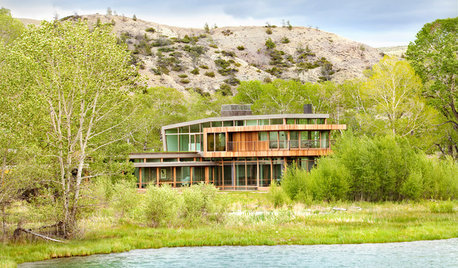
CONTEMPORARY HOMESHouzz Tour: A Big Sky Country House Embraces Wide-Open Views
Generous glass opens this Montana home to the rugged scenery, while wood keeps the look warm and inviting
Full Story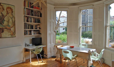
MOVING10 Rooms That Show You Don’t Need to Move to Get More Space
Daydreaming about moving or expanding but not sure if it’s practical right now? Consider these alternatives
Full Story
KITCHEN DESIGNKitchen of the Week: Taking Over a Hallway to Add Needed Space
A renovated kitchen’s functional new design is light, bright and full of industrial elements the homeowners love
Full Story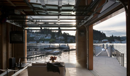
DREAM SPACESDesign Workshop: The Case for Big Overhead Doors
Garage-style doors are cost-effective solutions for opening rooms to dream views and fresh air — and they’re more stylish than ever
Full Story
WORKING WITH PROSWorking With Pros: When You Just Need a Little Design Guidance
Save money with a design consultation for the big picture or specific details
Full Story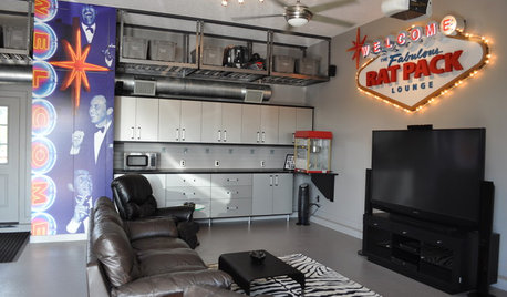
MAN SPACESWhy Men Really Do Need a Cave
Don't dismiss cars, bars and the kegerator — a man space of some kind is important for emotional well-being at home
Full Story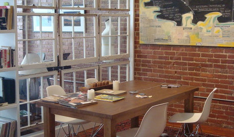
REMODELING GUIDESGet What You Need From the House You Have
6 ways to rethink your house and get that extra living space you need now
Full Story
MORE ROOMSNursery Essentials: What You Really Need
Before you go all out decorating your baby's room, find out what you'll actually want in there
Full Story
ARCHITECTUREDo You Really Need That Hallway?
Get more living room by rethinking the space you devote to simply getting around the house
Full StoryMore Discussions


Eo Eo