


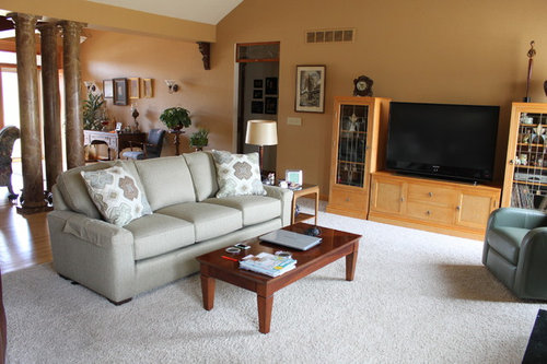
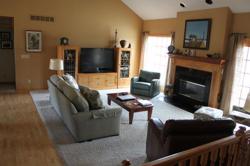
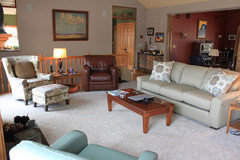
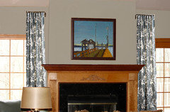
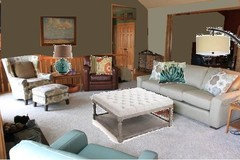
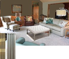
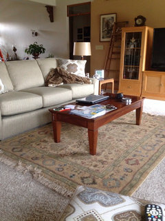
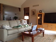
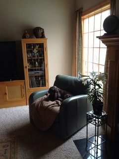
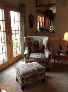
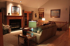
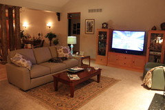
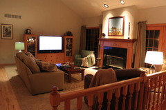
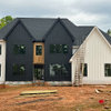
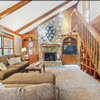
Design my Living Room! Walls-what color? What Accent Color? Tweaks?
Kathy Onarheim
10 years ago


Featured Answer
Sort by:Oldest
Comments (51)

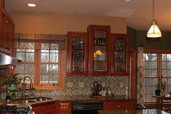
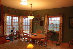
Kathy Onarheim
10 years ago
whattahouse
10 years agoRelated Professionals
Boise Interior Designers & Decorators · Little Egg Harbor Twp Interior Designers & Decorators · Bonney Lake Architects & Building Designers · Ojus Kitchen & Bathroom Designers · Owasso Kitchen & Bathroom Designers · Indianapolis Furniture & Accessories · Potomac Furniture & Accessories · Glenvar Heights Furniture & Accessories · Mill Valley Furniture & Accessories · Jacinto City Furniture & Accessories · Browns Mills General Contractors · Evans General Contractors · Fredonia General Contractors · River Forest General Contractors · West Whittier-Los Nietos General ContractorsKathy Onarheim
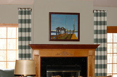
10 years agoKathy Onarheim
10 years agowhattahouse
10 years agowhattahouse
10 years agoKathy Onarheim
10 years agowhattahouse
10 years agoKathy Onarheim
10 years ago
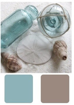
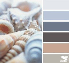
groveraxle
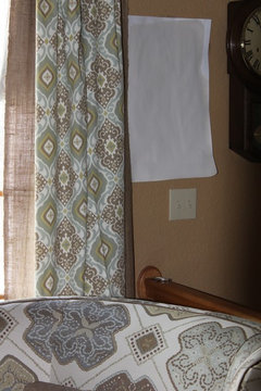
10 years agoKathy Onarheim
10 years agoKathy Onarheim
10 years agoKathy Onarheim
10 years agogroveraxle
10 years ago
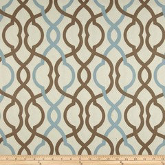
decoenthusiaste
10 years agoKathy Onarheim
10 years agoKathy Onarheim
10 years ago PRO
PROHummingbird Designs
10 years agoKathy Onarheim
10 years agolast modified: 10 years agoKathy Onarheim
10 years agoKathy Onarheim
10 years agogroveraxle
10 years agoKathy Onarheim
10 years agoKathy Onarheim
10 years agoKathy Onarheim
10 years agolast modified: 10 years agoKathy Onarheim
10 years agoKathy Onarheim
10 years ago PRO
PROflair lighting
10 years agoKathy Onarheim
10 years agolast modified: 10 years agoKathy Onarheim
10 years agoKathy Onarheim
9 years agoKathy Onarheim
9 years agolast modified: 9 years agoKathy Onarheim
9 years agolast modified: 9 years agoKathy Onarheim
9 years ago
Lainie D'Eon
9 years agoKathy Onarheim
9 years ago PRO
PROThrive Home Furnishings
8 years ago


Related Stories
MORE ROOMS5 Terrific Non-Permanent Design Tweaks
Nomads, Take Note: Turn That Temporary Living Space Into a Creative Outlet
Full Story
SELLING YOUR HOUSE10 Low-Cost Tweaks to Help Your Home Sell
Put these inexpensive but invaluable fixes on your to-do list before you put your home on the market
Full Story
LANDSCAPE DESIGN5 Tweaks for Updating Your Wood Deck
These improvements can enhance your deck’s look, feel and function
Full Story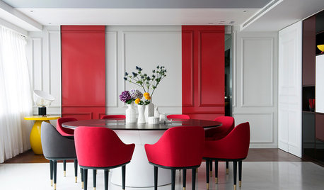
DECORATING GUIDESHaving a Design Moment: The Dining Room
Consider these 14 tweaks to bust your dining room's look out of a matchy-matchy furniture-set slump
Full Story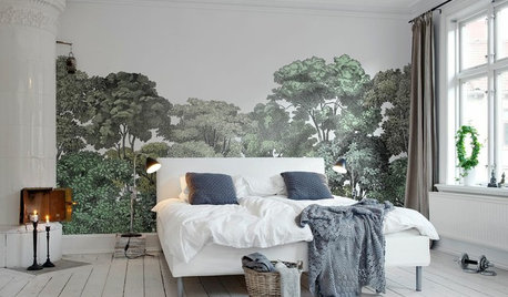
DECORATING GUIDES13 Stylish Ways to Accent a Bedroom Wall
From tried-and-true favorites to the latest textures, these creative ideas can strengthen your bedroom’s design
Full Story
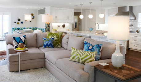
DECORATING GUIDESHow to Get Your Accent Pillows Right
Weekend Project: Pull your living room together with the perfect combination of decorative pillows
Full Story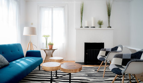
LIVING ROOMSNew This Week: Why Blue Is the Perfect Accent Color for a Living Room
Look to these 4 spaces for a dose of relaxation
Full Story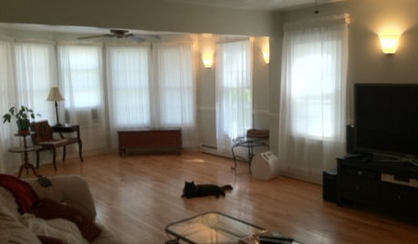
LIVING ROOMSDesign Dilemma: Share Ideas for a Navy Blue Room
Help a Houzz Reader Work With a Bold Choice for the Living Room Walls
Full StoryDECORATING GUIDESThe Case for the Anti-Accent Wall
Go ahead, paint everything the same color (even the trim)
Full Story

Charmean Neithart Interiors