


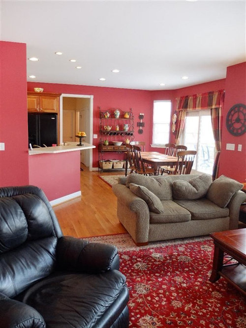
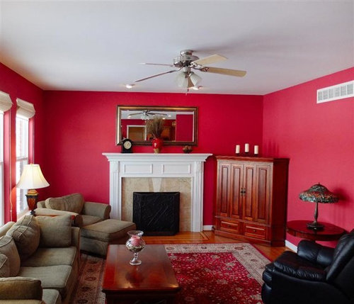
New house. Can't decide on wall color
Christine Multer Griffiths
10 years ago
last modified: 10 years ago

Featured Answer
Comments (53)
Related Professionals
Enterprise Architects & Building Designers · Lockport Kitchen & Bathroom Designers · Greenville Furniture & Accessories · Sioux Falls Furniture & Accessories · Sahuarita Furniture & Accessories · Tucker Furniture & Accessories · Clive Furniture & Accessories · Salem General Contractors · Ashtabula General Contractors · Elmont General Contractors · Goldenrod General Contractors · Prichard General Contractors · Sterling General Contractors · Torrington General Contractors · West Lafayette General Contractors
Christine Multer Griffiths
10 years ago PRO
PROPamela DeCuir Interior Designs
10 years agoChristine Multer Griffiths thanked Pamela DeCuir Interior DesignsChristine Multer Griffiths
10 years agolast modified: 10 years agoChristine Multer Griffiths
10 years agoChristine Multer Griffiths
10 years ago- PRO
Pamela DeCuir Interior Designs
10 years agoChristine Multer Griffiths thanked Pamela DeCuir Interior Designs Christine Multer Griffiths
10 years ago
apple_pie_order
10 years agoChristine Multer Griffiths
10 years ago PRO
PRObecca rea
10 years ago
groveraxle
10 years agoChristine Multer Griffiths
10 years ago
n247080
10 years ago PRO
PROJula Cordeira Interiors Llc.
10 years agolast modified: 10 years agoChristine Multer Griffiths
10 years agoChristine Multer Griffiths
10 years ago PRO
PROUser
10 years ago
moggie73
10 years agoChristine Multer Griffiths
10 years agomoggie73
10 years agoChristine Multer Griffiths
10 years agoChristine Multer Griffiths
10 years agolast modified: 10 years agoChristine Multer Griffiths
10 years ago- PRO
redteam strategies
10 years ago Christine Multer Griffiths
10 years agolast modified: 10 years agoChristine Multer Griffiths
10 years agoChristine Multer Griffiths
10 years agoChristine Multer Griffiths
10 years agoChristine Multer Griffiths
10 years agoChristine Multer Griffiths
10 years agomoggie73
10 years agoChristine Multer Griffiths
10 years ago


Related Stories
COLOR8 Color Palettes You Can't Get Wrong
Can't decide on a color scheme? Choose one of these foolproof palettes for a room that feels both timeless and fresh
Full Story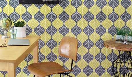
WALL TREATMENTSCan't Find the Right Wallpaper? Make Your Own
For one-of-a-kind walls, just use your imagination. Custom wallpaper is easier and less expensive than you might expect
Full Story
REMODELING GUIDES8 Natural Home Materials That Can't Be Beat
See how designing with natural stone, clay, wood and more can give a house luminosity, depth of color and lasting appeal
Full Story
HOUZZ TOURSMy Houzz: Eclectic Meets Rustic in a Decidedly Different Dallas Home
This couple's highly personal style embraces found objects, thrift store scores, international art and a whole lotta grandkid love
Full Story
PETS5 Finishes Pets and Kids Can’t Destroy — and 5 to Avoid
Save your sanity and your decorating budget by choosing materials and surfaces that can stand up to abuse
Full Story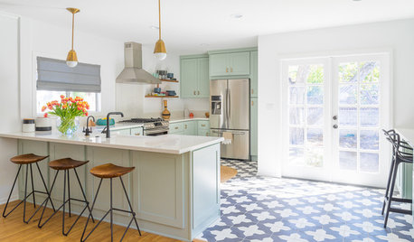
KITCHEN DESIGNTrending Now: 25 Kitchen Photos Houzzers Can’t Get Enough Of
Use the kitchens that have been added to the most ideabooks in the last few months to inspire your dream project
Full Story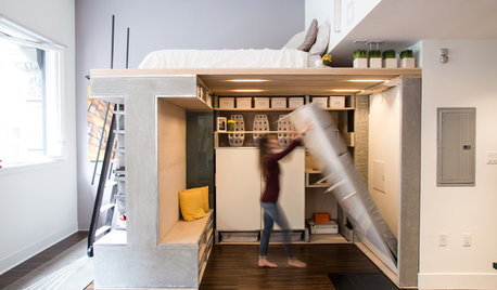
SMALL SPACESHouzz TV: You Won’t Believe Everything This Tiny Loft Can Do
Looking for more floor space, a San Francisco couple hires architects to design a unit that includes beds, storage and workspace
Full Story

LIFEHow to Decide on a New Town
These considerations will help you evaluate a region and a neighborhood, so you can make the right move
Full Story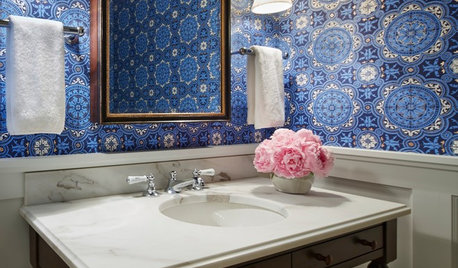
BATHROOM DESIGNYes, You Can Go Bold With Wallpaper in a Powder Room
The smallest room in the house can make the biggest design impact. Here are 10 of our favorite papered powder rooms
Full StoryMore Discussions


ProSource Memphis