


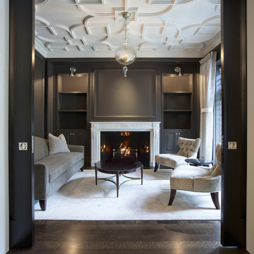
Search results for "Efficient use of space" in Home Design Ideas
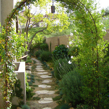
Garden makeovers by Shirley Bovshow in Los Angeles.This was formerly an abandoned narrow side yard used only to store trash cans. Now it is a favorite garden stroll area for the homeowner. See the complete makeover: http://edenmakersblog.com/?p=893
Photo and design by Shirley Bovshow
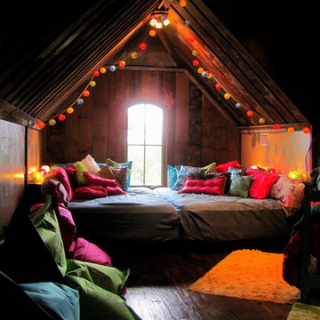
This room is a converted attic space. The platform holds two full size mattresses. Behind the bed is a ledge. The fronts of the ledge are hinged to use as storage and also to access the plugs on the wall.
Photo credit: Scott McDonald @ Hedrich Blessing
7RR-Ecohome:
The design objective was to build a house for a couple recently married who both had kids from previous marriages. How to bridge two families together?
The design looks forward in terms of how people live today. The home is an experiment in transparency and solid form; removing borders and edges from outside to inside the house, and to really depict “flowing and endless space”. The house floor plan is derived by pushing and pulling the house’s form to maximize the backyard and minimize the public front yard while welcoming the sun in key rooms by rotating the house 45-degrees to true north. The angular form of the house is a result of the family’s program, the zoning rules, the lot’s attributes, and the sun’s path. We wanted to construct a house that is smart and efficient in terms of construction and energy, both in terms of the building and the user. We could tell a story of how the house is built in terms of the constructability, structure and enclosure, with a nod to Japanese wood construction in the method in which the siding is installed and the exposed interior beams are placed in the double height space. We engineered the house to be smart which not only looks modern but acts modern; every aspect of user control is simplified to a digital touch button, whether lights, shades, blinds, HVAC, communication, audio, video, or security. We developed a planning module based on a 6-foot square room size and a 6-foot wide connector called an interstitial space for hallways, bathrooms, stairs and mechanical, which keeps the rooms pure and uncluttered. The house is 6,200 SF of livable space, plus garage and basement gallery for a total of 9,200 SF. A large formal foyer celebrates the entry and opens up to the living, dining, kitchen and family rooms all focused on the rear garden. The east side of the second floor is the Master wing and a center bridge connects it to the kid’s wing on the west. Second floor terraces and sunscreens provide views and shade in this suburban setting. The playful mathematical grid of the house in the x, y and z axis also extends into the layout of the trees and hard-scapes, all centered on a suburban one-acre lot.
Many green attributes were designed into the home; Ipe wood sunscreens and window shades block out unwanted solar gain in summer, but allow winter sun in. Patio door and operable windows provide ample opportunity for natural ventilation throughout the open floor plan. Minimal windows on east and west sides to reduce heat loss in winter and unwanted gains in summer. Open floor plan and large window expanse reduces lighting demands and maximizes available daylight. Skylights provide natural light to the basement rooms. Durable, low-maintenance exterior materials include stone, ipe wood siding and decking, and concrete roof pavers. Design is based on a 2' planning grid to minimize construction waste. Basement foundation walls and slab are highly insulated. FSC-certified walnut wood flooring was used. Light colored concrete roof pavers to reduce cooling loads by as much as 15%. 2x6 framing allows for more insulation and energy savings. Super efficient windows have low-E argon gas filled units, and thermally insulated aluminum frames. Permeable brick and stone pavers reduce the site’s storm-water runoff. Countertops use recycled composite materials. Energy-Star rated furnaces and smart thermostats are located throughout the house to minimize duct runs and avoid energy loss. Energy-Star rated boiler that heats up both radiant floors and domestic hot water. Low-flow toilets and plumbing fixtures are used to conserve water usage. No VOC finish options and direct venting fireplaces maintain a high interior air quality. Smart home system controls lighting, HVAC, and shades to better manage energy use. Plumbing runs through interior walls reducing possibilities of heat loss and freezing problems. A large food pantry was placed next to kitchen to reduce trips to the grocery store. Home office reduces need for automobile transit and associated CO2 footprint. Plan allows for aging in place, with guest suite than can become the master suite, with no need to move as family members mature.
Find the right local pro for your project
When my client had to move from her company office to work at home, she set up in the dining room. Despite her best efforts, this was not the long-term solution she was looking for. My client realized she needed a dedicated space not on the main floor of the home. On one hand, having your office space right next to the kitchen is handy. On the other hand, it made separating work and home life was not that easy.
The house was a ranch. In essence, the basement would run entire length of the home. As we came down the steps, we entered a time capsule. The house was built in the 1950’s. The walls were covered with original knotty pine paneling. There was a wood burning fireplace and considering this was a basement, high ceilings. In addition, there was everything her family could not store at their own homes. As we wound though the space, I though “wow this has potential”, Eventually, after walking through the laundry room we came to a small nicely lit room. This would be the office.
My client looked at me and asked what I thought. Undoubtedly, I said, this can be a great workspace, but do you really want to walk through this basement and laundry to get here? Without reservation, my client said where do we start?
Once the design was in place, we started the renovation. The knotty pine paneling had to go. Specifically, to add some insulation and control the dampness and humidity. The laundry room wall was relocated to create a hallway to the office.
At the far end of the room, we designated a workout zone. Weights, mats, exercise bike and television are at the ready for morning or afternoon workouts. The space can be concealed by a folding screen for party time. Doors to an old closet under the stairs were relocated to the workout area for hidden storage. Now we had nice wall for a beautiful console and mirror for storage and serving during parties.
In order to add architectural details, we covered the old ugly support columns with simple recessed millwork panels. This detail created a visual division between the bar area and the seating area in front of the fireplace. The old red brick on the fireplace surround was replaced with stack stone. A mantle was made from reclaimed wood. Additional reclaimed wood floating shelves left and right of the fireplace provides decorative display while maintaining a rustic element balancing the copper end table and leather swivel rocker.
We found an amazing rug which tied all of the colors together further defining the gathering space. Russet and burnt orange became the accent color unifying each space. With a bit of whimsy, a rather unusual light fixture which looks like roots from a tree growing through the ceiling is a conversation piece.
The office space is quite and removed from the main part of the basement. There is a desk large enough for multiple screens, a small bookcase holding office supplies and a comfortable chair for conference calls. Because working from home requires many online meetings, we added a shiplap wall painted in Hale Navy to contrast with the orange fabric on the chair. We finished the décor with a painting from my client’s father. This is the background online visitors will see.
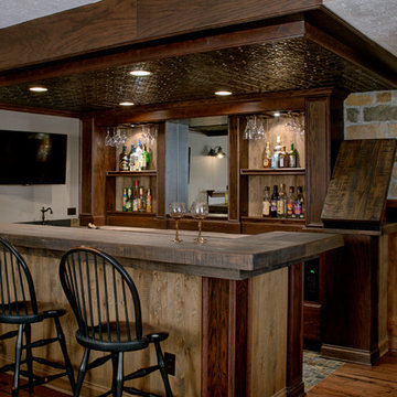
The last and best part of the renovation is the beautiful bar. My client is an avid collector of wine. She already had the EuroCave refrigerator, so I incorporated it into the design. The cabinets are painted Temptation Grey from Benjamin Moore. The counter tops are my favorite hard working quartzite Brown Fantasy. The backsplash is a combination of rustic wood and old tin ceiling like porcelain tiles. Together with the textures of the reclaimed wood and hide poofs balanced against the smooth finish of the cabinets, we created a comfortable luxury for relaxing.
There is ample storage for bottles, cans, glasses, and anything else you can think of for a great party. In addition to the wine storage, we incorporated a beverage refrigerator, an ice maker, and a sink. Floating shelves with integrated lighting illuminate the back bar. The raised height of the front bar provides the perfect wine tasting and paring spot. I especially love the pendant lights which look like wine glasses.
Finally, I selected carpet for the stairs and office. It is perfect for noise reduction. Meanwhile for the overall flooring, I specifically selected a high-performance vinyl plank floor. We often use this product as it is perfect to install on a concrete floor. It is soft to walk on, easy to clean and does not reduce the overall height of the space.
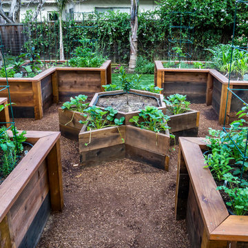
The star at the center of this veggie garden is the perfect place for the dwarf lemon tree. The six pointed star (just like the Great Seal of the United States) is ideal for the strawberries to cascade over the edges. The star is 6' with 3' clearance around the star so the space is wide enough to comfortably access the veggie beds from all sides.
Photo Credit: Mark Pinkerton
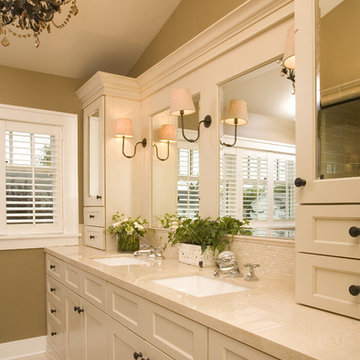
This bath offers generous space without going overboard in square footage. The homeowner chose to go with a large double vanity and a nice shower with custom features and a shower seat and decided to forgo the typical big soaking tub. The vanity area shown in this photo has plenty of storage within the mirrored wall cabinets and the large drawers below. The mirrors were cased out with the matching woodwork and crown detail. The countertop is Crema Marfil slab marble with undermount Marzi sinks. The Kallista faucetry was chosen in chrome since it was an easier finish to maintain for years to come. Other metal details were done in the oil rubbed bronze to work with the theme through out the home. The floor tile is a 12 x 12 Bursa Beige Marble that is set on the diagonal. The backsplash to the vanity is the companion Bursa Beige mini running bond mosaic with a cap also in the Bursa Beige marble. Vaulted ceilings add to the dramatic feel of this bath. The bronze and crystal chandelier also adds to the dramatic glamour of the bath.
Photography by Northlight Photography.
The unique design challenge in this early 20th century Georgian Colonial was the complete disconnect of the kitchen to the rest of the home. In order to enter the kitchen, you were required to walk through a formal space. The homeowners wanted to connect the kitchen and garage through an informal area, which resulted in building an addition off the rear of the garage. This new space integrated a laundry room, mudroom and informal entry into the re-designed kitchen. Additionally, 25” was taken out of the oversized formal dining room and added to the kitchen. This gave the extra room necessary to make significant changes to the layout and traffic pattern in the kitchen.
Beth Singer Photography
Sponsored
Delaware, OH
Buckeye Basements, Inc.
Central Ohio's Basement Finishing ExpertsBest Of Houzz '13-'21
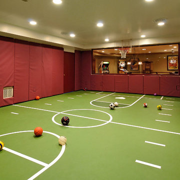
The homeowners wanted their basement to be an exciting and varied entertainment space for the whole family. For the children’s favorite activities, the architects designed spaces for a dance studio, craft area, Murphy beds for sleepovers and an indoor sports court.
© Bob Narod Photography / BOWA
10' ceilings and 2-story windows surrounding this space (not in view) bring plenty of natural light into this casual and contemporary cook's kitchen. Other views of this kitchen and the adjacent Great Room are also available on houzz. Builder: Robert Egge Construction (Woodinville, WA). Cabinets: Jesse Bay Cabinets (Port Angeles, WA) Design: Studio 212 Interiors
Our clients purchased this 1950 ranch style cottage knowing it needed to be updated. They fell in love with the location, being within walking distance to White Rock Lake. They wanted to redesign the layout of the house to improve the flow and function of the spaces while maintaining a cozy feel. They wanted to explore the idea of opening up the kitchen and possibly even relocating it. A laundry room and mudroom space needed to be added to that space, as well. Both bathrooms needed a complete update and they wanted to enlarge the master bath if possible, to have a double vanity and more efficient storage. With two small boys and one on the way, they ideally wanted to add a 3rd bedroom to the house within the existing footprint but were open to possibly designing an addition, if that wasn’t possible.
In the end, we gave them everything they wanted, without having to put an addition on to the home. They absolutely love the openness of their new kitchen and living spaces and we even added a small bar! They have their much-needed laundry room and mudroom off the back patio, so their “drop zone” is out of the way. We were able to add storage and double vanity to the master bathroom by enclosing what used to be a coat closet near the entryway and using that sq. ft. in the bathroom. The functionality of this house has completely changed and has definitely changed the lives of our clients for the better!
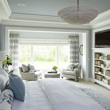
This tranquil master bedroom suite includes a small seating area, beautiful views and an interior hallway to the master bathroom & closet.
All furnishings in this space are available through Martha O'Hara Interiors. www.oharainteriors.com - 952.908.3150
Martha O'Hara Interiors, Interior Selections & Furnishings | Charles Cudd De Novo, Architecture | Troy Thies Photography | Shannon Gale, Photo Styling
Conceived as a remodel and addition, the final design iteration for this home is uniquely multifaceted. Structural considerations required a more extensive tear down, however the clients wanted the entire remodel design kept intact, essentially recreating much of the existing home. The overall floor plan design centers on maximizing the views, while extensive glazing is carefully placed to frame and enhance them. The residence opens up to the outdoor living and views from multiple spaces and visually connects interior spaces in the inner court. The client, who also specializes in residential interiors, had a vision of ‘transitional’ style for the home, marrying clean and contemporary elements with touches of antique charm. Energy efficient materials along with reclaimed architectural wood details were seamlessly integrated, adding sustainable design elements to this transitional design. The architect and client collaboration strived to achieve modern, clean spaces playfully interjecting rustic elements throughout the home.
Greenbelt Homes
Glynis Wood Interiors
Photography by Bryant Hill
The large living room was divided into several areas: game table, reading area, center table and main sitting/TV area. All white/neutral upholstery is tempered with the use of textures and wood. A custom game table has cup holder pull-outs to keep the card playing surface free of clutter. The bookshelves boast a collection of found items, family photos and books. The center table was sized to sit below the lantern and to be large enough to fill the space but small enough to not interfere with navigating the room.
Sponsored
Columbus, OH
Dave Fox Design Build Remodelers
Columbus Area's Luxury Design Build Firm | 17x Best of Houzz Winner!
Clean, contemporary white oak slab cabinets with a white Chroma Crystal White countertop. Cabinets are set off with sleek stainless steel handles. The appliances are also stainless steel. The diswasher is Bosch, the refridgerator is a Kenmore professional built-in, stainless steel. The hood is stainless and glass from Futuro, Venice model. The double oven is stainless steel from LG. The stainless wine cooler is Uline. the stainless steel built-in microwave is form GE. The irridescent glass back splash that sets off the floating bar cabinet and surrounds window is Vihara Irridescent 1 x 4 glass in Puka. Perfect for entertaining. The floors are Italian ceramic planks that look like hardwood in a driftwood color. Simply gorgeous. Lighting is recessed and kept to a minimum to maintain the crisp clean look the client was striving for. I added a pop of orange and turquoise (not seen in the photos) for pillows on a bench as well as on the accessories. Cabinet fabricator, Mark Klindt ~ www.creativewoodworks.info
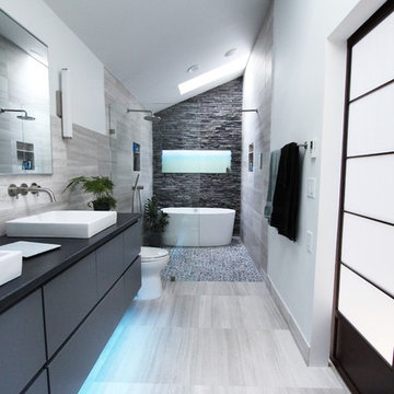
The goal of this project was to upgrade the builder grade finishes and create an ergonomic space that had a contemporary feel. This bathroom transformed from a standard, builder grade bathroom to a contemporary urban oasis. This was one of my favorite projects, I know I say that about most of my projects but this one really took an amazing transformation. By removing the walls surrounding the shower and relocating the toilet it visually opened up the space. Creating a deeper shower allowed for the tub to be incorporated into the wet area. Adding a LED panel in the back of the shower gave the illusion of a depth and created a unique storage ledge. A custom vanity keeps a clean front with different storage options and linear limestone draws the eye towards the stacked stone accent wall.
Houzz Write Up: https://www.houzz.com/magazine/inside-houzz-a-chopped-up-bathroom-goes-streamlined-and-swank-stsetivw-vs~27263720
The layout of this bathroom was opened up to get rid of the hallway effect, being only 7 foot wide, this bathroom needed all the width it could muster. Using light flooring in the form of natural lime stone 12x24 tiles with a linear pattern, it really draws the eye down the length of the room which is what we needed. Then, breaking up the space a little with the stone pebble flooring in the shower, this client enjoyed his time living in Japan and wanted to incorporate some of the elements that he appreciated while living there. The dark stacked stone feature wall behind the tub is the perfect backdrop for the LED panel, giving the illusion of a window and also creates a cool storage shelf for the tub. A narrow, but tasteful, oval freestanding tub fit effortlessly in the back of the shower. With a sloped floor, ensuring no standing water either in the shower floor or behind the tub, every thought went into engineering this Atlanta bathroom to last the test of time. With now adequate space in the shower, there was space for adjacent shower heads controlled by Kohler digital valves. A hand wand was added for use and convenience of cleaning as well. On the vanity are semi-vessel sinks which give the appearance of vessel sinks, but with the added benefit of a deeper, rounded basin to avoid splashing. Wall mounted faucets add sophistication as well as less cleaning maintenance over time. The custom vanity is streamlined with drawers, doors and a pull out for a can or hamper.
A wonderful project and equally wonderful client. I really enjoyed working with this client and the creative direction of this project.
Brushed nickel shower head with digital shower valve, freestanding bathtub, curbless shower with hidden shower drain, flat pebble shower floor, shelf over tub with LED lighting, gray vanity with drawer fronts, white square ceramic sinks, wall mount faucets and lighting under vanity. Hidden Drain shower system. Atlanta Bathroom.
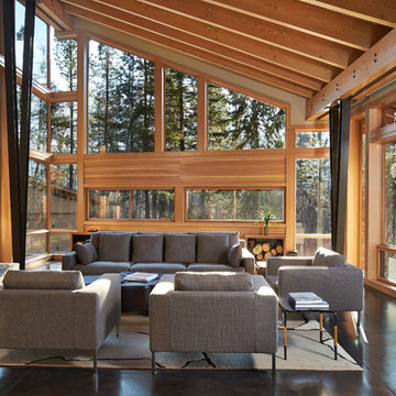
The Mazama house is located in the Methow Valley of Washington State, a secluded mountain valley on the eastern edge of the North Cascades, about 200 miles northeast of Seattle.
The house has been carefully placed in a copse of trees at the easterly end of a large meadow. Two major building volumes indicate the house organization. A grounded 2-story bedroom wing anchors a raised living pavilion that is lifted off the ground by a series of exposed steel columns. Seen from the access road, the large meadow in front of the house continues right under the main living space, making the living pavilion into a kind of bridge structure spanning over the meadow grass, with the house touching the ground lightly on six steel columns. The raised floor level provides enhanced views as well as keeping the main living level well above the 3-4 feet of winter snow accumulation that is typical for the upper Methow Valley.
To further emphasize the idea of lightness, the exposed wood structure of the living pavilion roof changes pitch along its length, so the roof warps upward at each end. The interior exposed wood beams appear like an unfolding fan as the roof pitch changes. The main interior bearing columns are steel with a tapered “V”-shape, recalling the lightness of a dancer.
The house reflects the continuing FINNE investigation into the idea of crafted modernism, with cast bronze inserts at the front door, variegated laser-cut steel railing panels, a curvilinear cast-glass kitchen counter, waterjet-cut aluminum light fixtures, and many custom furniture pieces. The house interior has been designed to be completely integral with the exterior. The living pavilion contains more than twelve pieces of custom furniture and lighting, creating a totality of the designed environment that recalls the idea of Gesamtkunstverk, as seen in the work of Josef Hoffman and the Viennese Secessionist movement in the early 20th century.
The house has been designed from the start as a sustainable structure, with 40% higher insulation values than required by code, radiant concrete slab heating, efficient natural ventilation, large amounts of natural lighting, water-conserving plumbing fixtures, and locally sourced materials. Windows have high-performance LowE insulated glazing and are equipped with concealed shades. A radiant hydronic heat system with exposed concrete floors allows lower operating temperatures and higher occupant comfort levels. The concrete slabs conserve heat and provide great warmth and comfort for the feet.
Deep roof overhangs, built-in shades and high operating clerestory windows are used to reduce heat gain in summer months. During the winter, the lower sun angle is able to penetrate into living spaces and passively warm the exposed concrete floor. Low VOC paints and stains have been used throughout the house. The high level of craft evident in the house reflects another key principle of sustainable design: build it well and make it last for many years!
Photo by Benjamin Benschneider
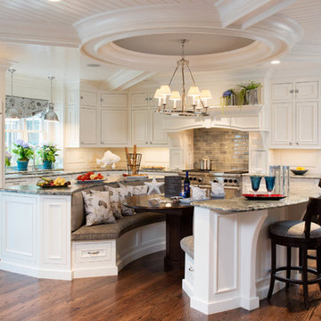
Family members enter this kitchen from the mud room where they are right at home in this friendly space.
The Kitchens central banquette island seats six on cozy upholstered benches with another two diners at the ends. There is table seating for EIGHT plus the back side boasts raised seating for four more on swiveling bar stools.
The show-stopping coffered ceiling was custom designed and features beaded paneling, recessed can lighting and dramatic crown molding.
The counters are made of Labradorite which is often associated with jewels. It's iridescent sparkle adds glamour without being too loud.
The wood paneled backsplash allows the cabinetry to blend in. There is glazed subway tile behind the range.
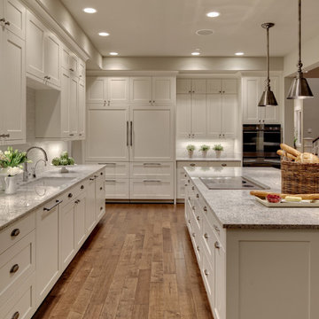
This lovely home features an open concept space with the kitchen at the heart. Built in the late 1990's the prior kitchen was cherry, but dark, and the new family needed a fresh update.
This great space was a collaboration between many talented folks including but not limited to the team at Delicious Kitchens & Interiors, LLC, L. Newman and Associates/Paul Mansback, Inc with Leslie Rifkin and Emily Shakra. Additional contributions from the homeowners and Belisle Granite.
John C. Hession Photographer
Showing Results for "Efficient Use Of Space"
This ceiling was designed and detailed by dSPACE Studio. We created a custom plaster mold that was fabricated by a Chicago plaster company and installed and finished on-site.
The 800 square-foot guest cottage is located on the footprint of a slightly smaller original cottage that was built three generations ago. With a failing structural system, the existing cottage had a very low sloping roof, did not provide for a lot of natural light and was not energy efficient. Utilizing high performing windows, doors and insulation, a total transformation of the structure occurred. A combination of clapboard and shingle siding, with standout touches of modern elegance, welcomes guests to their cozy retreat.
The cottage consists of the main living area, a small galley style kitchen, master bedroom, bathroom and sleeping loft above. The loft construction was a timber frame system utilizing recycled timbers from the Balsams Resort in northern New Hampshire. The stones for the front steps and hearth of the fireplace came from the existing cottage’s granite chimney. Stylistically, the design is a mix of both a “Cottage” style of architecture with some clean and simple “Tech” style features, such as the air-craft cable and metal railing system. The color red was used as a highlight feature, accentuated on the shed dormer window exterior frames, the vintage looking range, the sliding doors and other interior elements.
Photographer: John Hession
Our clients had just recently closed on their new house in Stapleton and were excited to transform it into their perfect forever home. They wanted to remodel the entire first floor to create a more open floor plan and develop a smoother flow through the house that better fit the needs of their family. The original layout consisted of several small rooms that just weren’t very functional, so we decided to remove the walls that were breaking up the space and restructure the first floor to create a wonderfully open feel.
After removing the existing walls, we rearranged their spaces to give them an office at the front of the house, a large living room, and a large dining room that connects seamlessly with the kitchen. We also wanted to center the foyer in the home and allow more light to travel through the first floor, so we replaced their existing doors with beautiful custom sliding doors to the back yard and a gorgeous walnut door with side lights to greet guests at the front of their home.
Living Room
Our clients wanted a living room that could accommodate an inviting sectional, a baby grand piano, and plenty of space for family game nights. So, we transformed what had been a small office and sitting room into a large open living room with custom wood columns. We wanted to avoid making the home feel too vast and monumental, so we designed custom beams and columns to define spaces and to make the house feel like a home. Aesthetically we wanted their home to be soft and inviting, so we utilized a neutral color palette with occasional accents of muted blues and greens.
Dining Room
Our clients were also looking for a large dining room that was open to the rest of the home and perfect for big family gatherings. So, we removed what had been a small family room and eat-in dining area to create a spacious dining room with a fireplace and bar. We added custom cabinetry to the bar area with open shelving for displaying and designed a custom surround for their fireplace that ties in with the wood work we designed for their living room. We brought in the tones and materiality from the kitchen to unite the spaces and added a mixed metal light fixture to bring the space together
Kitchen
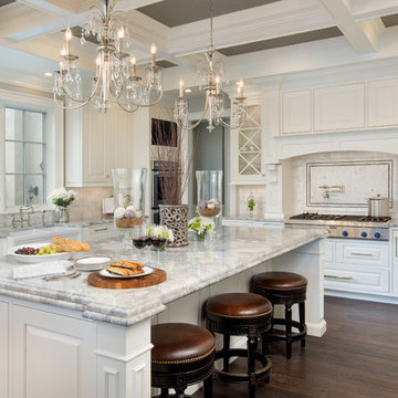
We wanted the kitchen to be a real show stopper and carry through the calm muted tones we were utilizing throughout their home. We reoriented the kitchen to allow for a big beautiful custom island and to give us the opportunity for a focal wall with cooktop and range hood. Their custom island was perfectly complimented with a dramatic quartz counter top and oversized pendants making it the real center of their home. Since they enter the kitchen first when coming from their detached garage, we included a small mud-room area right by the back door to catch everyone’s coats and shoes as they come in. We also created a new walk-in pantry with plenty of open storage and a fun chalkboard door for writing notes, recipes, and grocery lists.
Office
We transformed the original dining room into a handsome office at the front of the house. We designed custom walnut built-ins to house all of their books, and added glass french doors to give them a bit of privacy without making the space too closed off. We painted the room a deep muted blue to create a glimpse of rich color through the french doors
Powder Room
The powder room is a wonderful play on textures. We used a neutral palette with contrasting tones to create dramatic moments in this little space with accents of brushed gold.
Master Bathroom
The existing master bathroom had an awkward layout and outdated finishes, so we redesigned the space to create a clean layout with a dream worthy shower. We continued to use neutral tones that tie in with the rest of the home, but had fun playing with tile textures and patterns to create an eye-catching vanity. The wood-look tile planks along the floor provide a soft backdrop for their new free-standing bathtub and contrast beautifully with the deep ash finish on the cabinetry.
1