


Houzz Tour: Builder Customizes Old House for Modern Family Life
Special touches like indoor-outdoor bar stools, an outdoor kitchen and a rope loft mark this San Francisco home
Becky Harris
November 6, 2018
Houzz Contributor. Hi there! I live in a 1940s cottage in Atlanta that I'll describe as "collected."
I got into design via Landscape Architecture, which I studied at the University of Virginia.
Houzz Contributor. Hi there! I live in a 1940s cottage in Atlanta that I'll describe... More
Photos by Ed Ritger Photography
House at a Glance
Who lives here: The owner of a construction company, his wife and their son
Location: Bernal Heights neighborhood of San Francisco
Size: 2,309 square feet (215 square meters); two bedrooms plus office-guest room, 2½ bathrooms
Designers: Dennis Budd of Gast Architects (architecture); Nina Punzi of Nina Punzi Designs (interiors); and Aaron Gordon of Aaron Gordon Construction (contractor and collaborator on design)
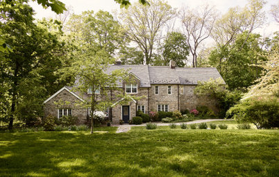
This San Francisco home had tiny, dark rooms, a garage that hardly could fit a car, much less a contractor’s truck, and a hazardous staircase that led to a head-banging converted attic space. None of it suited the lifestyle of this playful young family of three. But one of the homeowners, Aaron Gordon, is a creative contractor, and he knew he could make it just right for their city lifestyle. He chose architect Dennis Budd and interior designer Nina Punzi, and they worked as a collaborative design team. Together they were able to honor the context of the turn-of-the 20th-century neighborhood while updating the home with lots of customized details. Accordion doors completely open the kitchen up to the backyard, a grand new three-story staircase replaces the narrow one, a roof deck contains a spa and their son’s bedroom has a rope net loft across the ceiling.
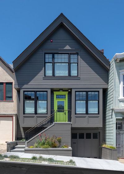
As for style, the house is a 1910 Edwardian that originally was not built with indoor plumbing, so the interior was a hodgepodge of unimpressive renovations over the years. The designers did not have to address the challenges of a historic designation, but they did want to honor the home’s history and respect the neighborhood. One way they did this was by keeping a gabled roof that was similar to the original.
“We popped up the headspace by using shed dormers along the sides of the roof, which are not visible from the street and minimize the massing of the house,” Budd says. “I would call the style of this house ‘Craftsman contemporary’ because of elements like the strong symmetry and traditional paneling.” And the bright green door is a big hint that there are a lot of fun design elements inside.
House at a Glance
Who lives here: The owner of a construction company, his wife and their son
Location: Bernal Heights neighborhood of San Francisco
Size: 2,309 square feet (215 square meters); two bedrooms plus office-guest room, 2½ bathrooms
Designers: Dennis Budd of Gast Architects (architecture); Nina Punzi of Nina Punzi Designs (interiors); and Aaron Gordon of Aaron Gordon Construction (contractor and collaborator on design)
This San Francisco home had tiny, dark rooms, a garage that hardly could fit a car, much less a contractor’s truck, and a hazardous staircase that led to a head-banging converted attic space. None of it suited the lifestyle of this playful young family of three. But one of the homeowners, Aaron Gordon, is a creative contractor, and he knew he could make it just right for their city lifestyle. He chose architect Dennis Budd and interior designer Nina Punzi, and they worked as a collaborative design team. Together they were able to honor the context of the turn-of-the 20th-century neighborhood while updating the home with lots of customized details. Accordion doors completely open the kitchen up to the backyard, a grand new three-story staircase replaces the narrow one, a roof deck contains a spa and their son’s bedroom has a rope net loft across the ceiling.
As for style, the house is a 1910 Edwardian that originally was not built with indoor plumbing, so the interior was a hodgepodge of unimpressive renovations over the years. The designers did not have to address the challenges of a historic designation, but they did want to honor the home’s history and respect the neighborhood. One way they did this was by keeping a gabled roof that was similar to the original.
“We popped up the headspace by using shed dormers along the sides of the roof, which are not visible from the street and minimize the massing of the house,” Budd says. “I would call the style of this house ‘Craftsman contemporary’ because of elements like the strong symmetry and traditional paneling.” And the bright green door is a big hint that there are a lot of fun design elements inside.
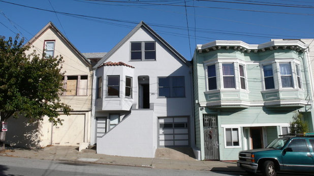
Before Photo
Expanding in a Respectful Way
Before, it was almost impossible to pull a car into the one-car garage and there was very little head space. City regulations required that the home provide three off-street parking spaces, and a contractor’s truck with lumber on top wouldn’t have come close to squeezing into that stall. This required the team to dig deep — literally. They lifted up the house and dug out a large lower level with 9½-foot ceilings to accommodate three vehicles, bikes, laundry, a mudroom and additional storage. Unable to extend the house forward toward the sidewalk on the ground level due to setback requirements, Budd added square footage by designing two bays on the front facade. They also gained space by raising the roof and adding the shed dormers to it.
Now let’s get to some interesting numbers, because it’s difficult to eyeball these differences when comparing this “before” photo to the previous photo. The ground floor was lowered 46 inches when they dug it out, and this lowered the first floor 39 inches. This meant that the new roof’s ridgeline was lifted only 25 inches from its original height. The original house had 1,335 square feet of living space and 932 square feet of garage and storage space. Now it has 2,309 square feet of living space and 1,042 square feet of garage and storage space.
Laying Out a Narrow Space
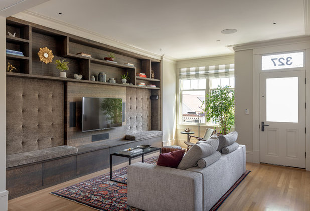
Before we step too far into the house, note that the lot is only 25 feet wide. This meant that the designers had 23 feet of width to work with when laying out the living room, a study and circulation between them across the front of the house.
Because the living room is narrow, they came up with a built-in media wall that incorporates extra seating and has an uncluttered yet playful look. The custom quarter-sawn oak flooring brings in darker tones while the tufted upholstery adds softness. The display niches have unexpected geometric shapes and the drawers beneath the built-in bench seating are touch-release. This maintains an uncluttered look that’s free of hardware.
The new bay added square footage, and light pours in from these street-side windows.
Another detail worth noting throughout the house is the millwork. They maintained classic Edwardian architectural proportions on trim like baseboards, crown molding and window and door trim. However, they gave it an updated look by milling pieces with simplified, squared-off modern profiles, seen here on the baseboards.
Learn more about Edwardian architecture
Before Photo
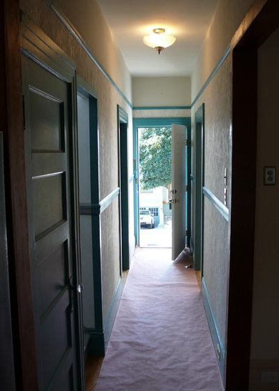
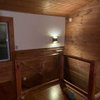
Before: The front door opened to a long, narrow hallway with a warren of tiny rooms off it. The staircase to the converted attic was not up to code.
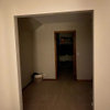
The new, more open plan is brighter and airier yet still maintains a cozy feeling thanks to colors, textures and bays.
The new, more open plan is brighter and airier yet still maintains a cozy feeling thanks to colors, textures and bays.
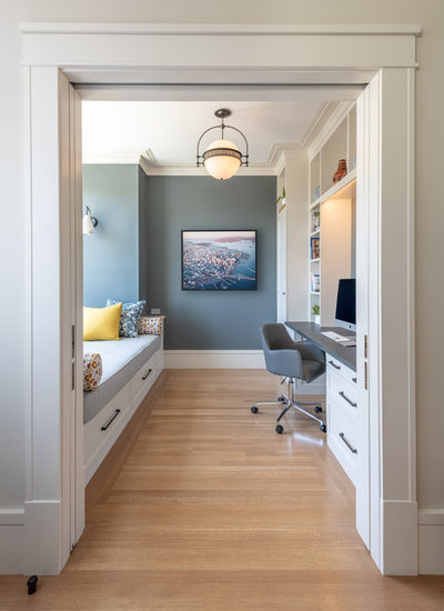
A Double-Duty Study
Across from the living room is this multifunctioning office space. Built-ins maximize storage and display space while pocket doors save space and provide privacy when needed.
Check out more Houzz photos of smart office built-ins
Across from the living room is this multifunctioning office space. Built-ins maximize storage and display space while pocket doors save space and provide privacy when needed.
Check out more Houzz photos of smart office built-ins
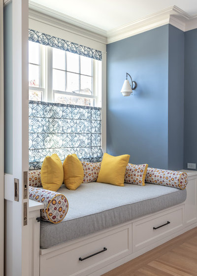
The other front bay contains a cozy reading nook. It accommodates a queen-sized mattress so the room can double as a guest room. A wall sconce provides plenty of reading light. Storage for the linens is built-in underneath and guests can hang their clothing in a tall wardrobe closet on the built-in wall.
Seamless Indoor-Outdoor Living
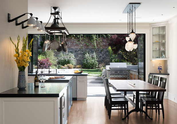
“We wanted to be able to look all the way through the house to the backyard from the front door,” Budd says. Between the living room and kitchen is a central open area next to the new staircase that the owners designated as a “chill-out space” outfitted with hanging chairs.
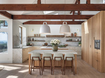
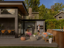
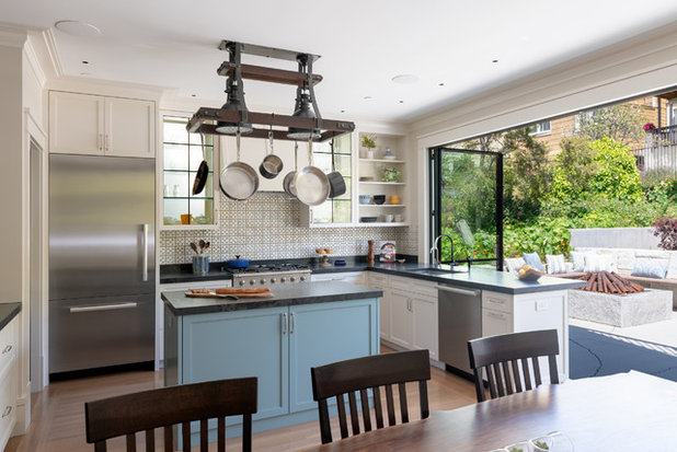
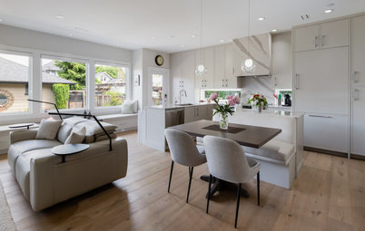
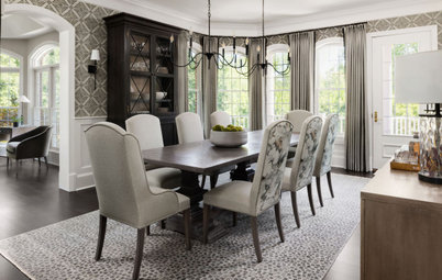
Combining the kitchen and dining room made the most of the narrow width of the house, and steel-framed accordion doors completely open this area up to the backyard. This makes the outdoor kitchen, fire pit, bar and patio a natural extension of this space. Architectural moves like this make the average-sized house feel much larger than it is.
Overhead, a pot rack and a chandelier help delineate the work area from the dining area. The iron-and-wood pot rack with integrated lights is a custom piece with a vintage industrial look, while the dining area light fixture is a fresh take on an Edwardian chandelier, composed of several pendants of different shapes and textured glass.
The cabinetry in the foreground serves as a bar and contains a wine refrigerator and refrigerator drawers.
“We wanted to be able to look all the way through the house to the backyard from the front door,” Budd says. Between the living room and kitchen is a central open area next to the new staircase that the owners designated as a “chill-out space” outfitted with hanging chairs.
Combining the kitchen and dining room made the most of the narrow width of the house, and steel-framed accordion doors completely open this area up to the backyard. This makes the outdoor kitchen, fire pit, bar and patio a natural extension of this space. Architectural moves like this make the average-sized house feel much larger than it is.
Overhead, a pot rack and a chandelier help delineate the work area from the dining area. The iron-and-wood pot rack with integrated lights is a custom piece with a vintage industrial look, while the dining area light fixture is a fresh take on an Edwardian chandelier, composed of several pendants of different shapes and textured glass.
The cabinetry in the foreground serves as a bar and contains a wine refrigerator and refrigerator drawers.
Before Photo
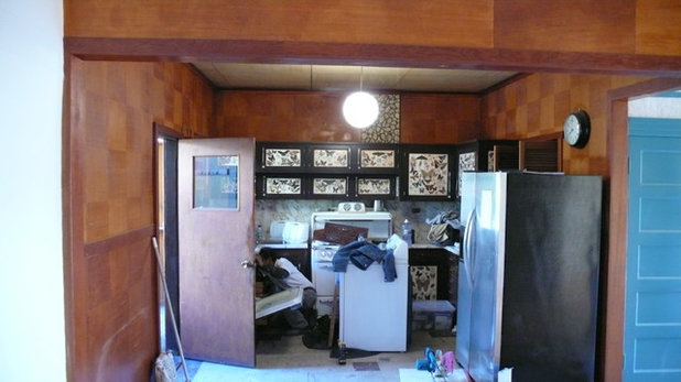
Before: Just for fun, let’s take a gander at the original kitchen, with its frisky butterflies on the cabinets.
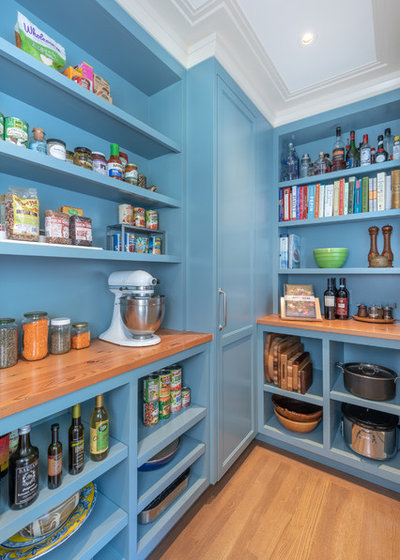
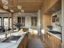
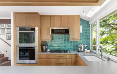
To the left of the refrigerator is a walk-in pantry, which provides space for small appliances. The paint is the same shade of blue as the kitchen island, and the countertops are made of vertical-grain Douglas fir framing pieces that the cabinetmaker reclaimed from the house during construction and upcycled. When the pantry is looking neat and pretty they can keep the view open to it from the kitchen, but when they want a more formal look there is a pocket door that closes it off.
Find a local cabinet pro on Houzz
Find a local cabinet pro on Houzz
“The homeowners knew that they wanted a kitchen with an island, a peninsula and a walk-in pantry as well as a large door system that opened completely to the backyard. This meant not loading up the walls with upper cabinets. These things seemed to be in conflict,” Budd says. But they were able to maximize the storage capacity of the lower cabinets, design an island with base-cabinet storage on both sides and make room for a walk-in pantry to minimize the amount of upper-cabinet storage they would need.
Another interesting trick was placing windows behind the cabinets that flank the range. Paired with glass-front cabinet doors, this allows natural light to filter through from the side yard. The cabinet-door glass is leaded, another nod to the home’s history. Along with the open shelves, they give the range wall a light feel.
Find a pot rack in the Houzz shop
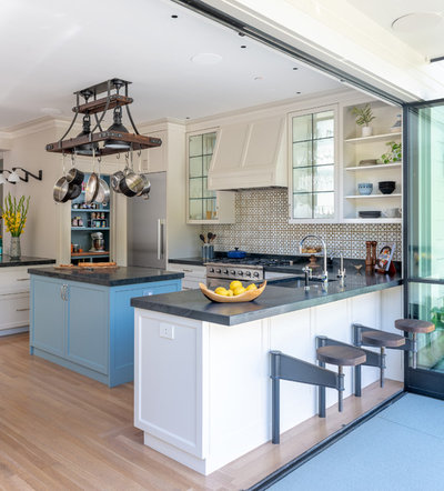
To get an eating bar out of the peninsula, Gordon came up with a clever idea for custom stools. When the accordion doors are open, the stool’s bases swing out and the seats fold down so the peninsula can serve as an outdoor bar. When they need to close the doors, they swing the stool bases over and flip up the seats. “It was fun to work with a contractor on his own home because he knew what was possible,” Budd says.
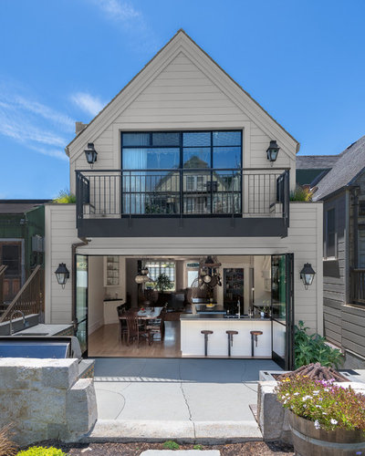
Here is the view from the back of the yard. The outdoor kitchen is on the left and the fire pit is on the right. The balcony is off the homeowners’ son’s room. Its steel-framed doors are a modern touch.
Browse more Houzz photos of patios with outdoor kitchens
Browse more Houzz photos of patios with outdoor kitchens
Before Photo
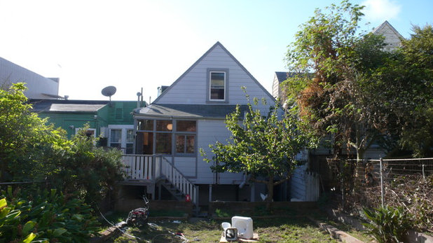
Before: The back of the house had a laundry porch that had been added on, typical of a lot of houses from this era in San Francisco.
A New Top Level
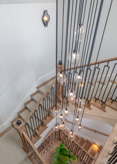
Before, the second floor was a converted attic with little headroom and a treacherously steep staircase that didn’t meet code. Now the three-story open staircase is a major design element. The rails, posts and dramatic light fixture are all custom.
Before, the second floor was a converted attic with little headroom and a treacherously steep staircase that didn’t meet code. Now the three-story open staircase is a major design element. The rails, posts and dramatic light fixture are all custom.
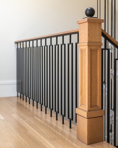
A large skylight above the light fixture bathes the staircase in natural light. Ball-topped newel posts nod to Edwardian style, but crafting them from steel gave the staircase a modern look that plays off the steel windows and railings. The posts, handrails and floors are European white oak, a material historically common in San Francisco flooring.
More Indoor-Outdoor Connections Upstairs
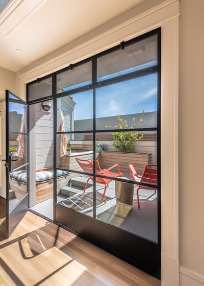
At the top of the stairs is another set of steel-framed windows and a door that leads to a roof deck. Outside on the left is a glimpse of one of the upper floor’s shed dormers. The spa is camouflaged by the wooden surround. (It’s just around the corner from the built-in cushioned bench.)
At the top of the stairs is another set of steel-framed windows and a door that leads to a roof deck. Outside on the left is a glimpse of one of the upper floor’s shed dormers. The spa is camouflaged by the wooden surround. (It’s just around the corner from the built-in cushioned bench.)
Calm and Textured Master Suite
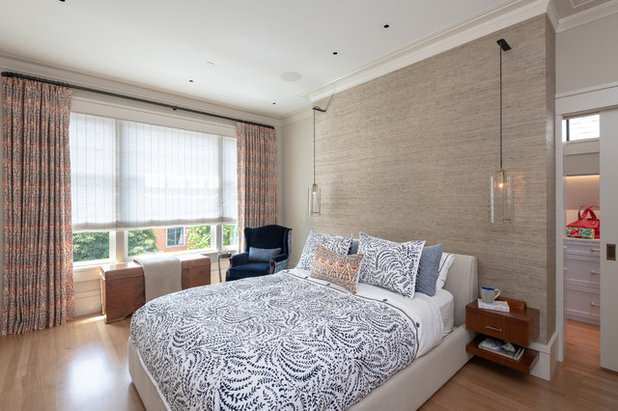
A grasscloth wallcovering brings warm texture into the master bedroom. Built-in walnut nightstands and wall-mounted pendant lights save space in the modest-sized room. USB charging outlets are hidden behind the drawers in the nightstands. To the right another pocket door leads to a walk-in closet.
Browse grasscloth wallcoverings
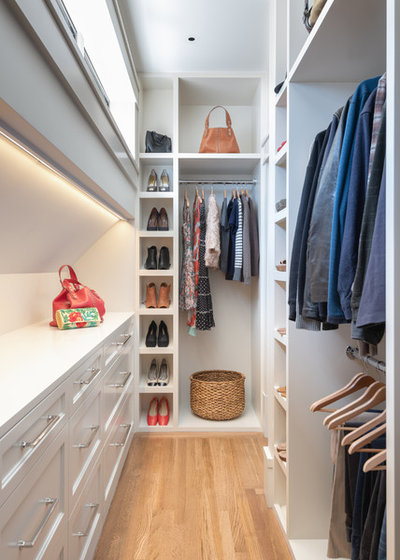
Clerestory dormer windows provide natural light in the closet. Building in dresser drawers saved floor space in the master bedroom. The shallow drawers on the dresser side are sized for undies and accessories.
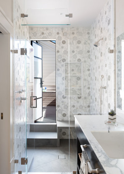
The master bathroom occupies one of the shed dormers. A floral water-jet mosaic tile adds a lovely pattern in calm colors. The cabinetmaker crafted the vanity from more of the Douglas fir framing pieces removed during construction.
A door beyond the shower stall leads straight to the spa deck. The clever design of the waterfall bench flows into the steps, and both are crafted from the same marble slab. “This kept this piece quiet in contrast to the tile pattern,” Budd says.
A door beyond the shower stall leads straight to the spa deck. The clever design of the waterfall bench flows into the steps, and both are crafted from the same marble slab. “This kept this piece quiet in contrast to the tile pattern,” Budd says.
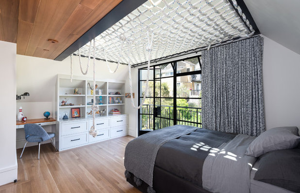
Lofted Ceiling Is a Rope Course
Their son’s room takes advantage of the space beneath the roof’s gable. A ship ladder leads up to a play loft where he can walk on or lie atop the woven ropes. This feature was the homeowner’s idea, and he planned it out prior to the framing stage of construction. This was necessary to build a structure that would accommodate the weight of people on top of the ropes safely. The rope ceiling is removable.
The built-ins include space for books, toys, artwork and clothing, with an integrated desk on the left. The large doors lead to the balcony off the back of the house.
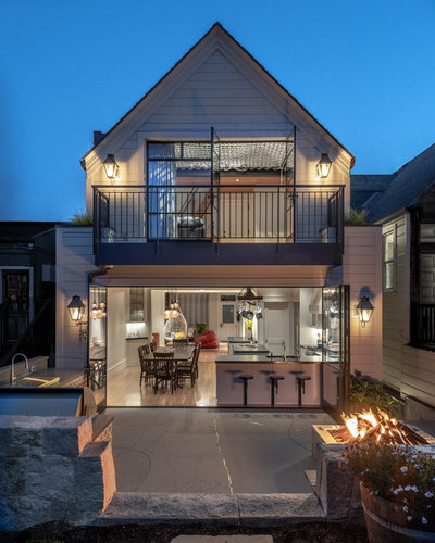
Here’s a look at the rope ceiling from outdoors; the ladder is in the back of the room on the left.
Exterior lanterns, the fire pit and some unusual LED lighting provide a welcoming glow in the evening. The homeowner purposely made the cracks in the pavement to emulate Andy Goldsworthy’s work at the de Young Museum in San Francisco and lit them with LEDs.
Shop for traditional outdoor lanterns
Exterior lanterns, the fire pit and some unusual LED lighting provide a welcoming glow in the evening. The homeowner purposely made the cracks in the pavement to emulate Andy Goldsworthy’s work at the de Young Museum in San Francisco and lit them with LEDs.
Shop for traditional outdoor lanterns
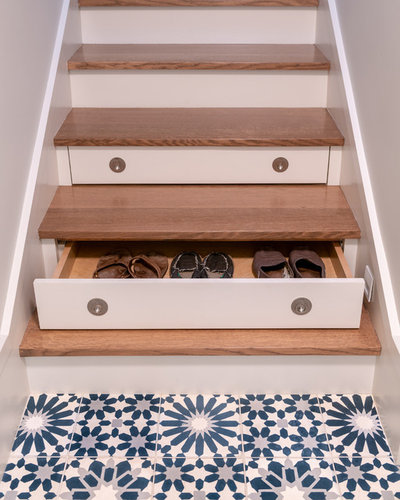
One Last Clever Custom Detail
The lower level off the garage contains the laundry room and mudroom. These stairs up to the main floor have hidden drawers so the family can swap their shoes for slippers before entering the main living spaces.
The lower level off the garage contains the laundry room and mudroom. These stairs up to the main floor have hidden drawers so the family can swap their shoes for slippers before entering the main living spaces.
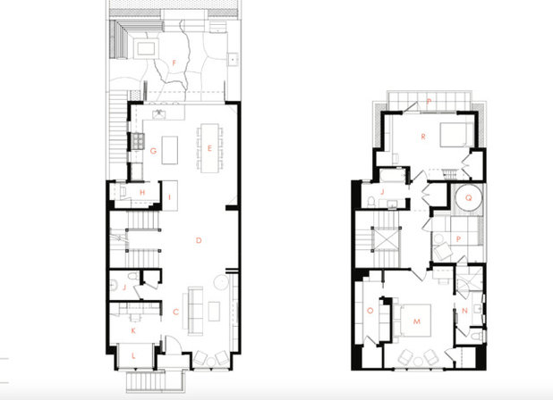
Floor Plans. Worth noting are the staircase and adjacent “chill-out” space in the center of the first floor that we didn’t see in the photos, left, and the way the roofline works on the second floor, right — particularly how the hallway and master shower have doors that access the spa roof deck, and how the roofline’s shed dormers around it make it private.
Takeaways. There were so many neat tricks that saved space in this house and made it seem larger. They include:
More: Read Houzz stories about how to hire a design pro
Takeaways. There were so many neat tricks that saved space in this house and made it seem larger. They include:
- Squeeze extra space from bays. This is a great idea for a smaller-budget micro-addition that will expand square footage and let in lots of natural light.
- Open up a plan. You don’t have to go fully open, but even opening up two rooms to one another or widening doorways will make things seem airier and brighter.
- Invest in built-ins. This allowed for extra seating in the narrow living room, a guest bed reading nook and loads of storage in the office, master closet and child’s room.
- Use pocket doors. The swing of a door is a space hog.
- Outfit lower kitchen cabinets with pullouts and other inserts to maximize their storage potential and ease retrieving things.
- Install USB plugs into or near nightstands — first thing in the morning, phone and tablet batteries will be 100% charged.
- Move a dresser into a walk-in to free up floor space from dressers in a compact bedroom. This can leave room for a couple of armchairs or a chaise lounge instead.
- Use clear glass on a shower surround.
More: Read Houzz stories about how to hire a design pro


What are you working on?
Related Products
Related Stories
Houzz Tours
Houzz Tour: Organic Style on an Avocado Ranch
By Becky Harris
A designer uses a soft neutral palette, handmade tile and reclaimed wood to update a 1980s contemporary home
Full Story
Houzz Tours
Houzz Tour: Elegant, Earthy Ranch House for an Empty-Nest Couple
Design styles, warm neutral colors and special details blend in a Minnesota ranch-style house with a finished basement
Full Story
Houzz Tours
Houzz Tour: Classic Meets Modern in a Designer’s 1900 Home
Designer Sara Swabb revives a stately row house for her family in Washington, D.C.’s Georgetown neighborhood
Full Story
Houzz Tours
Houzz Tour: Designer Infuses a 1950s Ranch House With Personality
By Becky Harris
Architectural salvage, reclaimed light fixtures and English pub inspiration add character in this remodel and addition
Full Story
Houzz Tours
Houzz Tour: Making the Most of Every Inch in 1,250 Square Feet
By Becky Harris
Designers use meticulous space planning, minimalist style and custom features to open up and brighten a duplex
Full Story
Houzz Tours
Houzz Tour: Dark and Moody Contrast With Serene and White
By Becky Harris
A design team working remotely brings dramatic contrast, style and comfort to a family’s Southern California home
Full Story
Houzz Tours
Houzz Tour: Home Reimagined as a 3-Level Treehouse
By Julie Sheer
A designer found on Houzz helps a couple bring nature views into their downtown Seattle home
Full Story
Houzz Tours
Houzz Tour: Bold Colors and Art Energize a New Family Home
A designer found on Houzz curates a Washington, D.C., home for a fun-loving young family
Full Story
Houzz Tours
Houzz Tour: Old Stone House Gets a Youthful Makeover
A designer mixes periods and styles to turn a 1929 house into a colorful, contemporary family home for her daughter
Full Story
Houzz Tours
Houzz Tour: Redesign Makes a Big House More Comfortable
By Becky Harris
A designer uses woodwork, furnishings and other elements to bring balance to large-scale rooms
Full Story
Love everything about this house.
Just charming. I love the ability to open the back wall to the outdoors. You can't really do this in my part of the world-Texas and Oklahoma-between the bugs and the heat no-one would ever come over twice. But in a cooler climate so lovely. The bedrooms are wonderful and I think it is very clever to have a door from the bathroom out to the deck. I am quite amazed by what had to be both planned and executed to expand the garage. Surely it cost quite a bit. But what a wonderful result/ And I see that there is now parking for 3 vehicles although I am surprised that a small family would need 3 ? Is the law because so many houses had multiple tenants and it caused huge problems ? I loved the green front door but might want to perk the window frames up as well- a coral shade maybe ? The foldaway barstools for ingress and egress-so smart. And if I were a guest waking up in that sweet bay window would be very lovely. Bravo.
beautiful architecture, craftsmanship and ingenious use of space.
I love the kid' s bedroom, the use of bays and the guest office.
The kitchen is ...those cabinets with windows as the back...the accordion doors and the foldable seats and the fact that this kitchen has an island, a walk in pantry and a peninsula!
The staircase is the showpiece of this home...its beautifully done.
very,very nice.