


Kitchen Design

Decorating Guides

Palatable Palettes: 8 Great Kitchen Color Schemes
Warm and appetizing or cool and relaxing? These 8 paint palettes can help you choose the best colors for your kitchen

‘‘There are no bad colors, just bad color combinations," said one of my interior design mentors many years ago. At first I disagreed with him, since there's a certain shade of brown-mustard yellow that I definitely wouldn't want slathered all over my walls. But after I chewed on his statement for a bit, I realized that I had seen that color used in ways that were quite beautiful. It's definitely possible to make any single color work in your home — it's all in how other colors and materials are incorporated with it. But how do you develop a cohesive color palette?
Spend a few minutes browsing through the thousands of kitchens showcased on Houzz and you will quickly see they come in all shapes, sizes, styles and colors. Colorwise they can run the gamut from eye catching, bold and bright, to light, tranquil and airy. Featured here are some of the many delightfully colorful kitchens on Houzz, along with examples of color palettes inspired by the kitchens.
Spend a few minutes browsing through the thousands of kitchens showcased on Houzz and you will quickly see they come in all shapes, sizes, styles and colors. Colorwise they can run the gamut from eye catching, bold and bright, to light, tranquil and airy. Featured here are some of the many delightfully colorful kitchens on Houzz, along with examples of color palettes inspired by the kitchens.
Example palette: This potential palette features warm, analogous colors, plus a grounding neutral. Clockwise from top left (all from Farrow & Ball): Rectory Red, Charlotte's Locks, Down Pipe and Pale Hound.
Cool Color Palette
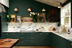
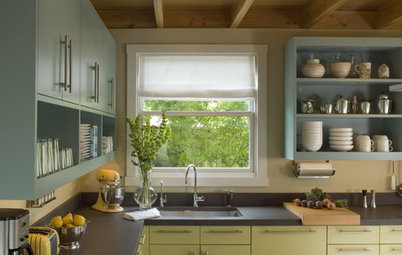
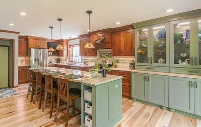
This kitchen also features bold analogous colors, but it's on the cool end of the color wheel with shades of green and blue. It has a sophisticated and serene feel.
This kitchen also features bold analogous colors, but it's on the cool end of the color wheel with shades of green and blue. It has a sophisticated and serene feel.
Example palette: Clockwise from top left, these cool analogous colors (all from Benjamin Moore) are Light Daffodil, Whipple Blue, Cream Silk and Brookside Moss.
Blank Canvas With Bold Accessories
Here's another kitchen that smartly features bold colors in a way that's easy and relatively affordable to change at any time. You could give this kitchen a completely different look just by swapping out the carpet tiles and counter stools.
Here's another kitchen that smartly features bold colors in a way that's easy and relatively affordable to change at any time. You could give this kitchen a completely different look just by swapping out the carpet tiles and counter stools.
Example palette: This potential palette features deep colors that pack a punch and are best utilized in small chunks. Clockwise from top left (all from Sherwin-Williams): Roycroft Copper Red, Knockout Orange, Rave Red and Softer Tan.
Splash of Green
An unexpected splash of color can be truly captivating. To prevent it from crossing the line to overwhelming, however, take a tip from this fresh and airy space by keeping all the other elements in the space neutral.
An unexpected splash of color can be truly captivating. To prevent it from crossing the line to overwhelming, however, take a tip from this fresh and airy space by keeping all the other elements in the space neutral.
Example palette: Here's another example of a palette that features one bold color with supporting neutrals. Clockwise from top left (all from Dunn Edwards): Lemon Lime, Chive, Cascading White and Silver Lined.
Bold Traditional Palette
Eye-popping colors aren't just for contemporary kitchens. This handsome kitchen features an oversize bold red range set in rich, dark chocolate cabinets. The tile backsplash has an intricate pattern to it but, because of the neutral colors used, it complements rather than competes with the range.
Eye-popping colors aren't just for contemporary kitchens. This handsome kitchen features an oversize bold red range set in rich, dark chocolate cabinets. The tile backsplash has an intricate pattern to it but, because of the neutral colors used, it complements rather than competes with the range.
Example palette: This potential palette features a luscious, saturated red and a rich chocolate brown. Clockwise from top left (all from Glidden): Candy Apple, Swiss Coffee, Bittersweet Chocolate and Soft Suede.
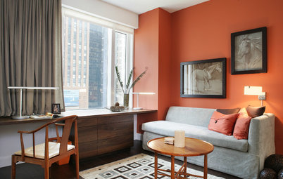
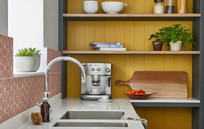
Splash of Yellow
This appealing, light-filled kitchen sports a band of color at the backsplash and via the dining chairs. This is a great option for someone who wants a very light, soothing and restrained palette but with a little twist.
This appealing, light-filled kitchen sports a band of color at the backsplash and via the dining chairs. This is a great option for someone who wants a very light, soothing and restrained palette but with a little twist.
Example palette: An example of a palette for a light and bright kitchen, with a kick of color. Clockwise from top left (all from Mythic Paint): Sunny Side Up, Helios, Silken Sand and Slip of Silver.
Warm, Rich Kitchen Palette
This kitchen makes me want to eat! And definitely drink some wine. The color red is said to be an appetite stimulant, which is why most fine dining establishments are painted shades of red rather than, say, green or blue. Red can be tricky to work with, though, because it tends to suck all the light from a room. Instead of painting your walls red, try using red in smaller chunks, such as the red range featured in an earlier kitchen, or as used here, in these beautiful cranberry-red cabinets.
This kitchen makes me want to eat! And definitely drink some wine. The color red is said to be an appetite stimulant, which is why most fine dining establishments are painted shades of red rather than, say, green or blue. Red can be tricky to work with, though, because it tends to suck all the light from a room. Instead of painting your walls red, try using red in smaller chunks, such as the red range featured in an earlier kitchen, or as used here, in these beautiful cranberry-red cabinets.
Example palette: A potential palette to stimulate one's appetite. Clockwise from top left (all from Behr): Indiscreet, Irish Mist, Chipotle Paste and Silver Drop.
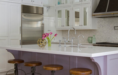
More: 8 Great Bathroom Color Palettes
More: 8 Great Bathroom Color Palettes
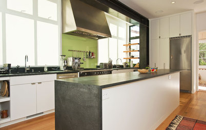
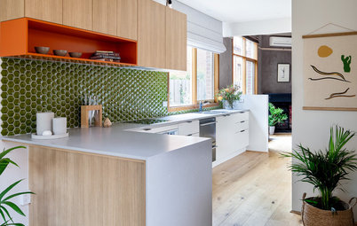

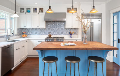


If you love lots of bright and bold colors but don't want your kitchen to appear as if a rainbow exploded inside of it, consider working with analogous colors: colors next to each other on the color wheel.
A simple way to think of this is warm versus cool colors. This kitchen features very bold splashes of warm oranges and red. The space feels exciting and energetic — great for entertaining.