


Color Guide: How to Use Yellow Ocher
Earthy and warm, this ancient color evokes the sands of time as well as speaks to modern decorating sensibilities
Samantha Schoech
August 29, 2012
Houzz Contributor. I am a former magazine editor specializing in travel and design. I just completed my first remodel, turning my crumbling 1941 kitchen into a beauty of grays, whites and natural wood. If I could, I'd sleep on the countertop. That's how much I love it.
You can also read my parenting blog on Baby Center http://blogs.babycenter.com/author/sschoech/
Houzz Contributor. I am a former magazine editor specializing in travel and design.... More
Yellow ocher ranges from golden to light brownish and is one of the oldest tints used by humans. It's what you see on the plaster walls of Tuscany. It's a wheat field at sunset. It's the glow of golden oak floors.
Ocher is warm and earthy (originally it was made out of clay containing colorful minerals). It has an ancient feel — the oldest known human art was made in ocher, and it is commonly used in traditional African and Aboriginal art. But it was also popular in midcentury design (it goes well with that particular shade of muted teal that was also popular then).
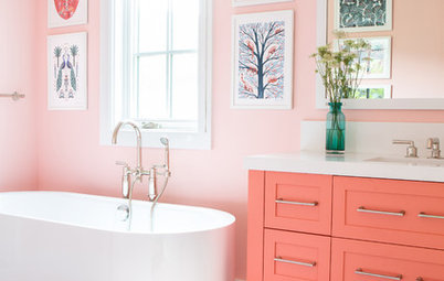
Ocher varies in both tone and hue. It can be pale or dark, golden or almost brown. It looks great next to teal, burgundy red and cool grays and purples. Its richness makes it a lovely candidate for heavy fabrics such as velvet and brocade. And of course it goes well with terra-cotta, its equally earthy cousin.
An ocher room is a cozy room, even if it's architecturally large and open. Used in accessories it adds brightness, richness and energy, just like other yellows do, but it's more subdued. Ocher is the mature yellow. When I look at it I keep coming back to words like "elegance," distinguished," "quality," "wisdom" and "confidence." Ocher is the eminent bohemian poet who invites you over for tea and regales you with stories of days gone by.
Ocher is warm and earthy (originally it was made out of clay containing colorful minerals). It has an ancient feel — the oldest known human art was made in ocher, and it is commonly used in traditional African and Aboriginal art. But it was also popular in midcentury design (it goes well with that particular shade of muted teal that was also popular then).
Ocher varies in both tone and hue. It can be pale or dark, golden or almost brown. It looks great next to teal, burgundy red and cool grays and purples. Its richness makes it a lovely candidate for heavy fabrics such as velvet and brocade. And of course it goes well with terra-cotta, its equally earthy cousin.
An ocher room is a cozy room, even if it's architecturally large and open. Used in accessories it adds brightness, richness and energy, just like other yellows do, but it's more subdued. Ocher is the mature yellow. When I look at it I keep coming back to words like "elegance," distinguished," "quality," "wisdom" and "confidence." Ocher is the eminent bohemian poet who invites you over for tea and regales you with stories of days gone by.
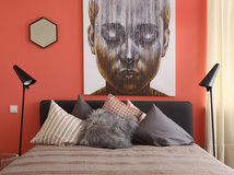
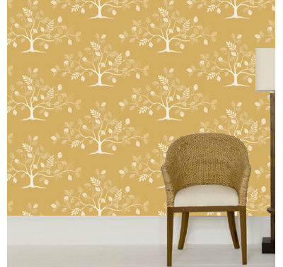
Ocher on the Walls
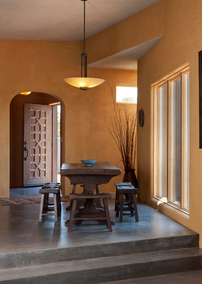
The textured ocher walls add warmth and elegance to this spare room with concrete floors.
The textured ocher walls add warmth and elegance to this spare room with concrete floors.
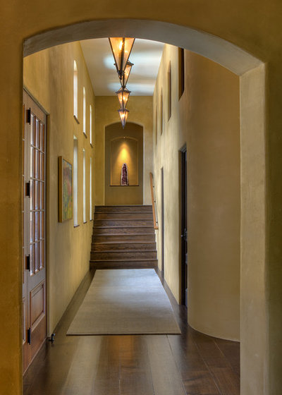
Ocher walls give a space gravitas. There is something distinguished and comforting about this color — maybe because it has weathered trends for centuries.
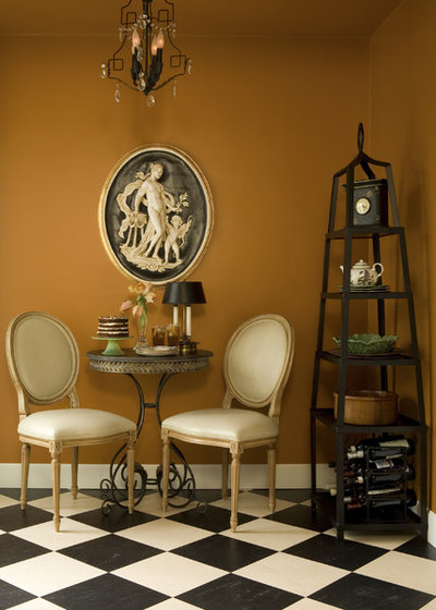
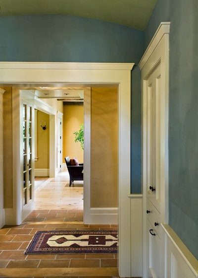
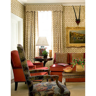
This is a very orangey ocher. It's chic and warm and provides the perfect backdrop for an otherwise muted black and white room.
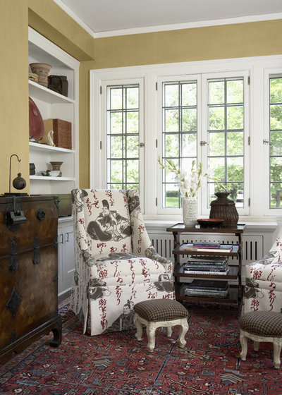
This light, greenish ocher is nearly neutral, but its warmth and depth make the rest of the room feel cozier and more intimate.
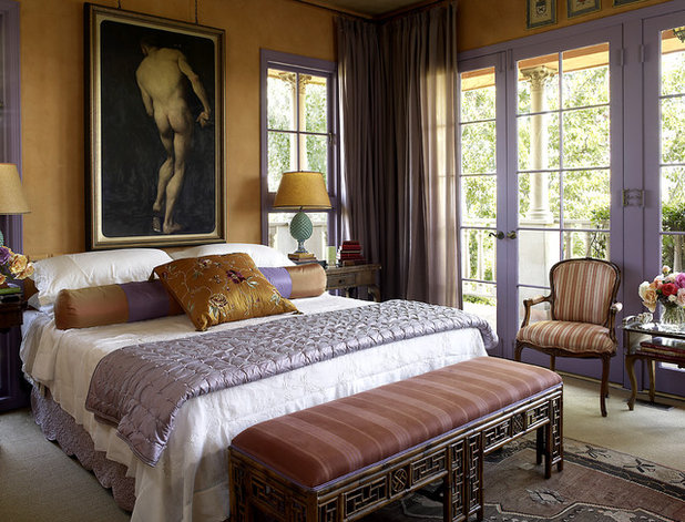
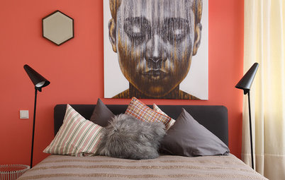
Eclectic design is so often played out against a white background. This glowing yellow ocher adds grace and confidence to the room.
Browse eclectic bedroom decor
Browse eclectic bedroom decor
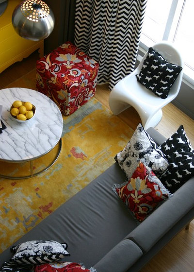
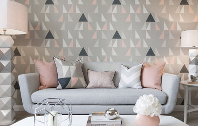
See how well it goes with teal? It's earthy and traditional and modern and fresh.
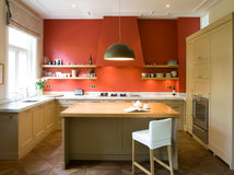
Ocher in the Kitchen
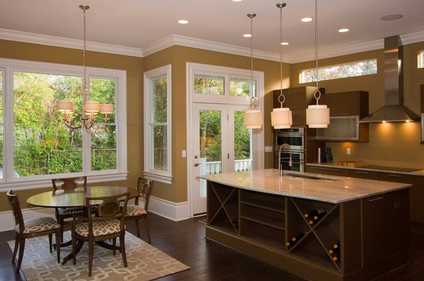
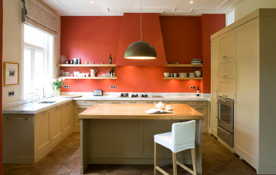
Ocher is said to stimulate appetite and is associated with food. Perfect for the kitchen.
Ocher is said to stimulate appetite and is associated with food. Perfect for the kitchen.
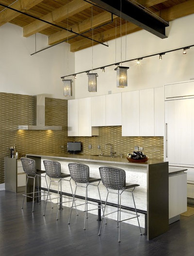
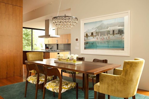
This ocher tile backsplash adds a touch of much-needed warmth to this open, white kitchen without sacrificing its modern aesthetic.
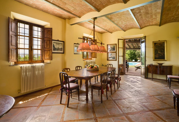
Ocher walls with exposed brick and terra-cotta tile floors fit right in in Mexico, Italy, Spain or California. It’s a classic look.
Basics of Decorating With Ocher
Ocher works well in rich, traditional rooms. It is especially beautiful in upholstery or draperies.
Ocher works well in rich, traditional rooms. It is especially beautiful in upholstery or draperies.
Ocher also makes a perfect warm base for a more modern, eclectic room.
Ocher velvet with muted teal. It's modern but not cold.
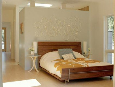
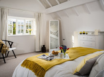
The golden tones in the natural wood bed frame and the modern bedspread seem to glow against the very pale neutrals in this bedroom.
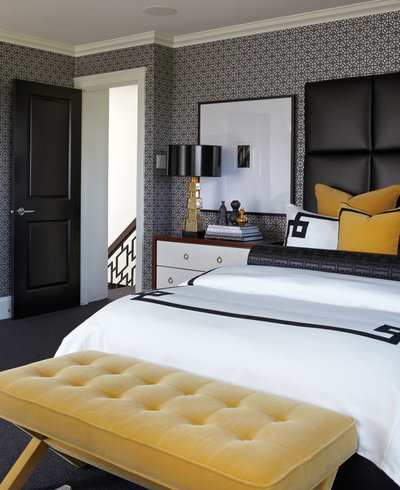
Spots of ocher velvet against black and white add muted, not-too-eager pops of color.
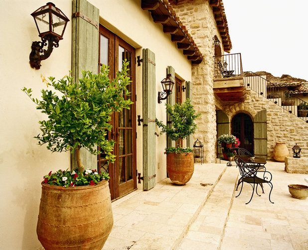
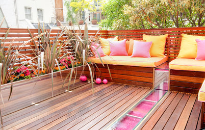
Ocher Outside
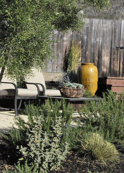
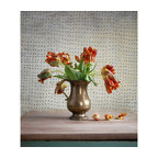
A large ocher vase adds color but looks earthy and ancient in a garden setting.
Yellow vases bring gardens year-round color
A large ocher vase adds color but looks earthy and ancient in a garden setting.
Yellow vases bring gardens year-round color
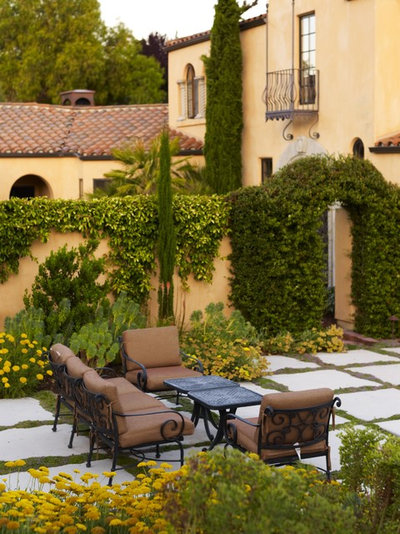
A more muted version of the color with a red tile roof adds instant Mediterranean cred.
Even paler, almost beige. But still with that yellow glow.
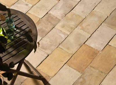
Ocher patio bricks have an ancient feel. Can’t you just picture the sandals of the Phoenicians on this?
Ask a professional how to bring ocher outside
Ask a professional how to bring ocher outside

Benjamin Moore
Ocher ranges from almost brown to bright gold. It can be orangey or greenish, but it is always warm. These paint samples and a swatch will get you thinking.
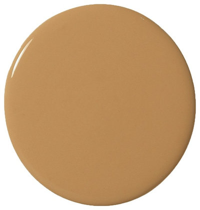


Benjamin Moore


Benjamin Moore
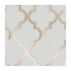
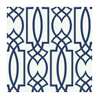
Cole & Son
We believe that the transition of a house into a home is a sense of history and a piece of the future. It tells... Read More

Related Products
Related Stories
Kitchen Design
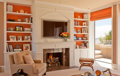
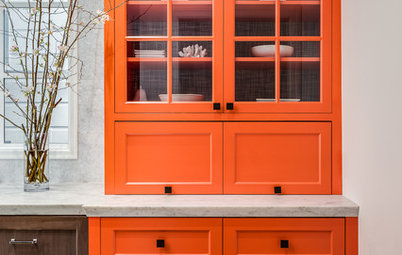
Cooking Up Color: 9 Places to Use Orange in a Modern Kitchen
By Jennifer Ott
See how this glowing color can create a tasty, zesty design
Full Story
Colors of the Year
Designers Around the World React to Pantone’s 2019 Color Choice
By Houzz
International design pros offer tips on how to use Living Coral, Pantone’s Color of the Year 2019, in home decor
Full Story
Colors of the Year
Are You a Fan of Pantone’s 2019 Color of the Year?
By Jennifer Ott
Living Coral is bold and bright. Here are places to consider using it indoors and out
Full Story
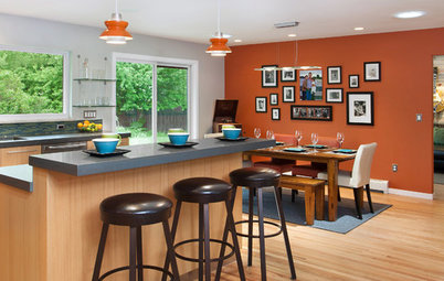
Color
Orange You Glad This Doesn’t Look Halloween-y?
Pops of orange don’t have to stop once trick-or-treating does. Here are some ways to make the bold color work anytime
Full Story
Color
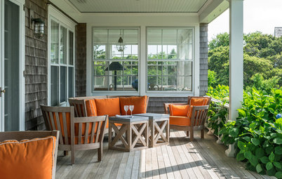
7 Rooms That Fall for Orange
By Karen Mills
Orange can work in any room throughout your home, and these 7 spaces offer some autumn inspiration
Full Story
Color
6 Ways to Use Pumpkin Spice in Your Decor
By Becky Harris
Add a dollop of this harvest hue to your home to get ready for fall
Full Story
Color
The Meaning of Color: Orange
Designing a space for people to gather and converse in good spirits? Consider including orange in your decor
Full Story
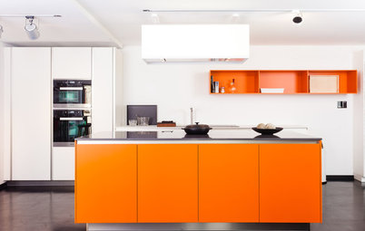
Kitchen Islands
Eye-Catching Islands: 8 That Bring the Zing With Orange
By Jennifer Ott
Whether soft and warm or bold and hot, orange sizzles in the kitchen
Full Story
Decorating Guides
10 Reasons to Decorate With Peach (Yes, Really)
Is it time to dust off this shade so beloved by 1980s decorators? Find out why you might want to give it a try
Full Story
Color
Decorate With the Colors of the Summer Sunset
By Lara Watson
Mix oranges and pinks for bold or blushing looks inspired by nature
Full Story
These are some brilliant ideas to try. We would like to know more