


Color of the Year: Off-White Is On Trend for 2016
See why four paint brands have chosen a shade of white as their hot hue for the new year
Jennifer Ott
October 20, 2015
San Francisco-based architectural color specialist and design writer. Jennifer's work has been featured in many print and online publications. Her recently-published book, "1000 Ideas for Color Schemes," is a beautifully illustrated and easy-to-navigate guide that takes the guesswork out of selecting the perfect color palette for your home or special event. For more information on Jennifer Ott Design, visit http://jenottdesign.com/.
San Francisco-based architectural color specialist and design writer. Jennifer's... More
It’s the time of year when many paint manufacturers and color forecasters release their picks for top shades for the coming year. And while these selections typically vary widely from company to company, one emerging trend for 2016 is what some would call a colorless color: white or, more specifically, shades of off-white. Here are four major paint brands’ achromatic color picks and how best to use them in your home.
Benjamin Moore and Glidden have made off-white hues their “color of the year” for 2016, while Sherwin-Williams and Behr are each showing an off-white in their 2016 color trend forecasts.
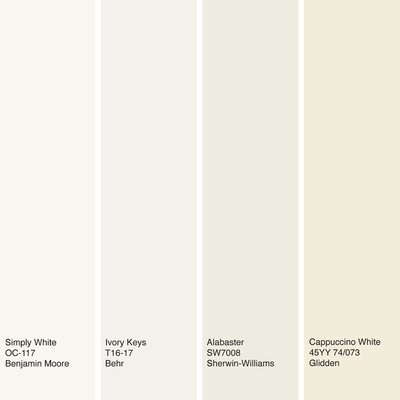
Shown here: Simply White from Benjamin Moore, Ivory Keys from Behr, Alabaster from Sherwin-Williams and Cappuccino White from Glidden.
Shown here: Simply White from Benjamin Moore, Ivory Keys from Behr, Alabaster from Sherwin-Williams and Cappuccino White from Glidden.
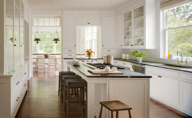
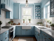
I tend to be drawn to colorful interiors but can still appreciate an all-white space that’s done well, such as this kitchen. The cabinets, painted in Benjamin Moore’s Simply White, are simply beautiful. Benjamin Moore has been slowly but surely moving toward softer and lighter hues with its “color of the year” selections.
In 2014, Benjamin Moore’s pick was the subtle sky blue Breath of Fresh Air, and last year, it chose the light and neutral Guilford Green. Simply White is perhaps the next logical choice in Benjamin Moore’s evolution toward barely there, wispy hues. Unlike color management company Pantone’s recent selections, these shades are soft and neutral enough to be used generously in a space, rather than as a small accent only.
In 2014, Benjamin Moore’s pick was the subtle sky blue Breath of Fresh Air, and last year, it chose the light and neutral Guilford Green. Simply White is perhaps the next logical choice in Benjamin Moore’s evolution toward barely there, wispy hues. Unlike color management company Pantone’s recent selections, these shades are soft and neutral enough to be used generously in a space, rather than as a small accent only.
If you prefer whites with a little more substance, check out Sherwin-Williams’ Alabaster. This neutral white doesn’t veer too far to the warm or cool side and pairs nicely with pretty much any other color.
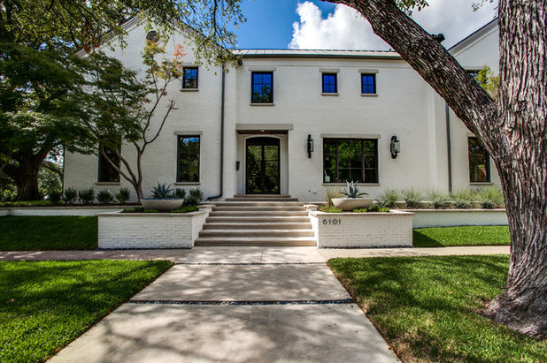
Alabaster also works well as a soft accent to a more true white. Here it subtly sets off the house trim from the pure white exterior.
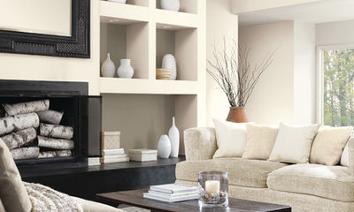
Cappuccino White from Glidden is a creamy white that works best with warm hues. Here it contrasts with the room’s dark brown accents. It’s a good choice if you need to boost the light in a space, as it mimics the warm glow you get from a sunny day.
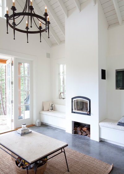
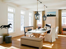
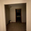
Here’s another room clad in Simply White, from Benjamin Moore. White spaces can often feel cold and sterile, but you can counteract this if your space has striking architectural details and charming furniture, fixtures or accessories. In fact, the white wall color allows these details to take center stage where a vibrant color would be too distracting.
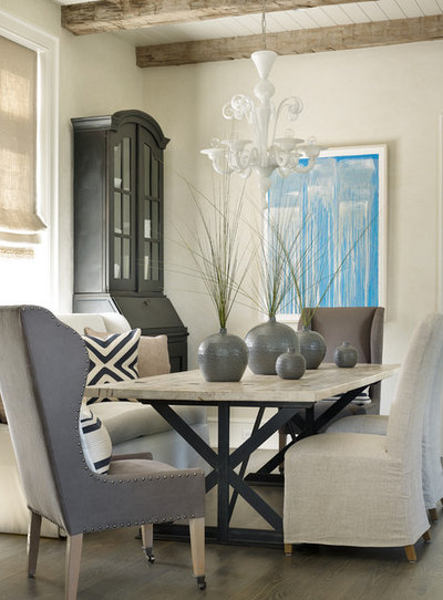
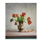
For those who want a mix of colors in a room but aren’t fans of brights and bolds, try a sampling of neutral whites, grays and browns instead. It makes a visually interesting, warm and welcoming space without going over the top with color. A bonus of a neutral-only room is that it won’t feel dated as quickly as one clad in vibrant trendy colors. The walls here are painted in Alabaster, from Sherwin-Williams.
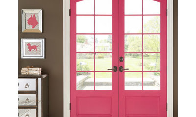
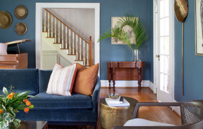
Even lovers of bold color need white or light neutrals to break up the palette. I like to think of this as the critical “negative space” that artists incorporate into their works. It’s the white or blank space necessary to allow the main elements of the composition to shine. This vivid door gets a visual break via trim painted in Behr’s Ivory Keys.
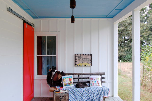
Likewise, Benjamin Moore’s Simply White offers a nice break here from the more intense colors. It’s clean and crisp whether you pair it with warm or cool hues.
Tell us: Are you on board with these off-white selections?
See other Colors of the Year
Tell us: Are you on board with these off-white selections?
See other Colors of the Year
What are you working on?

Related Products

We believe everyone deserves a space that will make them feel comfortable. Our goal is to help you create and... Read More
Related Stories

Decorating Guides
Design Pros Share 10 Favorite Creamy White Paints
By Becky Harris
These off-white color choices include versatile tones, warming hues and pleasingly soft shades
Full Story

Kitchen Countertops
What Kitchen Countertop Colors Should You Choose?
By tidgboutique
Consider these popular colors and styles to get the look you want — no matter what material you use
Full Story

Colors of the Year
Pantone Picks a Peach for Its 2024 Color of the Year
By Jennifer Ott
See how to use this juicy hue to create calm yet flourishing spaces inside and outside the home
Full Story

Decorating Guides
5 Ways Designers Are Working With Rich Warm Tones Right Now
By Becky Harris
Interior designers describe their strategies for using rich warm colors to create an inviting home
Full Story

Colors of the Year
10 Paint Colors Ready to Take Over in 2024
By Jennifer Ott
Blue is huge, but dark hues and warm tones also find favor among major paint companies’ 2024 Color of the Year picks
Full Story
Decorating Guides
How to Mix Colors and Make It Work
By tidgboutique
Don’t want to confine yourself to neutrals but lack the confidence to embrace colors? Check out this pro advice
Full Story

Events
7 Color Trends for 2024 at Maison & Objet
By Claire Tardy
New harmonies and unexpected pairings at the fall 2023 trade fair set the tone for next year’s interiors
Full Story

Decorating Guides
9 Ways to Layer Warm Neutral Colors for Comfortably Refined Rooms
By Becky Harris
Design pros share advice for building an inviting palette, introducing high contrast and mixing textures
Full Story

Decorating Guides
How to Create a Cohesive Color Flow Throughout Your Home
By Erin Carlyle
Designers share eight techniques for avoiding a choppy feeling in your spaces
Full Story

Decorating Guides
How to Get Your Ceiling Paint Color Right
By tidgboutique
Here’s how to tweak the shade of your ceiling paint to get the effect you want
Full Story
Dove white (BM) walls!
Love love white!