Pantone Unearths Emerald as Its 2013 Color of the Year
Whether you dig a natural version or go for one with polish, Pantone is predicting you'll treasure emerald green at home over the next year

Emerald has landed at the top of the color wheel, named by Pantone as its Color of the Year for 2013. Pantone's annual color predictions get lots of buzz. Do they influence the way you decorate each year?
And do you wonder what goes into the picking? "To arrive at the selection, Pantone quite literally combs the world looking for color influences," according to the company. "This can include the entertainment industry and films that are in production, traveling art collections, hot new artists, popular travel destinations and other socio-economic conditions. Influences may also stem from technology, availability of new textures and effects that impact color, and even upcoming sports events that capture worldwide attention." Spring collections by Tracy Reese, Nanette Lepore, Barbara Tfank, NAHM and Marimekko are listed as influences.
Poll: Vote for your favorite 2013 color prediction
In case you are also wondering what all of this color-predicting clout can lead to, be on the lookout for the Sephora and Pantone Universe 2013 Color of the Year beauty collection, and a Pantone bed and bath collection at JCPenny. Hmmmm ...
Whatever you think of the annual announcement, it gives us an opportunity to examine the ways designers are using a particular hue, which I always enjoy. Emerald is a hue taken directly from nature, on leaves both matte and glossy as well as in the gem. What I find most interesting about using emerald in home decor is its split personality — it has moods that are downright crunchy granola, and then it can transform into a glamorous diva at a moment's notice.
This means it has great versatility: You can take it in a more rustic direction (think leaves and twigs) or go full-out jewel-tone glam (think the $30 million worth of gems that Richard Burton gave Elizabeth Taylor on the set of Cleopatra.) Check and see if any of these emerald rooms fit your own mood.
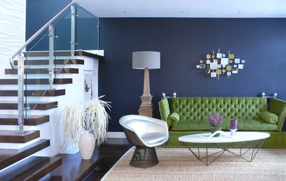
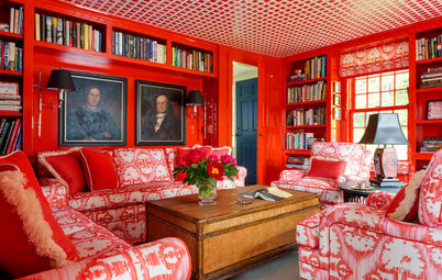
Glam in the living room. Interior designer Jamie Drake had his eye focused on emerald when he put together this dazzling room for the Kips Bay show house in New York.
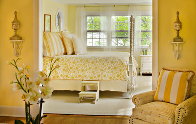
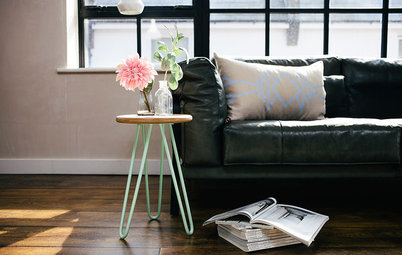
Natural in the living room. If you're intrigued by emerald but aren't ready to commit to full walls or upholstery jobs, bring it in via nonpermanent textiles and accessories, like pillows, rugs, plates, bottles, drapes or glassware.
Glam in the bath. The glossier surfaces in this bathroom give emerald a contemporary Hollywood-glamour moment.
Natural in the bath. Emerald brings in strong color and calm to this well-balanced bathroom.
Glamorous accent pieces. As a jewel tone, it also lends elegance to rooms bedecked in metallics and marble.
Natural accent pieces. Because it's a color found in nature, emerald works with rustic natural materials, like glass, wood and rope.
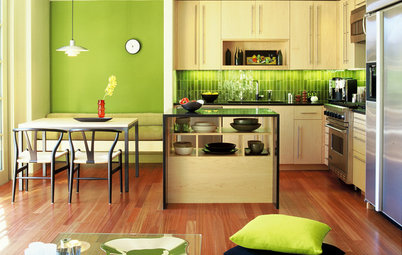
Glam in the kitchen. This kitchen's emerald isle takes its hue from a luxurious floral Stark wall covering.
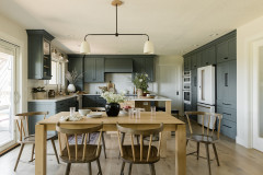
Natural in the kitchen. An antiqued paint finish on these cabinets adds a rustic, farmhouse-inspired touch.
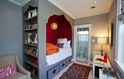
Glam in the bedroom. Malachite may come from nature, but it's a high-end kind of nature. This large-scale piece on the wall is a showstopper.
Glam chair. A large and bright porter's chair makes a strong design statement in this bright white entryway.
Natural chair. Paired with warm and light neutrals, these green chairs enliven the room with their color and geometric pattern.
Glam in the office. An animal print on a bergère chair and a glossy parson's desk stand out in front of an emerald wall.
Natural in the office. Emerald hues were popular during the Arts and Crafts era, which looked to nature for color palettes.
Perfect pairing. I like a green such as emerald, kelly or apple best paired with crisp black and white. It's a graphically bold and fresh move.
What do you think of Pantone's decision? And do you think it hit the mark with last year's Tangerine Tango pick?
Perhaps you prefer one of the major paint company's picks for 2013. Glidden is going with a dark and exotic hue, Indigo Night. Benjamin Moore's choice is a warm pastel, Lemon Sorbet. Sherwin-Williams is opting for vintage nostalgia with its Aloe pick. Yolo Colorhouse is considering reclaimed wood and other rustic materials with its subdued natural palette.
Vote: Don't forget to have your say in our 2013 color trends poll!