


Dynamic Duo: How to Pull Off a Two-Tone Exterior Color Scheme
Why stick to one main house color if you can easily and beautifully combine two?
Jennifer Ott
April 18, 2016
San Francisco-based architectural color specialist and design writer. Jennifer's work has been featured in many print and online publications. Her recently-published book, "1000 Ideas for Color Schemes," is a beautifully illustrated and easy-to-navigate guide that takes the guesswork out of selecting the perfect color palette for your home or special event. For more information on Jennifer Ott Design, visit http://jenottdesign.com/.
San Francisco-based architectural color specialist and design writer. Jennifer's... More
It’s house painting season once again and I’m seeing a huge uptick in requests for more unusual paint schemes. It seems that homeowners are no longer satisfied with the go-to light and neutral siding with a dark (or white) trim. I’m all for getting creative with exterior paint colors, but there’s often a fine line between a paint job that elicits a good “wow” versus a bad one. One way to change things up, tastefully, is to go for a coordinating duo of hues rather than a single color for the body or siding of the house. Check out some successful examples of two-tone color schemes for exteriors.
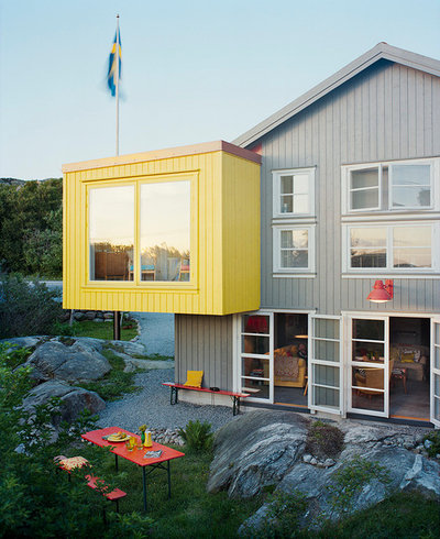
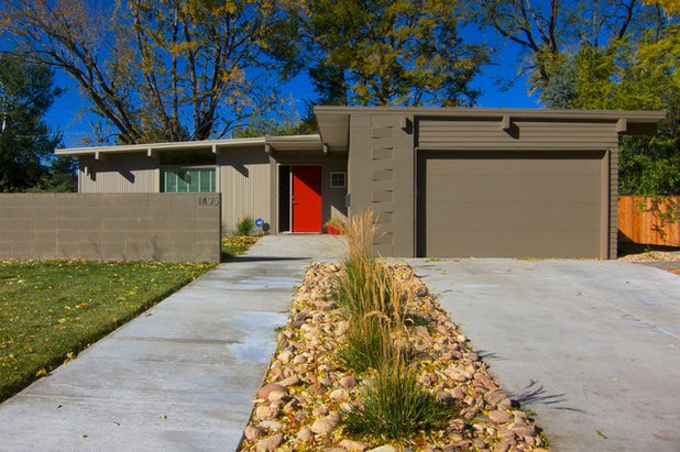
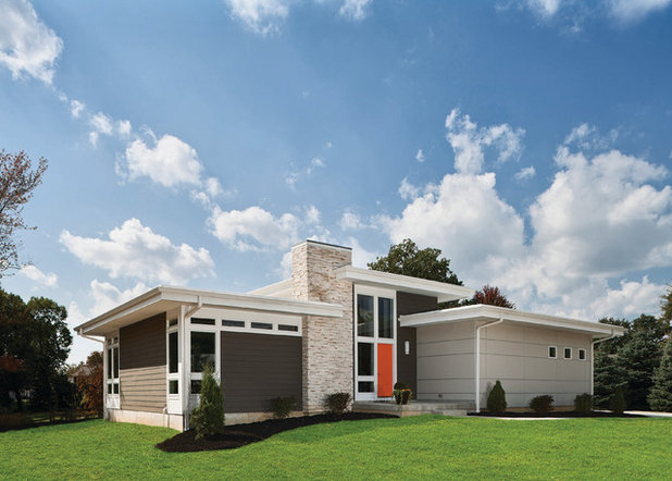
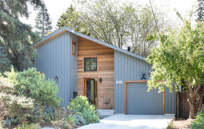
A two-tone exterior color scheme looks right at home on contemporary architecture. You also have the freedom to go quite bold with color on this style of home — the vibrant citrus yellow is a great choice here. I like how this bold hue is paired with a soft neutral gray and how all of the other elements are kept simple to support rather than fight with the dazzling color.
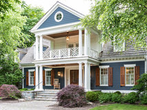
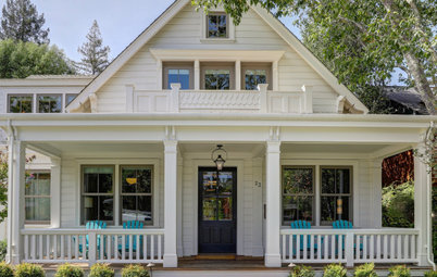
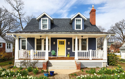
Of course, two-tone schemes need not be limited to contemporary-style homes. And you don’t necessarily need to go bold, either. A subtle color contrast is a good option for a more traditional home. Pick a house color you like and simply go a couple of steps lighter or darker on the swatch card to find your coordinating hue.
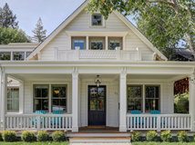
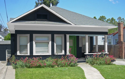
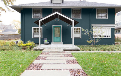
Here’s another example of a two-tone scheme using subtly different colors. If you keep the siding colors neutral, think about adding a splash of color at the door — a great way to welcome visitors to your home.
Take a quiz to see which color you should paint your front door
Paint colors: Ashley Gray (lighter gray on left) and Fairview Taupe, both by Benjamin Moore
Take a quiz to see which color you should paint your front door
Paint colors: Ashley Gray (lighter gray on left) and Fairview Taupe, both by Benjamin Moore
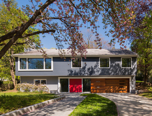
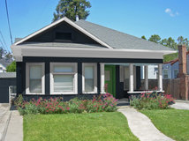
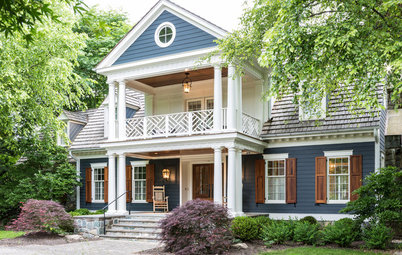
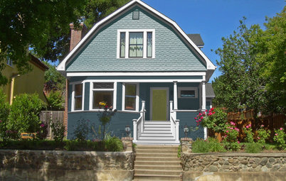
Being a child of the ’80s, I spent many of my formative years in split-level or raised ranch style homes. I was never a huge fan of them, but I love the look of this one and may have to reevaluate my dismissal of this style. Clearly, with the right color scheme it can look fresh and modern. A duo of cool blue-gray hues helps to break up the boxiness of the home, giving it a sleek and linear appearance.
Paint colors: Hearthstone (brick), Westcott Navy (siding), Poppy (front door), all by Benjamin Moore; garage door: custom door in sapele mahogany, Clingerman Doors, with two coats of Solo exterior latex satin coating by Sherwin-Williams
Paint colors: Hearthstone (brick), Westcott Navy (siding), Poppy (front door), all by Benjamin Moore; garage door: custom door in sapele mahogany, Clingerman Doors, with two coats of Solo exterior latex satin coating by Sherwin-Williams
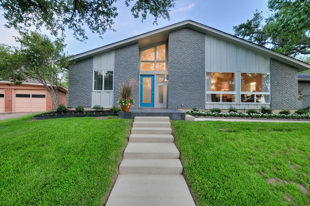
Here’s another nice example of using color to modernize a ranch-style home. If your home is clad in two different siding materials, it’s likely a terrific candidate for a two-tone color scheme. In this example, the brick and the vertical siding get two slightly different shades of cool gray. A bright blue hue adds a fun and vibrant touch to the front door.
Paint colors: Westchester Gray SW 2849 (brick), Chelsea Gray SW 2850 (siding), Stratford Blue (door), all by Sherwin-Williams
Paint colors: Westchester Gray SW 2849 (brick), Chelsea Gray SW 2850 (siding), Stratford Blue (door), all by Sherwin-Williams
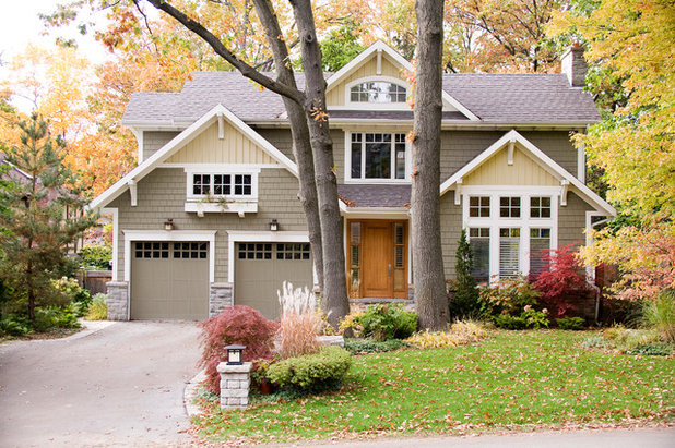
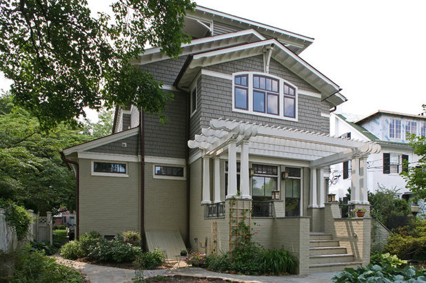
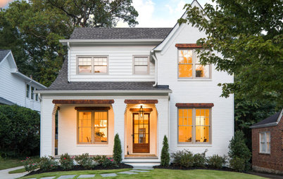
Another tip for deciding where to add a contrasting hue is to look for areas broken up by a line of trim, such as on the gables of this lovely home. Unlike in the previous examples, these are not shades of the same color, but because the gold is soft and the taupe is neutral they work well together, as well as with the colors in the landscape.
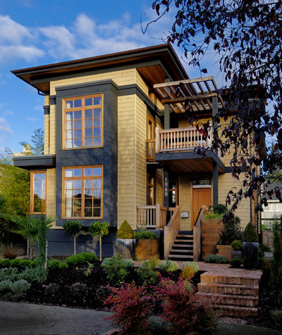
When considering house colors, be sure to factor in any fixed materials that aren’t being painted or replaced, such as any stone or brickwork and the roof. There are quite a few different colors going on here, but the body and trim colors play together well and coordinate with the stone on the chimney. The dash of zesty orange at the front door is the perfect bit of fun color in an otherwise handsome, neutral scheme.
Paint colors: Knockout Orange SW 6885 (front door), Porpoise SW 7047 (dark siding), Nuance (SW 7049) (gutters and trim around windows and doors), Amazing Gray SW 7044 (panels), all by Sherwin-Williams
Paint colors: Knockout Orange SW 6885 (front door), Porpoise SW 7047 (dark siding), Nuance (SW 7049) (gutters and trim around windows and doors), Amazing Gray SW 7044 (panels), all by Sherwin-Williams
If you have bay windows or other elements of your home that project outward, think about painting them an accent color. You could paint them the trim color or go for a contrasting hue, as was done here. Just make sure they’re worthy of drawing extra attention.
Your turn: How have you used color creatively on your home? Please post a photo in the Comments.
Get more exterior color help
Your turn: How have you used color creatively on your home? Please post a photo in the Comments.
Get more exterior color help


Related Products


Related Stories
Exteriors
8 Beautiful Blue Paint Colors for Home Exteriors
Pros share the blue shades they used to complement the architecture of these remodeled and new-build homes
Full Story
Exteriors
8 Great Gray Paint Colors for Home Exteriors
Pros share the gray shades they used to complement the architecture of these remodeled and new-build homes
Full Story
Exteriors
10 Wonderful White Paint Colors for Home Exteriors
Pros share the white shades they used to complement the architecture of these remodeled and new-build homes
Full Story
Color Palettes
5 Exterior Palette Options for 1 Modest Bungalow
By Jennifer Ott
Bold and bright, or soft and subtle: See this home get a virtual color makeover
Full Story
Color Palettes
See How 5 Color Palettes Look on 1 Charming Exterior
By Jennifer Ott
We used photo-rendering software to visually transform this home to show the dramatic power of paint
Full Story
Exteriors
Should You Paint Your Brick House?
See if paint is a good option for your exterior, and learn about the steps professional painters take
Full Story
Color Palettes
Choosing Color: See This Home Try On 5 Exterior Paint Palettes
By Jennifer Ott
Dark and dramatic, or soft and neutral. See how paint color alone can change the look of a home
Full Story
Exteriors
View 1 Exterior With 4 Different Color Schemes
By Jennifer Ott
By playing with hues on the door, window sashes and exterior walls, you can dramatically change the look of your home
Full Story
Color
Choosing Color: 1 Cottage, 6 Striking New Color Schemes
By Jennifer Ott
See 6 color palettes for this sweet San Francisco home, vote for your favorite and then find out which one was chosen
Full Story
Exteriors
6 Awesome Home Exterior Transformations
Before-and-after photos show the power of paint, imagination and top-notch architects
Full Story
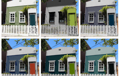
It would have been nice to find this article when I was choosing exterior window colors for our 2-tone house. (Some of you may have seen this in the discussions forum a few months back.) The house had been designed with different siding on the upper and lower levels, so I wanted different earth-tone colors as well and chose orange for the upper level (essentially the gables) and brown for the lower, with green roof shingles. From my days and days of online research on how to select window colors my takeaway was that one should either a) match the window trim to the sashes or b) match the trim to the siding. I've never had a house with window trim, so when I selected colors I thought I was following the rules - orange trim on the upper level and brown on the lower level, to match the siding on each! Two problems I discovered in retrospect were: a) Nobody discussed two-tone houses, so nobody discussed whether all of the trim should match on a two-tone house, and b) Nobody else seemed to have windows with separate frames and trim but treated them all as one piece of "trim".
So...as our windows were to be exterior-clad wood it followed that the frames (the boxes that the sashes rest in) should match the trim; therefore I chose orange (technically "terra cotta" as this was the only orange shade offered) aluminum frames for the upper window cladding and brown for the lower, with all of the sashes being green to tie in the roof color. But when the time came to select specific paint colors the experts told me I needed to paint all of the trim green to tie everything together. I decided to follow their advice but I'm concerned now that my house will look like a circus tent with too many color transitions (green sashes, orange frames, green trim, orange siding) surrounding each window. I've been told it will all look fine and I'm going to give it a fair shake but if it looks ridiculous I'll be repainting the trim myself to go back to my original, two-level scheme with green only in the roof, rakes and sashes. Attached are pics of my original idea first and then a computer mock-up from our architect of the house with all-green trim, which looks nice but doesn't show the orange or brown outlines between the sashes and window trim (3rd photo, taken of an upper window while testing paint samples). The house will be isolated and back in the woods, not part of a housing development. Still, I will likely get some should-have's over this but some reassurance would be nice...
I think the painted mock-up looks great. A warm, deep orange as opposed to a "fruit" orange should eliminate the circus feel. For the record, it seems like most house match the trim to the siding. Good luck!
Can you tell me the paint colors on the house with green yellow and white? David Smalls designs.