


How to Create a Cohesive Color Flow Throughout Your Home
Designers share eight techniques for avoiding a choppy feeling in your spaces
Erin Carlyle
July 9, 2023
Former Houzz Editorial Staff. Writing about the cost of renovation and what it takes to remodel. Former Forbes real estate reporter. Fascinated by cool homes, watching the bottom line.
Former Houzz Editorial Staff. Writing about the cost of renovation and what it takes... More
Color preferences vary as much as personalities. Some folks love the bright and the bold, while others feel most secure surrounded by neutrals. The good news is that when it comes to color, there really is no “correct” palette.
That said, we’ve all been inside homes where an explosion of color created a choppy feel between rooms — and sometimes, the urge to run. A great way to avoid this result is to hire a designer or color consultant, either to guide your entire remodeling or decorating project or simply to advise you on the best colors for your spaces. We asked pros to share their tips for creating a cohesive flow of color throughout a home. Read on to find out what they said.
That said, we’ve all been inside homes where an explosion of color created a choppy feel between rooms — and sometimes, the urge to run. A great way to avoid this result is to hire a designer or color consultant, either to guide your entire remodeling or decorating project or simply to advise you on the best colors for your spaces. We asked pros to share their tips for creating a cohesive flow of color throughout a home. Read on to find out what they said.
1. Pick a Flow-Through Paint
One simple way to create a cohesive feel is to use a consistent paint color on the walls of connecting spaces. “Particularly in homes that have more of an open floor plan, it’s best to choose one color that is going to serve as your main color or your neutral,” says Kelly Porter, an interior designer based in Washington, D.C. “That doesn’t mean it has to be beige or white or gray. But the foyer, the hallways and that main connector room should all be the same color because you want to have that dominant color in your space.”
Read more about selecting the right paint color
2. Pay Attention to Sightlines
San Francisco interior designer and color expert Jennifer Ott frequently works with clients who want more variety in their wall colors. When that is the case, she suggests considering sightlines. When you’re standing in the living room, what other rooms will you see? If you have a view into the kitchen, the dining room and the foyer, then the colors for those spaces need to work well together. “It can start to look really wacky if you have a different color scheme in each room,” Ott says.
Find an interior designer near you
3. Choose Color Groups
One way to increase the likelihood that a color scheme flows from room to room is to limit yourself to colors in the same temperature family. “Some people will stick to a warm color palette — reds and oranges and yellows or a cool scheme — grays and greens and blues,” Ott says.
Another option, Ott says, is to select one or two colors and then use variations of it. If the main color is blue, you might select a gray-blue, a pure blue and a navy paint as you move from room to room. The same concept can be used for decorative accessories.
For wall paint, you can ask the paint store to create a “tint” of a particular color, perhaps knocking down the main color by 50 percent, which the mixer will do by adding white. “They can create a lighter or darker version of it,” Ott says. “That’s a good way to unite without putting the same color everywhere.”
“I also tell people if they’re going to do their wall in this color, go two or three shades lighter for your ceiling so it doesn’t look like a sore thumb because you painted it white,” says Keith Wardlaw of Plus Modern Design in Kansas City, Missouri.
Paint decks can also be a good inspiration source for finding colors that work well together.
The Right Way to Test Paint Colors
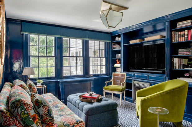
4. Restrict the Edgiest Colors to Enclosed Rooms
Rooms out of the sightline of other rooms are good places for going wild. Master bedrooms, powder rooms, kids rooms and any other room encapsulated by four walls are great places to indulge, says Carl Mattison, an Atlanta-based designer.
Rooms out of the sightline of other rooms are good places for going wild. Master bedrooms, powder rooms, kids rooms and any other room encapsulated by four walls are great places to indulge, says Carl Mattison, an Atlanta-based designer.
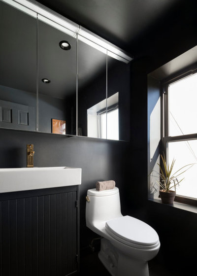
“If you turn the corner and go into a little powder bathroom, which you don’t go in all the time, who cares? Paint it black!” It works, Mattison says, “because it’s its own little box.”
50 Picture-Perfect Powder Rooms
50 Picture-Perfect Powder Rooms
5. For Bold Colors, Use Accessories
Accessories are a less expensive way to introduce dramatic colors than purchasing a couch or rug in the same tone, and they’re also easier to swap out should you tire of a color. Limiting bold colors to accessories also helps you avoid the shocking effect that can happen when a dramatic shade is painted on all four walls. “The key is finding a way to inject the color that makes rooms interesting and exciting without feeling like you need to escape,” Ott says. Bright color is good when you want to highlight a piece worthy of notice.
Browse pillows and throws on Houzz
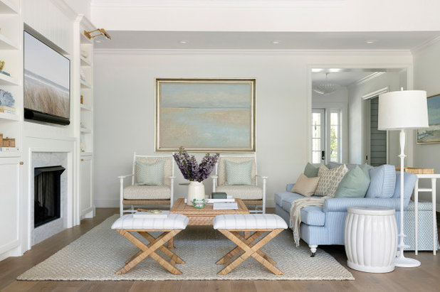
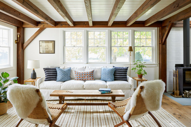
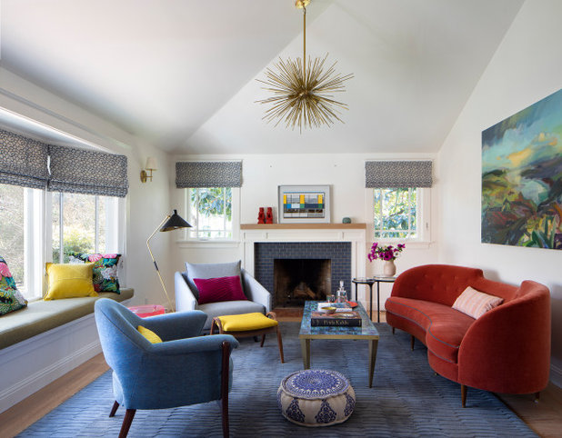
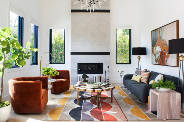
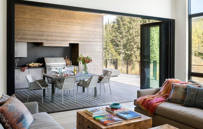
6. Tie Rooms Together With Accents
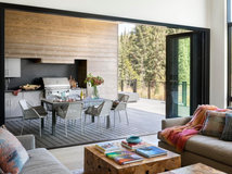
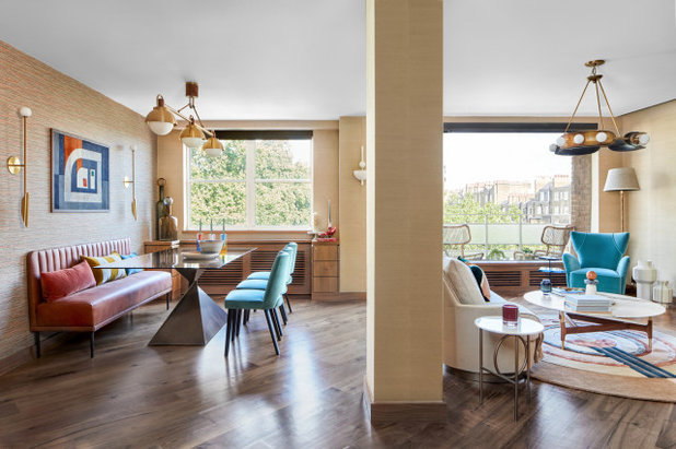
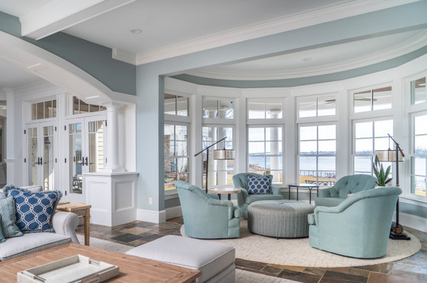
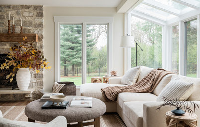
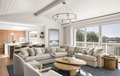
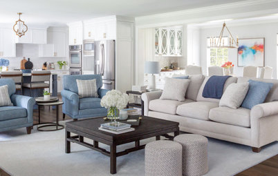
Accent colors can change from room to room, but continuing one consistent color throughout the home can help create a sense of continuity. “Let’s say you have green and blue in your living room,” Porter says. “Perhaps for the dining room, you use one of those two colors, maybe just the blue. Or you could do blue and yellow. So the blue is what will tie those rooms together.”
Accent colors can change from room to room, but continuing one consistent color throughout the home can help create a sense of continuity. “Let’s say you have green and blue in your living room,” Porter says. “Perhaps for the dining room, you use one of those two colors, maybe just the blue. Or you could do blue and yellow. So the blue is what will tie those rooms together.”
The two rooms pictured in this photo and the previous one are from the same home and illustrate this principle. The effect is cohesive but not repetitious.
Read more stories about color
Read more stories about color
7. Use the 60-30-10 Formula
Another way to create a cohesive flow from room to room is to think of the palette for your home as a math problem. “Use a base color that you really like as 60% to 70% of what you’re going to paint for your interior,” Wardlaw says. “Your next color needs to be 25% to 30%. Then you can do your accents of 5% to 10%.
“I really try to make people only go with about three colors, four at the max — at least on the interior,” Wardlaw says. “Otherwise it just feels chaotic.”
To pull the colors throughout the home, you might use a variation on the scheme in an adjacent dining room. The walls might be painted blue, and perhaps gray could be used as an accent, with a few small orange accessories providing the 10 percent dose of color. “As long as you keep it cohesive throughout your entire home, it’s going to make more sense,” Wardlaw says.
8. Consider Using Color-Planning Tools
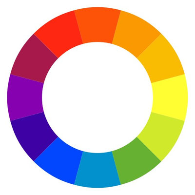
Those who love delving deeper into design principles may want to read up a bit on color theory — or at least ask your interior designer about it. “One of the main things I explain to my client is the color wheel,” Wardlaw says. “To keep that cohesive feel throughout your home, one of the main things you can do is consult that.”
A basic rule of thumb is that using analogous (or adjacent) colors on the wheel will create less contrast and a more calm feel, while choosing complementary colors (across from one another on the wheel) will create greater contrast and a higher-energy room. Understanding the relationships between colors will help you see why certain combinations have certain effects on you.
For a Well-Designed Look, Hire an Expert
Designers have studied color and can offer invaluable guidance when you’re decorating or remodeling. You can hire one to take your project from start to finish, or simply as a consultant to troubleshoot a specific area like tweaking your home’s palette so that the colors flow well throughout your home.
Designers have studied color and can offer invaluable guidance when you’re decorating or remodeling. You can hire one to take your project from start to finish, or simply as a consultant to troubleshoot a specific area like tweaking your home’s palette so that the colors flow well throughout your home.
Porter, who does a lot of color consultations, says her clients tend to know what color they want to use but need validation that the shade they are considering will produce the desired effect. She did a long-distance consultation with a client who passionately loves orange. “The colors she was telling me about were very bright and childlike,” Porter says. The designer suggested a more adult rusty orange instead. “She tried it and loved it,” Porter says.
Tell us: Have you achieved a great color flow in your house? What tricks did you or your designer use? Share in the Comments.
More on Houzz
Read more about color
Find a pro
Shop for products
More on Houzz
Read more about color
Find a pro
Shop for products
What are you working on?
Related Products
Our philosophy at Kitchen Kraft is to make home remodeling convenient. We are your one-stop shop for kitchen... Read More
Related Stories
Remodeling Guides
10 Spring Home Upgrades to Do Right Now
Consider these projects to get your home ready for summer and make it more comfortable all year round
Full Story
Organizing
How to Create a Joyful, Clutter-Free Home Office
Follow these steps to get rid of the paper piles and make room for beauty and better organization
Full Story
Remodeling Guides
15 Ways to Create Separation in an Open Floor Plan
By tidgboutique
Use these pro tips to minimize noise, delineate space and establish personal boundaries in an open layout
Full Story

White
Design Pros Share 10 Favorite Creamy White Paints
By Becky Harris
These off-white color choices include versatile tones, warming hues and pleasingly soft shades
Full Story
Entryways
4 Designer Tips for a Fashionable Entry
By tidgboutique
A pro shows how adding color, statement pieces and more to a foyer can set the right tone for the rest of the home
Full Story
Most Popular
7 Major Decorating Mistakes and How to Avoid Them
By tidgboutique
Gain confidence to start your interior design project with this advice from a professional designer
Full Story
Living Rooms
4 Must-Have Features for a Small Living Room
By tidgboutique
A designer shares important ways to live large in a tight space and make it look stylish
Full Story
Most Popular
7 Common Decorating Mistakes to Avoid
Pros share solutions to design problems they often find in people’s living spaces
Full Story
Most Popular
How to Decorate a Living Room
By tidgboutique
A designer offers tips for creating a comfortable space that reflects your style
Full Story
Budget Decorating
Where to Splurge and Where to Save When Decorating
By tidgboutique
See where it makes sense to invest in durable essentials and focal pieces, and where to economize on other things
Full Story
I’m trying to create a rustic transitional look in our new build, I have large black grid windows throughout the house and med wood tone floors, Dove colored walls and a black and wood tone combo in my kitchen with aged brass and iron accessories throughout. My interior doors are oak, stained a rich brown. My question is……..can’t decide on trim color. Options are 1) black trim,2) off white trim, 3) stained trim………any suggestions??????
Over the last 50+ years, I have painted trim same as the walls, white, and a complimentary color. Some were okay, some "well that didn't help", and some I still liked 3 years later.
You already have black grids along with a white and some browns.
Will matching the wall color help the other colors look sharp?
If you paint the trim black will it make the wall spaces look like patches on a quilt? If so, is this what you want?
If you apply a stain, will it match all of your wood elements?
One more consideration - if you paint the trim and later want the stained look you may have a big challenge undoing the paint.
I painted the whole house cloud cover abd used a gloss white on doors and moldings for a pop. For color I used Art in all different colors.