


They’re All Here: Paint Colors of the Year for 2017
There’s a bit of a consensus, plus a couple of interesting outliers, among paint companies' top color picks
Jennifer Ott
December 24, 2016
San Francisco-based architectural color specialist and design writer. Jennifer's work has been featured in many print and online publications. Her recently-published book, "1000 Ideas for Color Schemes," is a beautifully illustrated and easy-to-navigate guide that takes the guesswork out of selecting the perfect color palette for your home or special event. For more information on Jennifer Ott Design, visit http://jenottdesign.com/.
San Francisco-based architectural color specialist and design writer. Jennifer's... More
Color-management company Pantone Color Institute recently announced its Color of the Year for 2017, a vibrant spring-green hue called Greenery. If you’re among those who find Greenery a bit too bright to be used in or on your home, take heed. Paint manufacturers have chimed in with their various selections for Color of the Year and, for the most part, it’s a much mellower bunch. Deep grayish blues and purples dominate, but some warm neutrals and bold yellows are also offered up.
It’s worth pointing out that homeowners are in no way expected to change the color scheme of their home with each passing color trend. Where these selections can be useful, however, is when there’s a particular color being touted that you really like. It becomes much easier to find furnishings and decorative accessories that coordinate with the favorite hue because it’s trending.
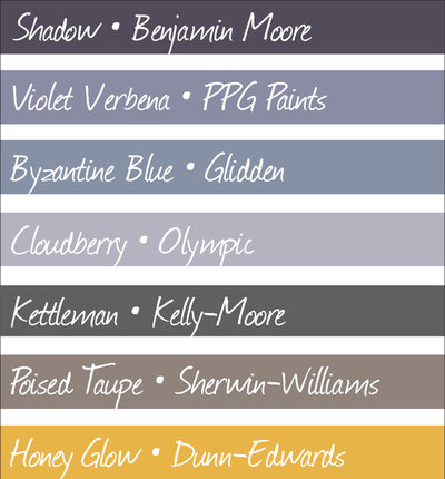
Shown here are the various 2017 paint colors of the year, from top to bottom: Shadow, from Benjamin Moore; Violet Verbena, from PPG Paints; Byzantine Blue, from Glidden; Cloudberry, from Olympic; Kettleman, from Kelly-Moore; Poised Taupe, from Sherwin-Williams; and Honey Glow, from Dunn-Edwards.
Shown here are the various 2017 paint colors of the year, from top to bottom: Shadow, from Benjamin Moore; Violet Verbena, from PPG Paints; Byzantine Blue, from Glidden; Cloudberry, from Olympic; Kettleman, from Kelly-Moore; Poised Taupe, from Sherwin-Williams; and Honey Glow, from Dunn-Edwards.
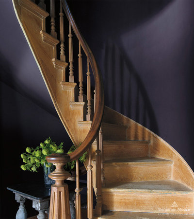
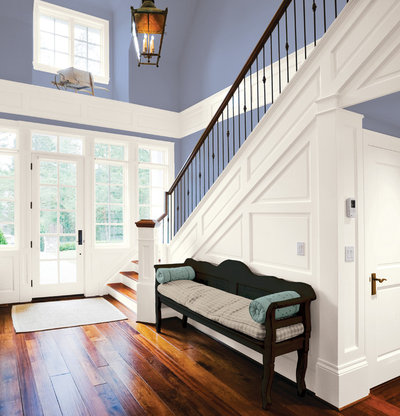
Benjamin Moore’s selection, Shadow, is a deep, dark purple-gray hue that’s quite a shift from its 2016 choice, Simply White. I think it’s a beautiful hue, but it needs to be used with care as it can easily make a space go gloomy. Using it in small doses or in spaces we don’t tend to linger in, such as a stairway, can add a nice dash of drama to a home without bringing everyone down.
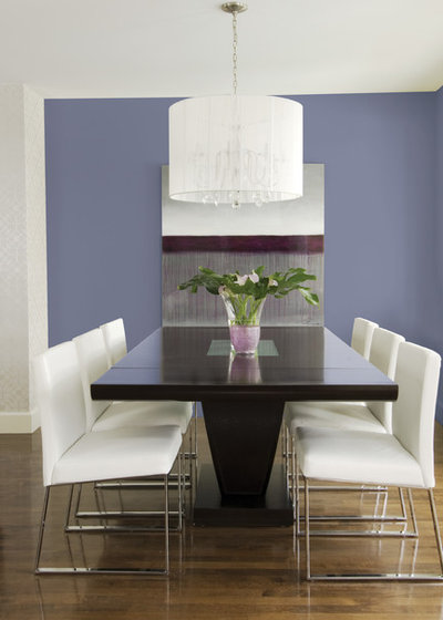
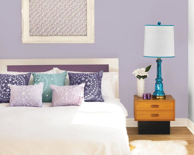
If Shadow is too shady for you, give PPG Paints’ Violet Verbena a look. It’s also a purple-gray hue but one that’s much lighter and brighter. It’s not a pastel but has a soft, soothing vibe nonetheless. I think it’s a terrific color for a bedroom or other space where a peaceful, easy feeling is desired.
Glidden’s pick, Byzantine Blue, is also a purple-gray, but this one has a bit more blue in it than the others. It has a neutral quality due to the heavy dose of gray it has, so it works well with lots of other hues in a home.
Olympic goes even lighter and wispier with its selection of Cloudberry. Again, the addition of gray here keeps it from going pastel, so it’s a nice choice in a bedroom, whether it’s a kid’s room or the master suite.
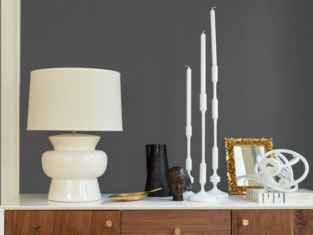
For those who prefer strict neutral hues, Kelly-Moore is offering Kettleman as its choice for 2017. It’s a dark gray that has a touch of warmth to it, perfect for those who find true gray too chilly. Like Shadow, it’s a rather dark color, so it needs to be used in small doses or paired with plenty of contrasting light hues.
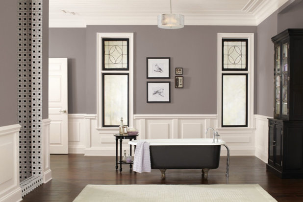
Sherwin-Williams’ choice of Poised Taupe is actually one of my go-to deep neutrals. In my color consulting business I’m seeing a bit of a homeowner revolt against the cool gray hues that have been so popular the last few years, but they aren’t exactly embracing beige again, either. Taupe — essentially a cool medium brown — is the perfect compromise between warm and cool.
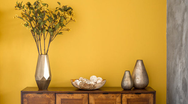
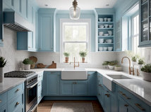
Honey Glow from Dunn-Edwards is like a burst of sunshine amid the cooler, moodier hues from the others. It’s a happy, welcoming hue that works well in a kitchen, living room or on the front door.
A couple of paint companies are promoting a slew of colors for 2017, rather than just one. Behr has chosen 20 hues that are divided into three categories: Comfortable, Composed and Confident. As a lover of bold color, I am most drawn to the Confident palette, shown above. Think about using these saturated colors in smaller doses, such as for an accent wall, in a niche or on the ceiling only, rather than on all four walls in a room.
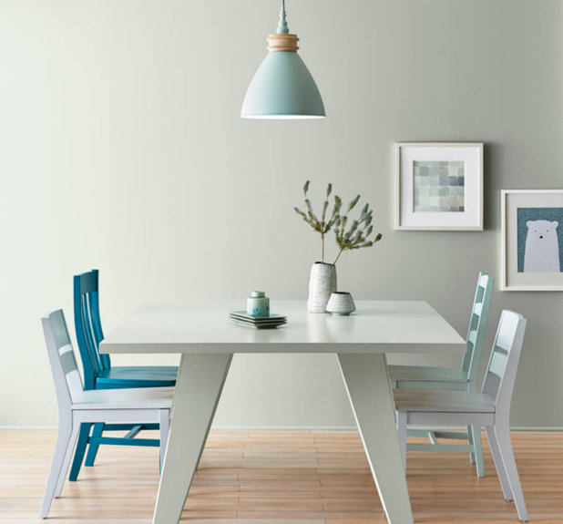
Valspar has put forth a mix of neutrals and bolder hues with its 12 selections for 2017’s hottest hues. One of my favorites of its neutral offerings, Soft Silver Sage, is shown above.
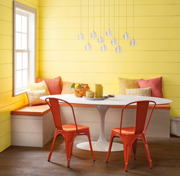
Among Valspar’s bolder color choices, I love the warmth and vibrancy of Here Comes the Sun, shown on the walls above.
Your turn: See anything you like? Which color is your favorite? Tell us in the Comments.
More
World of Design: Where Color Trends Begin
Read more stories about Colors of the Year
Your turn: See anything you like? Which color is your favorite? Tell us in the Comments.
More
World of Design: Where Color Trends Begin
Read more stories about Colors of the Year


Related Products
Related Stories

Color
Pantone Picks a Peach for Its 2024 Color of the Year
By Jennifer Ott
See how to use this juicy hue to create calm yet flourishing spaces inside and outside the home
Full Story

Color
10 Paint Colors Ready to Take Over in 2024
By Jennifer Ott
Blue is huge, but dark hues and warm tones also find favor among major paint companies’ 2024 Color of the Year picks
Full Story
Color
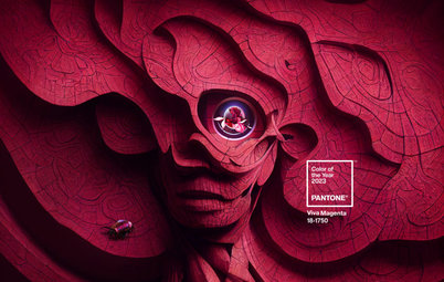
Pantone Chooses a Vibrant Magenta for 2023 Color of the Year
By Jennifer Ott
Viva Magenta is a bold, cool red hue meant to promote optimism and joy. See how to use it around your home
Full Story

Color
7 Paint Colors Set to Be Big in 2023
By Jennifer Ott
See the soft neutrals, warm pinks and deep blue-greens defining major paint companies’ 2023 Color of the Year choices
Full Story
Color
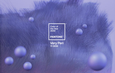
Pantone Picks a Periwinkle Blue for Its 2022 Color of the Year
By Jennifer Ott
Very Peri is an enchanting purple-blue hybrid chosen to represent courage and creativity. See how to use it in your home
Full Story
Most Popular
Green Is the Top Paint Color for 2022
By Jennifer Ott
Major paint companies reach a rare consensus, anointing various shades of green as their 2022 color of the year choices
Full Story
Landscape Design
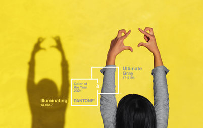
Pantone’s 2021 Color of the Year Looks Optimistic in Landscapes
See 9 ways to use Pantone’s pairing of Illuminating, a bright yellow, and Ultimate Gray in your outdoor space
Full Story
Color Palettes
Will These Soothing and Rich Paint Colors Define 2021?
By Jennifer Ott
Paint companies released their 2021 Color of the Year choices. See if soft teal, elegant brown or other shades suit you
Full Story

Houzz TV Live
An Editor and a Designer Discuss Pantone’s 2021 Color Pick
In this video, Mitchell Parker and Jennifer Ott show how you can use the bright and balanced color combo at home
Full Story
Color
Pantone Picks an Uplifting Combo for Its Color of the Year 2021
By Jennifer Ott
Hello, yellow! Good day, gray! See how to use the two colors predicted to be both hot and cool in the coming year
Full Story
Poised Taupe a winner for sure !! Soft Silver Sage was last year's winner in my mind.
It's that time a year! We are starting to see what the experts are announcing as their colors of the year. Check out this story on Sherwin-William's latest announcement of their 2018 Color of the Year...
Sherwin-Williams Embraces the Blue-Green Trend with Its 2018 Color of the Year:
http://www.durasupreme.com/blog/sherwin-williams-embraces-blue-green-trend-its-2018-color-year
I hope you all enjoy!
Mandi @ Dura
Two thumbs up for Poised Taupe!