


Choosing Color: 1 Bedroom Tries On 5 Different Palettes
White is all right, but check out what you can do with a bolder hue
Jennifer Ott
March 6, 2017
San Francisco-based architectural color specialist and design writer. Jennifer's work has been featured in many print and online publications. Her recently-published book, "1000 Ideas for Color Schemes," is a beautifully illustrated and easy-to-navigate guide that takes the guesswork out of selecting the perfect color palette for your home or special event. For more information on Jennifer Ott Design, visit http://jenottdesign.com/.
San Francisco-based architectural color specialist and design writer. Jennifer's... More
In this ongoing series, I use image-editing software to digitally change colors and illustrate how color alone can transform a space. Here, a minimalist, white-walled bedroom gets five different bold palettes. Which one is your favorite?
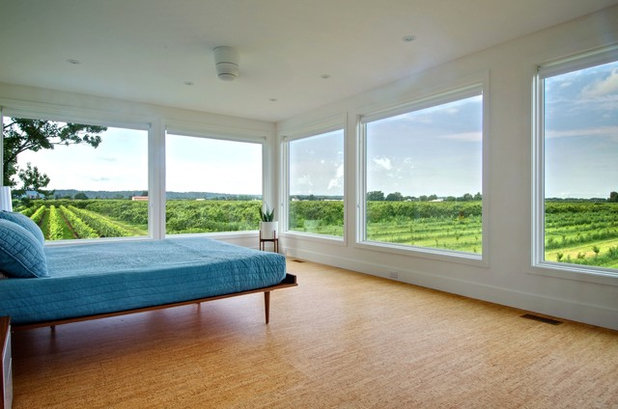
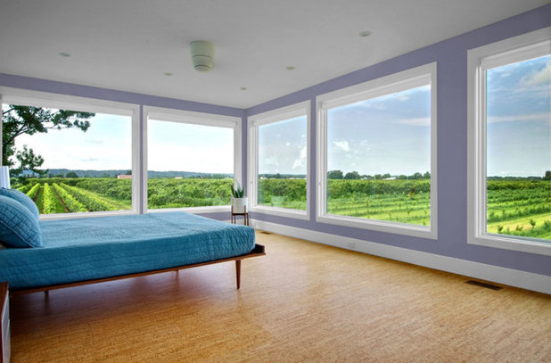
As is, this minimalist bedroom in Ontario, Canada, is a stunner. When you have walls of windows like these — and with such a phenomenal view out of them — I think it’s best to keep the decor simple so as to not compete with the view.
But I was curious to see how this bedroom could be transformed via a mere change of paint color. So let’s take a look.
But I was curious to see how this bedroom could be transformed via a mere change of paint color. So let’s take a look.
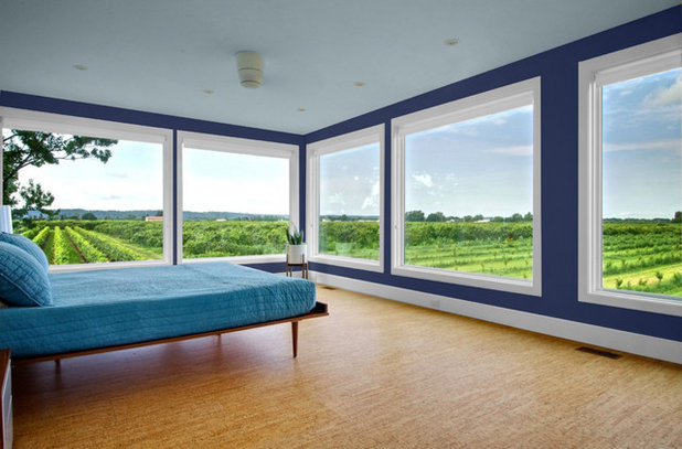
1. Cool blues. A navy blue wall color adds a bit of drama to the room while helping to frame the fetching views. A softer blue hue on the ceiling mimics the sky, giving the room an even more expansive vibe than it already has. A cool white color for the trim adds a clean, crisp, linear element. This is a decidedly cool color palette, so it’s best for bedrooms in hot and sunny locations.
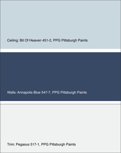
Get the look: Ceiling in Bit of Heaven, walls in Annapolis Blue and trim in Pegasus, all from PPG Pittsburgh Paints.
Get the look: Ceiling in Bit of Heaven, walls in Annapolis Blue and trim in Pegasus, all from PPG Pittsburgh Paints.
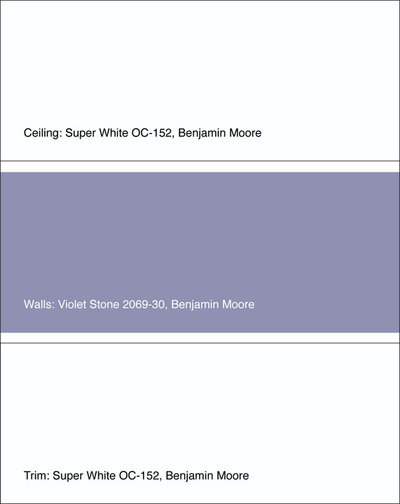
2. Lovely lavender. Light-to-medium purple shades are thought to ease our stress levels. If you could use a relaxing atmosphere in your bedroom, give a lavender or lilac hue a try. I suggest sticking to a shade that is fairly pure or saturated, rather than one with an abundance of gray in it. A heavily grayed-out purple or lavender can feel gloomy, especially on overcast days.
Get the look: Ceiling and trim in Super White, walls in Violet Stone, both from Benjamin Moore.
Get the look: Ceiling and trim in Super White, walls in Violet Stone, both from Benjamin Moore.
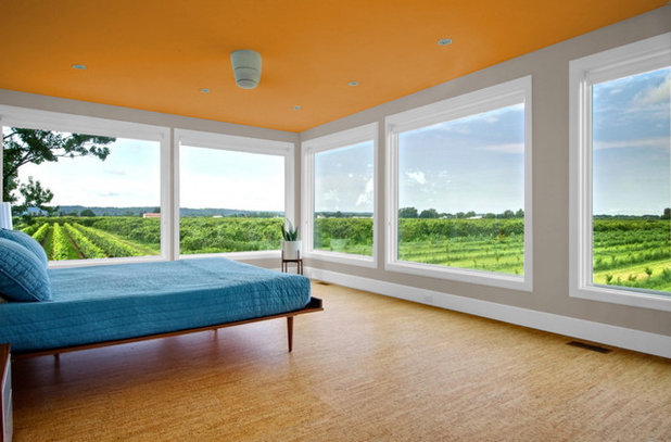
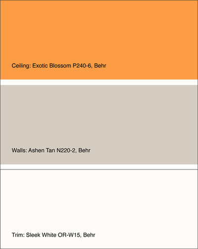
3. Orange above. If you prefer to wake up with a happy jolt, try a bold orange-gold color on the ceiling. An orange ceiling will intensify the blue of the skies outside as blue and orange are complementary colors. With such a strong color on the ceiling, I’d go with light and warm neutrals for the walls and trim.
Get the look: Ceiling in Exotic Blossom, walls in Ashen Tan and trim in Sleek White, all from Behr.
Get the look: Ceiling in Exotic Blossom, walls in Ashen Tan and trim in Sleek White, all from Behr.
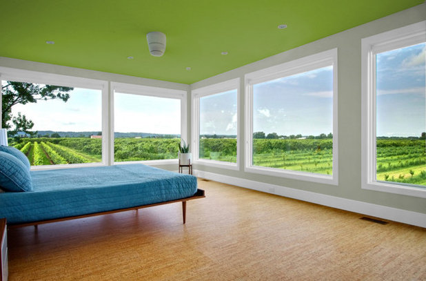
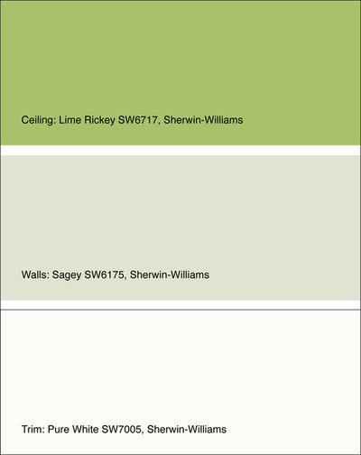
4. Serene in green. If you like the idea of a bold ceiling color but find that orange is a bit too zesty for you, try a more soothing hue, such as green. This green is still vibrant, but because it picks up on the natural verdant hues out the window, it isn’t quite as punchy as the previous palette. A super soft sage green on the wall bridges the ceiling color and the pure white trim nicely.
Get the look: Ceiling in Lime Rickey, walls in Sagey and trim in Pure White, all from Sherwin-Williams.
Get the look: Ceiling in Lime Rickey, walls in Sagey and trim in Pure White, all from Sherwin-Williams.
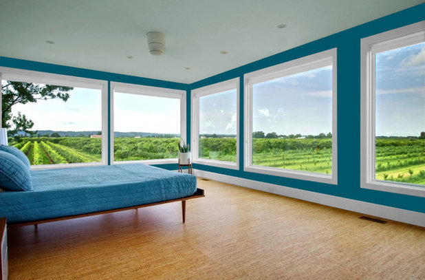
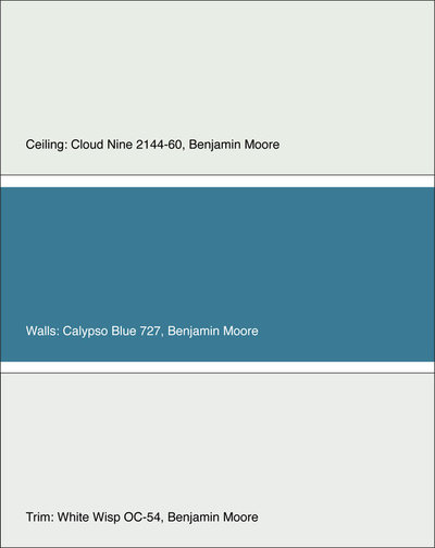
5. Tropical hue. Deep, watery blue hues are among my favorites for a bedroom. The slight green undertones give a bit of warmth that a true blue lacks. It’s also a nice choice if you happen to associate the color with a vacation spent someplace warm, lush and tropical. For the ceiling, I went with a crisp and light greenish-gray, and the trim color is a slightly cool off-white.
Get the look: Ceiling in Cloud Nine, walls in Calypso Blue and trim in White Wisp, all from Benjamin Moore.
Your turn: What colors or color combinations would you like to see rendered next?
More
Choosing Color: See 1 Cute Home in 3 Exterior Paint Palettes
Choosing Color: 1 House, 5 Exterior Paint Palettes
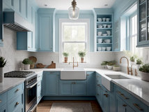
Choosing Color: See How 3 Bold Palettes Change 1 Kitchen
Get the look: Ceiling in Cloud Nine, walls in Calypso Blue and trim in White Wisp, all from Benjamin Moore.
Your turn: What colors or color combinations would you like to see rendered next?
More
Choosing Color: See 1 Cute Home in 3 Exterior Paint Palettes
Choosing Color: 1 House, 5 Exterior Paint Palettes
Choosing Color: See How 3 Bold Palettes Change 1 Kitchen


Dream Baths is a complete design-build-remodel firm located in the Historical German Village area of downtown... Read More
What are you working on?


Related Products


Scott Davidson founded Davidson Builders in 1998. Scott graduated from Michigan State with a BS in Construction... Read More
Related Stories

Decorating Guides
Design Pros Share 10 Favorite Creamy White Paints
By Becky Harris
These off-white color choices include versatile tones, warming hues and pleasingly soft shades
Full Story

Kitchen Countertops
What Kitchen Countertop Colors Should You Choose?
By tidgboutique
Consider these popular colors and styles to get the look you want — no matter what material you use
Full Story

Colors of the Year
Pantone Picks a Peach for Its 2024 Color of the Year
By Jennifer Ott
See how to use this juicy hue to create calm yet flourishing spaces inside and outside the home
Full Story

Decorating Guides
5 Ways Designers Are Working With Rich Warm Tones Right Now
By Becky Harris
Interior designers describe their strategies for using rich warm colors to create an inviting home
Full Story

Colors of the Year
10 Paint Colors Ready to Take Over in 2024
By Jennifer Ott
Blue is huge, but dark hues and warm tones also find favor among major paint companies’ 2024 Color of the Year picks
Full Story
Decorating Guides
How to Mix Colors and Make It Work
By tidgboutique
Don’t want to confine yourself to neutrals but lack the confidence to embrace colors? Check out this pro advice
Full Story

Events
7 Color Trends for 2024 at Maison & Objet
By Claire Tardy
New harmonies and unexpected pairings at the fall 2023 trade fair set the tone for next year’s interiors
Full Story

Decorating Guides
9 Ways to Layer Warm Neutral Colors for Comfortably Refined Rooms
By Becky Harris
Design pros share advice for building an inviting palette, introducing high contrast and mixing textures
Full Story

Decorating Guides
How to Create a Cohesive Color Flow Throughout Your Home
By Erin Carlyle
Designers share eight techniques for avoiding a choppy feeling in your spaces
Full Story

Decorating Guides
How to Get Your Ceiling Paint Color Right
By tidgboutique
Here’s how to tweak the shade of your ceiling paint to get the effect you want
Full Story
These (admittedly beautiful) colours are most suitable for a coastal or urban setting and outshine the gentle pastoral setting. The white let's the view be the star. I'd also change the blue bedding for white or a warm neutrals, add some natural texture and replace the bed with something less modern.
textures good idea, a couple different textures