


6 Places to Punch Up a Kitchen With Purple
Let the regal color reign in the heart of the home

Purple is, admittedly, a rather unusual color to use in a kitchen, but that’s exactly what makes it an interesting choice. It’s a tricky color to get right, though, because it can easily run cold and gloomy — not exactly the vibe most people are going for. We’ve rounded up examples and tips for how to successfully incorporate this regal hue into the kitchen.
2. Cabinets
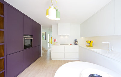
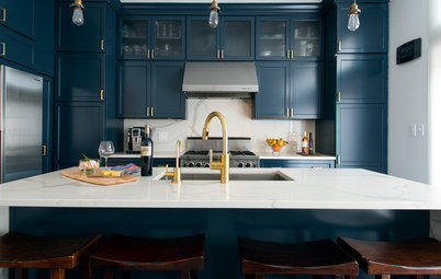
If you’re a lover of purple and want to go all-ir, try it on your kitchen cabinets. This is a bold way to use the color, but because the shade used here by Harvey Jones is so dark, it almost reads as a dark gray or black, and therefore a neutral.
An equally dark and cool hue is Blue Blood from Behr.
Find an interior designer on Houzz to help with your color palette
Here’s a more vibrant purple than the last example, and I think it works so well in this kitchen from Archipelago Workshop because the space is otherwise light and neutral. It’s also clean-lined and minimal, with no fussy decorative elements to compete with the bold color choice. The purple is allowed to stand out and capture our attention.
For a comparable color, take a look at Grape Smash from PPG Pittsburgh Paints.
For a comparable color, take a look at Grape Smash from PPG Pittsburgh Paints.
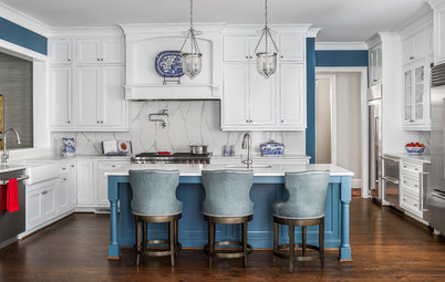
3. Island
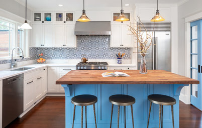
A more toned-down way to use purple on your cabinetry is to limit it to your island only. This pretty blue-purple hue makes for a nice colorful contrast against the white cabinets and countertops. The copper accents help warm up the space. Adding warm wood finishes also would act as a nice contrast to the cool purple.
A similarly soft shade is Pressed Violet from Benjamin Moore.
Find copper pendant lights in the Houzz Shop
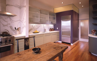
4. Appliances
Colorful appliances have been around for a long time, but they seem to be having a moment as a hot kitchen design trend.
Colorful appliances have been around for a long time, but they seem to be having a moment as a hot kitchen design trend.
I’m seeing appliances pop up in every color imaginable, including shades of purple.
If you go for such an eye-catching hue for your appliances, be sure to include other colors that play well with it, either shades similar to the appliances or soft neutrals.
And keep in mind that if you make your appliances the focal point, you’ll want to keep them neat and clean. If that’s not something you can easily commit to, then you probably should stick to appliances in colors that don’t shout for attention.
5. A Dash Here and There
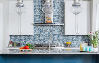
Here’s an expanded view of the previous kitchen. The designer, Deborah Law Interiors, used similar purple hues throughout the kitchen to tie the space together. The color adds richness and contrast to the cool and light neutrals used elsewhere.
An equally enchanting color is Stormy Purple from Valspar.
This beautiful kitchen from Lara Michelle Beautiful Interiors includes just a few small touches of our featured hue on the dining chairs and the island pendant lights. It makes the case for how a little bit of purple can go a long way toward dressing up a kitchen. And how you shouldn’t automatically select neutral hues for everything; instead try picking an item or two to be featured in your favorite fun hue.
6. Flooring
With the possible exception of ceilings, I think flooring is the most overlooked canvas for adding color in a home. That’s a shame because, as this kitchen from Warren Techentin Architecture indicates, it’s a fantastic place to bring personality and life into a kitchen. As all-white kitchens start to give way to more color-filled spaces, don’t neglect the floor as a spot to bring the color zing.
Your turn: Pretty or pass? What do you think of purple hues in kitchens? Tell us in the Comments.
More on Houzz
Will These 9 Paint Colors Dominate Homes in 2019?
8 Blue Paint Colors to Consider for a Beautiful Kitchen Island
9 Kitchen Islands That Look Gorgeous in Green
Find a kitchen designer near you
Shop for kitchen products
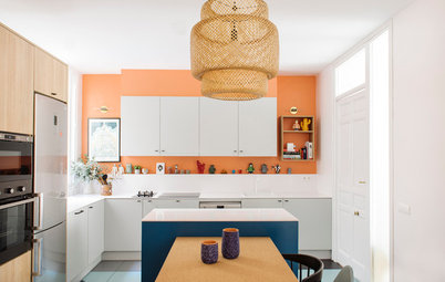


One easy and low-commitment way to pack in the purple is by painting an accent area. This is a smart strategy for stretching your design budget because you can use paint — rather than more expensive tile or countertop material — to cover the bulk of the kitchen wall. Just be sure to use paint that has a hint of sheen, which makes it more durable and easier to wipe clean.
This particular purple in a kitchen by Bulles & Taille-crayon is a warmer shade, more red than blue, so it feels more cozy than chilly.
A similar shade is Passionate Purple from Sherwin-Williams.