
9 Paint Colors of the Year for 2027 That Feel Like a Warm Hug
Earthy, deep and a little divided, these are the shades top paint makers are betting on

Paint makers have revealed their 2027 Colors of the Year, and the picks lean earthy, with several going deep and dark. The brands are split on whether warm or cool tones will win out, and a couple of lighter shades break from the pack. But the overall mood is clear: People want rooms that feel like a comforting hug. Let’s dig in.
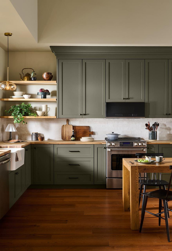
It’s also an appealing pick for kitchen cabinets, as shown here. It can serve as an interesting yet neutral backdrop if you have punchier kitchen focal elements such as a statement vent hood or eye-catching backsplash tile.
Find an interior designer on Houzz
Find an interior designer on Houzz
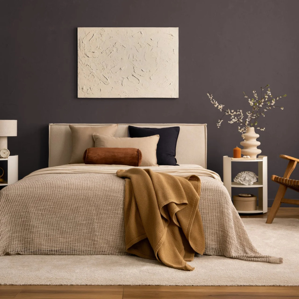
2. French Press Coffee by Dunn-Edwards
Here’s another dark and handsome hue: a deep brown with a notable plum undertone. It’s a warmer alternative to the cool charcoal grays that have been popular in recent years. Try it in intimate spaces like bedrooms or a powder room. Or take it outside, where it would make a striking front door color.
Here’s another dark and handsome hue: a deep brown with a notable plum undertone. It’s a warmer alternative to the cool charcoal grays that have been popular in recent years. Try it in intimate spaces like bedrooms or a powder room. Or take it outside, where it would make a striking front door color.
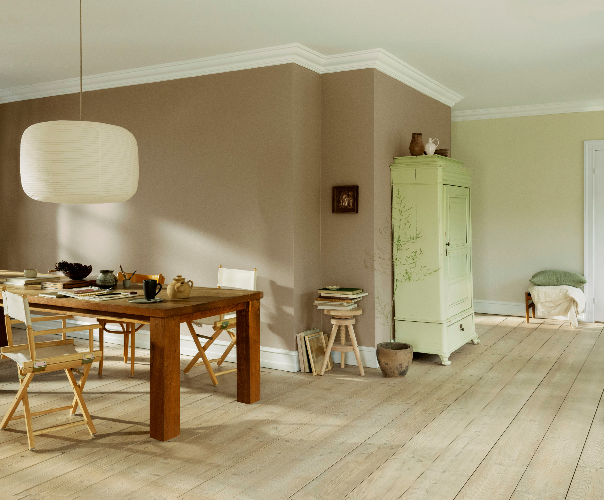
3. Country Soil by PPG
One of the few lighter hues in the bunch, Country Soil is a soft tan that won’t make a big statement on its own. Instead, it serves as a neutral backdrop for more eye-catching elements in a room.
Because it’s such an easygoing neutral, it pairs well with most other hues, warm or cool. Consider it an alternative to white or beige if you are seeking a bit more oomph in a space.
10 Times to Hire a Color Consultant
One of the few lighter hues in the bunch, Country Soil is a soft tan that won’t make a big statement on its own. Instead, it serves as a neutral backdrop for more eye-catching elements in a room.
Because it’s such an easygoing neutral, it pairs well with most other hues, warm or cool. Consider it an alternative to white or beige if you are seeking a bit more oomph in a space.
10 Times to Hire a Color Consultant
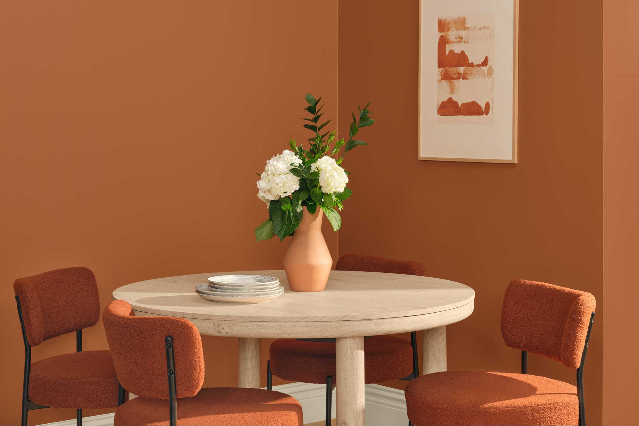
4. Deep Rooted by Dutch Boy
Talk about oomph. Deep Rooted is a saturated orange that veers a touch terra cotta. A slight brown undertone tempers the intensity that orange often brings to a space.
Still, it’s best suited to rooms where you want a spicy, energetic vibe, such as a kitchen or dining room. It would also work well in small doses on the exterior, such as for doors or shutters.
Talk about oomph. Deep Rooted is a saturated orange that veers a touch terra cotta. A slight brown undertone tempers the intensity that orange often brings to a space.
Still, it’s best suited to rooms where you want a spicy, energetic vibe, such as a kitchen or dining room. It would also work well in small doses on the exterior, such as for doors or shutters.
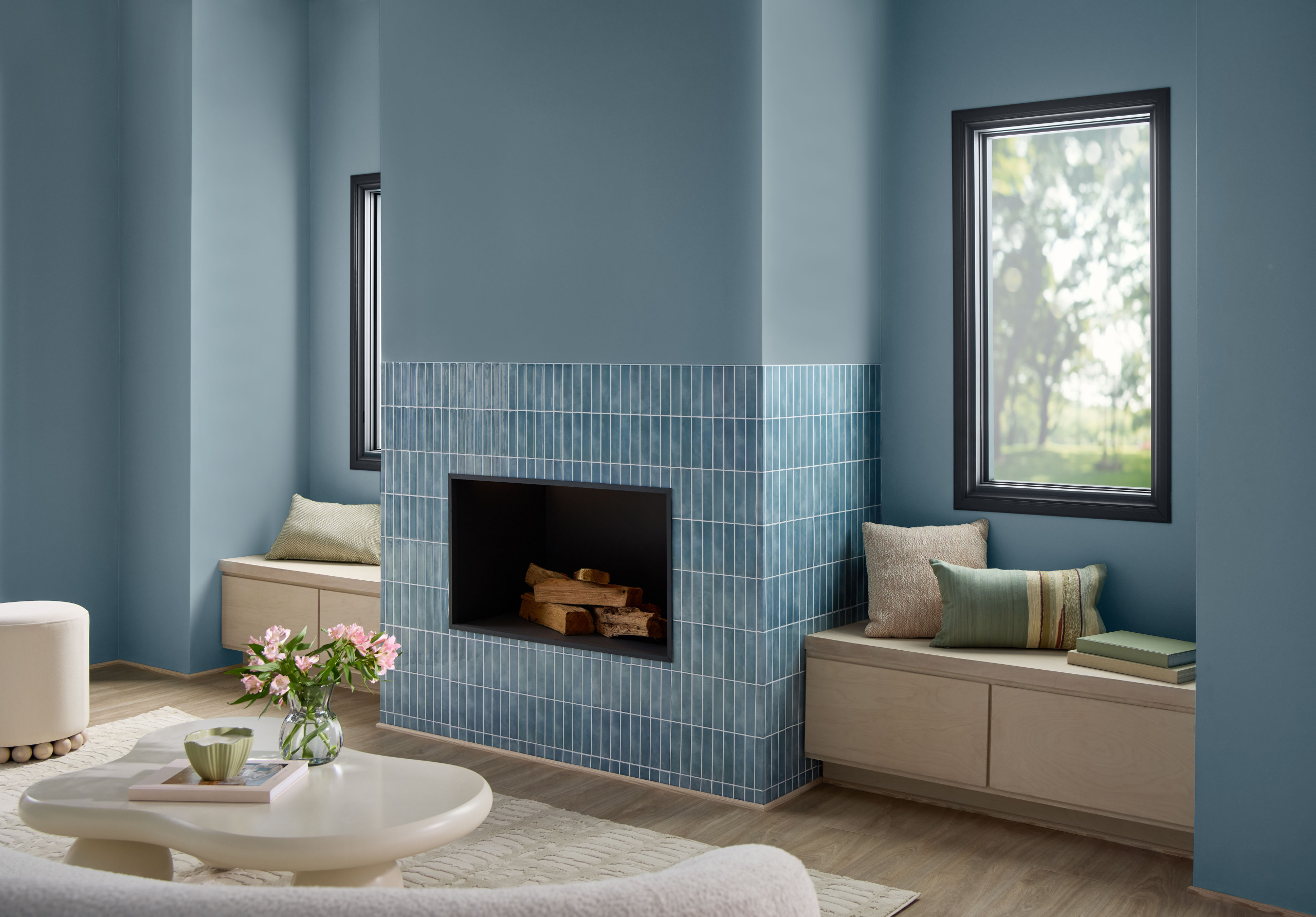
5. Cottage Door by Valspar
From an outgoing orange we pivot to a bucolic blue. Cottage Door is a cool and soothing mid-tone blue with gray undertones.
As the name suggests, it would be a charming color choice for an exterior door. It also works well indoors, especially in warm climates where you want to visually cool things down.
See why you should hire a professional who uses Houzz Pro software
From an outgoing orange we pivot to a bucolic blue. Cottage Door is a cool and soothing mid-tone blue with gray undertones.
As the name suggests, it would be a charming color choice for an exterior door. It also works well indoors, especially in warm climates where you want to visually cool things down.
See why you should hire a professional who uses Houzz Pro software
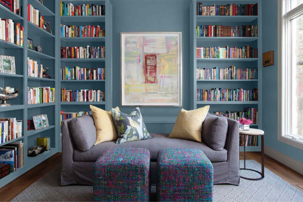
6. Artifact by Glidden
Artifact appears a bit warmer than Cottage Door, thanks to a slight green undertone. Neither too dark nor light, it brings calm to a space without fading into the background. Because it’s impactful without being loud, it works well as an accent or on all four walls.
Artifact appears a bit warmer than Cottage Door, thanks to a slight green undertone. Neither too dark nor light, it brings calm to a space without fading into the background. Because it’s impactful without being loud, it works well as an accent or on all four walls.
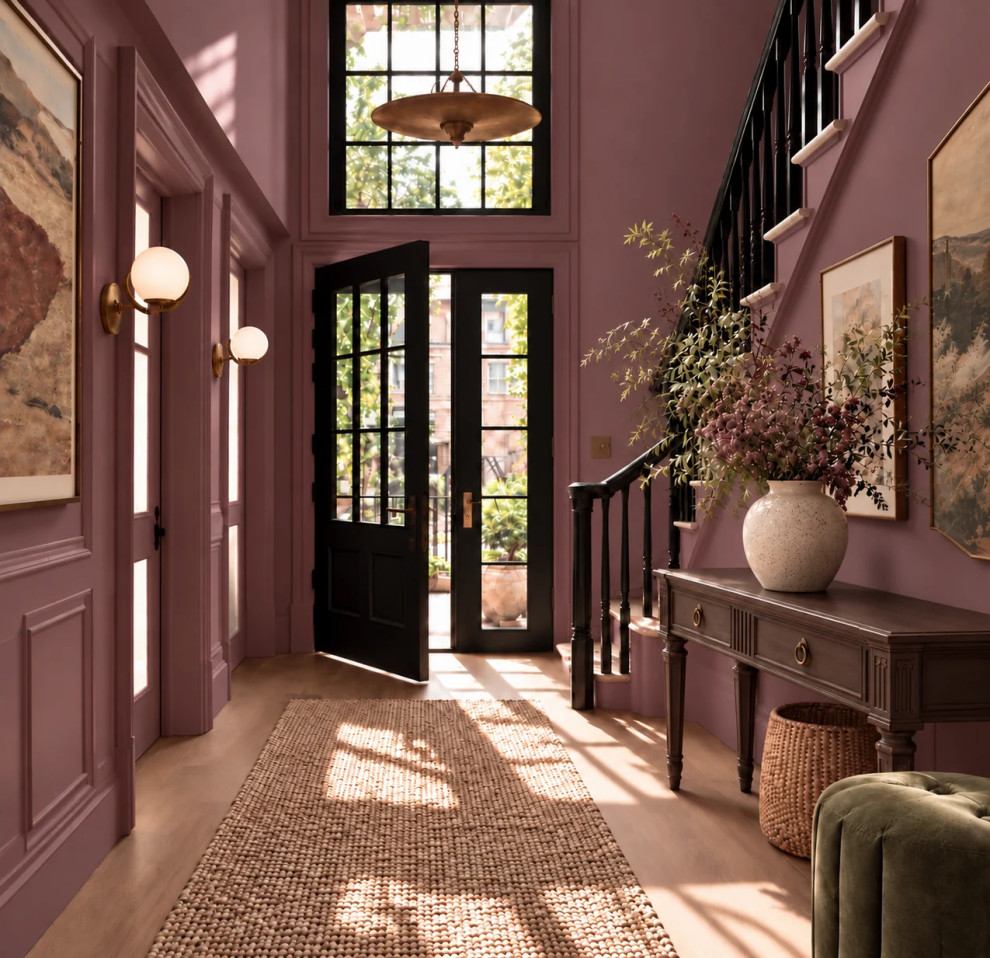
7. Pueblo by C2
Pueblo is a soft berry hue mellowed by brown undertones. It’s tough to pin down, in a good way: It shifts throughout the day with the changing quality of light. In the warmer light of morning and evening, it reads mellow and earthy. In midday sun, it takes on a rosier glow.
This makes it a great choice for a room that gets generous natural light but where a calm and cozy feel is desired, such as a bedroom, home office or library.
Pueblo is a soft berry hue mellowed by brown undertones. It’s tough to pin down, in a good way: It shifts throughout the day with the changing quality of light. In the warmer light of morning and evening, it reads mellow and earthy. In midday sun, it takes on a rosier glow.
This makes it a great choice for a room that gets generous natural light but where a calm and cozy feel is desired, such as a bedroom, home office or library.
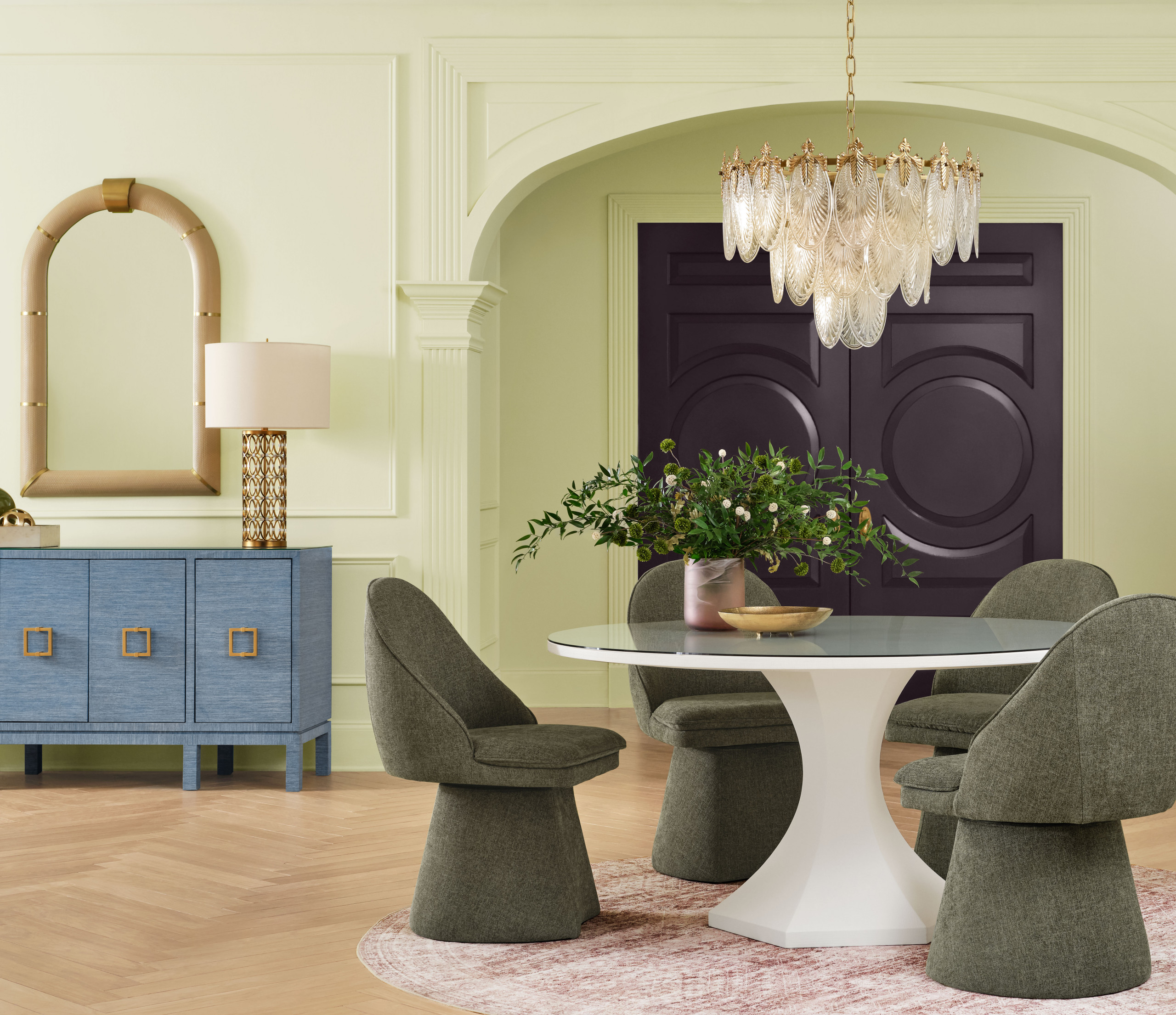
8. Celery by Sherwin-Williams
Another of the rare lighter hue selections for 2027 paint Color of the Year, Celery looks as crisp as it sounds.
Another of the rare lighter hue selections for 2027 paint Color of the Year, Celery looks as crisp as it sounds.
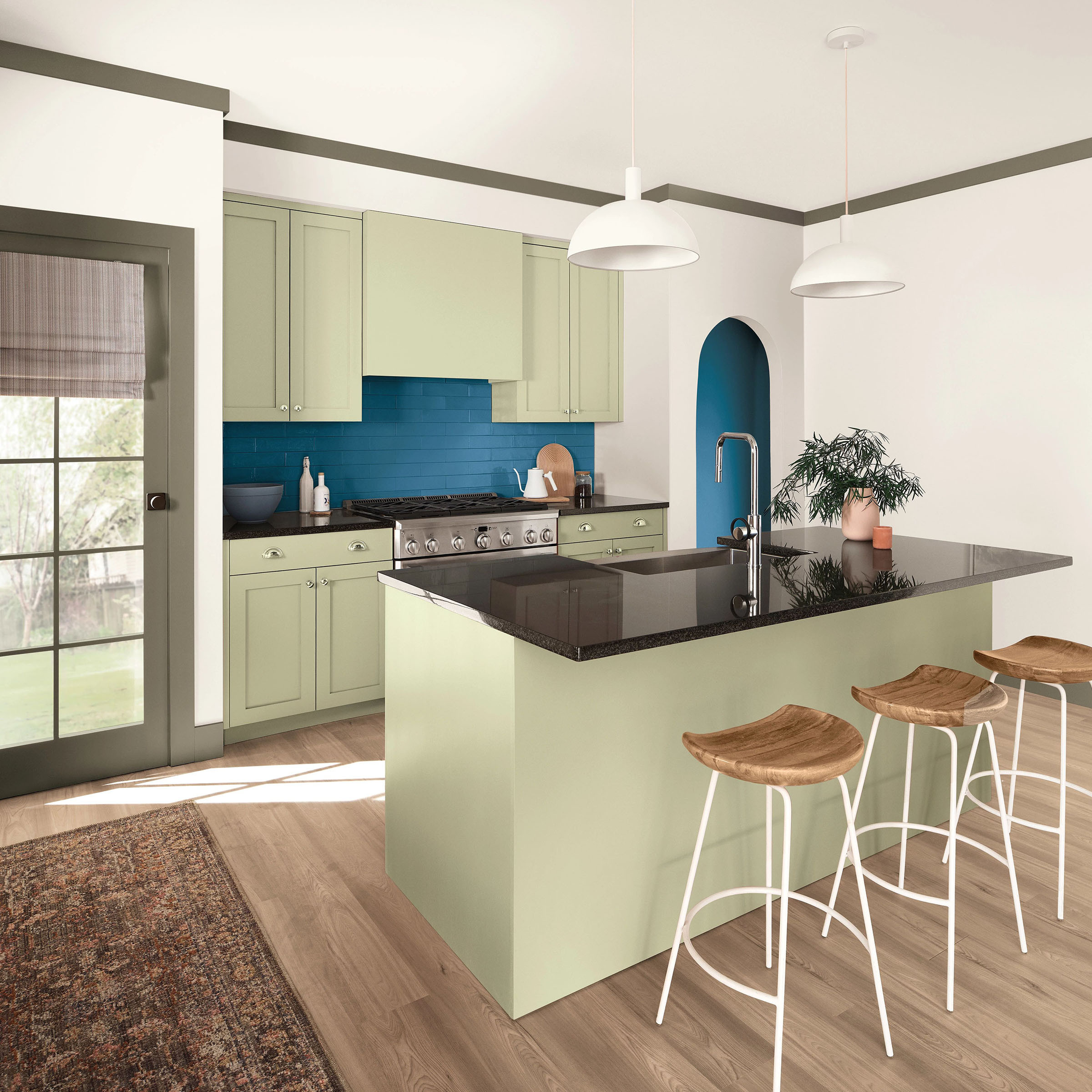
This airy yellow-green is a fresh alternative to white and off-white. It bridges warm and cool palettes nicely, so it plays well with everything from cool blues to warm wood tones. Try it on walls or kitchen cabinets, or as an accent color, if you want a light shade that still makes an impact.
Searching for the Perfect Paint Color? Try Our Color Finder Tool
Searching for the Perfect Paint Color? Try Our Color Finder Tool
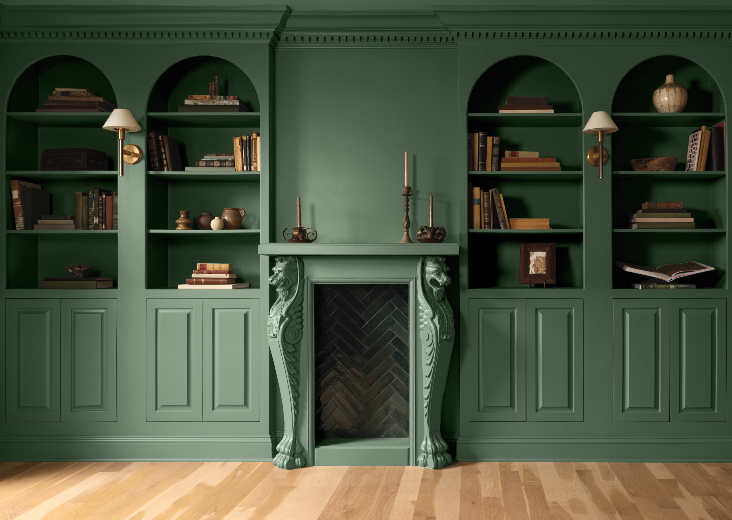
9. Webster Green by Benjamin Moore
This just-right green brings character to a space without overpowering. Webster Green is dark without feeling heavy, and doesn’t lean strongly warm or cool. It’s at once classic yet fresh. Its nature-inspired depth makes it a good fit if you’re after a soothing feel.
This just-right green brings character to a space without overpowering. Webster Green is dark without feeling heavy, and doesn’t lean strongly warm or cool. It’s at once classic yet fresh. Its nature-inspired depth makes it a good fit if you’re after a soothing feel.
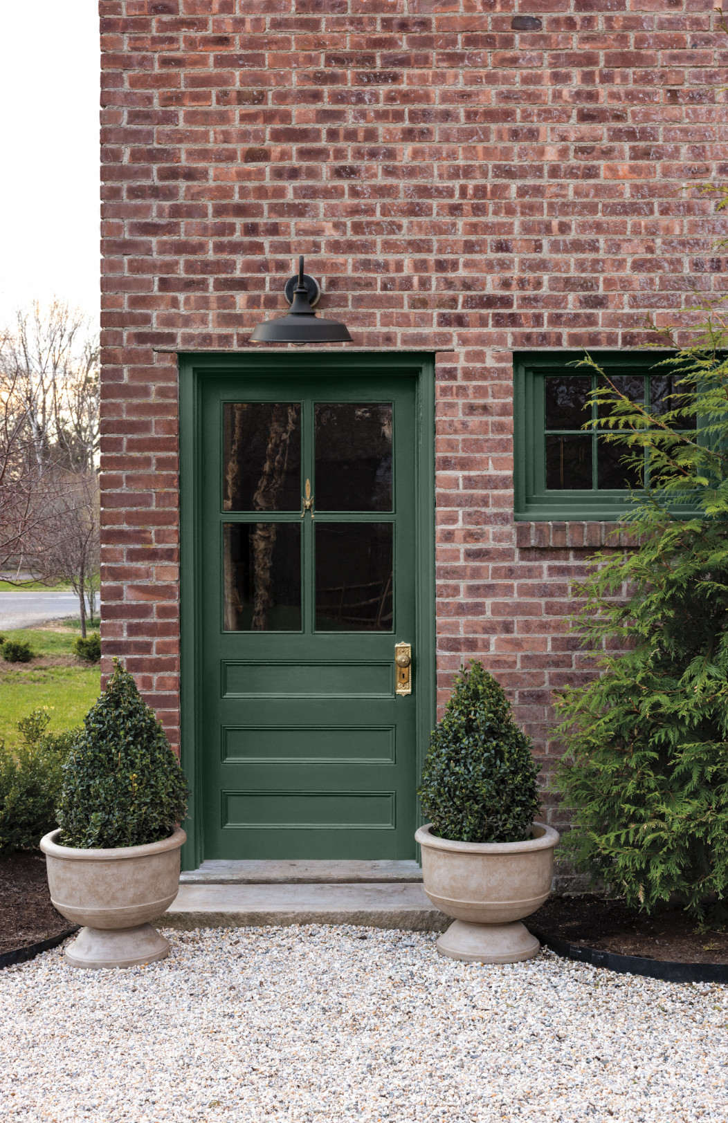
It’s also a standout choice for a home’s exterior. Here it picks up the greens of the surrounding landscape and makes a pretty partner for red brick, a notoriously tricky material to pair with paint.
Your turn: Which of these 2027 Color of the Year selections is your favorite? Share your thoughts in the Comments.
More on Houzz
Read more stories
Browse photos for ideas
Find home professionals
Your turn: Which of these 2027 Color of the Year selections is your favorite? Share your thoughts in the Comments.
More on Houzz
Read more stories
Browse photos for ideas
Find home professionals

Sponsored

Loudoun Co, VA's Award-Winning Interior Designer | 17x Best of Houzz
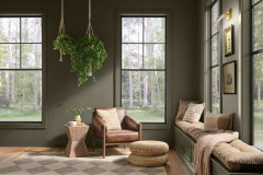
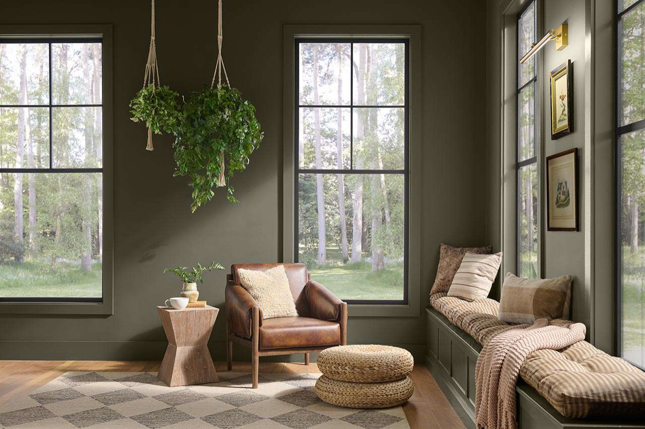
Evoking moss, olive and a hint of forest-floor brown, Behr’s Grounded lives up to its name. This deep, moody neutral adds drama without overwhelming a room. Use it to bring a rooted calm to your walls, and pair it with warm wood, burnished metallics and natural textures for a richly layered space.