


9 Ways to Boost Your All-White Color Scheme
Grays, seafoam, metal, wood and more help embolden a white-on-white look so it doesn't leave you cold
tidgboutique
June 17, 2015
Toronto Interior Design Group is a trusted one-stop-shop residential interior design concierge boutique-style firm crafting timeless interiors.
Toronto Interior Design Group is a trusted one-stop-shop residential interior design... More
Love the look of fresh white but don’t want to feel like you live in a cold, minimalist compound? Here’s how to boost white to get a livable, inviting look that feels airy, open and full of personality.
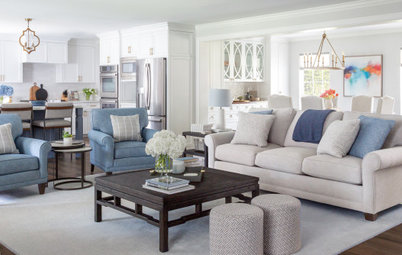
Colorful Accessories
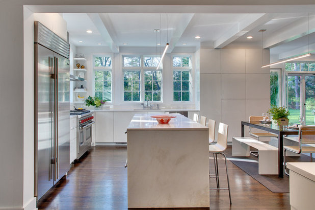
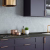
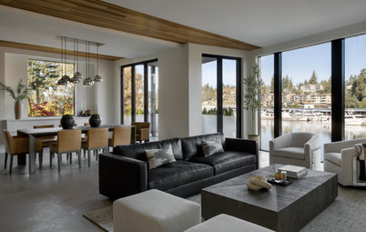
A kitchen can be mostly white surfaces and still have a sense of life with just a few colorful accents. Notice the red dials on the range, which add personality, as well as the occasional accessory and plant life. These add up to a feeling of a more diverse palette without any single hue taking over from white as the focus.
A kitchen can be mostly white surfaces and still have a sense of life with just a few colorful accents. Notice the red dials on the range, which add personality, as well as the occasional accessory and plant life. These add up to a feeling of a more diverse palette without any single hue taking over from white as the focus.
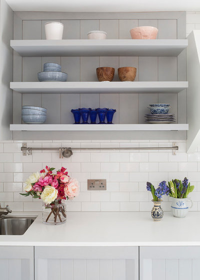
Open shelves are an especially effective way of revealing some hits of color through everyday dish ware. With the plant life below, this kitchen feels miles from all-white.
For a seasonal pop of color, try removable chair covers in a saturated hue. They’ll help add interest to an all-white scheme, are easy to clean and can be stored away between seasons to switch up the look throughout the year.
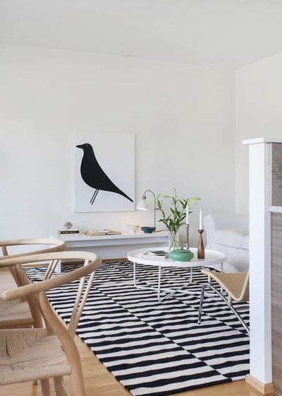
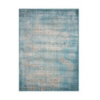
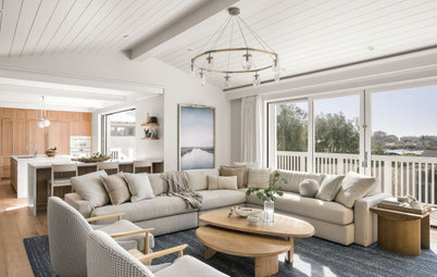
Patterned Rugs
Patterns will bring a lot of interest to a monochrome space. A black and white area rug is a great way to bring some drama to a space while anchoring the floor and still leaving the room airy and open. Plus, if your wood floor is too much wood for you, it helps tie the white walls back to the ground so the color palette all feels connected.
Patterns will bring a lot of interest to a monochrome space. A black and white area rug is a great way to bring some drama to a space while anchoring the floor and still leaving the room airy and open. Plus, if your wood floor is too much wood for you, it helps tie the white walls back to the ground so the color palette all feels connected.
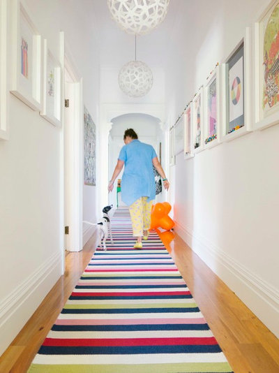
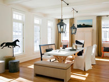
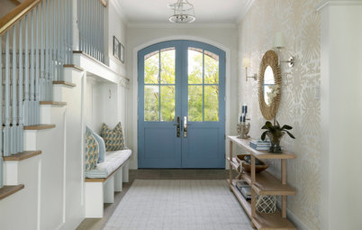
In a hallway, a runner rug draws the eye through the space for some dynamic energy — and perpendicular lines like this also visually widen the space.
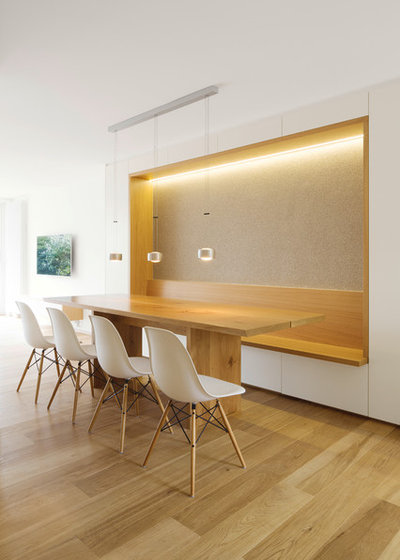
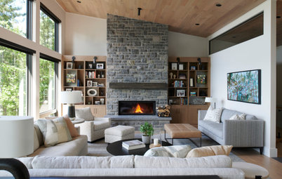
Wood
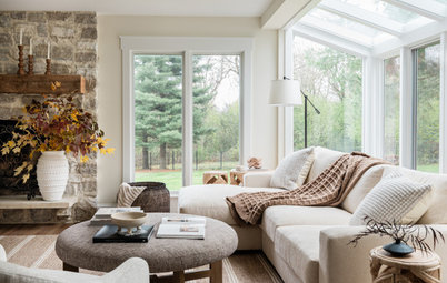
Wood is considered a neutral, despite having strong yellow or brown undertones, so it adds a hint of color to a white space without overriding the clean, fresh look. It also helps to bring in the element of nature, which keeps a white space from feeling sterile.
Wood is considered a neutral, despite having strong yellow or brown undertones, so it adds a hint of color to a white space without overriding the clean, fresh look. It also helps to bring in the element of nature, which keeps a white space from feeling sterile.
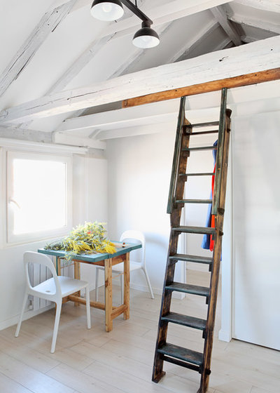
Aged woods especially give a space a sense of softness, so try adding a piece like an antique ladder, a wood-legged table or a vintage shelving unit or sideboard.
An exposed wood ceiling, dressed in a whitewash or pale stain, gives a hint of visual interest in an unexpected place. Contrast it with white walls and glossy tiles or other hard surfaces for lots of variety with no strong color in sight.
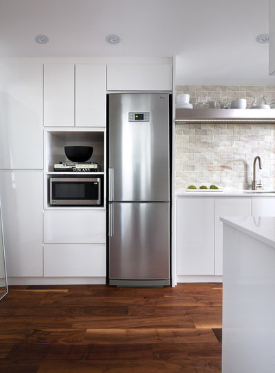
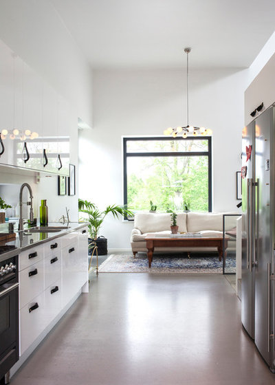
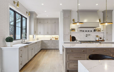
Metal
Cool metallics like silver or steel are a perfect complement to warm woods to give a white space a full range of undertones while staying in a neutral family. Plus, metallic sheen adds an all-important sense of sparkle to a space. If you don’t have stainless steel appliances, add sleek new cabinet handles instead, or a metallic floating shelf.
Cool metallics like silver or steel are a perfect complement to warm woods to give a white space a full range of undertones while staying in a neutral family. Plus, metallic sheen adds an all-important sense of sparkle to a space. If you don’t have stainless steel appliances, add sleek new cabinet handles instead, or a metallic floating shelf.
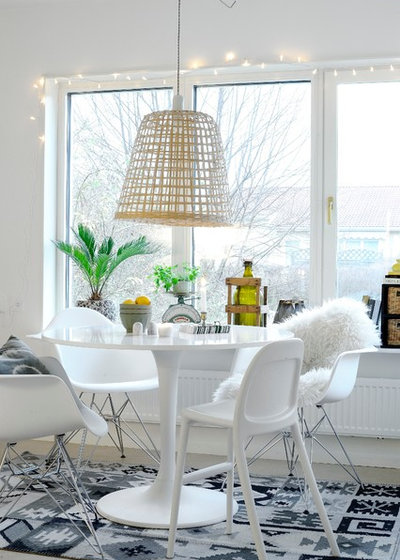
Varied Furniture Combinations
Besides mixing textures, playfully mixing your furnishings can add a relaxed appeal to a room. Try combining different chairs, all in white and-or metal accents, and mix in different pillows or a sheepskin to give the eyes plenty of shapely details to take in.
Besides mixing textures, playfully mixing your furnishings can add a relaxed appeal to a room. Try combining different chairs, all in white and-or metal accents, and mix in different pillows or a sheepskin to give the eyes plenty of shapely details to take in.
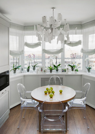
Sheer Materials
Instead of a new hue, look for places to add clear items for a new layer of colorless “color.” Try sheer shades, transparent chairs, glass vases or a combination of all.
Instead of a new hue, look for places to add clear items for a new layer of colorless “color.” Try sheer shades, transparent chairs, glass vases or a combination of all.
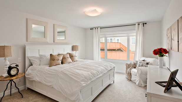
Sandy Off-Whites
Pale materials like burlap, linen and other textural fabrics in off-whites like sand and cream add depth and texture to a bedroom or living room while maintaining the dreamy quality of white. Use them in pillows, lampshades, carpet, picture frames or old maps and other sepia-toned art.
Pale materials like burlap, linen and other textural fabrics in off-whites like sand and cream add depth and texture to a bedroom or living room while maintaining the dreamy quality of white. Use them in pillows, lampshades, carpet, picture frames or old maps and other sepia-toned art.
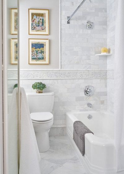
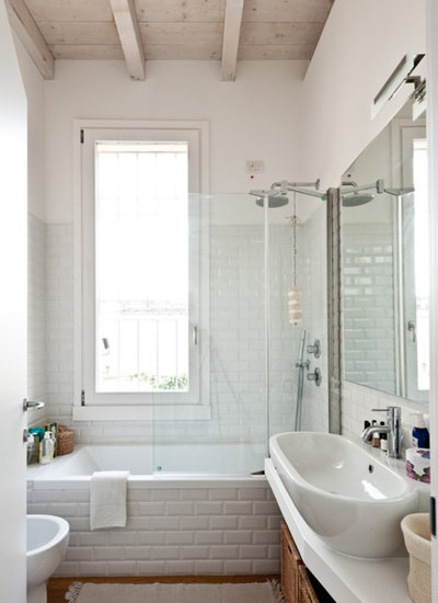
Grays
Pale gray shades read as white when mixed together, especially in stone tiles. Add a few deep gray elements for contrast and bathroom walls will look like a calming spa oasis with plenty of depth.
Pale gray shades read as white when mixed together, especially in stone tiles. Add a few deep gray elements for contrast and bathroom walls will look like a calming spa oasis with plenty of depth.
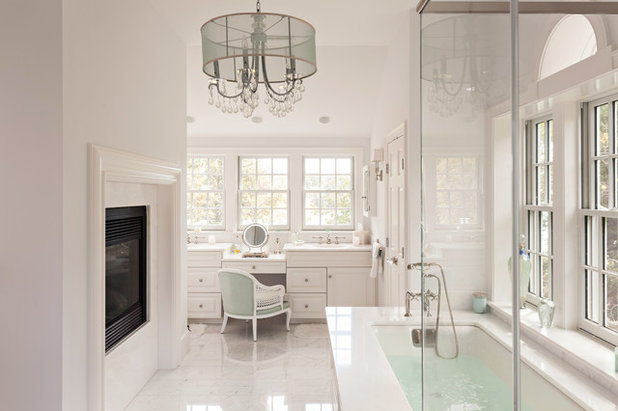
Seafoam
Pale, watery blue-green is another excellent color to add in a white bathroom because it helps white look whiter without breaking up the ocean of calm.
Pale, watery blue-green is another excellent color to add in a white bathroom because it helps white look whiter without breaking up the ocean of calm.
Ultimately, the key to working with white is to add just enough color and texture to make the space come alive without taking away that beautiful simplicity you fell in love with in the first place. Add small accents and details over time until the look feels right, then you’ll have a soothing space that’s full of character.
More:
What to Know Before You Paint Your Walls White
11 Reasons to Love White Bedding
More:
What to Know Before You Paint Your Walls White
11 Reasons to Love White Bedding
What are you working on?
Related Products

Related Stories
Organizing
How to Create a Joyful, Clutter-Free Home Office
Follow these steps to get rid of the paper piles and make room for beauty and better organization
Full Story
Remodeling Guides
15 Ways to Create Separation in an Open Floor Plan
By tidgboutique
Use these pro tips to minimize noise, delineate space and establish personal boundaries in an open layout
Full Story

White
Design Pros Share 10 Favorite Creamy White Paints
By Becky Harris
These off-white color choices include versatile tones, warming hues and pleasingly soft shades
Full Story
Entryways
4 Designer Tips for a Fashionable Entry
By tidgboutique
A pro shows how adding color, statement pieces and more to a foyer can set the right tone for the rest of the home
Full Story
Most Popular
7 Major Decorating Mistakes and How to Avoid Them
By tidgboutique
Gain confidence to start your interior design project with this advice from a professional designer
Full Story
Living Rooms
4 Must-Have Features for a Small Living Room
By tidgboutique
A designer shares important ways to live large in a tight space and make it look stylish
Full Story
Most Popular
7 Common Decorating Mistakes to Avoid
Pros share solutions to design problems they often find in people’s living spaces
Full Story
Most Popular
How to Decorate a Living Room
By tidgboutique
A designer offers tips for creating a comfortable space that reflects your style
Full Story
Budget Decorating
Where to Splurge and Where to Save When Decorating
By tidgboutique
See where it makes sense to invest in durable essentials and focal pieces, and where to economize on other things
Full Story
Lighting
Pro Tips for Lighting 10 Rooms and Outdoor Areas
Get professional advice for lighting your kitchen, bathroom, living room, office, patio and more
Full Story
21cylo...I think that when the advertisement is relevant to the discussion, there is no problem with the additional information. The discussion here is of an article that is actually comprised of advertisements from different designers that have been given credit in the upper right hand corner of the pictures used. You can access additional information about the designer or architect by clicking their name in the respective picture. What Panageries posted here is not only relevant but appropriate for this article and the ensuing discussion. Had this been in a dilemma post with no direct advice regarding the issue at hand, I would agree with you. However, I think this "ad" was a good example of proper discretionary use of the Houzz site by a Houzz pro. Of course, this is merely my opinion. :)
I do respect your opinion. As I said in my first post, I do not mind the information and pictures by the pros and decorators about the topic. Giving credit to the designers in the story is one thing. However, it is the "see my website" and the advertisement of a Rustic Bed #xxxx by Company ZZZZ in the discussion portion of the story that irks me. Guess I'll have to live with it :)
I love the striped hall runner with white hall! What brand is the runner?