


Designer Falls for Her Own Investment Property
A deft mix of antique hand-me-downs, midcentury modern and new pieces, and contemporary art suits this Toronto Victorian

Interior designer Stephanie Houghton originally bought this 1854 Victorian in a transitional area of downtown Toronto as an investment property. But in spite of a bad 1980s renovation that had stripped away a lot of the original architectural details and partially opened up the floor plan, she fell hard for the house and the neighborhood and decided to keep it for herself. This dramatic first-floor transformation shows how she used her design skills to embrace the home’s Victorian spirit, add new millwork and light fixtures, and make sense of the plan while infusing rooms with her personal style via a mix of antiques, midcentury modern and new furniture and rugs, and dazzling art that spoke to her.
Before. This photo gives you an idea of the home’s earlier look. A previous renovation had stripped many of the original Victorian details. Compare this photo with the next one, and you’ll see the difference the new high baseboards make.
Because the living room does not have a fireplace, Houghton used a large-scale photograph by Scott McFarland to create an eye-catching focal point. The bench underneath is covered in an embroidered velvet in a color inspired by the stained-glass window.
In terms of the architecture, the designer’s intention was to add back millwork that honored the original Victorian design while balancing it with modern sensibilities.
“The house had been stripped of this kind of character. The baseboards are a nice way to ground the rooms, and the ceilings are clear,” she says — another juxtaposition. This photo gives us a good look at the new 12-inch-tall baseboards. “I picked a profile I liked and said, ‘OK, add 6 inches to that,’” she says.
By forgoing any ceiling moldings, she gave the architecture the old-new balance that she also likes to employ with her furniture. The floors are the original subfloors of the Victorian. “I loved them so much, I couldn’t bear to touch them,” she says. “They are red pine and patchworked together in places.”
Bench fabric: Designers Guild
Browse landscape photographs
See how other homeowners are showing off original subfloors
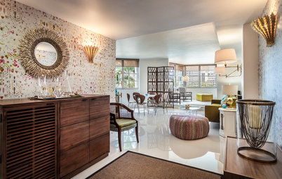
The lack of a separate entryway or a coat closet inspired this big design move — a hefty block of a walnut armoire with midcentury stylings placed just beyond the front door. The piece holds her coats and boots. The way she flanked it with vintage Hans Wegner Wishbone chairs is a good example of how the designer likes to balance straight lines and curves. And you can see how the new baseboard millwork stands up to the scale of such a big piece.
Houghton had her talented brother craft the armoire. Rich walnut contrasts with a white surround that has beveled edges. The large piece is supported by surprisingly petite tapered legs. “Most people want perfect pieces of walnut, but I wanted the variations in color, the holes and the knots,” she says. The piece is oiled and retains its natural color.
Houghton had her talented brother craft the armoire. Rich walnut contrasts with a white surround that has beveled edges. The large piece is supported by surprisingly petite tapered legs. “Most people want perfect pieces of walnut, but I wanted the variations in color, the holes and the knots,” she says. The piece is oiled and retains its natural color.
Dining Room
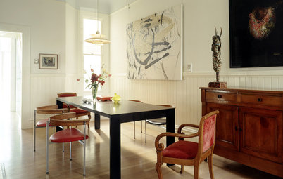
Favorite striking artworks mark the dining room (to orient you, that massive mirror in the first photo is just out of frame to the left of the graffiti-like piece). “I had to decide if I wanted to keep the plan open or make it compartmentalized again,” Houghton says. She decided to stick with the opened-up plan and even opened it more by expanding the entry to the kitchen to a size that still left some valuable wall space for artwork.
The scale of her artwork stands up to the room’s high ceilings. The photograph by Jill Greenberg has stirred controversy, but Houghton is a big fan. “I love how quickly a child’s emotions can change so dramatically. It shows how they can protect themselves,” she says. The large graffiti-like piece is by artist Graham Gillmore. “It has messages woven into it that show the multiple sides of love and how high and low emotions can run,” she says. “There is lots of texture to it.”
With such a strong graphic piece, she needed a bold rug and settled on a pink one, also from Madeline Weinrib. The Eero Saarinen Tulip table’s top and base provide two graphic circles. Paired with the white table, the wood of the vintage Cherner chairs offers the same kind of contrast that the armoire does. “They look like butterflies to me. They are so architectural and sculptural,” she says. The lantern originally hailed from Egypt and brings in ornate metalwork and an antique patina overhead.
See more round pedestal dining tables
Family Room
Before. This room is east-facing and gets lots of natural light, especially in the morning. Houghton refers to it as her “sunny room.” This shot was taken from the kitchen, which is between the dining room and this room.
Before. This room is east-facing and gets lots of natural light, especially in the morning. Houghton refers to it as her “sunny room.” This shot was taken from the kitchen, which is between the dining room and this room.
After. The sunny room is Houghton’s favorite laptop office space because of its lovely morning light and views out to the garden. The views inspired her to go natural and more muted than she did in the other first-floor spaces. “I wanted everything in here to feel organic, warm, easy and casual,” she says. So she chose fabrics like linens, cottons and wools. The pillows bring in botanical prints.
The Jens Risom cantilevered side tables and the Lotte lamp are vintage midcentury modern pieces. The table on the right side of the sofa holds some of her turned-wood collection.
Pillow fabrics: Tonic Living
The Jens Risom cantilevered side tables and the Lotte lamp are vintage midcentury modern pieces. The table on the right side of the sofa holds some of her turned-wood collection.
Pillow fabrics: Tonic Living
Houghton loves to create tension in a room, and placing this reclaimed-wood cabinet with an industrial hot-rolled steel top across from the pretty sofascape certainly creates some. It houses her printer and office supplies. The photograph of Shanghai by artist Greg Girard provides a stark juxtaposition to her colorful Keep Calm and Carry On posters across the room. “It’s moody as all get-out,” she says.
Settled in with her favorite things around her, Houghton is not planning to flip her former investment property anytime soon.
More
A Beginner’s Guide to Original Art and Limited-Edition Prints
Read more stories about designing living spaces
Find an interior designer on Houzz
Settled in with her favorite things around her, Houghton is not planning to flip her former investment property anytime soon.
More
A Beginner’s Guide to Original Art and Limited-Edition Prints
Read more stories about designing living spaces
Find an interior designer on Houzz


Living Spaces at a Glance
Who lives here: Stephanie Houghton of Emily Griffin Design
Location: Toronto
Size: 1,600 square feet (149 square meters); two bedrooms, one bathroom
Living Room
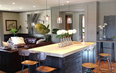
As soon as you walk through the front door, you get a sense of Houghton’s colorful style, her love of juxtapositions and her way with mixing pieces from different generations. (The front door is to the left of the sofa just out of view and opens right into the living room.) This room still had its original stained-glass fan window, which Houghton highlighted by using it as inspiration for the color palette. “I plucked the colors on the throw pillows and the bench directly from the window,” she says.
Houghton grounded the room with a Madeline Weinrib rug in a mandala pattern. An Excel floor lamp and an Eames stool topped with a work from artist Jaime Hayon’s Hope Bird collection are sculptural touches. “The lamp is large-scale, and it’s almost more architectural than a light. I love its form and all of the cord,” she says. The piece stands up to the room’s high ceilings. She would never dream of getting rid of her grandmother’s wonderful camelback sofa, but she did re-cover it. “It does a nice job of hiding the radiator behind it,” she says. Across from the sofa, two tuxedo armchairs bring in straighter, more traditional lines. “I love a healthy balance of straight and curvy lines and old and new in all of my rooms,” she says.
The 1980s renovation had opened up the living and dining spaces to each other in one big open space. Houghton placed a large mirror (8 by 4 feet) with a painted reclaimed-wood frame to mark the midpoint and provide a delineation between the living room and the dining room.
Eames-designed walnut stool: Herman Miller; Platner-designed coffee table: Knoll