


Kitchen of the Week: A Study in Contrasts
A designer found on Houzz uses black and white and geometric shapes for a family hub in a Spanish Revival home
Becky Harris
May 1, 2020
Houzz Contributor. Hi there! I live in a 1940s cottage in Atlanta that I'll describe as "collected."
I got into design via Landscape Architecture, which I studied at the University of Virginia.
Houzz Contributor. Hi there! I live in a 1940s cottage in Atlanta that I'll describe... More
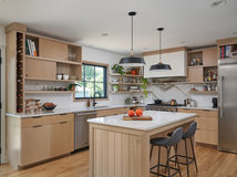
The Los Angeles real estate market has been so tight that many people have chosen an area to live in and then made any house they could find there work for them. That was the case for this young family, who scored a Spanish Revival house in the beautiful Hancock Park neighborhood. The house hadn’t been updated in more than 40 years, and they undertook a full renovation and addition to make it suit their needs. Most important to them was replacing the small galley kitchen with an open and airy room that would serve as a hub for the family.
Photos by Jessica Alexander
Kitchen of the Week
Who uses it: A young family
Location: Hancock Park neighborhood of Los Angeles
Size: 250 square feet (23 square meters)
Designer: Genna Margolis of Shapeside
The home renovation project included adding a master suite and family room off the back of the house. So interior designer Genna Margolis was able to create this new central kitchen in a space that used to be a bedroom, bathroom and hallway. The space is open to an adjacent dining area and the new family room. “Now the kitchen is smack-dab in the middle of the house,” she says.
The homeowners found Margolis by searching for a local interior designer on Houzz. They liked her style and she quickly homed in on theirs. “Sometimes people start out thinking they want one thing but it turns into something else,” she says. “At first they wanted Spanish modern, which was similar to a modern farmhouse style. But when I showed them how that would look, they didn’t like it. It made them realize they wanted to go more bold, modern and polished.”
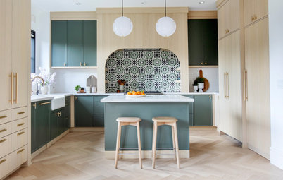
With their style preferences nailed down, the first idea Margolis had for the room was to use two contrasting materials: light wood for the cabinets and concrete for the floors. The cabinets are whitewashed oak and the floor is composed of 48-by-48-inch concrete tiles. From there she continued to play with contrast — black with white and triangles with circles.
Find an interior designer on Houzz
Kitchen of the Week
Who uses it: A young family
Location: Hancock Park neighborhood of Los Angeles
Size: 250 square feet (23 square meters)
Designer: Genna Margolis of Shapeside
The home renovation project included adding a master suite and family room off the back of the house. So interior designer Genna Margolis was able to create this new central kitchen in a space that used to be a bedroom, bathroom and hallway. The space is open to an adjacent dining area and the new family room. “Now the kitchen is smack-dab in the middle of the house,” she says.
The homeowners found Margolis by searching for a local interior designer on Houzz. They liked her style and she quickly homed in on theirs. “Sometimes people start out thinking they want one thing but it turns into something else,” she says. “At first they wanted Spanish modern, which was similar to a modern farmhouse style. But when I showed them how that would look, they didn’t like it. It made them realize they wanted to go more bold, modern and polished.”
With their style preferences nailed down, the first idea Margolis had for the room was to use two contrasting materials: light wood for the cabinets and concrete for the floors. The cabinets are whitewashed oak and the floor is composed of 48-by-48-inch concrete tiles. From there she continued to play with contrast — black with white and triangles with circles.
Find an interior designer on Houzz
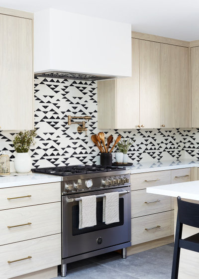
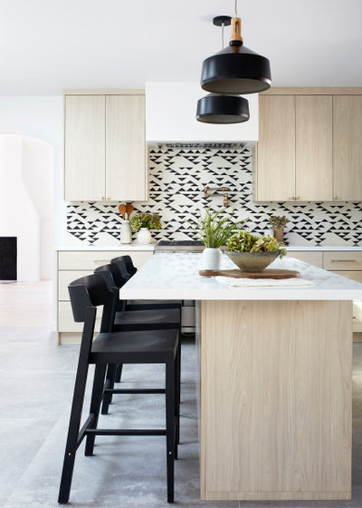
Next came a tricky tile decision. “While we wanted to nod to Spanish tile, we found the choices available in that category have become pretty generic. The only ones that wowed were hand-painted, and they were really expensive,” Margolis says. Her clients were drawn to this bold graphic black-and-white tile, another element that plays with contrast. Because there were many pattern possibilities with this particular tile, the designer played around with them using a computer design software program to get the layout just right.
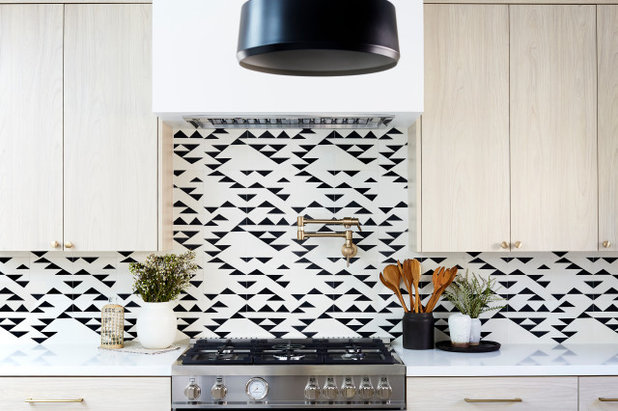
The dynamic pattern is full of triangles, so Margolis found some pendant lights to bring circles into the mix. “It was nice to add in shapes that were different from all the straight lines and triangles,” she says.
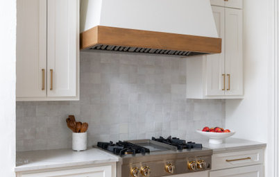
She specified drywall around the vent hood. This allowed it to fade into the background, maintaining a clean, minimalist look.
Find a local tile professional
She specified drywall around the vent hood. This allowed it to fade into the background, maintaining a clean, minimalist look.
Find a local tile professional
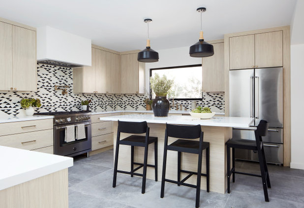
The countertops are a polished white quartz by Caesarstone. By extending the island’s overhang on the right, Margolis provided seating that wraps around the corner. The side that faces the sink includes a microwave drawer and additional storage.
“I wanted the fridge to have a built-in look so I designed a casing around it. It feels more custom this way,” she says.
Browse black modern and contemporary counter stools in the Houzz Shop
“I wanted the fridge to have a built-in look so I designed a casing around it. It feels more custom this way,” she says.
Browse black modern and contemporary counter stools in the Houzz Shop
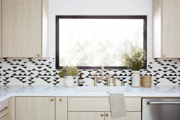
Margolis had this new window cut to provide a nice view during dishwashing.
The cabinets’ slab fronts fit together in a clean, minimalist way. In a room with such strong black-and-white contrast, matte black faucets and hardware would have been the most obvious choice. Instead, Margolis recommended the unexpected choice of brass. The finish adds warmth and polish to the room, and it looks beautiful against the cabinetry’s light wood.
The cabinets’ slab fronts fit together in a clean, minimalist way. In a room with such strong black-and-white contrast, matte black faucets and hardware would have been the most obvious choice. Instead, Margolis recommended the unexpected choice of brass. The finish adds warmth and polish to the room, and it looks beautiful against the cabinetry’s light wood.
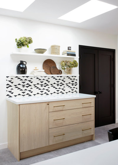
The skylights above this cabinet were existing. “I didn’t want to block the light from the skylights with upper cabinets so I placed floating shelves here instead,” Margolis says. They give the homeowners an opportunity to add more curved objects to contrast with all the straight lines in the room. The black doors lead to a pantry.
Shop for the perfect cutting board
Shop for the perfect cutting board
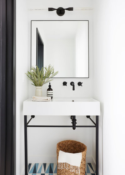
Margolis carried the black-and-white and graphic triangle motif into this nearby powder room.
See more of this house
More on Houzz
Read more kitchen stories
Browse kitchen photos
Hire a kitchen remodeler
Shop for kitchen products
See more of this house
More on Houzz
Read more kitchen stories
Browse kitchen photos
Hire a kitchen remodeler
Shop for kitchen products


We design, build and renovate in the most exquisite of fashions. Our team of revolutionaries is dedicated to... Read More
What are you working on?
Related Products
Our philosophy at Kitchen Kraft is to make home remodeling convenient. We are your one-stop shop for kitchen... Read More
Related Stories
Kitchen Backsplashes
30 Bold and Beautiful Range Backsplashes
Get ideas for eye-catching tile and stone backsplashes inside stove alcoves and behind cooktops
Full Story
Kitchen Design
7 Essential Features of a Well-Designed Kitchen
Make sure your new kitchen not only looks good but also functions beautifully
Full Story
Kitchen Workbook
How to Map Out Your Kitchen Remodel’s Scope of Work
Help prevent budget overruns by determining the extent of your project, and find pros to help you get the job done
Full Story
Kitchen Storage
Foolproof Storage Solutions for Corner Kitchen Cabinets
By tidgboutique
Consider Lazy Susans, pullouts and more to maximize storage
Full Story
Trending Now
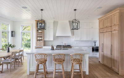
The 10 Most Popular Kitchens So Far in 2024
Get inspired by the warm neutral palettes, ample storage and inviting islands in these most-saved new photos on Houzz
Full Story
Houzz TV
5 Trends for Kitchen and Bath Products in 2024
See fascinating new features for showers, tubs, faucets and more launched at the 2024 Kitchen and Bath Industry Show
Full Story
Kitchen Backsplashes
Where to Start and Stop Your Backsplash
By tidgboutique
Consider these designer tricks to work around cabinets, windows and other features for a finished look in your kitchen
Full Story
Kitchen Workbook
How to Find Your Kitchen Style
If you’re planning to remodel your kitchen, here’s how to find inspiration and start narrowing down your choices
Full Story
Kitchen Design
15 Stylish Kitchen Range Hood Ideas
Get ideas for hood shapes, sizes and looks that can elevate a kitchen’s design while ridding it of bad air and odors
Full Story
Kitchen Workbook
How to Remodel Your Kitchen
Follow these start-to-finish steps to achieve a successful kitchen remodel
Full Story
Can you tell me what the cabinets are. I'm in NY and doing a kitchen remodel and those are what i'm looking for. The search is daunting for someone not in the design/construction industry! The kitchen is beautiful!
Wow cool kitchen! I love the backsplash so funky!
@Nicole Beldner, The cabinet material is whitewashed oak. You can look up local cabinet pros on Houzz, read reviews, contact them and show them these photos (during the current pandemic, give them a call and then email them this story). Just go to FIND PROS at the top of the page and follow the prompts.