


Kitchen of the Week: Airy Farmhouse Feel for Empty Nesters
A designer helps a Utah couple create a bright space with a better layout, modern appliances and improved storage
Jeannie Matteucci
February 3, 2022
Houzz Contributor. Home design writer and lifestyle reporter with a love for stylish spaces, smart lighting and a good decaf dry cappuccino.
Houzz Contributor. Home design writer and lifestyle reporter with a love for stylish... More
Empty nesters Lawrence and Isabelle Buhler love their 1905 urban farmhouse in an established Salt Lake City neighborhood. They bike or walk to work and have a garden where they grow fruits and vegetables for healthy meals. But they had a lot less love for their kitchen.
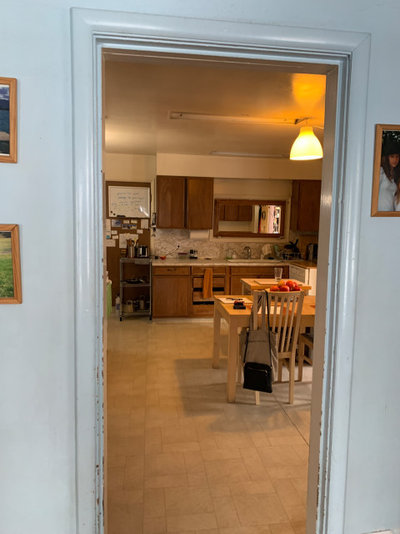
For 20 years, they lived with its dingy white walls, dropped ceiling, aging wood cabinets, limited countertop space and lack of natural light. A hodgepodge of appliances included a portable dishwasher that sat out in the open with a microwave on top. And a never-used full bathroom was right off the kitchen. If the Buhlers left the door open, they got a view of a pink tiled bathtub.
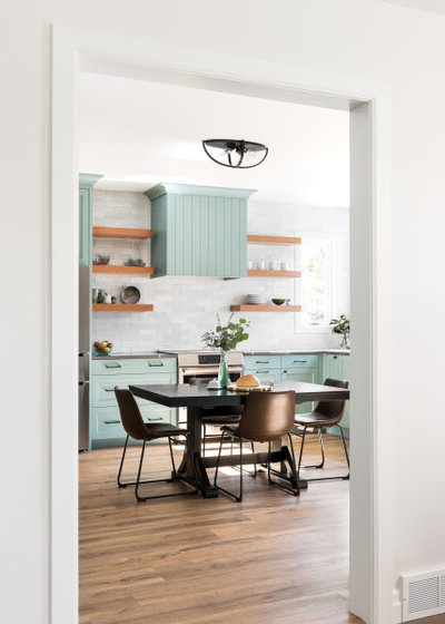
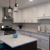
Wanting a brighter space with a more functional layout, upgraded appliances and improved storage, the couple turned to designer Nicole Zeigler for help. Zeigler eliminated the bathroom and a mudroom to expand the kitchen, adding 85 square feet and creating room for a breezy yet more functional layout. Soft green cabinets and a central dining table give the space a welcoming vibe.
For 20 years, they lived with its dingy white walls, dropped ceiling, aging wood cabinets, limited countertop space and lack of natural light. A hodgepodge of appliances included a portable dishwasher that sat out in the open with a microwave on top. And a never-used full bathroom was right off the kitchen. If the Buhlers left the door open, they got a view of a pink tiled bathtub.
Wanting a brighter space with a more functional layout, upgraded appliances and improved storage, the couple turned to designer Nicole Zeigler for help. Zeigler eliminated the bathroom and a mudroom to expand the kitchen, adding 85 square feet and creating room for a breezy yet more functional layout. Soft green cabinets and a central dining table give the space a welcoming vibe.
“After” photos by Lucy Call
Kitchen at a Glance
Who lives here: Empty nesters Lawrence and Isabelle Buhler
Location: Salt Lake City
Size: 285 square feet (26 square meters)
Designers: Nicole Zeigler and Lacy Green of Enzy Design
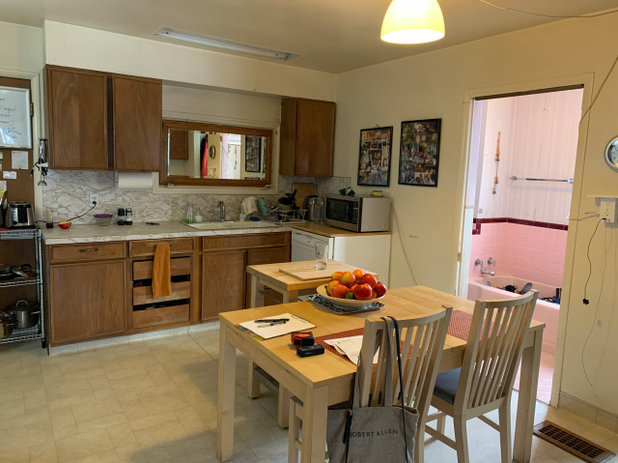
Before: The former kitchen had been had been pieced together over time. A freestanding wire-frame shelf system sat to the left of the aging cabinets seen here. It stored small appliances and pots and pans. “It was probably there for 10 years,” Isabelle says.
A portable dishwasher sat to the right with a microwave on top. A freestanding cutting board attempted to make up for a lack of counter space. The view of the pink tiled bathroom made meals at the dining table awkward. And beige vinyl flooring, laminate countertops and drab white walls did little to make things more pleasant.
“That kitchen was 70 or 80 years old, according to the builders,” Isabelle says. “The walls were chipping, the electricity was old, and the walls insulating that bathroom included newspapers from 1946.”
Kitchen at a Glance
Who lives here: Empty nesters Lawrence and Isabelle Buhler
Location: Salt Lake City
Size: 285 square feet (26 square meters)
Designers: Nicole Zeigler and Lacy Green of Enzy Design
Before: The former kitchen had been had been pieced together over time. A freestanding wire-frame shelf system sat to the left of the aging cabinets seen here. It stored small appliances and pots and pans. “It was probably there for 10 years,” Isabelle says.
A portable dishwasher sat to the right with a microwave on top. A freestanding cutting board attempted to make up for a lack of counter space. The view of the pink tiled bathroom made meals at the dining table awkward. And beige vinyl flooring, laminate countertops and drab white walls did little to make things more pleasant.
“That kitchen was 70 or 80 years old, according to the builders,” Isabelle says. “The walls were chipping, the electricity was old, and the walls insulating that bathroom included newspapers from 1946.”
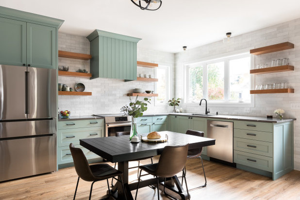
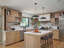
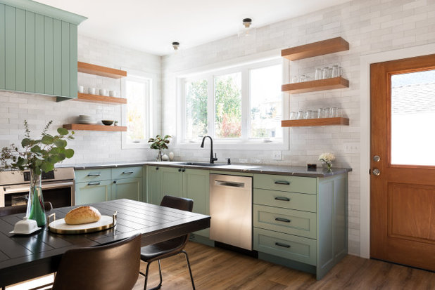
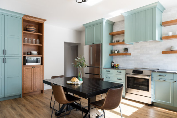
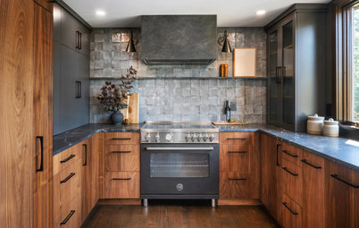
After: Zeigler knocked the kitchen back to the studs. She raised the ceiling about a foot. And she pushed the kitchen out, incorporating the bathroom and mudroom into the layout. Those moves added 85 square feet to the floor plan. “Before, the kitchen was a square,” Zeigler says. “We took that bathroom and mudroom and added them to the kitchen and pushed everything out to give us this large, rectangular kitchen.”
Zeigler then reworked the appliance locations. She placed the new 30-inch induction range about where the sink sat, creating a focal point highlighted with floating cherry shelves and a custom hood with vertical grooved paneling. “We love the induction because it seems very precise and warms up the oven very fast,” Isabelle says. “It’s also easy to clean.”
An expanded window brings in natural light that brightens new custom cabinets painted in Jasper Stone by Sherwin-Williams. The cabinet profile is a modified Shaker style with a beaded inside trim detail. “We didn’t want just a square Shaker style to those cabinets,” Zeigler says. “We wanted to soften the look by adding a profiled inside edge to the doors and drawer frames.”
Zeigler leveled and reinforced the floor, then added wood-look luxury vinyl planks. “It’s so low-maintenance and fits their simple, urban lifestyle,” Zeigler says.
Custom cabinets: Paramount Cabinet and Design; wall, ceiling and trim paint: Pure White, Sherwin-Williams
Find a kitchen designer
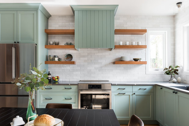
Zellige-style white ceramic tiles in varying tones form the backsplash, which Zeigler took all the way to the ceiling. “We liked their lightness and brightness and how the gloss finish reflects light,” she says.
An upper cabinet over the new 36-inch stainless steel French door refrigerator has dividers for storing baking pans and cookie sheets.
Backsplash: Cloe in white, Bedrosians Tile and Stone
Shop for tile
An upper cabinet over the new 36-inch stainless steel French door refrigerator has dividers for storing baking pans and cookie sheets.
Backsplash: Cloe in white, Bedrosians Tile and Stone
Shop for tile
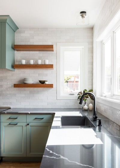
Black bronze cabinet knobs and pulls coordinate with the matte black faucet, dark granite composite sink and graphite gray marble-look quartz countertops with pronounced white veining. “They were worried about having too much white and wanted contrast for the backsplash,” Zeigler says of the countertop choice.
Sink: Granite double undermount in Cinder, Blanco; countertops: Sorano, Pental; cabinet hardware: Blackrock pull and Blackrock knob in Black Bronze, Amerock Hardware
Sink: Granite double undermount in Cinder, Blanco; countertops: Sorano, Pental; cabinet hardware: Blackrock pull and Blackrock knob in Black Bronze, Amerock Hardware
Two flush-mount ceiling lights with a vintage bronze finish and clear glass shade provide illumination over the sink.
A stainless steel dishwasher with integrated handle sits to the right of the sink. “It’s like day and night from what we had before, and it actually cleans the dishes,” Isabelle says.
Drawers to the right of the dishwasher hold utensils and cutlery. A paneled pullout trash and recycling center sits to the right of the range. A door to the lower left of the sink opens to a tall storage cabinet with dividers for cutting boards. A pullout system in the blind corner cabinet maximizes storage.
A half-lite door with a cherry finish now connects the kitchen to the side yard.
Ceiling lights: Ezra in Vintage Bronze, Designers Fountain
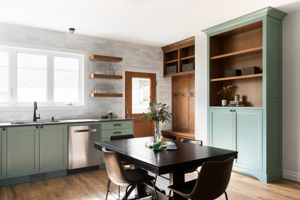
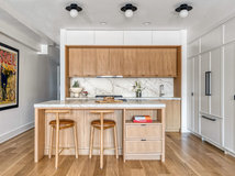
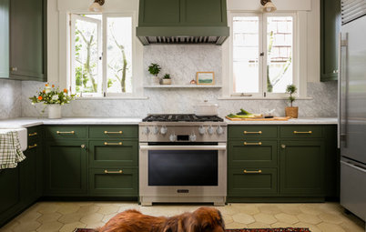
Built-in storage to the right of the door creates a mudroom area. The tall cabinet to the right of that includes a stand-up desk counter that Lawrence uses regularly for working on a laptop. “We wanted it to look like a freestanding furniture piece,” Zeigler says.
A black table with faux leather chairs provides a spot for meals. “I always wanted a bigger kitchen where we can cook and people can eat because I’m French and that’s part of my culture,” Isabelle says.
10 Awesome Design Ideas From the Best of Houzz 2022 Award Winners
A black table with faux leather chairs provides a spot for meals. “I always wanted a bigger kitchen where we can cook and people can eat because I’m French and that’s part of my culture,” Isabelle says.
10 Awesome Design Ideas From the Best of Houzz 2022 Award Winners
The doorway to the left of the refrigerator connects to a hallway leading to two bedrooms and the staircase to the upper level of the home.
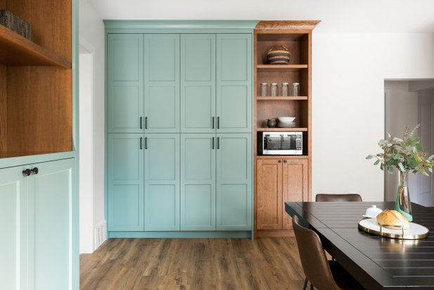
A hardworking storage wall features pantry cabinets with adjustable shelves inside. “These are 18-inch-deep cabinets, so we didn’t use rollout shelves there,” Zeigler says.
Open wood shelves to the right of the pantry cabinets hold collectibles and a stainless steel counter microwave. “They don’t use a microwave very often, so we have a small, compact microwave here,” Zeigler says.
Open wood shelves to the right of the pantry cabinets hold collectibles and a stainless steel counter microwave. “They don’t use a microwave very often, so we have a small, compact microwave here,” Zeigler says.
Before: In the former kitchen, a tight open doorway closed the kitchen off from the front part of the home. “We just wanted to create more of a connection between the kitchen, living room and front entry without fully opening it up,” Zeigler says.
New to home remodeling? Learn the basics
New to home remodeling? Learn the basics
After: A wider opening creates better connection between the spaces and allows more light to enter the kitchen.
A matte black flush-mount ceiling light with a simple cage design and four bulbs hangs above the table. “We didn’t do any pendants here because we didn’t have a fixed item underneath,” Zeigler says. “We wanted to give them flexibility for future use of that space.”
The kitchen also includes LED lights and hidden electrical outlets on the bottom of the floating wood shelves but no recessed ceiling lights. “We love those lights under the shelves,” Isabelle says. “Those are the lights we use all the time. They really change the atmosphere of the kitchen.”
Ceiling light: Colson flush-mount in matte black, Golden Lighting
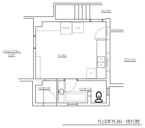
Before: This floor plan of the former kitchen shows how the unused full bathroom and mudroom (bottom) took up valuable square footage that could be used to expand the compact, square-shaped space.
A small refrigerator and electric range sat on a wall (top) opposite the bathroom door. The freestanding dishwasher sat next to the sink (center right).
A small refrigerator and electric range sat on a wall (top) opposite the bathroom door. The freestanding dishwasher sat next to the sink (center right).
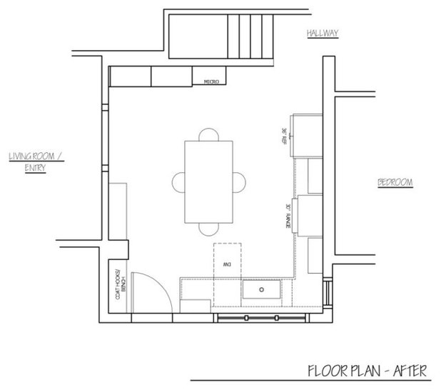
After: By incorporating the bathroom and mudroom into the space, Zeigler created a larger, rectangular kitchen with better flow and more storage and natural light. “The house is a very modest farmhouse, and the kitchen is now the big space,” Isabelle says. “It’s just a beautiful room.”
More on Houzz
10 Big Takeaways From the 2022 U.S. Houzz Kitchen Trends Study
Read more kitchen stories
Browse kitchen photos
Hire a kitchen remodeler
Shop for kitchen products
More on Houzz
10 Big Takeaways From the 2022 U.S. Houzz Kitchen Trends Study
Read more kitchen stories
Browse kitchen photos
Hire a kitchen remodeler
Shop for kitchen products


The Columbus based, Daniel Russo Home Team, recognizes the importance a well-thought-out interior design. The... Read More
What are you working on?
Related Products
Scott Davidson founded Davidson Builders in 1998. Scott graduated from Michigan State with a BS in Construction... Read More
Related Stories
Kitchen of the Week
Kitchen of the Week: Beer, Shuffleboard and Pizza Bring the Fun
Entertaining features and a warm industrial style create a lively atmosphere in this revamped Craftsman bungalow space
Full Story
Kitchen of the Week
Kitchen of the Week: Airy Beach Style in a Lake House
By Becky Harris
A designer creates a cottage feel by adding classic architectural elements and mixing white with warm woods
Full Story
Kitchen of the Week
Kitchen of the Week: Baker’s Dream Kitchen With Two Islands
A kitchen-family room makeover adds happy' aqua cabinetry and a dedicated baking space to a Massachusetts farmhouse
Full Story
Kitchen of the Week
Kitchen of the Week: Open Feel With White-and-Wood Japandi Style
A design-build firm helps a couple relocate their kitchen to gain space, openness and a warm and welcoming look
Full Story
Before and Afters
Before and After: 4 Uplifting Blue, White and Wood Kitchens
By Elena Vega
Chase away cooking space doldrums with shades of ocean and sky paired with classic colors
Full Story
Kitchen of the Week
Kitchen of the Week: Bold Black Style With Nods to ‘Star Wars’
A designer helps a young couple create an open kitchen with a large island and a dramatic look with fun sci-fi roots
Full Story
Before and Afters
Before and After: 3 Refreshing Green Kitchens
By Elena Vega
Rich green cabinets banish the banal in these redesigned cooking spaces
Full Story
Kitchen of the Week
Kitchen of the Week: Rich Color and Style in a 19th-Century Condo
A 160-square-foot kitchen in a Chicago three-flat gets a traditional look with dark green cabinets and authentic details
Full Story
Kitchen of the Week
Kitchen of the Week: Former Barn Gets a Modern Rustic Style
A designer opens up a closed-off kitchen and creates a warm and moody look with walnut cabinets and black details
Full Story
Kitchen of the Week
Kitchen of the Week: Respecting History in a Seattle Bungalow
By Becky Harris
A designer uses an English-inspired palette in the kitchen to honor the style of the landmark Arts and Crafts home
Full Story
This is exceptionally pretty and functional. Beautifully done. I’m not usually a fan of kitchen tables in the middle of the room but you have changed my mind. I love this!!
Of all the kitchen renovations, this is by far the best. Why? For the first time in a long time we have a table in the center of the kitchen. Life is changing and people are busy and children now grown are moving back in with parents. Why, they cannot afford a home on their own in this climate. For the first time we may have a generation that will skip buying. A sad story in some ways, yet uplifting in others. And so, back to this kitchen. It affords change, you can move the table. Open the space up for a party, since the kitchen is where everyone always ends up. The kitchen table also represents family. In some way having a talk with Mom in the kitchen at the table was always a good chat. Or, put on the kettle and have a cup of tea. Why is this different than an island. It is far more personal. An island you all face one way. Why because all the island really has if a sink, maybe two and a couple of display shelfs for books and stuff. The table and this entire kitchen makes me want to cook and have my family hang out with me cleaning string beans for Sunday dinner. I love this kitchen and I think that as designers it is time to make way for a change in home life for many people. Maybe all the clients have big pockets, but some do not. Some of the projects are more challenging when you must take a home that will now have a couple coming back and helping their parents and the parents helping them. I think more of America is starting to go this way and as designers the spaces must work for all. Now and in the future. This kitchen is very well appointed with storage, space to work and that famous kitchen table. I feel as if I can smell the apple pie baking. Thank you for a great design and a look at America from another viewpoint.
Great comments & I absolutely agree COCo! (: