


Kitchen of the Week: Better Sightlines and a Touch of Rich Green
A designer helps a California couple relocate their kitchen and create a more functional and open space with great flow

Shaun and Brittany Souza loved the character of their 1940s two-bedroom, one-bathroom home in Campbell, California. But the layout consisted of small, chopped-up rooms that were dark and awkward to navigate. They turned to designer Alex Volosciuc for help rethinking the flow of the entire home.
Volosciuc rejiggered the floor plan and added an addition to the back of the house. These clever design moves created enough space for a third bedroom, a second bathroom, a dining area and a spacious kitchen that gained 50 square feet. The Souzas gathered Houzz photos to inspire a fresh new look in the kitchen with lots of bright whites, a rich green island, modern-industrial details and a bit of vintage flair that nods to the home’s roots.
Volosciuc rejiggered the floor plan and added an addition to the back of the house. These clever design moves created enough space for a third bedroom, a second bathroom, a dining area and a spacious kitchen that gained 50 square feet. The Souzas gathered Houzz photos to inspire a fresh new look in the kitchen with lots of bright whites, a rich green island, modern-industrial details and a bit of vintage flair that nods to the home’s roots.
After: Volosciuc removed a wall between the living room and the former kitchen to open up the floor plan and expand the kitchen. She then moved the laundry function to another area of the house. She absorbed the former space into an addition on the back of the home — open to the kitchen — that now contains the living room and dining area. Part of the former living room became a home office or third bedroom; another part became an entry hall. (See “after” floor plan.) “They wanted the kitchen to have access to the backyard, but they also wanted the living room adjacent to the back,” Volosciuc says. “This was a good layout to fit all their needs.”
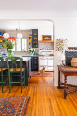
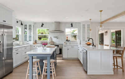
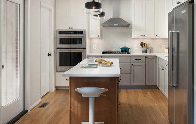
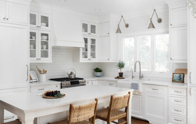
An island painted a rich forest green (Olympic Range by Sherwin-Williams) anchors the mostly white kitchen. “We didn’t want this space to feel like another white kitchen, so this gives it some weight,” Volosciuc says. “The kitchen would have felt very different without it.”
The just over 8-foot-long island creates good flow into the kitchen from the entry and through to the living room in back, and it provides a large countertop surface for unloading groceries.
Durable wood-look vinyl flooring holds up to stains as well as to scratches from the couple’s dog, Barney. “Dog nails scratching the floor is definitely something we didn’t want, but it was also about keeping costs in mind,” Brittany says.
Wall paint: Big Chill, Sherwin-Williams; ceiling and trim paint: Chantilly Lace, Benjamin Moore
Find a kitchen designer near you
Pendant lights with tapered clear glass shades and a matte black finish hang over the island. Recessed LED ceiling lights offer overall lighting. Cabinets on the back side of the island store extra glassware and vases. Antiqued brass frames on the distressed gray velvet stools coordinate with honey bronze cabinet hardware and open shelf brackets.
Black stainless steel appliances add a bit of dramatic contrast that complements the island base color.
Shop for bar and counter stools
Black stainless steel appliances add a bit of dramatic contrast that complements the island base color.
Shop for bar and counter stools
A matte black faucet over an undermount white single-bowl apron-front sink coordinates with the finishes on the appliances, island pendants and double-hung window frame. (The couple plan to add window treatments soon.)
Sink: Whitehaven, Kohler
Where Should You Put the Kitchen Sink?
Sink: Whitehaven, Kohler
Where Should You Put the Kitchen Sink?

Need a pro for your general contracting project?
Let Houzz find the best pros for you
Let Houzz find the best pros for you
Before: This view of the former kitchen looks toward the entry to the home on the left at the end of the hallway. The opening in the wall at the rear connected to the former living room and included an awkward bar top.
Not sure where to start on your home project? Learn the basics
Not sure where to start on your home project? Learn the basics
After: Volosciuc knocked down the wall and pushed the kitchen into the former living room. The range now sits on a new wall that encloses what’s now the third bedroom, which the couple use as a home office.
The quartz countertops have soft gray veining on a creamy white background. “The large island top allows it to be a gathering space,” Volosciuc says. “It became a huge part of this kitchen, especially coming from a kitchen with no continuous counters.”
A new doorway off the entrance hall leads to the couple’s bedroom, which was updated with a new en suite bathroom.
See more photos of this home renovation project
The interior side of the island has a 24-inch stainless steel microwave drawer. To the right is a cabinet with an appliance lift for a stand mixer. “It’s one of our favorite features,” Brittany says. “I always envisioned a minimalist kitchen, and having a way to store the mixer away is really nice.”
A 36-inch black stainless steel hood hangs over the 30-inch slide-in black stainless steel gas range. “For budget purposes, we went with a really beautiful hood that we didn’t have to dress up further,” Volosciuc says.
Black shelves with aged brass strap brackets flank the hood. “It’s like a piece of art, with different items that catch your eye,” Brittany says. “It really opens the kitchen up when you look at it from the living room.”
Black shelves with aged brass strap brackets flank the hood. “It’s like a piece of art, with different items that catch your eye,” Brittany says. “It really opens the kitchen up when you look at it from the living room.”
For the backsplash, glazed white 5-by-5-inch ceramic tiles feature a glossy finish and variations in tone. “We wanted something with character but that was also understated,” Volosciuc says. “This tile is at a great price point but has enough color variation that makes it interesting. The way it plays with the light was a way to add a fun element to the kitchen.”
Backsplash tiles: Cloe 5-by-5-inch in white, Bedrosians Tile and Stone
Backsplash tiles: Cloe 5-by-5-inch in white, Bedrosians Tile and Stone
This view from the living room in the new addition shows the open flow from the front door at the far back left through to the kitchen and into the living room. “They were so used to being separated by a wall,” Volosciuc says. “This brings the two spaces together and creates more of an entertaining environment.”
Before: This floor plan of the former layout shows the compartmentalized nature of the home. The front door (bottom center) opened into the living room, which was cut off from the kitchen (left center). The former laundry room (upper left) forced an awkward J-shaped layout.
After: In the updated layout, the front door opens to an entrance hall and flows smoothly into the kitchen and the new living room and dining area at the back of the house (top). In the former living area is the new bedroom the couple use as their home office (bottom left). Volosciuc also reworked the couple’s main bedroom (bottom right) to include an en suite bathroom (right center).
“It’s like night and day from the kitchen we had before,” Brittany says. “It’s bright, energetic and inviting.”
More on Houzz
Read more kitchen stories
Browse kitchen photos
Hire a kitchen remodeler
Shop for kitchen products
“It’s like night and day from the kitchen we had before,” Brittany says. “It’s bright, energetic and inviting.”
More on Houzz
Read more kitchen stories
Browse kitchen photos
Hire a kitchen remodeler
Shop for kitchen products


Kitchen at a Glance
Who lives here: Shaun and Brittany Souza and their dog, Barney
Location: Campbell, California
Size: 280 square feet (26 square meters)
Designer: Alex Volosciuc of Woodcliff Builders
Before: This photo shows the view of the former kitchen when entering from what was the front living room and entry to the home. (See “before” floor plan below.) The wonky J-shaped layout had the fridge and range sticking out into the room. The back of the refrigerator and its exposed electrical components were in full view when entering and exiting the laundry room behind the fridge.
Off-white plaster walls and standard oak cabinets didn’t uplift the space either. The wood countertop on the left sat at a cutout in the wall to the living room, creating an awkwardly placed bar area. “It was wasted space,” Brittany says.