


Kitchen of the Week: Clever Redesign for a Cabinetmaker
An architectural firm helps a favorite cabinet pro create an inviting kitchen in his family’s historic D.C. row house
Becky Harris
January 14, 2021
Houzz Contributor. Hi there! I live in a 1940s cottage in Atlanta that I'll describe as "collected."
I got into design via Landscape Architecture, which I studied at the University of Virginia.
Houzz Contributor. Hi there! I live in a 1940s cottage in Atlanta that I'll describe... More
“This kitchen design was a game of inches,” designer Catherine Fowlkes says. Luckily, her client was her favorite cabinetmaker, Ted Ferris. The two were used to collaborating on projects together, and he knew every smart storage trick in the book. Ferris and his wife wanted a more open kitchen that included an eat-in area. And they wanted to honor their historic row house’s vintage while updating it for modern life. The project also included adding a screened-in porch off the kitchen.
Before Photo
“After” photos by Brandon Webster
Kitchen at a Glance
Who lives here: Cabinetmaker Ted Ferris of FerrisCo, his wife and their two children
Location: Mount Pleasant neighborhood of Washington, D.C.
Size: 200 square feet (19 square meters)
Designer: Catherine Fowlkes of Fowlkes Studio (architecture)
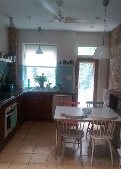
Before: The kitchen was a wide galley space. Though the family had squeezed in a table, its placement hindered the flow.
Find a local architect
Kitchen at a Glance
Who lives here: Cabinetmaker Ted Ferris of FerrisCo, his wife and their two children
Location: Mount Pleasant neighborhood of Washington, D.C.
Size: 200 square feet (19 square meters)
Designer: Catherine Fowlkes of Fowlkes Studio (architecture)
Before: The kitchen was a wide galley space. Though the family had squeezed in a table, its placement hindered the flow.
Find a local architect
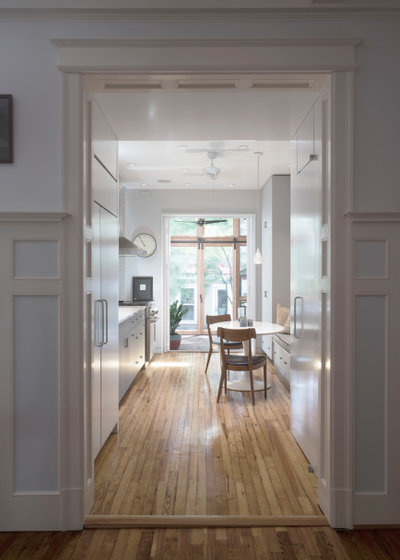
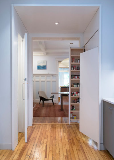
After: The key to giving this kitchen a nice flow and a more open feel was making the most of an extended threshold. This deep-cased opening serves as a transitional area between the kitchen and dining room. “We packed these side walls,” Fowlkes says. The two large handles on the left are attached to a pullout pantry cabinet and a panel-front refrigerator. “By placing these clunkier things in the threshold, we were able to create a lighter look in the kitchen and make it feel more like a room,” Fowlkes says.
The extended threshold’s dropped ceiling reinforces the lighter feel of the space beyond. Passing through this more compressed space makes the kitchen, with its higher ceilings, seem airier by comparison. The wide opening to the new screened-in porch at the opposite end of the room also makes the kitchen feel more expansive.
The extended threshold’s dropped ceiling reinforces the lighter feel of the space beyond. Passing through this more compressed space makes the kitchen, with its higher ceilings, seem airier by comparison. The wide opening to the new screened-in porch at the opposite end of the room also makes the kitchen feel more expansive.
Here’s the view from the kitchen through the threshold to the formal dining room. “The kitchen-dining room adjacency is important and nice. We didn’t want the kitchen to feel too informal by comparison,” Fowlkes says.
Hire a cabinet pro
Hire a cabinet pro
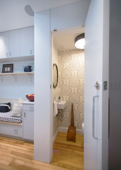
The door on the opposite wall of the threshold leads to a powder room. Using a matching appliance handle for the door gave the threshold a more cohesive look and added a bit of mystery. “It’s a handle to ponder when looking for the powder room — it makes it a fun hidden space,” Fowlkes says. “Handles matter.”
Shop for cabinet hardware
Shop for cabinet hardware
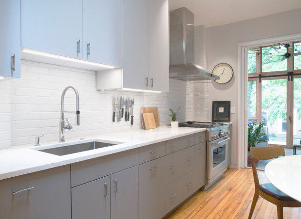
Just past the threshold, the left side of the kitchen is a work area. The cabinetry is two-tone, with charcoal lower cabinets and light gray upper cabinets. Undercabinet lighting illuminates the countertops and backsplash. (The lower cabinet color is darker than it appears in this photo.)
“The row house informed some of the materials,” Fowlkes says. “Often the shared walls are brick, so we like to expose brick or create a fiction that it’s there.” On this side of the room, it’s fiction — the designer specified thin brick for the backsplash. Thin bricks are real bricks sliced about a quarter-inch thick.
Fowlkes replaced the tired tile floors with reclaimed salvaged pine. The countertops are Caesarstone with subtle marble-like veining. The crisp counter edge, contemporary faucet and stainless steel range and vent hood add updated touches. Even though this was a full renovation, the mix of old and new gives the impression that the kitchen has evolved over time.
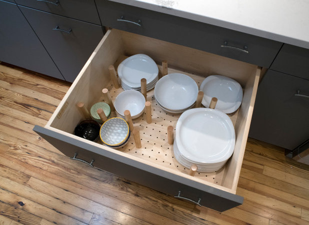
This photo shows the true charcoal tone of the lower cabinets. Ferris set up the cabinets to make the most of every inch. Dowels keep china safely organized in this deep drawer.
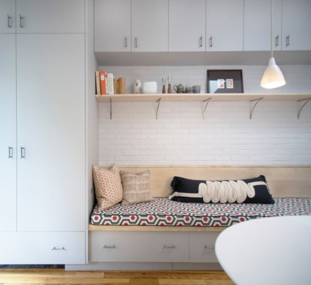
Fowlkes created a room that functions as more than just a kitchen — it was designed to draw in the family for activities other than cooking and eating. To make the kitchen feel more like other types of rooms, Fowlkes eschewed running countertops and appliances down both sides. Whereas the left side of the kitchen is for work, the right side is dominated by a cozy banquette that forms part of the eat-in area. “This makes it a room they really live in whether they are eating breakfast together, playing a game or the kids are doing homework. It’s where everyone wants to be,” Fowlkes says.
The brick on this wall isn’t telling a fictional tale — the designer exposed the original shared wall and had it painted. The cabinetry on this side of the room is painted the same light gray as the upper cabinets across the room.
The brick on this wall isn’t telling a fictional tale — the designer exposed the original shared wall and had it painted. The cabinetry on this side of the room is painted the same light gray as the upper cabinets across the room.
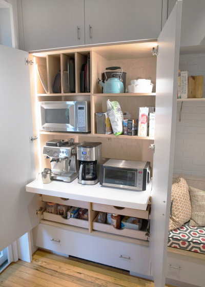
“A banquette can take up a lot of space,” Fowlkes says, and Ferris used his cabinetmaking expertise to pack storage into the areas over, under and on either side of this one.
“This piece to the left of the banquette is a real workhorse,” Fowlkes says. It houses small appliances, which keeps the countertops across the room clear. Ferris outfitted it with LED strip lights, outlets, shelves, slats and pullout drawers. “It’s so much fun to work with him because he does this kind of thing all the time,” Fowlkes says.
“This piece to the left of the banquette is a real workhorse,” Fowlkes says. It houses small appliances, which keeps the countertops across the room clear. Ferris outfitted it with LED strip lights, outlets, shelves, slats and pullout drawers. “It’s so much fun to work with him because he does this kind of thing all the time,” Fowlkes says.
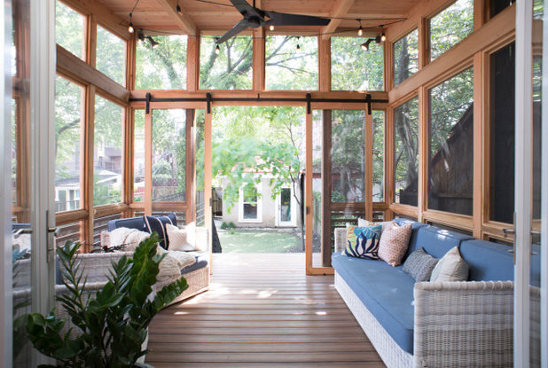
At 140 square feet, the new screened-in porch practically doubles the size of the kitchen. On nice days the family keeps the glass doors between the kitchen and porch open. But even on days when the weather doesn’t allow for it, the doors preserve the view to the space.
Fowlkes used sliding barn doors between the porch and the deck. “Space was tight back here — every inch mattered. The barn doors saved space over swing doors,” she says.
She specified a shed roof for the porch. It angles upward from the spot where it meets the house. “We created the soaring roof because sometimes adding a porch off the end of the room can block out the natural light,” she says. The angle of the roof provides a higher, more expansive view out from the kitchen, and it makes the porch feel larger and more airy. Fowlkes also added a skylight in the porch roof just past the kitchen doors to bring more light into the kitchen.
Browse outdoor lounge furniture in the Houzz Shop
Before Photo
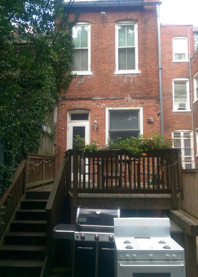
Before: This was the outdoor space before Fowlkes added the porch. “While the front of row houses are historic, the backs tend to be a mishmash, so there’s no need to be historic back here,” she says.
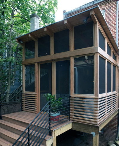
After: The porch roof creates a screened-in clerestory. A gutter and downspout prevent water from standing where the roofline meets the home.
The porch is made of Douglas fir and the railings are black steel. The deck and stairs are a composite material made of wood, sawdust and recycled plastic.
The porch is made of Douglas fir and the railings are black steel. The deck and stairs are a composite material made of wood, sawdust and recycled plastic.
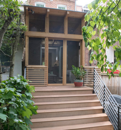
A small deck and wide stairs provide space for parties to extend outdoors.
More on Houzz
Read more kitchen stories
Browse kitchen photos
Hire a kitchen remodeler
Shop for kitchen products
More on Houzz
Read more kitchen stories
Browse kitchen photos
Hire a kitchen remodeler
Shop for kitchen products


Our philosophy at Kitchen Kraft is to make home remodeling convenient. We are your one-stop shop for kitchen... Read More
What are you working on?
Related Products

Related Stories
Kitchen Backsplashes
30 Bold and Beautiful Range Backsplashes
Get ideas for eye-catching tile and stone backsplashes inside stove alcoves and behind cooktops
Full Story
Kitchen Design
7 Essential Features of a Well-Designed Kitchen
Make sure your new kitchen not only looks good but also functions beautifully
Full Story
Kitchen Workbook
How to Map Out Your Kitchen Remodel’s Scope of Work
Help prevent budget overruns by determining the extent of your project, and find pros to help you get the job done
Full Story
Kitchen Storage
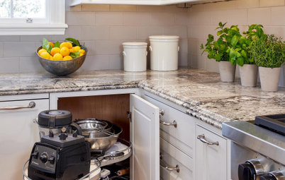
Foolproof Storage Solutions for Corner Kitchen Cabinets
By tidgboutique
Consider Lazy Susans, pullouts and more to maximize storage
Full Story
Trending Now
The 10 Most Popular Kitchens So Far in 2024
Get inspired by the warm neutral palettes, ample storage and inviting islands in these most-saved new photos on Houzz
Full Story
Houzz TV
5 Trends for Kitchen and Bath Products in 2024
See fascinating new features for showers, tubs, faucets and more launched at the 2024 Kitchen and Bath Industry Show
Full Story
Kitchen Backsplashes
Where to Start and Stop Your Backsplash
By tidgboutique
Consider these designer tricks to work around cabinets, windows and other features for a finished look in your kitchen
Full Story
Kitchen Workbook
How to Find Your Kitchen Style
If you’re planning to remodel your kitchen, here’s how to find inspiration and start narrowing down your choices
Full Story
Kitchen Design
15 Stylish Kitchen Range Hood Ideas
Get ideas for hood shapes, sizes and looks that can elevate a kitchen’s design while ridding it of bad air and odors
Full Story
Kitchen Workbook
How to Remodel Your Kitchen
Follow these start-to-finish steps to achieve a successful kitchen remodel
Full Story
Love the screened in porch and small deck off of it.
Beautiful and functional. ❤️❤️💚💚
Beautifully and cleverly done.