


Kitchen of the Week: Fresh Style and Family-Friendly Function
A new layout and beautiful finishes make this Chicago kitchen a star

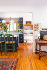
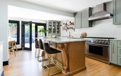
Parents of two daughters bought this home in Chicago’s desirable Logan Square neighborhood knowing it would need a lot of work to suit their needs and style. They knew they needed someone with vision to reimagine its layout and design, so they hired interior designer Rebekah Zaveloff to make it lighter, brighter and more functional and fun for their family. She designed a highly functional and pleasingly balanced galley layout, added a walk-in pantry, installed a large island and set up a multipurpose eating nook. And she used a delicious material palette of white oak, quartzite, brass, matte black and deep green to add personality and timeless style to the space.
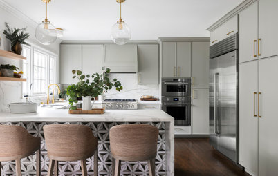
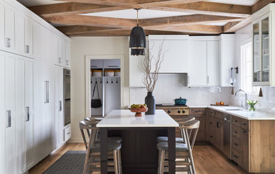
After: Rather than keeping the layout, Zaveloff knew it would be more efficient to create a galley that incorporated a large, hardworking island. The island measures 121 by 54 inches and accommodates four counter stools. This side of the island has concealed 14-inch cabinets for extra storage. The island also houses the sink, the dishwasher, trash and recycling pullouts and more storage on the other side. With this setup, the kids can hang out on one side of the island while their parents cook on the other. It’s also easy for them to grab drinks from the fridge and snacks from the pantry without having to enter the work zone.
The designer found one large slab of Infinity quartzite for the island countertop to avoid having any seams. A mitered edge gives it the appearance of being 2½ inches thick — a substantial look that’s a good match for the large scale of the island. Zaveloff used the same quartzite with a thinner profile on the perimeter countertops and the range backsplash.
To increase storage in the kitchen, she replaced the wet bar with a walk-in pantry, which can be seen in the top right corner of this photo. “A pantry gives you a lot of bang for your buck because there’s no cabinetry required. It’s just open shelves,” Zaveloff says. The homeowners keep all their small appliances set up in the pantry, as well as the microwave and a wine fridge.
Wall paint: White Dove, Benjamin Moore
Browse counter stools in the Houzz Shop
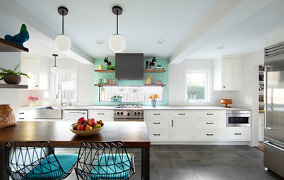
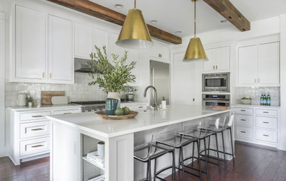
After: Now a large range alcove serves as a strong focal point and lends a symmetrical feel to the kitchen. The homeowners opted to replace their existing 36-inch range with a 48-inch model. This created a nice proportional relationship between the large island and the range alcove.
With the kitchen’s new storage and pantry, Zaveloff was able to work in white oak open shelving with a white beveled subway tile backsplash. This reinforced the range as the focal point and lightened up the space.
The white oak accent on the range hood matches the white oak of the island. “This hood is simply drywall with a trim piece. It’s an inexpensive option that looks great,” Zaveloff says.
Find a local countertop pro
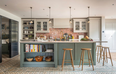
The working side of the island has a large workstation sink with a variety of prep inserts, such as cutting boards and colanders. The faucet is matte black with brass accents.
Browse matte black kitchen faucets
Browse matte black kitchen faucets
The designer chose aged brass for the art lights over the open shelving and satin brass for the cabinet hardware.
“The tile up the walls behind the shelves and around the refrigerator just absolutely makes this room,” she says. The beveled edges of the tile add dimension and reflect the light in interesting ways.
“The tile up the walls behind the shelves and around the refrigerator just absolutely makes this room,” she says. The beveled edges of the tile add dimension and reflect the light in interesting ways.
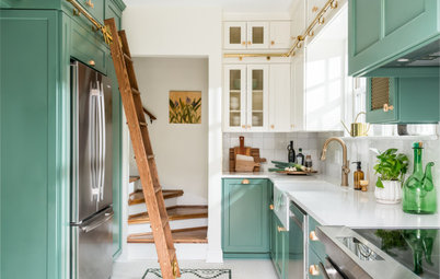
Zaveloff closed in the existing wet bar that led to the living room with a new walk-in pantry. The pantry door is powder-coated aluminum with reeded glass panes. The glass reflects the light while blurring any sort of messy view inside the pantry.
With the exception of the range alcove, the beveled tile covers all the kitchen walls up to the ceiling. Zaveloff worked the design around the homeowners’ existing refrigerator, which was in fantastic shape.
A vintage runner adds visual warmth and physical comfort underfoot for those working at the range or island.
The island pendants are matte black. “The interesting thing to think about is that this room would have looked totally different if we’d used brass pendant lights,” Zaveloff says. “The black plays off the faucet and the pantry door, creating a nice mix of finishes. I love to mix metals because it keeps things classic, preventing them from ever looking dated in the future.”
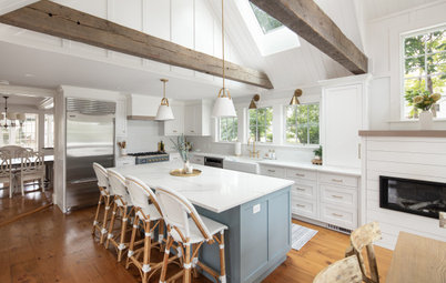
The designer used Essex Green paint by Benjamin Moore on the cabinets. “This is my favorite paint color of all time,” she says. “It’s a very rich green that’s almost black-green.”
With the peninsula gone, Zaveloff needed a new way to separate the kitchen from the family room. So she placed a hutch cabinet at the end of the range wall. “When a kitchen is open to a family room like this, I like to end the kitchen with something that defines the space. And I love to do it with an elegant, furniture-like piece,” she says. The hutch has reeded glass doors that match the pantry door.
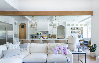
After: Zaveloff replaced the desk with a multifunctional family-friendly eat-in area. “I love a banquette,” she says. “I want these spaces to be cozy and comfy. And it’s so much cleaner-looking than having chairs all the way around a table — they are often pulled out and look messy.
“And they can use this area to work on a laptop, do homework or enjoy a glass of wine and chat with whomever is cooking,” she says.
“And they can use this area to work on a laptop, do homework or enjoy a glass of wine and chat with whomever is cooking,” she says.
This photo shows how the eat-in area relates to the kitchen island. Zaveloff chose a walnut table in an oval shape. “There are so many rectangles in this room that we needed some curves to break it up,” she says. “It also fit into this corner better than a rectangular table would have.” The powder room is past the table to the left and Zaveloff wanted to keep a clear path to it. “It was also a matter of softening the space and it’s something you see right as you walk into the room,” she says.
A George Nelson pendant light plays off the curves of the table. This fixture and the Bertoia chairs and counter stools are all iconic designs from the midcentury era. Though the house is relatively new, the neighborhood is historic. The new style of the space has a timeless look, as though it had evolved through different design eras.
A George Nelson pendant light plays off the curves of the table. This fixture and the Bertoia chairs and counter stools are all iconic designs from the midcentury era. Though the house is relatively new, the neighborhood is historic. The new style of the space has a timeless look, as though it had evolved through different design eras.
After: “So often a kitchen project turns into a ‘kitchen and’ project, meaning the renovations spread out beyond it,” Zaveloff says. As part of the renovations, she replaced the fireplace surround and hearth with a durable porcelain that looks like marble.
Tip: Keep in mind that when you have a designer and a renovation team working on one room, they’re often happy to complete smaller projects around the house. Take advantage of getting your home to-do list done while you have them.
As for the flooring, Zaveloff was able to save the existing red oak throughout the first floor. She ripped out the inlaid travertine in the kitchen and wove in red oak hardwood, then had all the floors restained to give them a cohesive look that’s lighter and less red.
The “kitchen and” projects often expand into a powder room. “There’s always a good chance that people will want to renovate their powder room at the same time as their kitchen, and this was one of those cases,” Zaveloff says. “We always try to talk people into having fun with their powder rooms. This wallpaper is called Miami and it is just a trip, it’s so much fun.”
Zaveloff found a ready-made vanity and added a narrow Marquina black marble countertop and backsplash. The floor is coordinating marble in a hexagonal pattern.
More on Houzz
Read more kitchen stories
Browse kitchen photos
Hire a kitchen remodeler
Shop for kitchen products
Zaveloff found a ready-made vanity and added a narrow Marquina black marble countertop and backsplash. The floor is coordinating marble in a hexagonal pattern.
More on Houzz
Read more kitchen stories
Browse kitchen photos
Hire a kitchen remodeler
Shop for kitchen products


Kitchen at a Glance
Who lives here: A couple and their two young daughters
Location: Logan Square neighborhood of Chicago
Size: 291 square feet (27 square meters)
Designer: Rebekah Zaveloff and Kat Andrejevic of KitchenLab Interiors
Before: The house was built in 2006, but the kitchen had a 1990s look. “It had a palette of browns, oranges, greens, beiges and a weird inlaid travertine floor,” Zaveloff says. In the back right corner was a seldom-used wet-bar area that led through to the living room. A peninsula divided the kitchen from the family room within an open floor plan.
Find an interior designer on Houzz