


Kitchen of the Week: From Overwrought to Simplified Beauty
Transitional style, a reconfigured layout and a new butler’s pantry suit a family of 6

Before. The kitchen was too traditional for the homeowners and there was no direct link to the dining room and its wonderful natural light. “The house used to be very dark old-world traditional,” says Tausk, who worked on the interiors throughout the house. She notes that the floors, while light in color, were impossible to keep looking clean. “The main entrance to the kitchen from the front hall was through a little hallway with a desk on one side and a pantry door on the other,” she says. “Not only was this desk space not needed since the family has a large home office space, but it also became a clutter-and-drop zone. And this was the first thing you’d see as you’d walk into the kitchen.”
Features worth keeping. The kitchen’s beautiful windows were one of its best features, but they weren’t being shown at their best. For example, to the left of this arched window was a tower of cabinets that blocked its light, and over it was an awkwardly shaped cutout in the ceiling. “We created a barrel ceiling with a simple narrow shiplap detail to draw the eye up, accentuate the window’s architecture and tie in with the wider shiplap surrounding the range,” Tausk says. A new dark trim paint for the muntins and other window trim millwork accentuates their beauty.
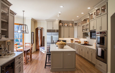
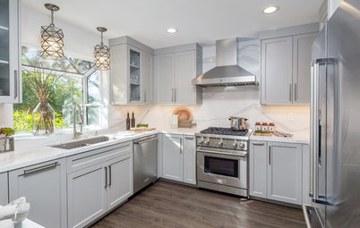
Layout. A large island anchors the main workspace between a range alcove and the refrigerator. Opposite the fridge is a large sink flanked by two dishwashers. A prep sink in the island is within the work triangle, while the dishwashing sink is flanked by two dishwashers and is close to the cabinets where everyday dishes and china are kept. Past the island is a generously sized eat-in area that overlooks the yard and a porch. A large butler’s pantry area in a new location behind the fridge wall provides space for all the food and a breakfast bar, and a beverage bar replaced the kitchen desk area.
Island. The island is 94 by 65 inches. Its base is stained alder cabinetry with hand-scraped detailing. It has a chunky quartz countertop that sets it apart from the perimeter countertops. The feet of the end posts have a brushed-nickel finish that matches the cabinet knobs and pulls.
The island is hardworking: It houses a double garbage pullout, tray dividers for the cutting boards and a drawer outfitted with a knife block. There is another cabinet with rollouts to hold bakeware, and more drawers for storage. The side that faces the refrigerator has storage for the larger stock pots that are too large to fit in the range alcove’s pot and pan drawers.
Countertops. “Quartz is our favorite for countertops because of its durability and beauty — but not all quartzes are created equal,” Tausk says. “We really looked at a lot of options to find one that had the most natural look with the right amount of movement.” Because they planned to continue the quartz up the range alcove backsplash wall, finding just the right amount of veining and pattern was key.
Window trim paint: Kendall Charcoal, Benjamin Moore; all cabinets: The Plain & Posh Custom Collection; dishwashers: Bosch; sink: Whitehaven in Sea Salt finish, Kohler; faucets: Model 5200, Waterstone; pendants: Remains Lighting
Here’s a closer look at the character of the alder wood and the hardware.
Smaller but important detailing. The island countertop is chunkier than the perimeter countertops: 6 centimeters versus 3 centimeters thick. “The homeowners are both tall and wanted the added height,” says kitchen designer Stephanie Frees, who completed the architectural design and cabinet design. “As these are custom cabinets, the perimeter cabinets were built three centimeters taller than the island so that the end result is the same height overall.” This brought the total height from the floor to the top of the countertops to 37½ inches (standard height for base cabinets plus countertops is 36 inches).
Counters: Eternal Pearl Jasmine, Silestone; hardware: Tiffany knobs and Bremen pulls, Hardware Resources
Flooring. Flooring was one of the big questions in the remodel. The existing tiles and grout were difficult to keep looking clean, and the clients didn’t like the color of the hardwoods in the rest of the house, so they rejected the idea of continuing them into the kitchen. In considering tile and stone options, they looked to large-format tiles to give them a less-busy look and fewer grout lines. And getting the color just right was important — “not too gray or cold-looking but not too gold or yellow either,” Tausk says. “We finally hit the jackpot with these beautiful tumbled-limestone floors.” The tiles are 24 by 24 inches.
This photo also gives us a good look at the brushed-nickel foot detail on the island. The counter stools add leather texture to the material palette.
Limestone tiles: Paris Ceramics; Jamy stools: Made Goods; check out more backless counter stools
This photo also gives us a good look at the brushed-nickel foot detail on the island. The counter stools add leather texture to the material palette.
Limestone tiles: Paris Ceramics; Jamy stools: Made Goods; check out more backless counter stools
Now two openings on either side of the range alcove lead to the dining room.
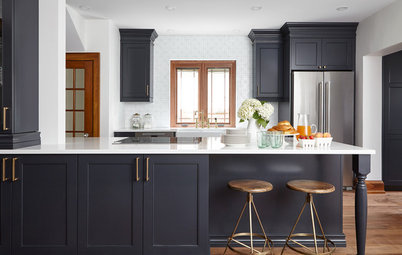
Lighting. You astute Houzzers probably noticed that the light fixtures are the same in the before and after photos. That’s because lighting was the first thing Tausk helped her clients change out before they embarked on the full remodel. Previously there had been a pair of tiny pendants over the island that were out of scale. Now new large glass globe pendants suit the scale without blocking the view through the room too much.
Wall paint: White Dove; cabinet paint: Classic Gray, both Benjamin Moore
Refrigerator wall (before). A behemoth of a fridge bulked up this wall, ceremoniously adorned with scrolled columns and crowned with an arch with a medallion and just about every other sort of fanciful overwrought detail you can think of thrown in there.
Through the arched opening on the right is the hallway to the front of the house, and it served as the main entry into the kitchen before. The kitchen desk area previously mentioned was through the archway on the right.
Through the arched opening on the right is the hallway to the front of the house, and it served as the main entry into the kitchen before. The kitchen desk area previously mentioned was through the archway on the right.
Refrigerator wall. The cabinetry along the right side of the kitchen includes a panel-front Sub-Zero refrigerator and freezer that blend right in. There is a pullout coffee station between them.
Cabinet paint: Classic Gray, Benjamin Moore; coffee system: Miele; column refrigerator and freezer: Sub-Zero
Cabinet paint: Classic Gray, Benjamin Moore; coffee system: Miele; column refrigerator and freezer: Sub-Zero
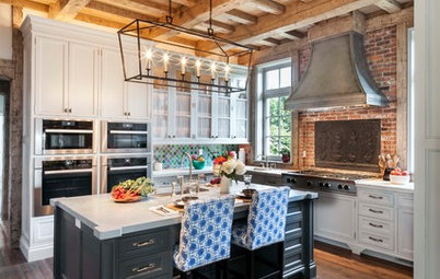
Range alcove. The range alcove remained in about the same place, but now it has a simplified look marked by a mix of lovely textures — shiplap, quartz and a distressed beam mantel. And now it’s flanked by the two openings to the dining room. The range is 48 inches wide and has six burners, a griddle and two ovens.
The designers walked the homeowners through several different options before landing on this design, including a decorative cement-tile backsplash and a stone to tie in with the stone fireplace in their family room. “Ultimately, these options started feeling like too much — we liked the simplicity of the quartz backsplash and brightness and clean lines of white shiplap,” Tausk says. “The reclaimed wood beam was our way of bringing in the warmth, color and texture we wanted.”
There are spice shelves tucked into each end of the alcove. The top drawers in the alcove’s cabinets have inserts for all of the cooking utensils while the drawers below hold the pots and pans.
Shiplap and wall paint: White Dove, Benjamin Moore; backsplash and counter: Pearl Jasmine, Silestone; 48” range, Wolf
Here you can get a better look at the spice rack and a peek into the breakfast bar portion of the butler’s pantry.
And here you can see how the room now enjoys the view into the dining room and the sunlight that floods it. African baskets add texture to the wall.
Eat-in area. The large family gathers for almost all of their meals in this comfortable and bright spot. The homeowners already had the table, which the designers had refinished to look like new. “We purchased new upholstered chairs in a navy color so that they would be both comfortable and easy to maintain,” Tausk says. A new chandelier over the table has traditional detailing but a more modern linear silhouette.
Dining chairs: Arhaus; E.F. Chapman Classic Linear Chandelier, Visual Comfort; browse linear chandeliers
Dining chairs: Arhaus; E.F. Chapman Classic Linear Chandelier, Visual Comfort; browse linear chandeliers
There is a reconfigured butler’s pantry behind the refrigerator wall. There is access from both sides — through the opening on the right there is a beverage bar; through the opening on the left there is a breakfast bar and lunch-making area.
Kids’ breakfast and lunch-making bar. “This area was custom-designed to house all of the items needed for the kids to get their breakfasts and pack their lunches,” Frees says. The cabinet on the left has a bread drawer in it and all of the lunchware and water bottles are stored in the drawers below it. The counter above it is for the Keurig (for hot chocolate and tea) and a toaster, and the adjacent wall holds a microwave drawer. The baskets hold all of the snack foods.
Subway tile: Masia, Soho Studio; microwave drawer: Wolf
Subway tile: Masia, Soho Studio; microwave drawer: Wolf
Once you walk past the breakfast bar and turn right, you enter the food storage pantry. At the other end of the pantry is a hallway to the kitchen from the front of the house — custom doors with fluted-glass inserts introduce the alder wood seen throughout the kitchen to those about to enter the room.
Beverage bar. The desk has been replaced with a beautiful beverage bar. “Because the main kitchen area is more neutral, we decided to have a little fun with color in the bar area,” Tausk says. Everyone fell hard for the combination of soft blue, a knotty alder wood backsplash and brass hardware, and it provides a prettier journey from the front of the house into the kitchen. As you can see here, the pantry doors echo not only the alder wood but also the brass hardware.
Cabinet paint: Solitude, Benjamin Moore; lighting and cabinet hardware: Rejuvenation
Cabinet paint: Solitude, Benjamin Moore; lighting and cabinet hardware: Rejuvenation
There is a beverage fridge on the left and a wine fridge on the right.
Beverage and wine refrigerators: U-Line
Beverage and wine refrigerators: U-Line
Floor plan. Here you can see the way the pantry is laid out along the bottom of this plan. The dining room is behind the range wall.
I know this beautiful kitchen’s size and budget are beyond reach for most of us, but there are plenty of ideas to steal from it.
Takeaways
More
Browse more Kitchens of the Week
Find a kitchen designer
I know this beautiful kitchen’s size and budget are beyond reach for most of us, but there are plenty of ideas to steal from it.
Takeaways
- If you’re tired of all white in the kitchen but still love a light look, take a handful of baby steps away from it — using a light gray on the cabinets, mixing in wood details, choosing a different color or wood for an island base or painting window trim a contrasting color.
- You’re not likely to know exactly what you want right away. Take the time to walk through different options and looks. For example, looking at options they initially thought they wanted for the range alcove made this family realize they didn’t want it to look too busy or too heavy, and they landed on just the right look.
- Consider cleaning when choosing a floor tile and grout, especially in a high-traffic, high-spillage-potential area like a kitchen.
- Think about every single thing you want to grab when you are prepping, cooking and cleaning and arrange for convenient storage within reach of those areas.
- Got four kids? Get dark or wipable upholstery on the kitchen chairs.
- Think about ways you can set up stations to keep people out of the way of the cook.
- The easier you make it for your kids to grab their own breakfasts and pack their own lunches, the easier your mornings will be.
- If you are getting rid of items like cabinets, lighting or a sink that simply don’t suit your style but are in good condition, there are plenty of resources for donating them for reuse. Check out How to Donate or Recycle Home Remodeling Materials for more information.
More
Browse more Kitchens of the Week
Find a kitchen designer


Sponsored
Custom Craftsmanship & Construction Solutions in Franklin County
Kitchen at a Glance
Who lives here: A family of six that keeps the kitchen extra busy in the mornings
Location: Hinsdale, Illinois
Size: 520 square feet (48 square meters)
Designers: Stephanie Frees (kitchen design) and Amy Tausk (interior design)
This kitchen was just too much — towering, bulky cabinetry, a closed-off feeling and millwork details like scrolls, medallions, beading, fanciful corbels, even a giant fridge that looked like it was wearing a crown. All of this overwrought detailing was cramping the style of this family of six. “The kitchen was too old-world for them,” says interior designer Amy Tausk.
So in keeping with the overall traditional style of the house, Tausk and kitchen designer Stephanie Frees lightened and brightened the space with a simpler, more current transitional style that respected the architecture and worked well for the family’s lifestyle. While the family found a lot about the existing layout that worked for them, they made some big architectural changes. The new plan changed the flow between the kitchen and dining room and created a new butler’s pantry that worked for the whole family, with stations for making breakfast and lunch and serving beverages.
Style. Tausk describes the kitchen as transitional. “It blends the best of traditional familiarity with modern sophistication to create a comfortable, livable space,” she says. The family was ready to simplify the ornate details that did not suit their style, but they wanted to keep an elegant feel. “We were inspired by the modern farmhouse look because it feels more casual and in keeping with this family’s unfussy style,” Tausk says. “But we wanted to put our own spin on it and create something that was a little different. We wanted things bright and white but to bring in warmth with wood tones and lots of texture.”