
Kitchen of the Week: Timeless Charm in Soft Green and Terra Cotta
Smart storage, a slim island and period-appropriate finishes add style and function to this 1920s Craftsman kitchen

Nine years after design-build firm Copper Sky added a second story to this 1920s Craftsman in Atlanta, the homeowners returned with another challenge: transform the worn, inefficient kitchen with durable, period-appropriate finishes, more storage and improved flow. Below, see how Jessica Flake, senior architect and lead designer at the firm, rose to the task — absorbing an adjacent room to expand the space and leaning into patina with unlacquered brass accents and terra-cotta floor tile.


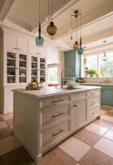
After: This zoomed-in photo showcases the finishes used throughout the expanded kitchen, which include custom inset perimeter cabinets painted an earthy sage green, creamy white 4-by-4-inch backsplash tile set in a running bond pattern and similar-colored quartz countertops. Flake complemented the green with warm terra-cotta floor tiles. The floor tiles are Craftsman-appropriate, she says, as well as a practical pick for an active family of five.
“The client really liked that this tile looked lived-in from the start, because they didn’t want to be concerned about it not looking pristine all of the time,” she says. They also chose unlacquered brass for the perimeter cabinet hardware and lighting “to lean into that patinaed look,” she says.
The previous layout of the major appliances worked well, so Flake was able to save on costs by keeping them in the same locations. Above the new JennAir gas range is a custom hood wrapped in red oak with a gray granite trim, both of which match the new island, which is in the foreground of the photo. The perimeter cabinetry now stretches to meet the 10-foot ceiling, emphasizing its height and updating its look.
Paint colors: Green Earth (perimeter cabinets), Alabaster (walls), Accessible Beige (trim), Sherwin-Williams
Perimeter countertops: Calacatta Lavasa quartz, MSI; island countertop: Silver Gray leathered granite
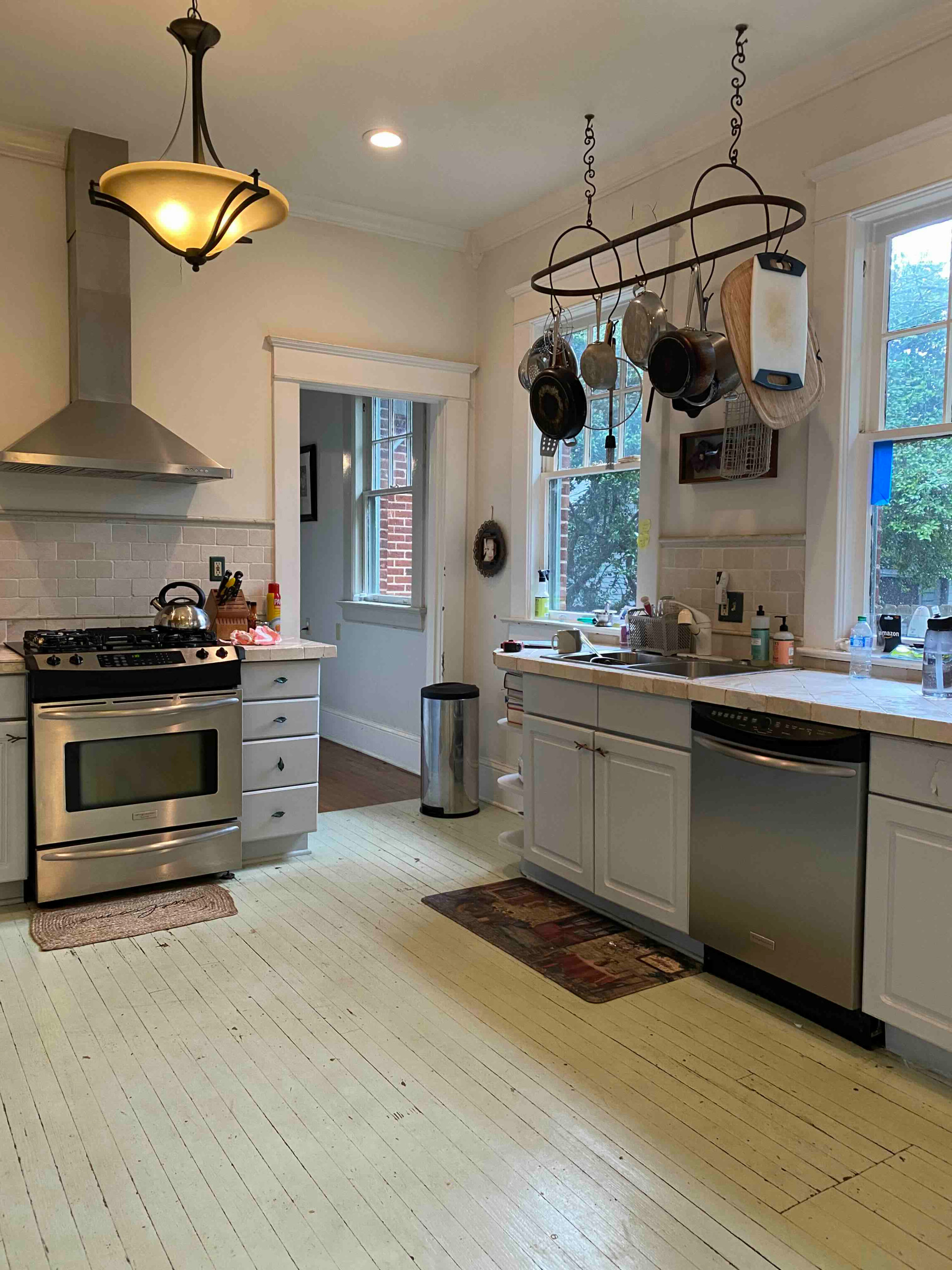
Before: A door in the corner of the kitchen to the right of the range led to a staircase and pass-through to the dining room (labeled “butler pantry” in the floor plans below). The corner was an awkward pinch point between the two runs of cabinetry.
See why you should hire a professional who uses Houzz Pro software
See why you should hire a professional who uses Houzz Pro software
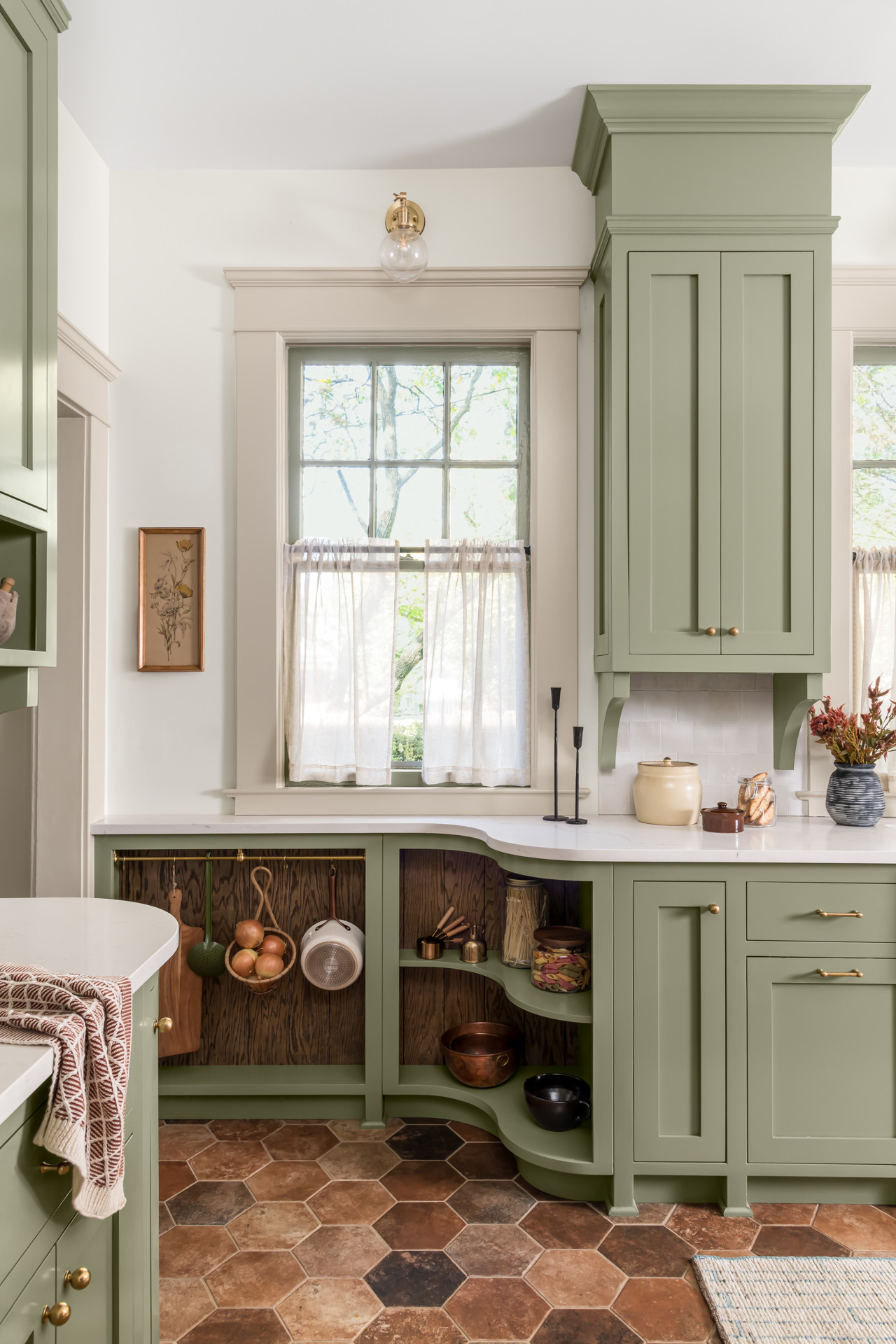
After: Flake introduced gently curved cabinetry at the end of each of the runs to ease flow between the two spaces and maximize storage space.
The open shelving with the red oak backing is one of Flake’s favorite details in the kitchen. It’s only about 5 inches deep where it meets the corner, but Flake put it to work by mounting a wall-hanging brass pot rail with S-hooks for hanging pots and pans.
The open shelving with the red oak backing is one of Flake’s favorite details in the kitchen. It’s only about 5 inches deep where it meets the corner, but Flake put it to work by mounting a wall-hanging brass pot rail with S-hooks for hanging pots and pans.

To make the cabinets feel more integrated with the rest of the kitchen, she mimicked the curves through the rest of the lower cabinetry, as well as in the upper cabinets’ corbels, the brass island pendant light and the island’s countertop.
The dark gray granite used for the island top and range hood detail resembles the soapstone the owners love, but it’s lower-maintenance. The red oak base’s warm tones are echoed in the hammered copper apron sink and terra-cotta tiles.
The dark gray granite used for the island top and range hood detail resembles the soapstone the owners love, but it’s lower-maintenance. The red oak base’s warm tones are echoed in the hammered copper apron sink and terra-cotta tiles.
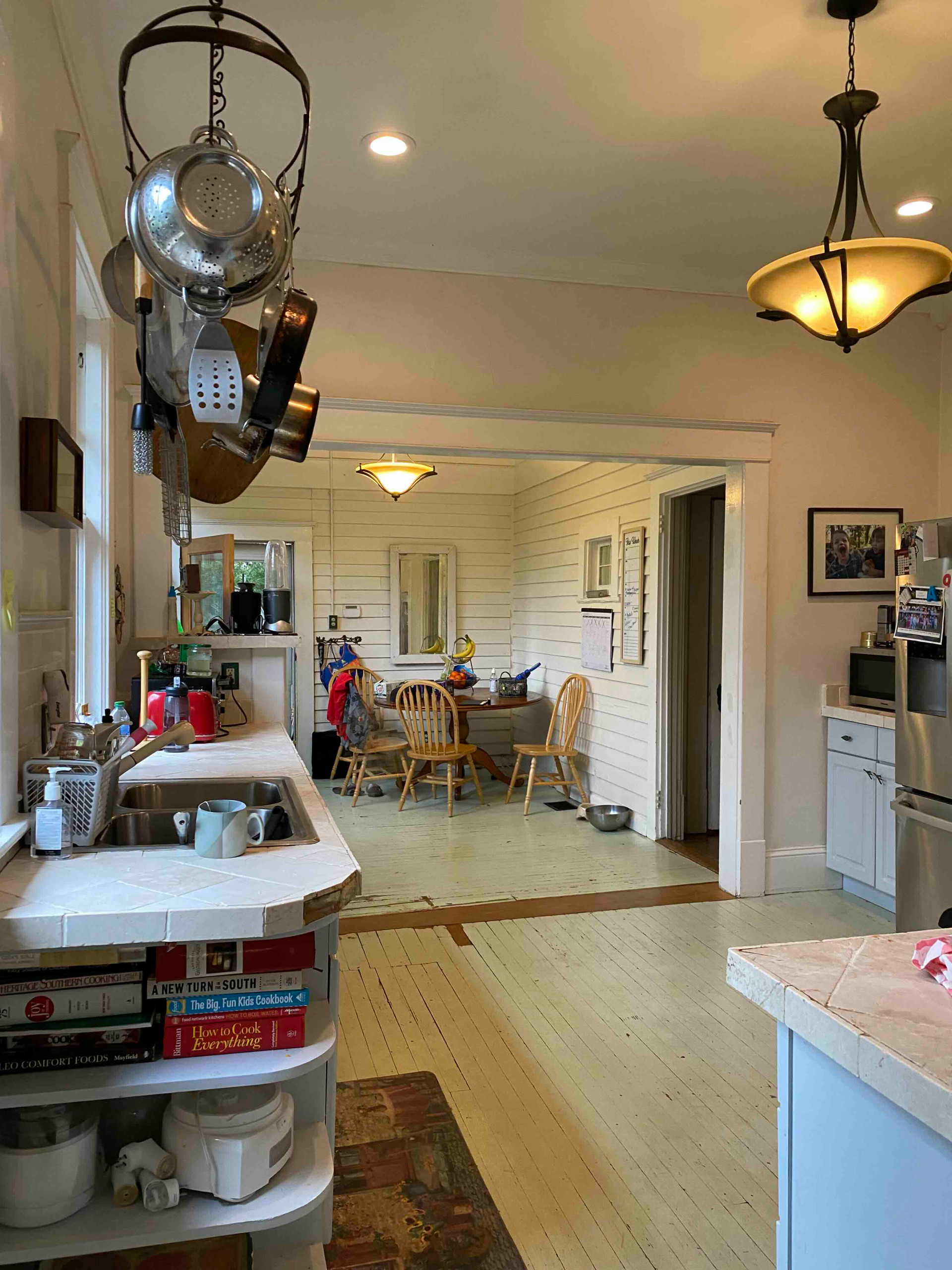
Before: This was the view looking back toward the breakfast room. The refrigerator is on the right, and the door just past the framed opening previously led to a hallway and closet used for pantry storage.
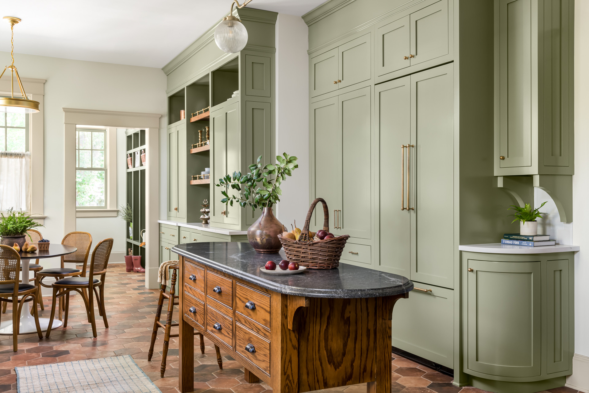
After: That hallway door was eliminated, and Copper Sky rerouted plumbing and installed a header in order to remove the framed opening and create one smooth ceiling. A panel-front fridge is now concealed amid a tall wall of cabinetry that spans the two previously divided spaces. To the fridge’s left, an appliance garage hides small appliances such as a coffeepot and microwave.
The freestanding island’s rounded corners and slim 2-foot width help ease circulation, with a little over 3 feet of clearance on either side. Despite its narrow profile, the 7-foot-long island offers generous counter space, which was lacking in the previous kitchen. It also provides additional storage, though only the drawers facing the sink are functional.
The rounded lower cabinet in the foreground is beside an existing hallway door that’s just out of frame.
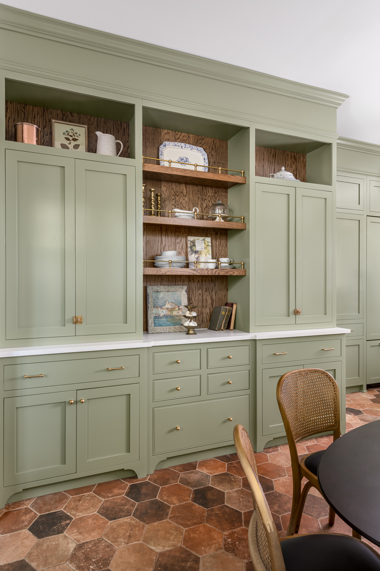
The tall cabinets in the former breakfast room function as a pantry. Along with the new kitchen cabinetry, they more than compensate for the storage lost when creating the new powder room.
“The storage we provided them really was double or triple what they had before,” Flake says.
Compare the before-and-after layouts below to see how Flake reconfigured the space.
25 Genius Kitchen Storage Ideas
“The storage we provided them really was double or triple what they had before,” Flake says.
Compare the before-and-after layouts below to see how Flake reconfigured the space.
25 Genius Kitchen Storage Ideas
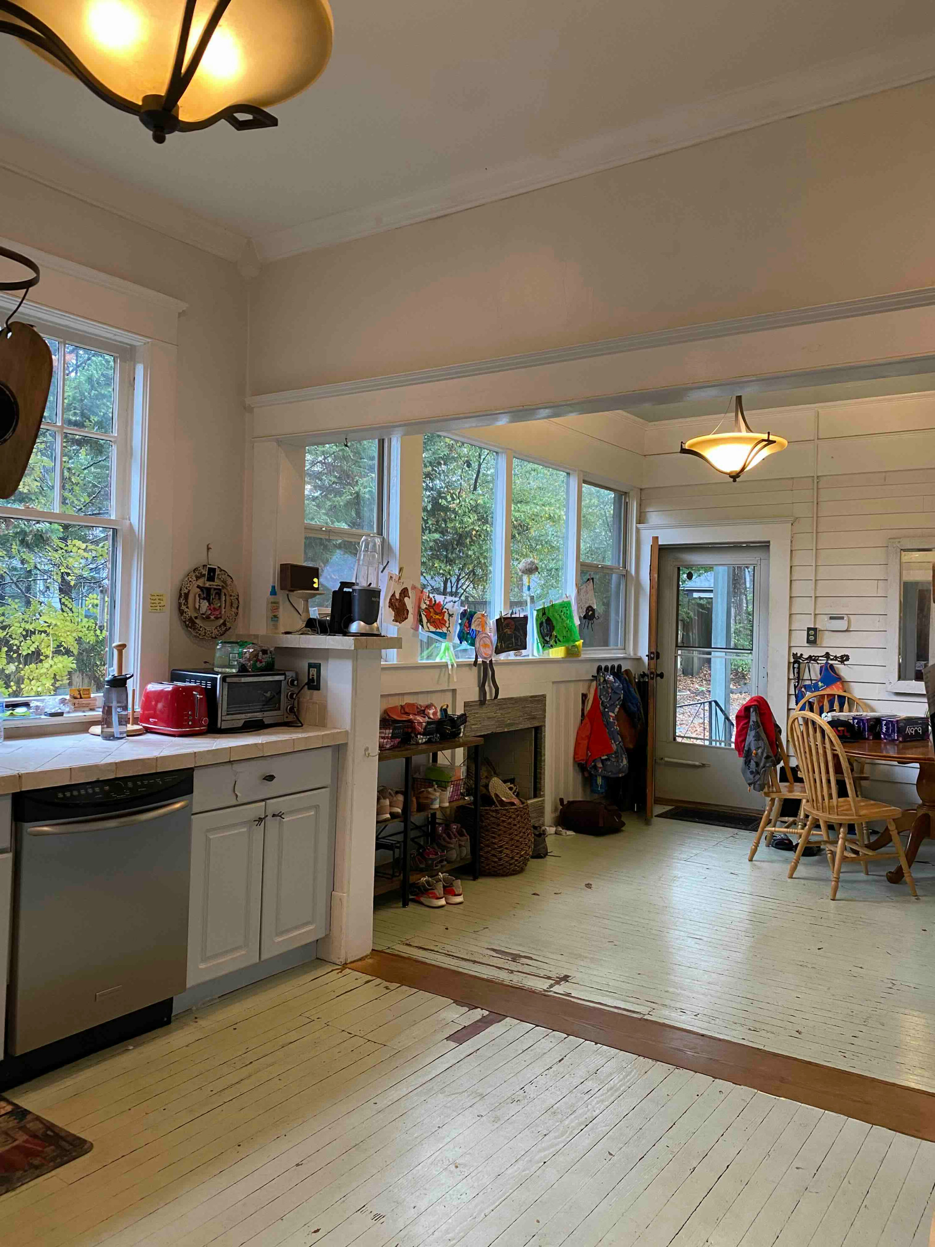
Before: On the other side of the breakfast room was an exterior door, a drop zone for shoes and jackets and a fireplace that the homeowners didn’t want to keep.

After: The previous door became a window, and three replacement windows bring in plenty of natural light. Flake designed a built-in storage bench with a cushion on top to create a sunny new breakfast nook.
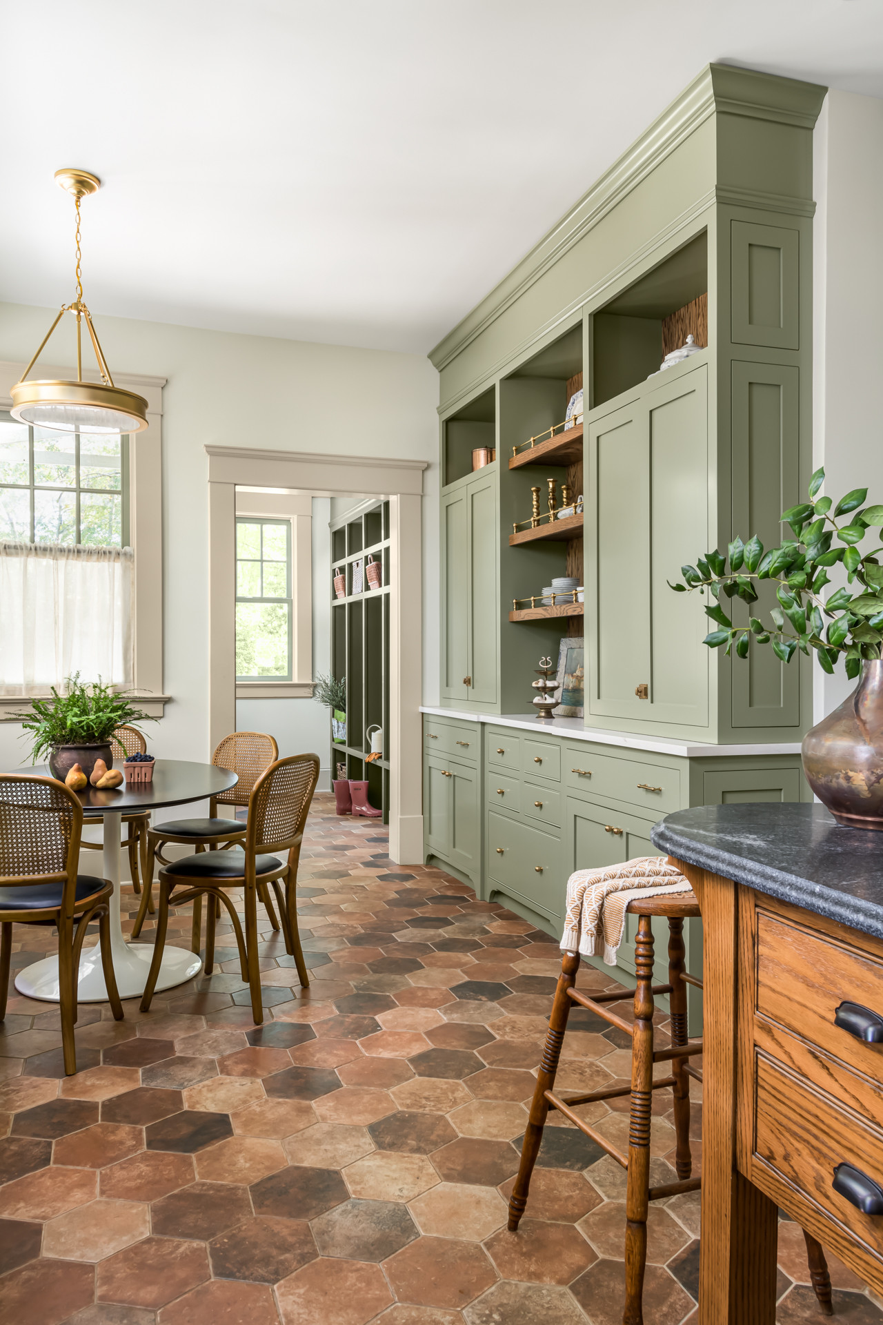
She also transformed part of an underused sunroom into a 56-square-foot mudroom off the kitchen’s back right corner, reorienting the stoop and adding an exterior door to make it the new point of entry. Outfitted with open lockers painted a few shades darker than the kitchen cabinets, it now welcomes the family, corrals jackets and shoes and offers a warm preview of the kitchen’s fresh new look.
Mudroom paint: Forest Floor, Benjamin Moore
Mudroom paint: Forest Floor, Benjamin Moore
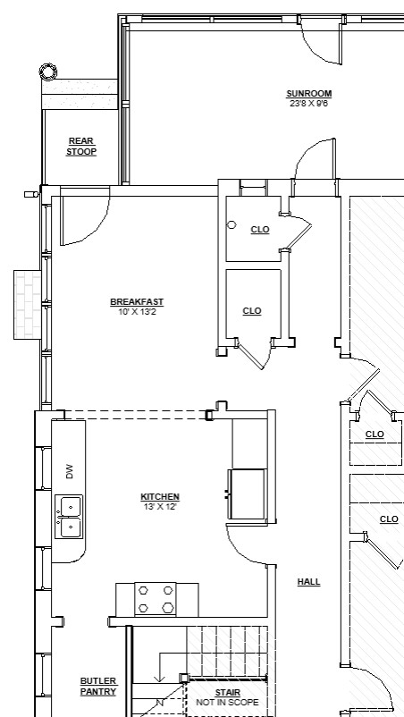
The previous floor plan
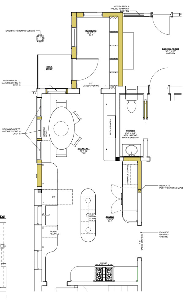
The new floor plan
More on Houzz
Read more kitchen stories
Browse kitchen photos
Hire a kitchen remodeler
More on Houzz
Read more kitchen stories
Browse kitchen photos
Hire a kitchen remodeler

Sponsored

Kitchen at a Glance
Who lives here: A couple with three children
Location: Decatur, Georgia
Size: Kitchen is 216 square feet (20 square meters), breakfast area is 92 square feet (8.6 square meters)
Designer: Jessica Flake of Copper Sky Design + Remodel
Before: This photo of the kitchen was taken from the former breakfast room and de facto mudroom. Originally it was the home’s back porch. Although there was a large opening between the two rooms, they functioned like separate spaces.
The hardwood floor throughout (which had been painted by previous owners) and the kitchen cabinetry were in disrepair, and storage was lacking. The homeowners were using a small closet between the breakfast room and hallway as a pantry. The plan was to combine the two spaces, create a small powder room and add a designated mudroom.
Scroll to the bottom to see the before-and-after floor plans.
Find kitchen remodelers near you