


New Layout and Function for a Chicago Family Home
The challenges of a 110-year-old foursquare are met with thoughtful updates that add comfort and preserve character
Julie Sheer
January 9, 2020
Houzz Contributor; journalist with more than two decades of experience as a graphics editor and writer at the Los Angeles Times and Chicago Tribune; outdoor guidebook author; lover of all things outdoors, nature and wildlife. Follow me at https://westcentric.wordpress.com/
Houzz Contributor; journalist with more than two decades of experience as a graphics... More
After living in a modern duplex in Chicago, Hannah and Ryan Hamburger were ready for a comfortable place to call home. “It was great for living in the city, but definitely not home. We wanted to find something that felt homey. It was really a feeling rather than a look,” Hannah says. They were driving around the North Shore neighborhoods north of the city when they spotted an open house in Winnetka. Hannah jumped out and went inside the 110-year-old foursquare house. “I took a look around and realized the floor plan was perfect for what we wanted, but it did need work,” she says.
House at a Glance
Who lives here: Hannah and Ryan Hamburger; their 3-year-old daughter, Maya; and their dog and two cats
Location: Winnetka suburb of Chicago
Size: About 3,000 square feet (279 square meters)
Contractor: Kaleb Wilson
The couple purchased the home, started renovations two months later and moved in four months after that. They hired local general contractor Kaleb Wilson and, to refresh the walls and exterior, a local painter.
Instead of giving their vintage home a modern open-concept layout, the couple widened many of the cased openings in the main living space to open up the floor plan. They took down one wall on the main floor and injected light and comfortable decor touches, while staying close to the home’s traditional roots.
Find a local general contractor on Houzz
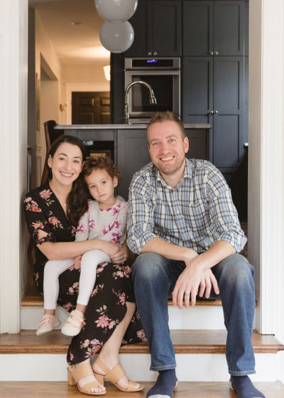
Hannah, seen here with Maya and Ryan, provides data and analysis for litigation consulting. Ryan works on business development and strategy for Instacart. The couple’s business and tech skills, such as Hannah’s love of spreadsheets, came in handy during the renovation, along with design inspiration from Houzz. Ryan’s organizational skills kept the design projects on track. “My husband takes on a lot of projects, so we knew going in what was needed. He’s good at knowing which walls could be opened up, and has a spatial awareness of what should be where. I came in on design stuff,” Hannah says.
“We picture our family living here for many years, in a cozy and older home with character,” Hannah says.
How to Create and Use Ideabooks
“We picture our family living here for many years, in a cozy and older home with character,” Hannah says.
How to Create and Use Ideabooks
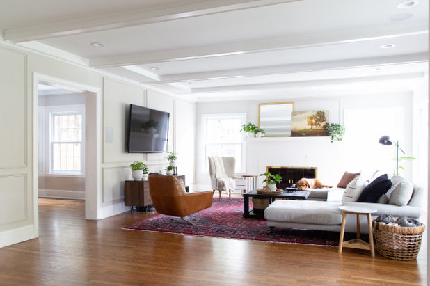
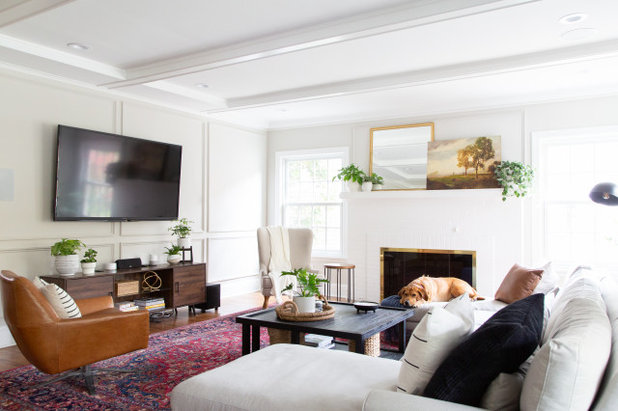
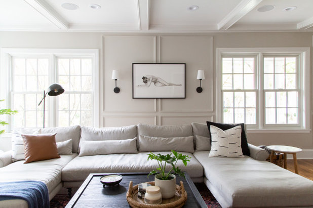
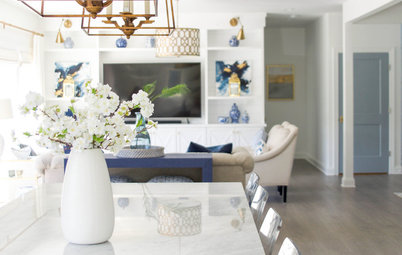
The cased opening between the living room and dining room, seen here, was widened, and the walls and trim took on a refined and modern look with new paint. The couple prefers a comfortable traditional style with modern touches.
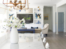
The flat-screen television is mounted prominently on one of the living room walls. “We’re not a hide-the-TV family. We like TV, and my husband really wanted a comfy couch,” Hannah says.
Wall paint: Agreeable Gray; trim paint: Pure White, both by Sherwin-Williams
The flat-screen television is mounted prominently on one of the living room walls. “We’re not a hide-the-TV family. We like TV, and my husband really wanted a comfy couch,” Hannah says.
Wall paint: Agreeable Gray; trim paint: Pure White, both by Sherwin-Williams
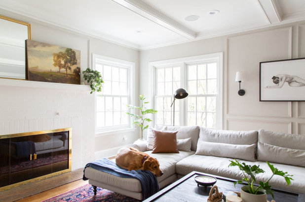
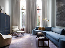
The custom gray Maxwell U-shaped sectional sofa from Interior Define was the starting point for the design of the living room. It’s upholstered in a durable and plush ecru material, which their dog Zoe is enjoying in the photo here. “Everything had to be kid-friendly. We had the fabric tested to make sure it was kid- and pet-friendly. Our dog ran in the mud and then went on the couch, and the mud came out,” Hannah says. The mirror and art on the fireplace mantel are thrift store finds.
Windows tend to be a defining feature in historic homes, but the existing ones in this one were not original and were likely brought in during the 1940s, Hannah says. “They were really drafty and didn’t function that well,” she says. “We ended up replacing most of them with those with a very similar style. We tried to stay true to the original windows.”
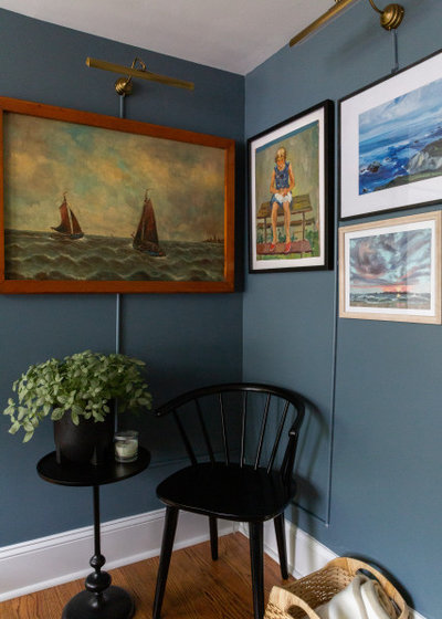
The couple finished the walls with picture frame molding to add texture and character. A wide space between the windows cried out for something to fill it, but finding something to fit was a challenge. “I knew I wanted it to be black and white or grayscale in order to not overwhelm the space, but I couldn’t find anything to fit horizontally that wide,” Hannah says. She ended up commissioning a custom watercolor from Victoria Bradley, an artist she discovered online.
The couple finished the walls with picture frame molding to add texture and character. A wide space between the windows cried out for something to fill it, but finding something to fit was a challenge. “I knew I wanted it to be black and white or grayscale in order to not overwhelm the space, but I couldn’t find anything to fit horizontally that wide,” Hannah says. She ended up commissioning a custom watercolor from Victoria Bradley, an artist she discovered online.
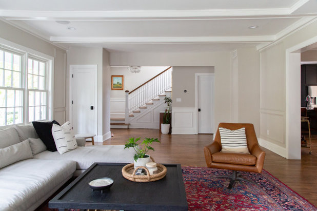
A secondhand saddle-colored leather swivel chair and a rug inject color and texture into the living room’s otherwise white palette. The home’s front entry and stairway to the second floor are seen at the far end of this photo.
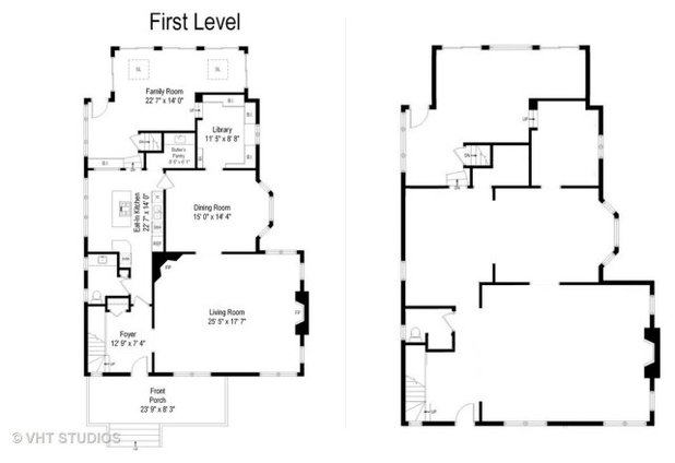
Before and after: The floor plan on the left shows the first floor when the couple purchased the home. The new floor plan, on the right, shows where room openings were widened and the wall between the kitchen and dining room was removed.
Before Photo
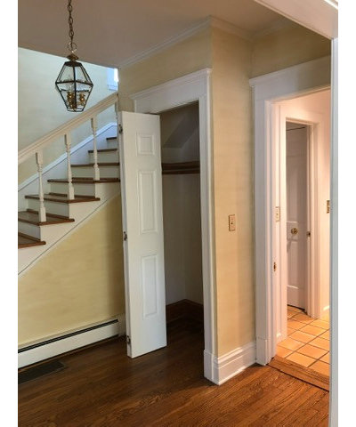
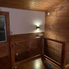
Before: There was a closet next to the stairway. Behind the closet, seen through the doorway, was a bathroom adjacent to the kitchen.
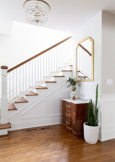
After: The homeowners had the closet removed and the bath downsized to a powder room to give the kitchen more space. Against the wall where the closet used to be, the couple placed an antique chest under a mirror with a frame they painted gold. The wall has a stenciled design that Hannah says was inspired by a discontinued Serena & Lily wallpaper.
Before Photo
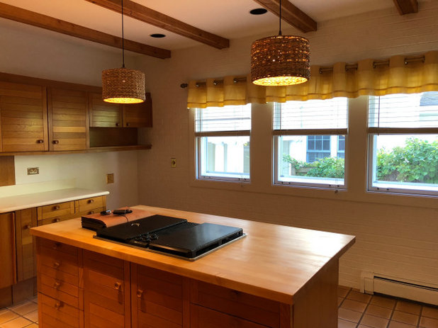
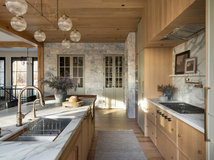
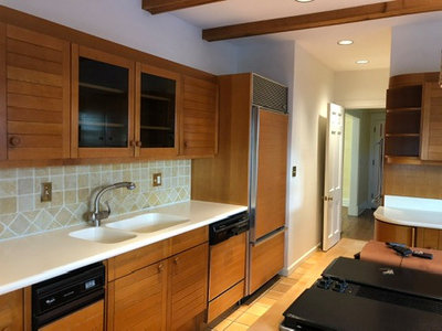
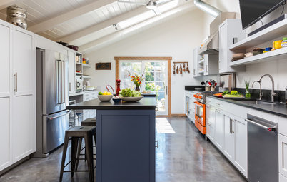
Before: One wall in the kitchen had three windows that were placed too low to install cabinetry beneath. “Troubleshooting the nuances of an old house,” Hannah says, was just one of the challenges the couple encountered. Brown also dominated the previous kitchen palette, from the terra-cotta floor to the slatted wood cabinets.
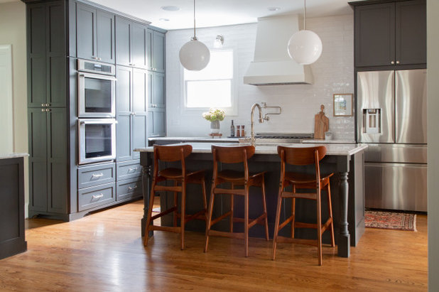
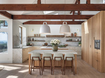
After: Contractor Wilson closed off two of the windows and shortened the third to accommodate a stovetop, cabinetry and counters. A handsome new island with a white quartzite top and turned wooden legs replaced the old one, in a different orientation. New wood flooring replaced the old square terra-cotta tiles.
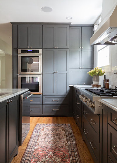
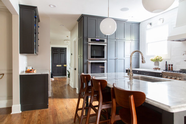
The white quartzite countertops kicked off the kitchen’s new design. “That was the first decision we made in the kitchen. We saw the slab, and it was beautiful. We knew we wanted dark cabinets, and looked for a color that looked good. It all developed from there,” Hannah says. The new custom Shaker-style cabinetry is by Keith Wilson of Whispering Pines Woodshop. The cabinets are painted in Iron Ore from Sherwin-Williams, a classic blue-gray, to contrast the light countertops. “We worked with [Wilson] to design the cabinets,” Hannah says. “We wanted to stay true to the age of the home, so we leaned toward traditional in the decisions we made,” she says.
Countertops: Precision Stone Design
Countertops: Precision Stone Design
Before Photo
Before: This wall with the sink and refrigerator was removed during the renovation to open up space to the dining room.
After: New cabinets with wine storage and a beverage refrigerator are now in the area where the wall was removed and the old refrigerator was located.
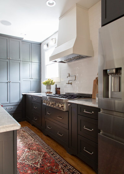
Here’s a closer look at the wall where the windows were removed. Hannah turned to Houzz to figure out how she wanted the backsplash to look. She browsed images of kitchens with various grout and spacing configurations, and chose a white organic-edge subway tile with minimal spacing.
A custom range hood sits above a new range top. “I knew I wanted a certain number of burners. I wanted gas, and I wanted it to be more of a range top, and this one got really great reviews. Instead of sitting on top, it slides in. There’s room for pots and pans underneath,” Hannah says.
Range top: ZLine Kitchen and Bath
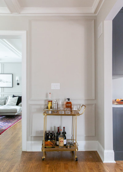
This small area in the dining room between the kitchen and living room is the perfect spot for a bar cart. “We like to entertain. I like cooking and entertaining, and my husband is in charge of drinks,” Hannah says.
Shop for bar carts on Houzz
Shop for bar carts on Houzz
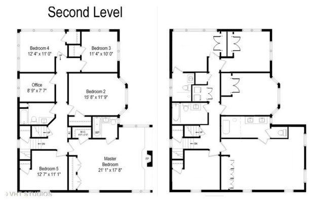
Before and after: On the left is the upstairs floor plan before the remodel. On the right, the floor plan shows the reconfigured master suite and a bathroom that was added to one of the other bedrooms.
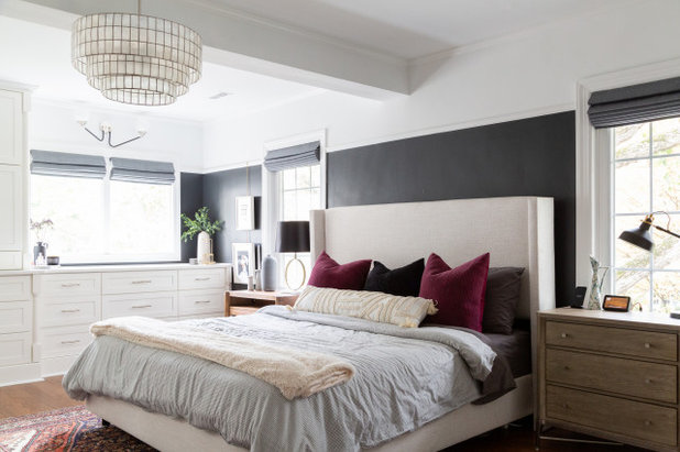
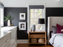
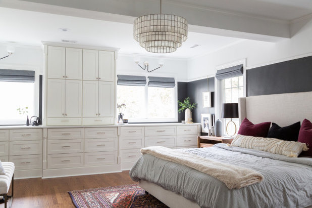
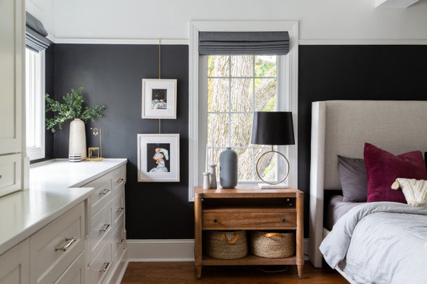
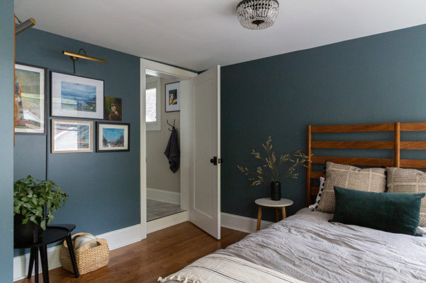
The homeowners are particularly pleased with how the master suite turned out. “I really love our master bedroom,” Hannah says. “It’s a great space, and it’s really cozy. The picture rail and gallery rods make it really easy to change art.” The dark paint on the lower two-thirds of the wall is on-trend, though at first Hannah thought it might be “a little out there.” When she showed it to her father during a video chat, he assumed it was existing paint that would be changed. “He said, ‘They’re going to cover the black, aren’t they?’” Hannah says.
Upper-wall paint: Pure White, Sherwin-Williams; lower-wall paint: Cheating Heart, Benjamin Moore
Upper-wall paint: Pure White, Sherwin-Williams; lower-wall paint: Cheating Heart, Benjamin Moore
Before Photo
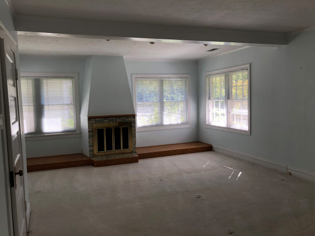
Before: The previous master bedroom featured a fireplace that the couple felt made that wall unusable. “The space is very large. When you walked to the back of the room, there was a fireplace sitting on top of what I called a stage. It was on a 4-inch-high stage; I don’t know why,” Hannah says.
After: The fireplace was removed, and the windows were raised so white custom cabinetry could fit underneath.
So the homeowners could open the cabinet closest to the window on the wall with the bed, the window was changed from a double to a single. “We made a last-minute decision to close up half of that window to make the drawers functional,” Hannah says.
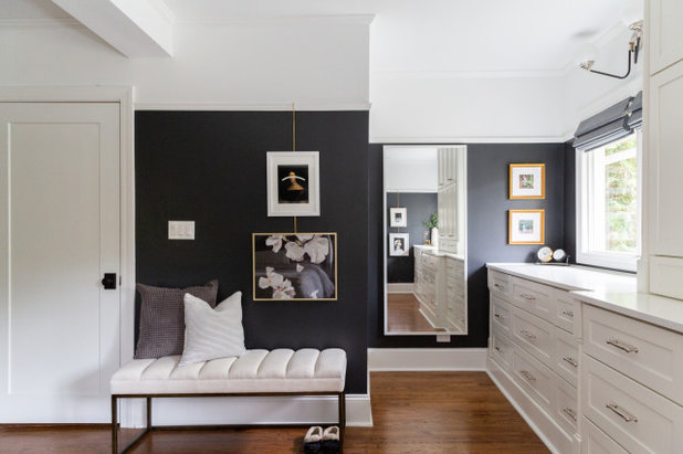
The remodel involved taking space from the bedroom to give the bathroom more space, and adding a wall to enclose the toilet — the wall behind the white bench in this photo. Art hangs on gallery rods from a picture rail, similar to the art on the opposite wall, reflected in the mirror.
Before Photo
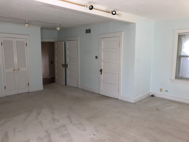
Before: There was previously a closet behind the louvered doors seen here, and one behind the door just past the room’s entrance. The door to the right of that leads to the bathroom.
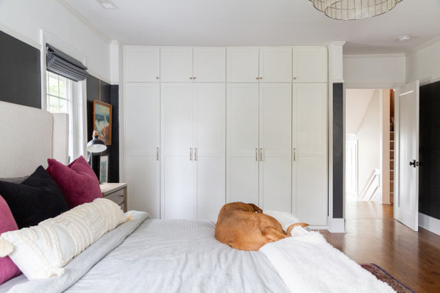
After: The remodel provided the bedroom with a wall of built-in closets. The closet next to the bathroom was removed to give space to the new master bath, which stayed in the same location.
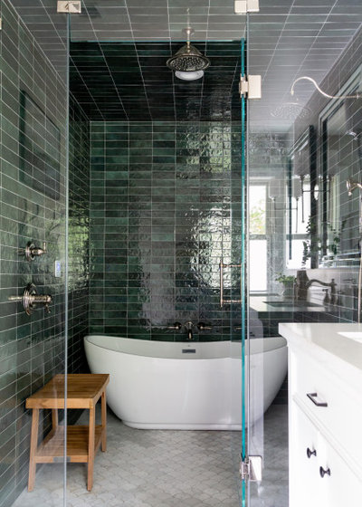
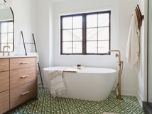
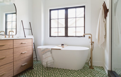
The master bathroom features a tub and shower area, with a glamorous glazed ceramic subway tile in a glossy green encasing the walls and ceiling, and marble scalloped tile on the floor. The couple created a kind of wet room with a freestanding tub in the 6-foot-square shower area. The marble floor tile will be sealed every year, Hannah says.
Tile: Cloe, Bedrosians Tile and Stone
Tile: Cloe, Bedrosians Tile and Stone
Before Photo
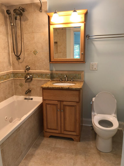
Before: An outdated single-basin vanity was situated between the tub and toilet in the old master bathroom.
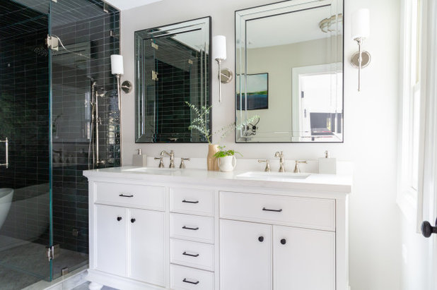
After: A crisp white double vanity now sits beside the tub-shower area. “The bathroom is everything we really wanted. That was a big transition. The master bath was not really a master bath,” Hannah says.
Eliminating a fireplace in the living room downstairs helped give the homeowners the master bath they wanted. The fireplace had a three-floor chimney that extended from the basement up through the master closet. Removing that chimney and closet freed up space for the new master bath. “It took up so much space, so it was an easy choice. It allowed us to have both a shower and bathtub,” Hannah says.
Shop for white double vanities on Houzz
This handsome guest bedroom is used by Hannah’s parents when they visit from Cleveland. The couple added color by having the walls painted in Slate Tile from Sherwin-Williams. “Most of the house’s paint colors were traditional or neutral, and we wanted to take one space and make it a little bold,” Hannah says.
Hannah had her mother in mind when it came to decorating the guest bedroom. “My mother’s favorites are the outdoors and sunsets, so I collected those [artworks] for her,” Hannah says. She found most of the art by thrifting and buying at online auctions.
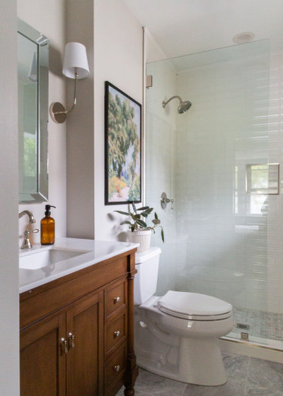
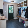
The couple added an en suite bath to the guest room, taking space from what was previously an office. They split the old space between the new bathroom and a laundry.
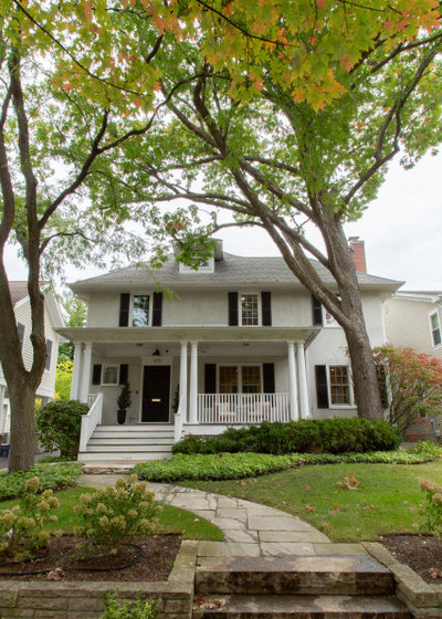
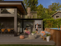
The home is a foursquare, and its exterior was in good shape and needed only paint touch-ups; the shutters are now painted black. “The porch was a big selling feature for us,” Hannah says. “It’s a really nice space and felt very inviting. Maybe one day I’ll get a porch swing.”
See more of this home
My Houzz is a series in which we visit and photograph creative, personality-filled homes and the people who inhabit them. Share your home with us and see more projects.
More on Houzz
See other home tours
Find an interior designer
Shop for home products
See more of this home
My Houzz is a series in which we visit and photograph creative, personality-filled homes and the people who inhabit them. Share your home with us and see more projects.
More on Houzz
See other home tours
Find an interior designer
Shop for home products


Related Stories
Bathroom Design
6 Beautiful Master Bathrooms With Double-Vanity Setups
By Janet Paik
Geometric tile, a claw-foot tub and shiplap walls are some of the standout details in these renovated master bathrooms
Full Story
Houzz Tours
Soothing Blues and Whites in a Virginia New Build
By Sarah Lyon
Clean coastal-inspired style, statement wallpaper and custom woodwork mark the home of a decorator and a contractor
Full Story
Transitional Homes
Color, Heirlooms and Artwork Refresh a Kansas City Home
By Julie Sheer
See how this 1922 Colonial Revival house got a bright update
Full Story
Christmas
Sweet Christmas Charm in a Renovated 1949 Home in California
By Janet Paik
Splashes of cheery sunshine yellow and shiplap walls are a backdrop to holiday decor in this decorator’s forever home
Full Story
Holidays
Tour 7 Homes With Fresh and Cheery Holiday Decor
By Janet Paik
Festive place settings, garlands and trees personalize these warm and inviting homes for the Christmas season
Full Story
Trending Now
5 Reader-Favorite Home Tours From 2019
By Janet Paik
See the bright and personalized design details that feature in the most popular homes from our My Houzz series
Full Story
Transitional Homes
New Tudor-Inspired Family Home in Chicago
By Julie Sheer
See how a couple worked with their builder to mix traditional and modern elements for a comfortable and chic home
Full Story
Small Homes
Stylish 800-Square-Foot Home Brimming With Personality
By Julie Sheer
See how the head of merchandising at Palecek transformed his rental apartment with paint, lighting and decor
Full Story
Houzz Call
Homeowners, Share Your Home With Us!
By Janet Paik
We want to hear about your recent remodel or update. You and your home could be featured on Houzz
Full Story
A beautiful old house with a serene interior. However, nobody seems to have picked up on the problem of heating the very large living room, now very much open to the hall and stairs; the heat will inevitably disappear up those stairs! I can imagine that the owners will need to tuck their feet up on the sofas and wrest the throw from Zoe to cuddle up in.
I do wish, with all the publicity about climate change and the need for us all to do our part, that designers would put environmental considerations at the heart of their schemes. The efficient heating of spaces is an important consideration and open plan living is problematic in this respect, unless there is a renewable energy source available.
I love it. It is beautiful. I love the space in the lounge and the fact that they haven't hidden the TV. I love that they admit they like TV and are happy to snuggle up and watch it. The only thing I would question is the need to reseal the bathroom tiles every single year. That would irritate me, but I still adore the house.
Big fans of YHL, it appears