


4 New Kitchens in White, Wood and Blue
Designers share how they mixed shades of blue with white cabinets and wood details to create welcoming looks

We recently profiled stylish white-and-wood kitchens. While some homeowners are happy with that light and warm combo, others prefer adding a punch of color. And few colors work better in a kitchen than shades of blue. Blues can bring a bright, inviting energy without veering too bold. Plus, they work well with wood tones and almost any metal finish, including brass and matte black. Here, design pros share details of four kitchens in white, wood and blue.
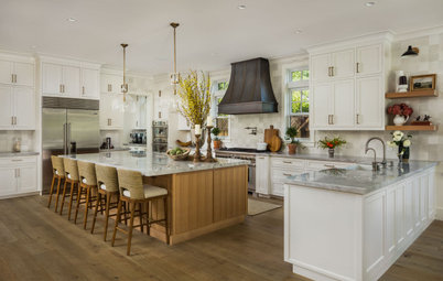
2. Tile Style
Designer: Rachel Julkowski
Location: Roseville, Minnesota
Size: 333 square feet (31 square meters)
Homeowners’ request. “This is a beautiful home, but the kitchen just did not reflect the style of its owners,” designer Rachel Julkowski says. “We decided a much larger island with a beverage refrigerator and seating would help gain some much-needed function.”
White, wood and blue details. “The owners really let me have fun with the style,” Julkowski says. “They wanted it to feel unique and liked the color blue, so we went bold with a navy tile backsplash contrasted by off-white cabinets (Elephant’s Breath by Sherwin-Williams), walnut hood and island cabinets and gold accents.”
The wall paint is Calm by Benjamin Moore.
Other special features. Marble-look quartz countertops (Britannica Gold by Cambria). “A gold faucet and light fixtures added some bling, which I think every space needs,” Julkowski says.
Designer tip. “Have fun mixing metals,” Julkowski says. “We used gold on the faucet, black bronze on the hardware and stainless for the appliances. It creates a much more interesting palette with a designer feel.”
“Uh-oh” moment. “We moved the window location at the sink and increased the size by quite a bit to take advantage of beautiful views to the wooded backyard,” Julkowski says. “Unfortunately, when we opened up the wall we discovered HVAC and other mechanicals in our way. We assured our clients not to worry. It was a fairly simple change to relocate those mechanicals to a nearby wall cavity and continue with the installation of the new window.”
Shop for counter and bar stools
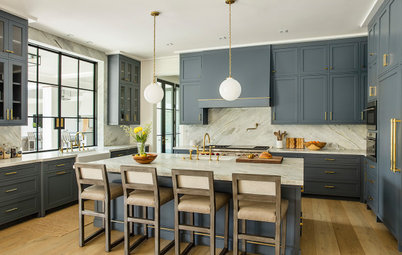
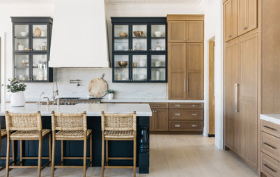
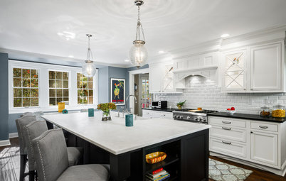
3. Deep Blue-Gray Beauty
Designer: Kelly Caruso of Regarding Design
Builder: Hage Homes
Location: Minneapolis
Size: 336 square feet (31 square meters); 14 by 24 feet
Homeowners’ request. “For this new build, it was important to the homeowners that the exterior of the traditional Tudor brick home match the interior layout, but with spaces made for modern living,” designer Kelly Caruso says. “Classical elements are featured throughout the kitchen, including cased openings, cabinet built-ins and cozy window seating, creating an ambiance steeped in tradition.”
White, wood and blue details. The cabinets are a dark blue-gray (Inchyra Blue by Farrow & Ball). The hood and hutch are birch in a custom stain. The walls and trim are Shoji White by Sherwin-Williams. The flooring is white oak.
“By using a color palette grounded in warm white paired with an elegant blue-green and a natural-stain wood hutch and range hood, the kitchen has plenty of old-world charm and blends seamlessly with the family room and the rest of the home,” Caruso says. “The blue-green veining of the White Infinity quartzite countertops and backsplash ties into
the cabinet color and adds movement.”
Other special features. “Cabinet hardware in traditional designs with an unlacquered brass finish added a sense of tradition,” Caruso says. “And rather than the usual eat-in kitchen, the homeowners opted for a bistro table paired with banquette window seating. This creates a beautiful space for morning coffee or evening wine and conversation while watching the cook.”
Designer tip. “There is amazing light that streams in throughout the day from the south-facing windows but not a lot of privacy,” Caruso says. “Rather than traditional window treatments, I chose cafe curtains in a lightweight linen fabric to allow for light, provide privacy and add a sophisticated textile print that softens the space.”
Pendant lights: Precision in burnished brass, Visual Comfort; bar stools: Africa in Ecru, Vondom
Before and After: 3 Beautiful Blue-and-White Kitchen Makeovers

Need a pro for your kitchen remodeling project?
Let Houzz find the best pros for you
Let Houzz find the best pros for you
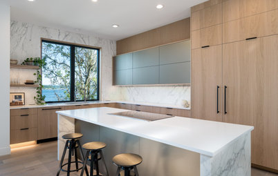
4. Steely Blue Boldness
Designer: Dougal Murray of Racing Green
Location: Encino neighborhood of Los Angeles
Size: 320 square feet (30 square meters); 16 by 20 feet
Homeowners’ request. For this spec home, designer Dougal Murray wanted to maximize views from the kitchen and create a natural, earthy palette. “Because the floor plan was so open, we needed to maximize the workability of the space and reduce clutter as much as possible,” Murray says. “So we added a large butler’s pantry and a walk-in pantry with floating white oak shelving to help keep everything organized and easily hidden.”
White, wood and blue details. The wood cabinets are rift-sawn white oak. The lower cabinets and island base are a blue-gray color (similar to Mineral Alloy by Benjamin Moore). “The decision to go with a rift-sawn white oak was borrowed from the surroundings and the numerous oaks in the vicinity of the Hollywood Hills,” Murray says. “Due to the immensity of the open floor plan, we wanted to ground the kitchen in something more solid, which is why the base cabinets [are] a nice gray-blue color that centered the cabinetry without overpowering the space.”
Other special features. “The kitchen was finished off with natural Ceppo di Gre stone countertops, which waterfalls over each island end,” Murray says. “With their ammonite-esque markings, this gave the kitchen some much-needed movement while also tying the cabinetry together.”
Designer tip. “Our style is very minimalist in design but also has a lot of detail in it,” Murray says. “I recommend keeping the color palette simple but playing within that to maintain range and interest.”
Staging: Bella Casa
More on Houzz
Read more kitchen design stories
See more kitchen photos
Shop for kitchen storage and organization
Find a kitchen remodeling pro


Sponsored
Columbus Area's Luxury Design Build Firm | 17x Best of Houzz Winner!
Sponsored
Columbus Area's Luxury Design Build Firm | 17x Best of Houzz Winner!
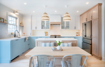
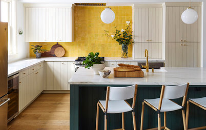
Designer: Jasmine Koblik of Otis Interiors
Location: Guelph, Ontario
Size: 216 square feet (20 square meters); 12 by 18 feet
Homeowners’ request. “The homeowners came to us for a main floor renovation with a particular focus on their kitchen,” designer Jasmine Koblik says. “Their existing U-shaped kitchen felt tight and hard to operate in and they were looking for ways to open things up to create better flow and function. We removed a wall in between their kitchen and dining room to create more space and brighten the room.”
White, wood and blue details. Koblik looked at the homeowners’ inspiration photos found on Houzz and saw that many featured mostly neutral palettes with pops of blue. “Their style also pointed to a modern farmhouse feel, so that’s the natural direction we went in but with a refined approach,” she says. “We used Cloud White by Benjamin Moore for the perimeter cabinetry and Hale Navy by Benjamin Moore for the island and the custom hood vent. Then we incorporated a midtone oak wood tone to bring some warmth in. A similar hardwood flooring tone runs throughout the main floor so it all feels connected.”
Other special features. Vertical shiplap on the island ends and behind the glass cabinets. “It provides dimension and a nod to farmhouse charm,” Koblik says. “The white subway tile backsplash is classic, and we added a twist by incorporating a pencil rail tile to frame and bring attention to the beautiful custom hood range with a slim X detail, another nod to farmhouse but in a modern way. Lastly, we encouraged the homeowners to go with two oversized pendants above the island. They are larger than what might be expected but that is part of what makes them work so well. We have no upper cabinets on the window wall, so using the navy blue on the hood range and the larger pendants help to anchor the whole space.”
Designer tip. “One of the small details that we love building into kitchens is the mix of different hardware finishes,” Koblik says. “Overall, we integrated matte black, polished nickel and ash gray. You’ll find matte black around the perimeter of the kitchen against the white, and on the island we changed the color to an ash gray. It makes an unexpected striking combo against the navy blue and feels really luxe.”
Pendant lights: Camden in polished nickel, Regina Andrew; custom cabinetry: DB Custom Design Woodwork
Find a kitchen designer near you